Hello folks, and welcome to another edition of Box Art Brawl!
In last week's edition, we took a look at The Legend of Zelda: The Minish Cap for the GBA; perhaps one of the most underrated entries to Nintendo's enduring franchise. Japan once again took the lion's share of votes with a whopping 76%. Europe came in second place with 14% and North America in third with 9%.
It just goes to show how beneficial the landscape orientation proved to be for Japan's GBA boxes; there's simply a lot more space to work with, and this is demonstrated beautifully with the colourful shot of Link surrounded by the Minish folk.
Subscribe to Nintendo Life on YouTube847k
This week, were sticking with Zelda once again to look at what is often considered to be one of the finest entries to the franchise: The Legend of Zelda: The Wind Waker. Released in Japan for the GameCube in 2002 before its western launch in 2003, the follow-up to Majora's Mask was initially ridiculed heavily for its drastic departure in visual style, with many mockingly referring to the game as 'Celda' for its cel-shaded approach.
In the decades since, however, fan appreciation of the game has only increased with each passing year, and there are many (including us) who are simply desperate to see the Wii U's HD version of the game ported over to the Switch - please, Nintendo!
For this week's Box Art Brawl, North America and Europe will be teaming up once again due to the stark similarities in their respective designs. While there are differences in tone and colour, the actual compositions are near enough identical. But enough chit chat, let's get on with it!
Be sure to cast your votes in the poll below; but first, let's check out the box art designs themselves.
North America and Europe
The western design for The Wind Waker kept very much in line with the series' gold theme, which was popularised with the launch of A Link to the Past some years prior. With both versions, we can see Link sailing atop The King of Red Lions, though the picture is undoubtedly more prominent in the European version. It's tough to say which one we prefer as they're so similar in design, but if pressed, we'd probably lean towards the North American version for its brighter, subtler approach.
Japan
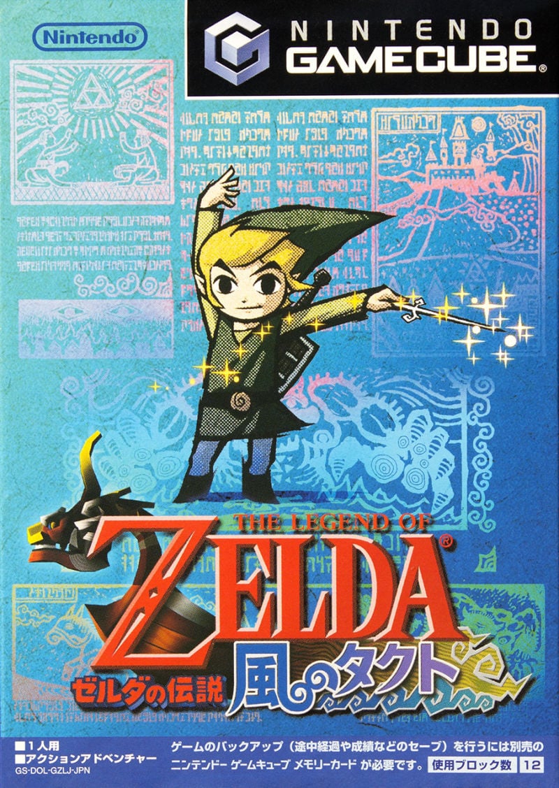
Where the western launch of The Wind Waker demonstrated a more "traditional" approach to its box art, Japan went in the opposite direction and opted for a brighter, more vibrant approach. You've got Link himself front and centre waving his little Wind Waker baton around and he's surrounded by depictions of the game's opening prologue, including some of the stunning Hylian text. It's certainly a drastically different approach in design, but we reckon it works really well!
Thanks for voting! We'll see you next time for another round of the Box Art Brawl.


Comments 58
The Japan art more closely resembles the Wii U box art, which I really like. So I voted for Japan
Third option: Windwaker HD JP/EU
Neither of them is particularly great, nor do they do the game's art direction justice, to be honest. Maybe they went with the more muted color palette on the box in the hope that casual buyers wouldn't be turned off by the game's cartoony graphics. The darker color scheme on Toon Link in the Japanese one is actually kinda reminiscent to Twilight Princess, interestingly enough.
Box Art Brawls Current Total:
Europe: 35
Japan: 44
North America: 44
Australia and New Zealand: 1
Nintendo, put this on Switch you cowards!
The NA version has the right theming but the colors and wash look terrible. The Japanese version has the right colors but the theming and art does not match the game at all. I bet this didn't help the sales of the game when it first came out.
This is really the case where there was significant improvement when the Wii U box was released.
I voted Japan, but the American and European covers look quite different so should be separate entries IMO. Like the angry Kirby boxarts, The American one again has an insecure about too much cutesy look about it, giving the impression of "make the controversial Link design as faded as possible so people can't see that embarrassing kiddy looking monstrosity!"
None are admittedly too eye catching for me, but I finally went with Japan. I prefer things in color (in most cases), and I do like the game's opening Hylian text. There's also something I like about Link's classic WW pose too.
Personally, I prefer the Wii U cover out of all of these.
astonished by that, think the western cover looks far better.
Trying to use a 3D model of the character does not translate too well into box art. It wasn't uncommon for GameCube games (Smash Melee did this too), but it definitely does not age well. The 2D artwork on the JP box art is much more defining of Link and even the game itself, showing the Wind Waker on the cover rather than the King of Red Lions.
This is a tough one. I think this is a case where the Japanese box actually has too much going on. So, by a narrow margin, I'll go NA/EU.
I went with the North American/European box art. Although admittedly, neither one really does anything for me.
Can I choose the Wii U version?
I find both of these just......ok. The NA/EU one is iconic and the JP one has some very nice art (particularly with the Hylian glyphs in the background) but neither of them really speak to me. I'll go with NA/EU on this one (even if the EU one would've been much better without all the unnecessary advertisements) but honestly: the HD re-release has the best one of the lot.

Not crazy about any of these, but I'll vote japan. The NA/EU one blends into the background way and looks like it's faded. The WWHD box art is leaps and bounds better then any of these.
This one was tough, I actually think EU has the best art, but all that text slapped on it ruins it, IMO, so because of that I barely prefer the US version. JPN is certainly unique & I almost voted for it, but I think I slightly prefer the more adventurous take on the western boxes (though if the background lore/scroll text is holographic, which looks like it could be but is nearly indecipherable with still pics like this, I'd have easily gone with it).
As it stands I went with US/EU.
Voted for Japan, I really like the colors.
Even if I didn’t have nostalgic fondness for the Japanese cover, I’d have voted for it. The Western ones seem so monotone in comparison.
I prefer the gold covers for my Zelda games, I have a lot of nostalgia for them since my first Zelda was Ocarina of Time.
If I had to choose, I'd go for the Europe version. Link and the King of Red Lions are much more defined against the background.
I'm glad thr majority of us here agree that both aren't that great. I just went with Japan because I like the colors more
Honestly, they're all terrible. The NA and Europe ones are boring, and the Japanese one feels like an unnecessary mess.
Voted NA/EU though because boring beats an unnecessary mess.
Wii U box art looked a heck of a lot nicer.
It’s funny…this box art taken completely out of context of the environment the game was released into is really difficult to judge all these years later. At the time, the marketing around the game was filled with apprehension and uncertainty. A big push in NA was the inclusion of an Ocarina of Time AND the Master Quest port to Gamecube. I recall these being highlighted more than Wind Waker. I think all these box arts tried to NOT remind people of the game’s style but more to the “It’s the Zelda you know” concept.
The beautiful WiiU cover is a testament to how well the game and its style have aged and how wonderfully unique it is.
japans version is quite ugly
Japan, because I for one always liked the art style, I came from the Game Boy games, to the Gamecube being my first home console. I never wanted more dark realism, I wanted a great adventure that looks fun yet reaches into more emotional story as well. The Japan cover OWNS that art style, and doesn't seem to be shy about it at all. Also, the Japanese characters and the waves in the logo go together very well.
I am gonna vote for neither, because they're both unappealing.
Add me to the list of those who think none of these are particularly good. Depicting Link as a music conductor in that pose on the Japanese cover is just the wrong concept for a game cover. It's not dynamic, heroic, or even interesting. While not a ton better, the sailing is a better concept for a cover. While overly cluttered, I still prefer the Euro cover for the higher contrast which makes Link more visible.
I voted NA/Europe just because it's such a classic minimalist type of zelda cover.
Definitely going for the Japanese one. I always thought the all gold Zelda covers are largely just lazy.
Pretty sad how most people still don't seem to understand The Legend of Zelda. Asking for more colors and complaining about the iconic gold covers.
These are all pretty close. I think Europe has the best though.
How about that disc art though?
NA for me, that cover is very iconic.
@Fizza Thanks for that. I think the Wii U art erased the others from memory. The gold cartridge was always more important than the gold box to me, so I was not a fan of the Wind Waker box when I bought it for the Gamecube (NA). I was kind of hoping the Japan one would be really cool, but I find it repulsive, myself. The game was much better than the box!
An unforgettable game, but that western box art is just useless. This is peak "it's gold, it's Zelda, you'll buy it" material. I mean, they were not wrong. But if we're comparing it to an actual colourful box art, drenched in blue and showcasing Link's wicked new art style, there's no contest.
Japan, but the correct answer is the Wii U art.
@Mattock1987 I'm thinking it'll come to Switch in 2024. BotW2 is getting close now, and once that launches we enter the next big wait for an all new 3D Zelda. 5 years at best. That means 2024-2028 will all be part of the wait.
WW and TP will come across from Wii U - not as a double pack as some hope - to help fill that big void.
I think it's reasonable to also expect an all new 2D Zelda in the early part of the wait period too - 2025 perhaps, but could be 2024 - it feels like a 2D Zelda should be close.
Beyond that, there's a lot of possibilities to fill the wait for whatever comes after BotW2. Ocarina of Time and Majoras Mask got "tidied up" on the 3DS and it feels like they wouldn't simply port across to the Switch. I think it's a pretty safe bet to expect a full remake of Ocarina of Time to land in that 2025-2028 window. Majoras Mask feels less likely - but it obviously could follow.
Links Awakening enjoyed a successful remake that could be followed by the Oracle games. Nintendo may be nervous on the sales potential, but again, a 5 year gap between BotW2 and whatever is next is surely the best time for this to happen, if it is going to happen. It's possible this has already been greenlighted by Nintendo.
And then there's the NSO. Minish Cap arriving alongside GB/GBA games feels like its just a matter of time. It could even be the next Zelda to arrive on Switch after BotW2 around September 2023 if I had to guess - OR its also a good title to bring in ahead of BotW2 if they feel NSO needs GB/GBA this September.
And all that's before we even consider Nintendo's typical "doing something we'd never predict" !
Europe all day for me. NA is too muted for me. JP makes me think this is strictly a musical Zelda lol
If I saw both at a store, I would buy the NA/EU version.
US/Europe for me. I need gold on my Zelda box!
Interestingly, the box art used on Nintendo Life's game page for The Wind Waker seems to be a variant of the western cover but it's yellow instead of gold. Any idea where that one is from?
Surprised to see that it's actually real close. The NA/EU box art, while obscured by the sepia tones, shows Link and the King of Red Lions sailing across the Great Sea, a major part of the game. But the JP box art has Link use the Wind Waker, also an important part of the game.
Ultimately, I went with the JP box art, since it also is more colorful than the plain NA/EU box art, and has the lore from the beginning of the game in the background. But I think we can all agree that The Wind Waker HD for the WII U beats them both out.
Europe but now Wii u and not going back
I had to vote for NA/Europe. I don’t think either cover does the game justice. But I think Link waving a conductors wand is a rather obscure indication of what the game is about where as the kind of water mark sailing motif at least give people an idea of the game.
Weak reasoning I know, but both covers are rather disappointing for me
@TheRealKyleHyde Not a real boxart. Pretty sure Nintendo Life got it from this Wiki page and got fooled: https://www.zeldadungeon.net/wiki/The_Legend_of_Zelda:_The_Wind_Waker
Japan.
The EU art is way too cluttered with ugly text all over it while the US art is even more muted.
The Wii U cover is lovely though, but the “HD” in the logo always looked cheap and out of place.
"there's simply a lot more space to work with"
I haven't measured, but I'm almost certain Japanese GBA boxes are much smaller in physical dimensions than the western boxes.
I suppose what is more accurate is that Japanese art is designed for the aspect ratio, and western art usually doesn't take more advantage of its own AR.
@JimmyFleck Wasn't the OoT/MQ disc a preorder bonus and not included with the game?
I only got the games later, preowned, as during that era I chose PS2 as my one console (I usually don't buy multiple consoles of the same era. Not sure why I've never been big on that.)
The Japanese one is so incredibly tacky and ugly. Oh myyyyyyy.....
@Franklin they just don't make puppets like you anymore.
Japan for me! Love the colours 😍
Seeing more of the art style (even if it's just Link) in the Japanese box art is really nice, and it goes well with the blue sea filled background
The north america cover is iconic but man, the japanese cover is really nice, the blue background is gorgeous. I prefer the japanese one 😃
Sorry but (as per most of the comments) the Wii U version should have been there too and blown both of them out the water.
But i do like the colours of the Japanese one better
Japanese one is a hot mess but at least it looks like fun. The Western box has so little content in its design that it's almost completely without value.
Japanese writing is just awesome
it makes things feel better i guess idk
Europe should have been a separate entry and wins in my book.
The 'unnecessary ' limited edition writing that people keep moaning about is important as it shows it's the version that came with ocarina of time and the master quest on 2 separate bonus discs so UK version wins all day for me.
@KingMike Yes, that’s right, but I recall the advertising being lead by the Ocarina of Time bonus. Like “get the Ocarina of Time and The never released Ocarina of Time Master quest…when you pre-order wind waker…” As the main feature was the ports and not the new game. Know what I’m saying? I could be wrong, but that was my perception at the time. Or maybe I was just more excited for the ports back then.
@JimmyFleck I think one of the Pokemon RPGs also had the preorder bonus app Pokemon Bank.
That would have to have been the only way for people to get the US version, if going to New York wasn't an option for them. (outside of, of course, resellers. But that's a given for anything.)
Show Comments
Leave A Comment
Hold on there, you need to login to post a comment...