Hello everyone, and welcome back to another edition of Box Art Brawl!
In last week's edition, we took a look at Teenage Mutant Ninja Turtles II: Back from the Sewers for the Game Boy. It was a pretty close call, too! Although many of you demonstrated a keen fondness for the western box art, it was Japan's more lighthearted take that ultimately won the day with 57% of the vote.
This week, with Mario Strikers: Battle League inching ever closer to its June 10th launch, we're going to be travelling back to where it all began in 2005 with Super Mario Strikers, also known as Mario Smash Football in Europe and Australia.
This time, since the box art for North America and Japan are so similar, the two regions will be teaming up against the decidedly different design featured in Europe. So get off the bench, stretch out your calves, and get ready for another heated Box Art Brawl!
Be sure to cast your votes in the poll below; but first, let's check out the box art designs themselves.
North America & Japan
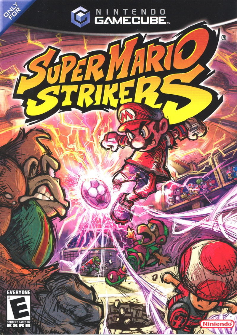
Okay, so we're starting off with Super Mario Strikers, and this one is pretty busy compared to the EU version. We've got Mario himself front and centre about to launch the ball across the field, along with Donkey Kong in the immediate foreground, looking like he's either incredibly angry or that he's about to wet his pants with fear.
The art style here is simply magnificent; a trend that's continued with each subsequent Mario Strikers release. The chaotic pen strokes lend a certain sense of movement to the artwork that we doubt would be easily replicated elsewhere.
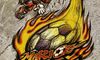
Europe
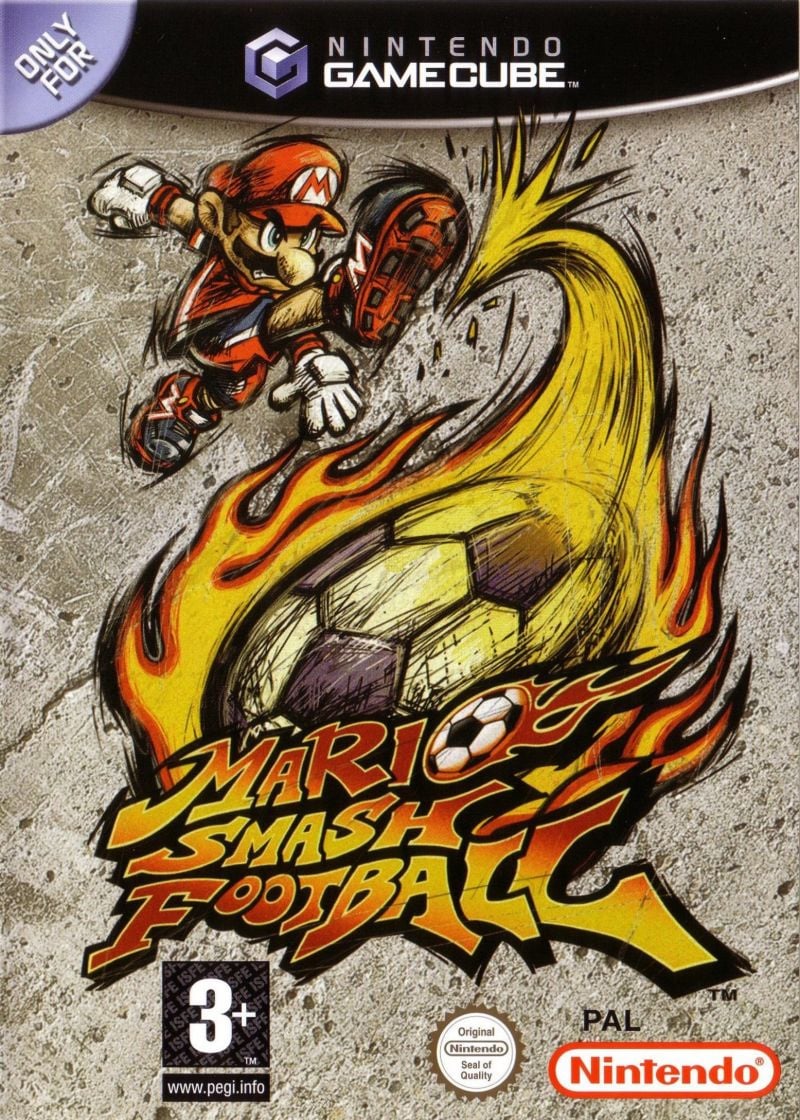
Let just ignore the fact that the European release includes a completely different name for the game here. The art work on display is more restrained compared the NA & Japan variant, with Mario booting a flaming ball into the game's title logo. Other than that, the background seems to be textured to replicate concrete, with cracks and dents dotted around the outside.
Stylistically, the art work remains consistent with the series to date, so whether you prefer the EU version or the NA/Japan variant really depends on whether you prefer a busier composition or something a bit simpler.
Thanks for voting! We'll see you next time for another round of the Box Art Brawl.


Comments 44
NA and Japan win this one because it actually has more artwork which I always prefer, so long as it doesn't get too crowded of course, which this certainly isn't. Also love the Yoshis in the crowd vibing in this box art!
EU isn't bad though, just a bit too simplistic for me in this case.
Let's be honest with ourselves here, they're both incredible. NA/Japan captures the over-the-topness and extreme energy of Strikers whilst EU goes for a very much underground football aesthetic with the grungy, concrete background and higher emphasis on the ball itself.
As a result, as much as I want to pick EU due to me being Irish, NA/Japan captures the 'Mario' side of Mario Strikers much better whilst being more visually pleasing to a general audience (as much as I adore the aesthetic of EU personally).
Overall, this series had no reason to ooze this much swagger from every part of it's design.
The background of the Europe artwork looks like a rock. Easy NA and Japan win.
Both are good but the lack of characters on the EU one is why I chose NA/Japan
Box Art Brawls are awesome. Love seeing these art works fight.
Yes I have the european cover and yes I did not know it is the ugly one.
Mario Smash (as in Super Smash brother?) or Super Mario . Two names which are kinda gone in the new title. Now we got a combination Mario (EU) Strikers (JP/US) and then the follow up: Battle Legue. Im going for 1 though.
Also- I think both Hammer Bros and Kritter, at the very least, NEED to come back in Battle League if only because they were both featured pretty prominently on the boxart for the first game in the series! (In JP and EU at least.)
I expect the results would be reversed for the Strikers Charged (Wii) artwork. The Euro art was so much better than NA on that game.
I love how intense the North American/Japanese box art looks, it's definitely the better of the two covers.
They are equally awesome. I don't know if that means European gets the point because it's the one I know best, or US gets the point because it's new to me and instantly equally awesome.
I demand a trial by actual SMASH FOOTBALL. (Europe wins in the title department, but I don't like how the 'o' is a burning football in front of... a burning football...)
Decent art style all around. Angry Mario is on both, but I'm also quite attracted to competitive DK, Toad, and the surprised Koopa/Hammer Bro. North America & Japan it is then.
Yeah, definitely going with the NA/JP art on this one. While they're both good, that one better captures the chaotic action I hear the series is supposed to have.
@chapu2006 it's worn out concrete. One does not wear out concrete by playing regular football on it. It gives it more of a 'street' feel, but an aggressive one, where the other one is a battlefield (equally suitable). And I like Mario's pose on the European one better, as well as the ball trajectory, deformation, and flames. But I didn't vote, as they're equally awesome overall in my opinion.
@Yosher Interesting, I had the opposite reaction - I think both are quite nice, but the NA version was too busy for my taste and I preferred the simplicity.
They’re both good, but I think NA/JP just looks cooler overall and sells the chaotic energy better.
The European one makes this look like a game for CAVEMEN
No contest here. USA! USA! USA!
And Japan.
Tough call. NA/Japan initially, but Europe has a simpler, succinct design and better contrast. Gotta go with angry Toad, though.
Also, having kicked a ball (Europe) is not as pleasurable a thing as wanting to kick a ball (NA/J). I believe Spock said that.
@FantasiaWHT Just shows how tastes can differ from person to person and that's totally A-OK. c:
North America and Japan cover significantly here. There is more interesting stuff going on with the artwork here with the extra characters featured.
This is a close call, but North America just barely edges it out.
While I get the point of the European cover, it doesn't show how violent Mario Strikers can be. For that reason, I'm going with the North American/Japan cover.
The same would go for the box art of Mario Strikers Charged (Football). My vote would go to Europe/Japan over North America/South Korea for that one. We got a complete reverse in the covers in North America and Europe. Only Japan has had the chaotic covers.
Europe. Because the sport gets the right name.
Europe's isn't bad. Obviously, it's simpler, which isn't a bad thing. Most importantly, it works as a cover. The other version has a lot more going on, which isn't always a good thing. In this case, I think it is a good thing. The color and composition of the NTSC versions is excellent. It's a good piece of promo art that works well specifically as a cover. So I voted for the NTSC version, but nice to see two good covers.
North America and Japan win this, I always like to see more detailed artwork.
Why would they choose Concrete to represent football?
These are some amazing covers.
I love everything going on in the US/Japan version; great action and atmosphere.
The European version is a bit scary tbh 😵 Mario is actually going to murder you.
neither, really ugly
Wait how are we supposed to know what sport they are playing in the NA/Japan version?
Box Art Brawls Current Total:
Europe: 31
Japan: 37
North America: 42
Australia and New Zealand: 1
Who loves to smash a football…? Mario that’s who
Birdo in the background wins every time.
NA/JP give a bigger Mario Kart with football vibe and the EU one triest to pose as street art.
I like them both but Super Mario Strikers does sound a lot cooler than Mario Smash Football.
EU looks like the placeholder you'd see at Gamestop before the box art is finalized.
NA/Japan looks so much more BADASS with Hammer Bro looking all surprised and Toad in the front looking like a mafioso. EU isn't bad though.
I prefer the EU version, I like the simplicity of the artwork and I think the font they've used for the title looks a lot better. I think I like it because its very different to nintendo's usual style. Both of them remind me of the old kids comics I used to read like the Beano and Dandy so that's cool as well.
@Shambo I can see your point, it just feels a bit bland compared to the anarchic, frantic feel of NA and Japan's boxart. I can totally get why some people like it but it doesn't really strike me.
Absolutely North America & Japan. No contest in the slightest.
@Franklin did this count as a win for both USA and Japan?
I'm curious to know how many Europeans are on this site.
@TotalHenshin
Yes.
@Franklin Thanks!
Show Comments
Leave A Comment
Hold on there, you need to login to post a comment...