Good morning, good afternoon, and good evening; welcome back to another edition of Box Art Brawl!
Looking back to last week, we put Kirby 64: The Crystal Shards to the test with two similar-ish boxes, save a different colour scheme and some character placements. And, well, we at Nintendo Life Towers should probably stop trying to make predictions, as it was (again) a lot less close than we thought — Japan won the pink puffball's latest fracas with 67% of the votes! And you can now go and experience the game on NSO if you have the expansion pack!
Subscribe to Nintendo Life on YouTube845k
We should have really included the PAL box art here, too, even though it's very similar to the North American one — just with a huge black border around the box and a lot more blue plaid on show. We'll be sure to keep on top of that going forward, as we know some of you have been tallying up the results over the years! (In fact, we added "& Europe" into several previous articles and polls just to keep things 100% prim and proper.)
Anyway, on to this week! We're going to be putting the heroes in a half shell under the microscope with the Game Boy game Teenage Mutant Ninja Turtles II: Back from the Sewers. Amazingly, we've never done a Box Art Brawl for a turtles game before, so for such a momentous occasion, you're probably thinking "why not one of the more famous ones?" Well, because it's the game's 30th anniversary here in Europe! There's still plenty of time and opportunities to see the other TMNT games here — it's the Year of the Turtle, after all. This week's combatants are very different too, which means it should be a juicy one.
Be sure to cast your votes in the poll below; but first, let's check out the box art designs themselves.
North America & Europe

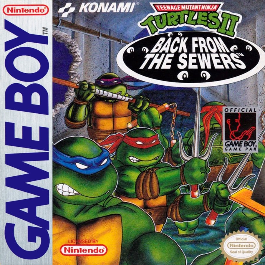
The turtles mean business in this one! The art on the North American and European boxes is pretty close to the original comic's art style; they've got a bit of grit about them, and Michealangelo isn't even taking the time to look at us! Oh, and we have to point out the logo here because we adore it — the four pairs of eyes peeping out from the sewer is a nice little touch. Donatello looks like he's just made a hole in the wall, too. Yeah, these are turtles that you don't want to mess with.
There is one slight difference in the European box art — the title. The turtles were still known as the Teenage Mutant Hero Turtles in PAL regions back in those days. Remember that? That was a long time ago. Sigh.
Japan

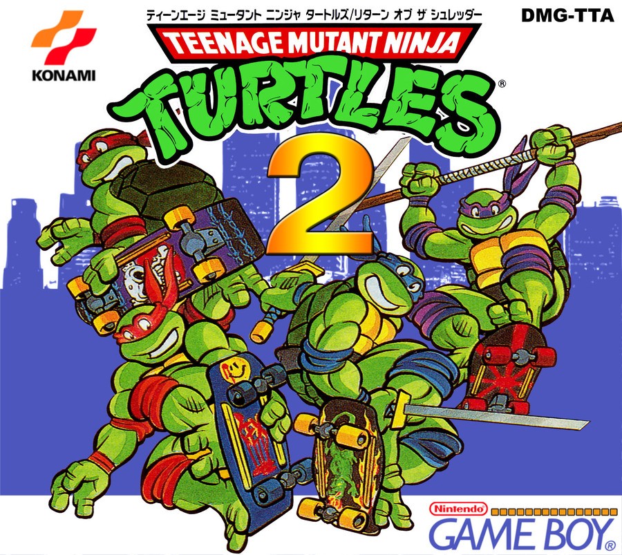
In contrast, Japan's box art is anything but gritty. It's colourful, it's goofy, and and it's fun. Simply known as Teenage Mutant Ninja Turtles 2, this is much closer to the 1987 cartoon series that many (including us) grew up with and loved. All four of the turtles are facing the front and all of them are riding on skateboards — Raphael and Michealangelo's red and orange look a bit too similar here, though. Leonardo also isn't practicing safety rules by having his dual katanas out. The muted blue city skyline here really makes the quartet pop. The only thing we don't really like about this one is the '2' in the logo — it doesn't match the classic logo unlike the 'II' in the English box art.
We don't think you can go wrong this week regardless of what art you vote for — it might come down to whether you're more attached to the comic books or the cartoon. Don't forget, this game will be included in the Teenage Mutant Ninja Turtles: The Cowabunga Collection when it launches later in the year, so you'll get a chance to experience (or re-experience) a classic handheld beat 'em up soon.
And hey, happy 30th Back to the Sewers! We raise a slice of pizza to you!
Thanks for voting! We'll see you next time for another round of the Box Art Brawl.


Comments 54
The NA/EU is the better one I prefer the "angry" turtles
Plus you have SEWERS in the background!!! That is important!!!
I have to say NA, yes the JP one looks vary vintage and cool looking, but I just need my bad**** turtles you know >/
Didn't realise TMNT got the Kirby effect overseas: cutesy in Japan, angry in NA.
I really like both though honestly! They both convey the different sides of the Turtles of the time whilst still looking incredibly unique at the same time, they're fantastic. If I had to pick one though, I'll go with NA since it fully leans into the grungy look of the Turtles with the dark, dingy sewer background.
Japan. They are still IN the sewers on the US box lol.
I remember those blind pupil-less characters, they were really popular back then.
I bought this game in the airport Duty Free at the start of a holiday where I’d foolishly not actually packed my GB, so I had to wait a whole extra week to play it. Cracked it open at 2:00 am when we finally got home, much to mum’s despair, and loved every second of it.
Wait... Nobody is going to mention that the Japanese version reuses the art form TMNT II: The Arcade Game on NES?
I wish I have the box for this game
The European/American box art looks like a poor imitation of the original Eastman/Laird comics. It could be some early Michael Dooney art work, but I'm guessing in-house Konami. The Japanese box art at least captures the 1987 cartoon.
I like the western box art but there's a weird contrast between the angry turtles and the innocent looking eyes around the subtitle which made me choose the Japanese one which looks great.
US looks closer to the comic.
Most days I would take the 80s cartoon turtles but they look a bit maniacal in this JP box art so I have voted for the NA/EU art
Neither is perfect. The art on the NA/Europe one is pretty badly drawn but I quite like the vibe and the setting. The Japanese one is better drawn, but what the hell is with that big yellow 2 in some ill fitting font?
the Japanese box art has style that the US art just cannot compete with. beautiful.
Nostalgic for the angry style of the NA version, but def loses because of Michaelangelo facing the wrong way
I like both, but I went with Japan this time. Those colors just pop, plus it gives the Turtles more personality. I also like the city backdrop over the sewer setting.
Both aren't good but that Japan art looks terrible, plus the 2 is a gross eyesore
NA because Japan is recycled from TMNT2 arcade
Hard to choose between both, but I think I have to go with Japan because it's a little more accurate to the Turtles' actual design
Box Art Brawls Current Total:
Europe: 31
Japan: 36
North America: 41
Australia and New Zealand: 1
1980s style Mikey is a fan of Watchmen?
I dig the Japanese cover, but it's almost the same for the US release of Turtles 2 on NES.
Have you seen the Fall of the Foot Clan remake? https://gamejolt.com/games/TMNT_FOTFC/654544
I'm torn on this, on one hand, I really love that late '80s/early '90s feel of the Japanese cover. On the other hand, however, I also really like the dark and gritty artwork of the North American version.
I guess ultimately I'm confused about the box art of the North American cover. Like why is Michealangelo looking away from the rest of the turtles? Is he about to throw down with Donatello? Is he running away scared in a half shell from the big bad? I just have so many questions.
I guess the classic vibes of the Japanese box art wins out for me.
I think they both look fine, so it's more of a style preference (I went for Japan).
If there was no black circle sewer cap on the NA version, I would have chosen that one. It's too much of an eyesore due to its size.
@Fizza I think the Jpn one used art based on the TV show, where as the NA one seems to be using more of an art style from the comic books. I personally chose the NA one for a couple of reasons, the biggest being that stupid 2 in the middle. It looks so out of place in this.
The JP one loses major points because those are some of the most widely-used images of the Turtles — not created for this box.
The NA/European box art looks like the turtles are angry at the "Official Game Boy Pak" icon.
I wasn't particularly into either of these, so I wasn't sure which way I was going to go. I was thinking of voting for the US cover, but the more I looked at it, the less I liked it. Michaelangelo is facing away. Raphael is posed so strangely. The quality of the art is just okay. Japan's is a bit basic, and could use some background detail to be more interesting, but I think it works better.
I voted NA but they both have pros and cons. The style and background on NA cover are interesting, but, wow, those are some angry turtles. The colors are nice on the Japanese version but I think the turtles look just a little too goofy.
These covers need ro get together and make a baby cover to find the right place between rage and airheaded.
Both look great, but just something about the turtles with all white eyes always gets me.
@HotGoomba 🤣 They somehow knew about the Virtual Boy graphics that the logo would foreshadow. You know, because they've also time traveled.
That 2 in the Japanese one I also find tacky, but imagine how many extra tricks one could do on a skateboard incorporating a bo staff.
@GrailUK Good point, but there is a sewer section of the first stage.
@Zuljaras LOL good points. Anger and sewers are good. For me the color and composition of the JP version narrowly edged out the NA/EU version, but I can see it from your perspective too. 🙂👍
So… that’s alota skateboards!! Was skateboarding heavily featured in the game?
Why is Michelangelo facing away from the camera in the North American cover?
Japanese artwork all the way, no contest.
I like the serious turtle look, but the Japanese box art just nails the look of the goofy radical turtles better 😄🐢🛹
The Japanese cover is just the character art from the NES' TMNT: THE ARCADE GAME, but without the 'bustin' through a brick wall background' and a giant 2 added. I'll take the Western art, please.
North America & Europe, the Japanese one makes the turtles look dopey.
Japanese one for sure. Loved the cartoon version of the turtles.
One of the first games I owned! Oh the nostalgia for that NA/EU boxart. Thank you for doing a Boxart Brawl for it!
Neither are bad, but I'm going with the NA/Europe cover. Just fits with the theme of the game more.
Can't wait for the Cowabunga collection btw.
It's not just the issue of red/less red being not quite right - in the Japanese one, Leonardo is looking rather cross-eyed!
Either is a good choice but I'll learn towards the west.
@BionicDodo Probably recycled from the FC TMNT3 (or 2 as it was numbered there, since the first game had a different title).
I think the poses on the Japanese box art are more dynamic and interesting. The western poses look a bit stiff.
As much as I like the Japanese cover which was more in tune to the tv show, I prefer to western cover. It's more representive of the orginal comic.
@samuelvictor I saw that as well. That Artist must have been a fan.
I almost chose the Japanese box art, but it looks like it's directly lifted from the NES/Famicom port of the first arcade game. That's not exactly a bad thing, but it does seem lazy to recycle art from another game cover.
Another oddity, at least according to MAME, would suggest at least in the UK, the arcade game title scene still had the "Ninja Turtles" voice but the "Hero Turtles" logo.
@DrDaisy Poor Don got mostly covered on the US TMNT2 NES cover art by a Pizza Hut promotion.
Can we point our fingers at Reggie?
Really surprised that the Turtles logo is using a different shade of green for the two releases. Who signed that off?!
I'm surprised the European art allowed Mikey to have his oh so dangerous nunchucks out.
Seriously, this is a series where one Turtle has those very pointy sais, while another Turtle has a pair of freakin' swords, yet it's the nunchucks that got censored?!
@Nintendo_Thumb They had the Byakugan before it was cool!
Show Comments
Leave A Comment
Hold on there, you need to login to post a comment...