Ahoy everyone, welcome back to another Box Art Brawl! We've got a great one for you this week, just in case the image and the title didn't quite give it away.
Last week, we looked at Mario Golf (which is out now on Nintendo Switch Online + Expansion Pass!), pitting North America against Japan to determine which box art design is better. The more 'classic' design of the North American box art came out on top, taking in 67% of the vote. It seems the more 'artsy' approach for the Japanese version didn't quite resonate with readers, and we totally get it!
This week, to celebrate the 30th Anniversary of The Legend of Zelda: A Link to the Past in North America, we'll be looking at how the region's box art design stacks up against Japan's. We won't be including Europe on this occasion, because its box art is so similar to NA's, it doesn't really warrant looking at as a separate entity.
Be sure to cast your votes in the poll below; but first, let's check out the box art designs themselves.
North America
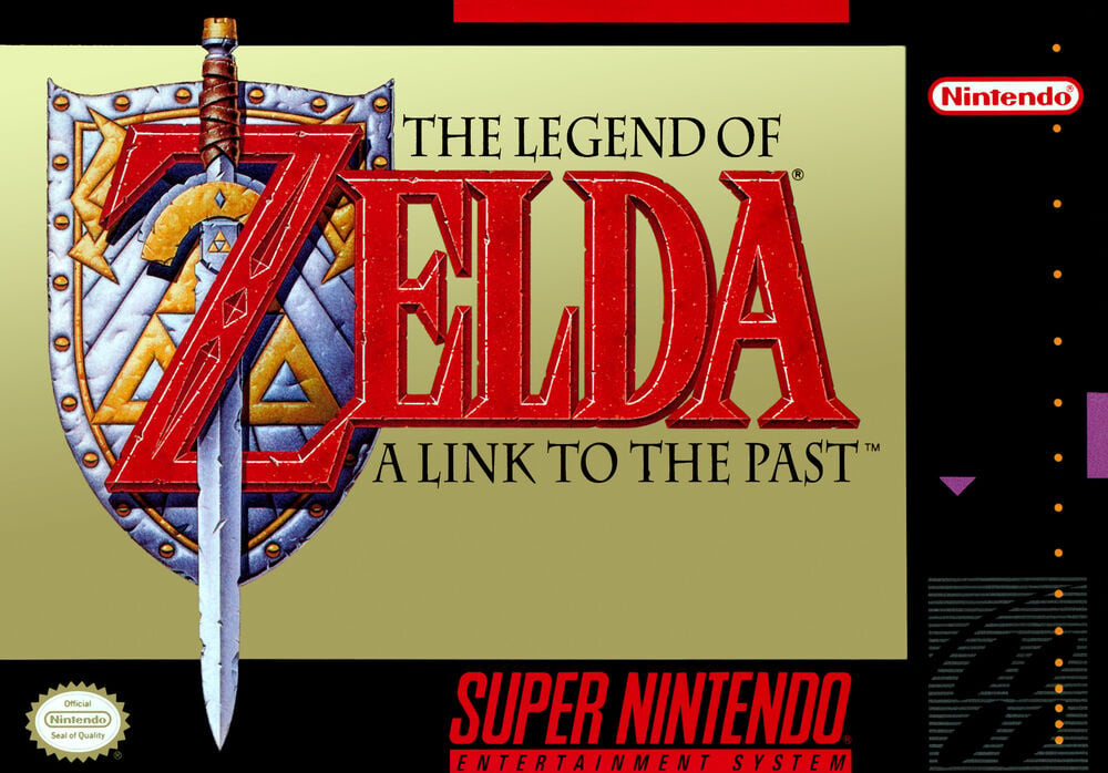
The North American box art for A Link to the Past is very classy. There's just something about that gold background, right? It's an aesthetic that's been prevalent with Zelda box arts since the very first game on the NES, and although it's dropped off a bit with later titles, we don't think anyone would complain if Nintendo used the same design for every mainline Zelda title. It just works.
This also happens to be the first game in the series to feature a sword piercing through the letter 'Z' in the Zelda title, a design choice that returned in Link's Awakening and - to a lesser extent - Ocarina of Time, before taking a vacation until 2017's Breath of the Wild. Again, this feels like vintage Zelda, and we love it!
Japan
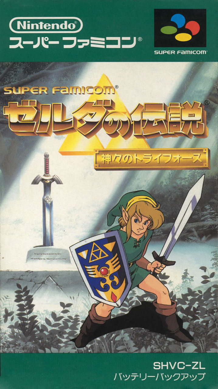
Japan's box art follows the general tone of the NES Zelda games from the region, with a beautiful drawing of Link in a typical action pose against a backdrop of The Lost Woods. The Master Sword can be clearly seen in the background, lit up by gorgeous sunbeams. It's the polar opposite of the NA box art, but arguably does just as good of a job at depicting what the Zelda series is all about.
The logo itself is also absolutely stunning. The gold metallic lettering against a striking image of the Triforce is iconic in an entirely different way to the NA version. It's something we haven't really seen again since, as Japan's logo design is more or less on par with other regions.
Overall, it's certainly a nicer looking design, in our eyes, but does it trump the classic gold aesthetic of the NA box? Hmm, not sure...
Thanks for voting! We'll see you next time for another round of the Box Art Brawl.


Comments 50
The NA boxart is more iconic, but the Japan boxart has more personality so I'm going to vote for that one
The gold background with the game's logo is about as iconic for the Zelda series as the white background with the game's logo is for the Final Fantasy series but going off of personal preference, I probably prefer the Japanese art. Link looks just kind of pasted there but that Lost Woods is just too good.
The Japanese one is nice, but the minimalism of the NA one really just works for me. The fact it's one of the most iconic SNES-era boxarts in history may be swaying me here, but I honestly love the highly detailed logo with the sword and shield accompanied by a desaturated gold background. It gives off an amazing air of intrigue and confidence, like it knows that it's fantastic through and through.
Can you tell Link to the Past was my first proper Zelda game?
I prefer the crisp and clean look of the NA box.
Probably a bit of nostalgia at play here, but I went with NA.
Also not a huge fan of how Link just seems to be overlayed over the background art instead of a part of it on the JP box. I think it'd be a bit better if the background was a bit more anime to match Link, or vice versa.
idk why but I really hate the fact there are two swords on the Japan box.
I'm sorry but that link character design has not aged well, I have to go with NA on this one
Never liked the NA versions of A Link To the Past/Link’s Awakening/Ocarina of Time. Even if iconic, they’re just kind of boring, and blend into each other.
Impossible choice. Gold has become somewhat LoZ's 'thing', so I prefer that one for that reason, but the other option gives a much stronger representation of what to expect. I still have my entire Zelda collection, every game ever in very good complete condition, just lacking the Majora's Mask adventurers edition, and the Oracles collection box, and have a couple of the games from multiple regions because I 'needed' that boxart to 'complete my collection', you know how those things escalate...
I have it under control now, but my Zelda collection... Still can't get rid of it, even though it's displayed in my old room in my mother's house (wouldn't store it in my cabin in the forest, where I actually live, with some pretty wild big semi wolves...).
NA. There's something very iconic about that boxart. It invites you to play the game.
Looks like nostalgia got the best of people here. I never grew up with this game and immediately went with the Japanese box art. Had the North American box art had subtle, faded art in that same monochrome colour, I probably would've went with it.
I also chose Japan because it's more representative of what the franchise will come to eventually. We were going to see Link on the box art in later games regardless, so an aim towards consistency suits me better.
As a final note, Nintendo ultimately decided to make a somewhat faithful callback to the Japanese box art, looking at the box art for A Link Between Worlds (especially considering its Japanese title).
Box Art Brawls Current Total:
Europe: 30
Japan: 34
North America: 39
Australia and New Zealand: 1
The NA version looks more medieval and regal to me compared to the JP version. Makes me wonder what the PAL version looked like, assuming it had one.
If Link wasn't on the box, I'd vote for Japanese box.
@chapu2006 That was my issue to, it didn't really make sense to me to have Link just standing there with is lvl 1 sword ready to fight when the master sword is right behind him.
In contrast to what I said about Mario Golf, I think simple and bold does the job here. This is the 3rd game. By this point, you should already know what to expect from a Zelda game, I think the NA boxart shows this clearly.
There’s a reason why nobody puts the logo on a solid background anymore. Also, for how simple the art is, it really doesn’t go well with the NA SNES box border. Additionally, I feel like I have to give points to Japan’s subtitle as well in this case, being “Triforce of the Gods,” which is a far better title than A Link to the Past.
Link's face looks very punchable there.
@Zeropulse I agree, if they had used maybe a shadow of the Master Sword in the light instead of the actual thing, that would have been so much cooler.
The NA one if only because Link looks like he's standing very unnaturally on some bushes. Even if they're supposed to be shadows, they also should've been cast on Link in that case, so that makes the Japanese boxart look kind of amaturely made in my opinion.
N.A. is just classy. Japan's looks a little constipated.
Voted for Japan's because of the scenery. North America's is fairly bland.
I like the Japanese one but the artworl style has not aged well. So the golden NA one wins it for me.
Golden is classic
A Link to the Past is my favorite in the series. Growing up when it was new, this adventure was a quantum leap past what we'd seen in Zeldas 1 and 2. Its sprite art is still charming today
The European one with more Gold and less black border is the best by far. Why wouldn't you have it as an option seems strange to me.
The look of the Japanese cover is not a good representation of the essence of the TLoZ series.
The logo on a gold background may be iconic, but that doesn't make it better. I've always found that style of Zelda cover to be rather boring. It never did anything for me. Japan is an easy pick for me this week.
Removed - inappropriate language
I prefer the more solemn tone of the American version.
I love the classic North American cover, it's so Iconic, however, I'm voting for the Japanese box art.
@nowthisisepic
That's one way to put it lol
North American is great.
Japanese looks a bit... off...
Could be because they used 2 separate illustrations and slapped one on top of the other. Link does not look like he belongs in that background at all, and having Link already wielding a sword, with the master sword in the background seems odd.
They are both amazing and both very different I’m only choosing na as I have to choose something but its almost 50/50 for me.
I'm not sure why the PAL cover has been omitted again. It's a curious decision when so many of the visitors to the site are more accustomed to the European cover
I much prefer the Japan version. That art style and type of Link appearing on that box is pretty epic.
I'm going to hafta go with Japan, NA has pretty boring box art.
I'm going to go with Japanese one, the American one doesn't tell me anything beyond the game's name, that would be a problem if I didn't know better.
Nintendo Life! Box Art Brawls are my favourite! Thank you!
Logos are BORING by themselves, but I guess it does remind me of the books of adventure.
But Japan wins for Link's legs
In context, the NA cover is powerful, where so many action and RPG games were over the top in showing the most exciting things they could think of, Zelda needed no fanfare, just a title and logo. That was epic enough.
I'm really not sure how the NA cover is winning. The overused gold background with nothing but the logo is SO boring.
Seriously? How is it better than detailed drawn art with an actual background? Are people just basing their preference on nostalgia and nothing else?
As glad as I am that the later Zelda games started to get slightly busier boxarts, the simplicity and regality of some of the early boxarts like Link To The Past, Ocarina, Majora, and Awakening exudes a real sense of confidence. You don't need anything else, you see that shield and sword and you know you're getting a top-notch video game experience.
I prefer the NA version, it's more classic and memorable.
@eltomo Same here.
Japan hands down. Seeing that cover makes me want to play the game again.
The NA cover is very special to me.
I got ALttP for my 7th birthday and my PAL copy was sealed with a bright orange Toys 'R' Us sticker.
The gold, the ageing red font - the word alone is enough to sell it. No need for pictures
I'm not sure which I like more, but mostly I'm just surprised you haven't done this game until now!
The background to the Japanese image I had as a poster that came with my copy of LttP, and it's gorgeous, but Link simply inserted into the image just doesn't flow right to me-- Cartoony Link against a realistic-looking background. I'll take the NA image.
@Olliemar28 Nobody has mentioned the USA Player's Choice release got a completely different boxart. A gold logo against a stone background.
Show Comments
Leave A Comment
Hold on there, you need to login to post a comment...