There's a lot to love about Bandai Namco in terms of the games it releases, but one thing that hasn't gone down so well is the company's logo refresh - originally revealed last October and scheduled to come into effect in April this year.
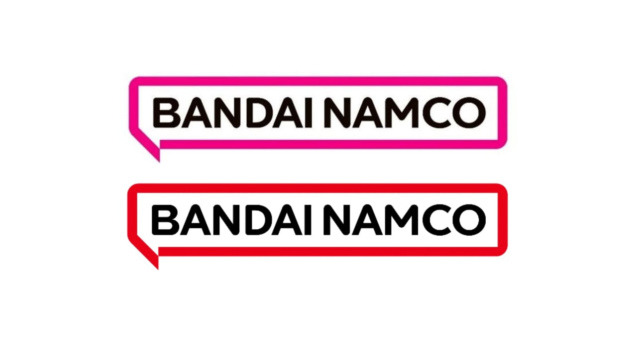
While the Japanese publisher responsible for series like PAC-MAN, Tekken and Tales is still going ahead with this makeover, it has now made one slight adjustment. As detailed in its latest mid-term plan (April 2022 - March 2025), the speech bubble outline has been changed from magenta to red.
Magenta was originally used as the motif colour to represent diversity, create a bright and fun impression, and because it's easy to reproduce. However, Bandai changed its mind after sending out a questionnaire to employees - asking for their own thoughts.
The new red colour apparently creates an impression that is enthusiastic, fun, active and bold:
“For the motif colour, we sent questionnaires to employees around the world to gather their thoughts about words that express images associated with the aims of the Group.
“From among the words that were frequently mentioned, we selected candidate colours through scientific methods linking words with colours. From among these candidates, we selected a bright red colour that creates an impression that is enthusiastic, fun, active, and bold.”
So, what do you think of the new logo's latest look? Leave your thoughts in the comments below.
[source videogameschronicle.com]


Comments 54
I still think this logo looks like trash, the last one had such pop to it, and it made me think of, well, you know, Bandai.
Still looks too generic.
obviously they changed it to red because Nintendo's about to buy Bamco /s
Evidence keeps mounting for the Switch Pro.
(🙃)
Remember when Nickelodeon changed their logo from a splat to something more generic because someone thought that the logo wouldn’t look good on a business card?
Bet something like that is happening at Bandai Namco.
Seriously why fix something that’s not broken?
@Gwynbleidd I'm actually asking, so I don't mean to be rude at all.
How so, what about it do you like better then the old one? Or do you just like the clean and simple look of it?
https://preview.redd.it/8q0v0sbjmjr71.png?width=640&crop=smart&auto=webp&s=e31989a4fb793cc71ec2b5ed7f526653c4ebe9a0
Found a pretty decent logo!
Edit:DANG IT how do I add a picture to my post?
Blandai Namco
Painfully generic.
Me no like.
They should make the C look like PAC-MAN or something. Wish it were orange, but the red is better than pink at least.
I liked the magenta. It was fun and different, and it doesn't hurt that it's one of my favorite colors. Really the only thing I liked about the new logo. Now there's nothing.
Ah man, thank goodness they changed the one good part of the logo. Might as well make the Nintendo logo PURPLE.
Still hate the logo, but at least it has the red from the Namco and Bandai logos.
I don’t mind the logo change, but I’m sad they didn’t keep the neon pink. We don’t get alot of pink logos. We got plenty of red ones though.
The font still needs to change but the color change is good.
@Greatluigi The bottom one is perfect.
Ah, that's what it needed! Wow, such a huge difference. I now have faith in logos, again.
@Xiovanni
Red is for Nintendo
Orange is for Bandai Namco
Green is for Xbox
Blue is for Playstation
Thats how I see it
Looks better to me. You can still celebrate diversity without making everything friggin pink.
They could've devoted their time and energy to remastering Pac-Man World 2, but instead they did this.
I actually thought when the design first came out that red would improve it so it's something. Though in general I don't understand why people even really get so invested in what a logo looks like. So long as it's legible it doesn't really affect anything.
I’m surprised they didn’t wait to reveal this earth shattering news on tomorrow’s Direct.
Liked the magenta better.
@UglyCasanova

I like Pink colored logo.
Logos shouldn't still be effectively reduceabdle to a font though. Kinda sick of this approach
If the full “Bandai Namco” font was in the classic “Namco” font and the speech bubble was a red outline, it would be awesome.
What a boring new logo, I honestly don't see how this is better than their orange and red Hulk Hogan color style logo of the past.
Speed bubble or speech bubble?
Okay I guess, I mean it isn’t newsworthy but okay
mmhmm mmhmm mmhmm. It has now gone from a turd to a polished turd.
This company periodically goes through identity crises so I'm sure it won't stay this way for too long.
@Xiovanni indeed. It’s like a ‘download required’ logo which you put somewhere in a corner of the box. Out of the way as much as possible.
Such a horrible ugly looking logo. The old one was iconic, fun, memorable
I really don't know how that logo exemplifies "Fun for All into the Future". It's a disservice to that slogan. Changing it red makes it worse, at least the pink had some character to it.
Still terrible!
more FUNctional than FUN. Ah well, it's just a logo. Who cares.
@NinChocolate I work for a huge corporation who recently did the same thing, rolled out a new totally generic and sterile logo. We joked that whoever was tasked to make it forgot until five minutes before it was due. I get that "clean and understated" is in right now, but my god, some of these new logos are just pathetic.
I still like the new logo - it’s not like the previous one is some amazing design. This has a nod to company’s output with the manga speech bubble, clean lines and doesn’t look like it’s out of focus or badly printed. Magenta was fine, but red harks back to the logo before the last one, so it’s a nice nod. Approved.
Well at least their logo isn't as bad as the new Pringles logo. Am I right?
I miss the original NAMCO logo. Ridge Racer attitude and Katamary saving screen.
Others: "I still think the logo looks like trash"
Me, an intellectual: "I still don't think about the logo at all"
This is Switch menu icons times ten.🙄 If anything, the speech bubble shape already makes the logo technically more adorned than what Nintendo or Square Enix have used for decades - are we to bash them, too? Perhaps Bamco just wanted a comic reference, given how many stakes the company has in the realms of manga and anime.
Actualyl quite an improvement, thoguht the old was quite generic, and this has a little twingle because of the speach bubble
still could have been the logo of many other companies though (including my own, which is actually about talking, but has a nicer logo;))
...but it's still a speech bubble...that's the problem...
Looks like a logo of a telecoms company like talktalk or something.
It's confirming the rumors of merge with Nintendo
I mean, red is slightly better at not feeling like an insurance company… but the original logo is MUCH better obviously.
It is better, which is kind of a shame as the bright pink is fun but it just doesn't feel a good fit here. Honestly I don't hate it now, but I still think many of the fan mock ups were cooler. I do actually prefer it to the orange wobbly blobs.
what the hell am I looking at?
Terrible. Just like every new sterile logo that looks 100x worse than the old one.
Am I the only one who misses the classic Namco logo? Every time I see it, I instantly think Ridge Racer, Tekken and Klonoa.
I still hate the logo. While I understand a clean and simple design is now the way to go forward but you lose your identity and I now I won't be able to know if it is a Bandai Namco game right away.
This is a bad logo redesign. Not everything has to become more simpler and more "professional."
Sorry but it still looks to plain to be honest. Seriously why fix something when it ain't broken
Still looks crap.
Remarkable how they made such an incredibly boring logo, then took the single bit of personality it had out of it.
Seriously the magenta was the only thing it had going for it, and even then it was inferior to their old logo
Show Comments
Leave A Comment
Hold on there, you need to login to post a comment...