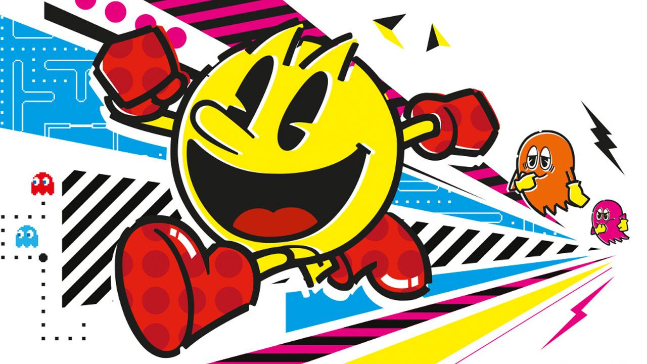
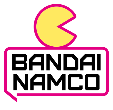
Every now and then, companies like to refresh, change and update their logos for marketing reasons, and the latest company to do this will be Japanese publisher and developer Bandai Namco - known for series such as PAC-MAN, Tekken and Tales.
The new logo will come into effect in April next year, and will replace the current logo - which expresses the "fusion" of Bandai and Namco. This new logo, apparently reflects the company's new purpose "fun for all into the future".
"Fun for All into the Future - Bandai Namco exists to share dreams, fun and inspiration with people around the world. Connecting people and societies in the enjoyment of uniquely entertaining products and services, we’re working to create a brighter future for everyone."
The new logo is described as a speech bubble motif or "Fukidashi" in Japanese - expressing the potential of the brand's ability to connect with people around the world and "inspire them with amazing ideas". And here's everything else it represents:
"The speech bubble also represents Japan’s manga culture that has become so popular everywhere. The logo stands for our determination to communicate with fans worldwide, to connect with our fans, and to create entertainment unique to Bandai Namco. The magenta used as the motif color not only represents diversity, but also creates a bright and fun impression and is easy to reproduce."
Again, this mid-term plan will come into effect in April 2022. What do you think of Bandai Namco's logo? Tell us down below.
[source bandainamco.co.jp, via twitter.com]


Comments 129
Whoo, another fancy logo turning into basic and generic, cool.
Looks generic, still prefer the orange color logo.
more like "Ban Fun"
That is a very iconic logo for me I can't believe there changing it
Quite possibly the worst rebranding I've ever seen. Not only is that tagline terrible, it's also ill-fitting, considering that there's nothing fun about the logo now. Not to mention...why on EARTH is it partly meant to represent manga culture when Bandai Namco is a VIDEO GAME DEVELOPER AND PUBLISHER first and foremost??? It's so bad, it's comical - and the old logo was perfectly fine and distinct, too. This is painfully generic. Hopefully the negative reaction makes them reconsider.
"Nooooo, I don't want to be a minimalist, corporate logo!!"
@PikaPhantom they really said "Making a sans serif typeface with a fun personality is hard"
Terrible, simply terrible.
Thanks, I hate it!
I like the magenta. You don’t see alot of magenta gaming logos.
Looks like garbage, their old logo looks ten times better
Unpopular opinion here, but I cringed once Namco and Bandai merged and revealed that childlike blob logo. Barf. The new logo is boring, but won't make me feel like I'm 9 years old when I boot up Tekken.
I guess I can appreciate the sentiment they’re trying to promote, but the new logo just seems rather blah.
don't really care about the logo they still make good games
Looks like a Target/WalMart store brand logo. Like Mainstays or something.
They really are devaluing the graphic design degree huh? Following the Western trend of minimalistic/simple/plain logos you can come up with in 5 min of Paint is not a good thing.
I don't mind this one. I always would see their logo in dark souls and it seemed kinda silly.
Feels really sterile. Guess it's not a huge deal though.
This isn't a logo. It's just their name. What are they thinking?
Just going for plain and generic seems to be the cool thing to do nowadays. But whatever, in the end a logo means nothing.
The text bubble makes it look like a messenger service and the color Magenta isn't an inherently fun color and I question how having a single color in your logo demonstrates diversity. Additonally, having such a generic look is not inspiring creativity. Imo this logo fails at everything they set out for it to do. Well, it is easy to reproduce at least.
@N00BiSH That pfp of yours is my expression when I see something trying to be minimalist.
So,what's wrong with the orange-yellow logo?
This logo feels like something that fits better for a teenage girl-centric tv channel rather than an entertainment company. I don't think that it's as bad as other people think, I mean, I see bad logos all the time because I work for a logo wiki, it's nothing new for me, but this logo is so boring.
Never liked the old logo tbh but this new one seems alright. People are overreacting about this.
The new logo isn't awful in a vacuum (just forgettable and bland, especially when compared to other, more well designed minimalistic logos), it's just a bad fit for Bandai-Namco, in my opinion.
It's not offensively bad or anything, but it's so plain my eyes kinda roll right past it.
Did someone get paid actual money to come up with these? Horrendous. Back to the drawing board. Or, perhaps better yet, leave it as is.
Nothing will beat the Standard Life Aberdeen rebranding as….. ABRDN. God I hate this trend.
It's better than the current one, but not as good as the old Namco logo. You know, before Bandai had anything to do with it and did not exist in the name.
Looks like the modern minimalist standard. Clean and easy to read. Just waiting on them to go by Bamco. LOL
Why? What was wrong with the old logo? This is why it’s a good thing that Reggie didn’t let them change the Nintendo logo.
The orange is very iconic tho
Not feeling the new one, looks like generic pharmaceutical.
@KiraMoonvalley What? How did post-2000s kids apparently ruin media?
Just woke up by sheer coincidence in middle of the night, had a look at my phone, saw the new logo.
I'm going back to bed for a few more hours to try and write off this new logo as hallucination..
I don't really care but that is terrible. No one would recognize that instantly. Hiding your brand is never good. (unless you're ActiBlizzard in 2021).
They paid someone to make this...
what's with this generic, minimalistic trend in logos?
Another one added to the list of victims to logo simplification.
If it ain't broke, why fix it?
Looks like they wannabe StraightTalk? Check out their logo.
Bet its the same Marketing Firm. Could of done something unique like PacMan at an end giving a thumbs up and not a speech bubble.
It will take some getting used to, that’s for sure. I’m sure that over time I’ll come to accept and even embrace the new logo. But, as with any company logo changes, for me personally, it will take some time getting used to. It’s not a bad logo or anything; it’s just kind of simpler and business-like than the previous one. I’ll miss the old logo, but like I said, I’ll probably come to accept this new logo over time.
So glad to see all these companies whipping together logos that could be created by a 9th grader in PhotoShop. Bleh.
@PikaPhantom They really aren't. They do a lot of things outside of gaming, most notably owning the entire Gundam franchise, amongst others.
Bandai namco exist to make a profit like all companies
@alexybubble I know that, but gaming is what they're known for in particular, at least in the West
Let's be honest, their logo was already bland and forgettable. Now it's bland and forgettable, but also magenta. I LOVE magenta, so it's all good.
The new “logo” looks more like a heading or pop-up you would see in a business/slideshow presentation as opposed to a signature for a long-standing brand. Terrible. Maybe I should consider a career in graphic design after all (and I am utterly hopeless at it).
Their best logo was the red one (as posted by @Specter_of-the_OLED above).
@PikaPhantom Yeah, that's not true at all. Anime is a huge part of their corporate identity. They own Sunrise and made classic anime like Gundam, Cowboy Bebop, Inuyasha and Steamboy, amongst many other things. Bandai is also very famous for toys.
Also, I'm not really sure they care too much what they are known for in the West. It's a Japanese company through and through, and I'm sure the Japanese market is always first in their thoughts.
@JasmineDragon - "Let's be honest, their logo was already bland and forgettable"
Sure, it wasn't great, but you've got to admit, compared to this new logo, the old one looked positively vibrant.
I'm generally in favour of a more minimalistic design, but this is not a great way to do it. While I get that most of their video games are anime/manga-based, there are probably better ways to visually express that than this incredibly bland-looking speech bubble, especially compared to the previous logo, which at least looked unique (though the namco logo posted above was probably better than both if I'm being honest). In fact, considering how vibrant anime/manga are in general, you'd think a more extravagant icon would be the way to go?
Why do companies do this? Why be bland when you can be creative and expressive?
@FullMetalWesker Oh, it's definitely not great - no argument there. I just don't think it ever was. I like the old Bandai logo with the Star Trek-style lettering 500% more than anything else they've come up with.
Another colorful company logo turned into minimalist generic garbage…
I hate modernity
I couldnt tell it was a logo until I was told it was a logo. Just looks like plain text with a hot pink hollow box around it.
In my opinion Namco's old logo was cool, the orange mess wasn't really.
I actually like this, it makes it a lot less cluttered. A lot of old game company logos were just the company's name written with some snazzy typography (like Namco, Sega, Nintendo, Capcom, Atlus) and this is not that different.
I don't mind the text bubble but could the font be any less basic?
i think this is the next level in political corretness propaganda
.....
Bandai Namco has entered that chat.
Bandai Namco: Sign up today for our Great Rate plan for unlimited calls, texts, and 4G broadband on your smart device for one low rate. Sign today and get $100 cash back on the all new iPhone 13!
Bandai Namco has left the chat.
Not my call anyway, but colour-wise, I prefer the former... while the new one does appeal to my bias with its theme.
The problem with the new logo isn't that it's minimalist though I really don't understand why suddenly the world has decided 1874 did logos right, it's that it signals it's the logo for a telecom, not an entertainment company.
Orange is my favorite color.
Dark Souls is my favorite series.
Namco also made Soul Edge, my favorite fighting game.
But this new logo looks completely sterile and devoid of anything remotely fun. It looks like someone made it in MS Paint.
Thank goodness the old games will forever have the better logos.
Plus, their old logo looked like some type of Venn diagram, probably meant they had three pillars to their business plan, probably meant they were inclusive or something.
I dunno. I like orange
They should have made a complete merge and call themselves BANCO or NAMDAI ^_____^
(And their new logo is awful BTW)
Looks worse. I still prefer the classic Namco logo that adorns all their great games from the 90s.
This also means if we do get Klonoa encore (or whatever they call it) it will have this logo on it 😔
What almighty marketing god decided that all company logos need to be remade to become a dull, soulless husk version of the previous one?
Like, I've never heard anyone praise a remade logo and all I've ever heard are people saying how much they hate simple logos yet companies insist of simplifying and taking a steamy dookie all over their legacy. I don't get it? Who are they appealing to? Doesn't seem like it's the customer?
The new one is a stupid chat bubble in a dating site
This logo looks horrendous. What the heck. Any amateur could've made that using paint3D on like 5 minutes...
That's just bad. Wow.
Fun for all, except people at Namco apparently
Why do rebrands mean make less colourful?
Wouldn't it be less effort and money-saving to... not change it?
Why do companies need to change their unique-looking logos into something beyond simplistic?
The old logo was terrible, the new logo is worse.
It is not great, but okayish. At least it does not look like a kids TV channel logo anymore. But they really could have done better…
I really like when companies put a nice little graphical element in their logo. Like Psygnosis did. Or Rainbow Arts. Or the first EA logo. Atari. Playtonic. Why not use Pac-Man in a new Bandai Namco logo?
I swear I could make a better logo. And half the people I know can't read my handwriting.
The logo itself is boring but doesn’t offend me. But that tag line is just horrifyingly awful. Most people outside of Japan will just scratch their heads at it.
I hope they didn't pay for that design.
This is just terrible
Didn't know Bandai Namco was a cheap prepaid minutes cellphone company.
Two things annoy me about this new logo:
a) It looks like minimalist trash; and
2) There are people who honestly give this much of a ***** about a multinational corporation's logo.
Verdict: it sucks, and who cares.
Absolutely terrible. No recognition at all.
A horrendous logo/tagline combo makes this ones of the worst rebrands I have seen in recent memory.
The current Bandai Namco logo had a serviceable design with an appealing red-yellow mix. Of course, the solid red colors and distinct bold fonts of both companies pre-merger are just too iconic to overcome.
With this redesign, I wouldn't have made any connection to Bandai Namco had it not been for the name. It looks like some second-rate social media app. It lacks personality, it's needlessly streamlined, and fails to build upon or continue its predecessors in any way.
I like it. Or, more to the point, I like the square one with Bandai above Namco, as that’s a more typical shape for a speech bubble. The flat one doesn’t really work for me. And the tag line is awful. Just awful. Glad they’re restricting that for corporate materials.
But the square one, I like. Far prefer it to the orange blob.
I don’t much care for the blob logo but I’m not super into this one either. It looks like some app for a boring thing trying to dress itself up as a fun thing. Like something for organising your fridge or whatever.
As others have said, both companies had much better original logos before the merge. Would prefer to have seen something more back to lose roots.
@Specter_of-the_OLED
Damn, you beat me to it.
@bobzbulder Actually, for a couple of years during the Wii and Wii U era, Nintendo did change their logo - it was just a colour change but they made the grey version the official logo and even asked publications to stop using the red version.
Thankfully they've brought the red back since (though now as white on red).
https://kotaku.com/nintendo-feels-all-grown-up-changes-logo-5099017
Honestly, looks like something some freeview tv channel or car insurance company would have.
Looks dull as dishwater and as iconic as ground beef.
Their old logo is bad. No doubt. But this new isn't exactly sparkling either.
They should do something to integrate the logo design from their toy product line. That logo is iconic.
@Specter_of-the_OLED you beat me to it
Another simplified logo...it looks rubbish!
Let's talk when Nintendo is going to change their logo, which they won't... never ever ever... right?
Okay, woken up for real now. Logo is still here, so it wasn't a fever dream.
Couldn't they have at least used the same font from the Namco logo, or filled the speech bubble instead of having an outline? This "simple" design looks like it was made in 30 secs.
quick fix:
The way everyone's blanding their branding, Times Square, Piccadilly Circus and the Shibuya Crossing will soon look like a scene from They Live, only you won't need a pair of magic sunglasses to see it.
Godawful. Absolutely godawful. It looks like something for a bar or app. Not a game company.
Also, when I think of Bandai Namco, the last ***** thing I think of is purple. Their old logos were red. Their mascot is yellow. Orange makes perfect sense. WTF is this?
@Ardisan to be fair that also pretty much describes Nintendo’s logo. Minus the hot pink.
Ugh. Speech bubble logos are typically associated with messenger apps. A very misleading logo that does not make sense for a video game company.
Looks boring and bad
I like it alot.
@chipia
I think their logic makes sense.
They make a ton of games based on manga and anime - Naruto, Dragon Ball, Kill la Kill, My Hero Academia etc.
I'd guess they have some kind of exclusive deal with Shonen Jump and that games based on manga will continue to be a core part of the business (it's probably where most of their income comes from).
So, it makes sense to lean into that with the logo. But it's a bit too stylized - it doesn't really look much like a manga speech-bubble. That's my problem with it, rather than the actual concept.
IMHO looking at a logo as an isolated design element is one thing.
It is a completely different thing to take it into consideration based on what the company has made it mean.
Sure we can judge a logo based on what it looks like, but I think it means a lot more to judge a logo based on what the company has done.
@Joeynator3000 kinda like it better than their current one. Come to think of it, they've had logo for a very long time.
I have no strong opinions on it. I'm damaged enough by capitalism in other ways, I Have no emotional currency to spend on a corporate logo
@vanYth That looks a million times better, good job!
@Splodge Oh, I didn’t know that. But thank goodness they changed it back.
@vanYth Though now it looks like a restaurant logo to me, I really like it.
it looks a million times better than the one they chose.
Looks like a logo for some kind of helpline
Similarly, I'd say when people think of Konami, it involves the 1986-2002 logo. How many people fondly think of the boring red box?
Though I guess they still had some good stuff in the pre-1986 KIONAMI SOFTWARE era.
Looks...social.
I hate it.
@Specter_of-the_OLED
100% Agree
The current logo has always looked outdated and perhaps even childish. Given that Bandai were primarily a toy maker that's not surprising. Really wish they'd go back to the old Namco logo, and even just dropped Bandai from the name. I know that won't happen though
This was obviously designed by the guy behind the first Sonic the Hedgehog designs from the Sonic movie. Because nothing SCREAMS fun like a purple RECTANGLE that sort of resembles a speech bubble? Wow... "Like Dullsville Man"
Just call it Bamco and we're good.
Okay, it looks fine.
It doesn't really matter, I'll play the games regardless but this is very bad. They should have something that looks cool, having such iconic series, maybe featuring a Gundam attacking PacMan. Or even keep the speech bubbles but the old fonts should still be there, the new one looks really generic.
The sickness that is minimalism spreads.
@KiraMoonvalley I’d rather do a 1985-1998 loop.
Definitely prefer new logo, never liked the previous one.
Didn't know Tmobile owned a majority share of the company waits for laughter . Anyway, really like they provide the design decision behind it, it shows they thought it through and probably went through dozens of iterations to arrive on the style / slogan / colors.
TOTAL AND UTTER SH#T
Personally I don't like it that much, the old one has much more color, I don't understand why so many companies change their logos into a more boring look, like RARE for instance.
Looks like a chat app exclusive to T-Mobile customers.
The old Bandai Namco logo was ***** enough, but this?
I miss the old Namco logo, so stylish.
It looks crap.🤦♂️
Feels like when they changed the Nickelodeon logo years ago; a kind of minimalism that is afraid we might have our senses inflamed by a myriad of colours.
It's kinda ugly, I really don't like it.
Just one word: awful. Another: WORSE. The current one is great.
I don't hate the new logo. The problem is that it is boring. I understand that minimalist is the new approach but sometimes you lose an logo that casuals won't know at a glance.
That said they really should have gone with an orange colour and not pink around the name.
I could recognize the old logo from miles away and yet they wanna change it into that ugly new logo...
Show Comments
Leave A Comment
Hold on there, you need to login to post a comment...