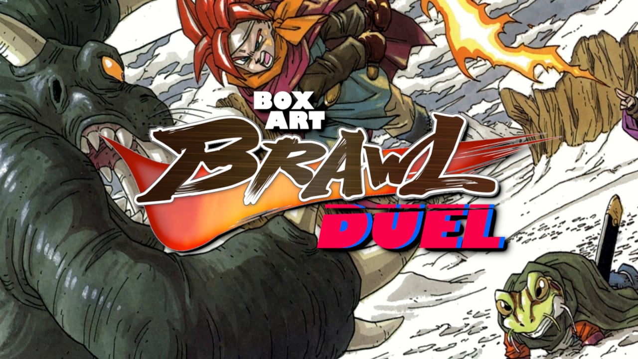
Welcome back to Box Art Brawl, our increasingly erratically scheduled series of retro box art polls where we all decide the best regional variants from two or more territories.
Last time we looked at F-Zero: GP Legend for the GBA. Europe and North America ultimately duked it out for the silver medal (with Europe having to settle for bronze) while Japan brought home the gold with 58% of the vote.
This week we're taking a look at a classic 16-bit RPG, one that’s currently Number One SNES game ever, as ranked by Nintendo Life readers. Chrono Trigger from Squaresoft was originally released in the US on 11th August 1995 — 26 years ago.
Subscribe to Nintendo Life on YouTube844k
Europe sits this brawl out, as the DS version was the first time European gamers could get their hands on the game without importing it. So, let's see what North America and Japan can produce for us this week…
North America
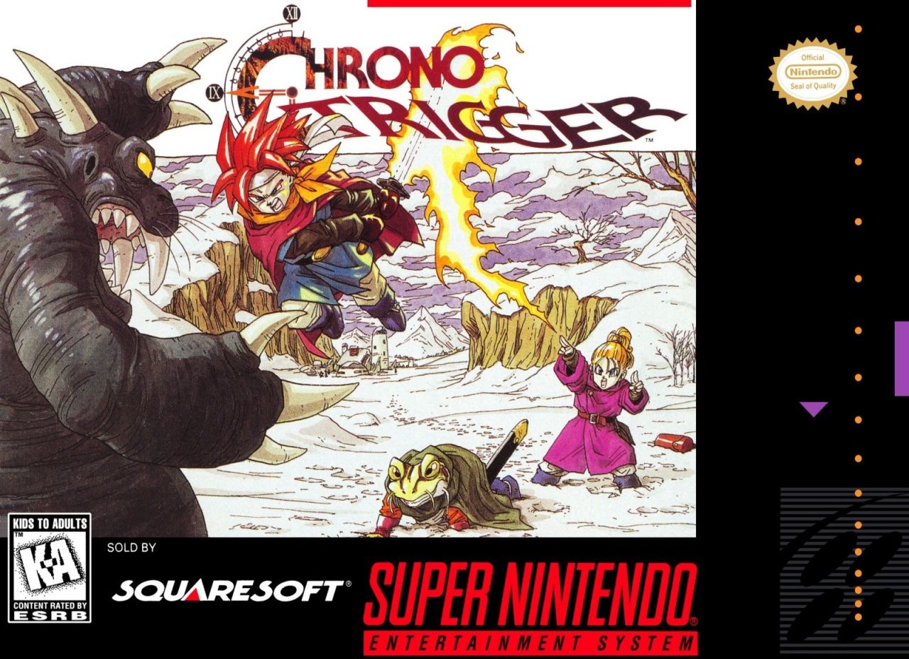
The North American box got a dynamic battle scene from legendary artist Akira Toriyama with a snowy terrain helping to highlight the characters as they do battle with flaming swords and chiselled grimaces.
Not much to say here, it's a great piece. If we were being picky, there's a big old white gap in the middle, the standardised black border takes up space that the art could be occupying, and the cool clock face logo is obscured.
If we were being picky, that is. And we are. Because we're gamers, and we're like that. Insufferable bunch.
Japan
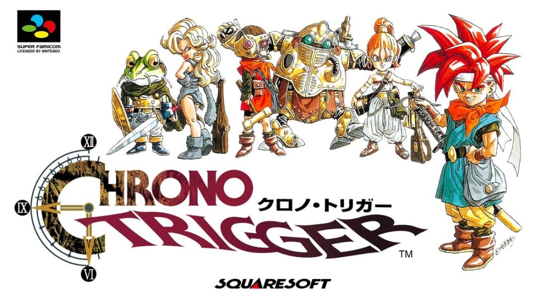
More character art from Toriyama here, but this time unfettered by peripheral environmental detail or big borders. What's whiter than snow? Nothing. No, we mean literally nothing but white — you get an absolutely blank white background here that makes both the characters and the logo really pop.
If we were being picky... nah, this is the one, innit.
Or is it? You’ve seen the options, but which one triggers your deepest respect and admiration? Click on your favourite below and hit ‘Vote’ to let us know:
Thanks for voting! We'll see you next time for another round of the Box Art Brawl.


Comments 51
Best SNES game ever!!!
I personally think this is one of the best art pieces of Toriyama. The North American cover wins it for me with the action setpiece.
Absolutely the North American one, even though Marle doesn’t have fire magic. I loved that game as a kid. Still do
That was a tough one as I really liked both. I went with the action one though.
Voting the UK cover on this on- oh...
Hehe, US all day, every day.
Both are pretty good, but I vote Japan. The NA one has a little too much empty space right where there shouldn't be any. But yeah, this is super nitpicky. Both of them work.
I usually go with japanese ones, they generally have better design all around and are more "experimental", more conceptual... But the US version of this one takes the cake for me!
The only issue with the American cover is that Marle doesn't use fire, lucca does. I wonder what a chrono trigger remake would look and play like. I could imagine it like a botw style game, ooooooohh, that'd be fun.
NA this time, it's more action packed and composed than the JP cover.
The SNES/DS cover art is a lot more dynamic whereas in Japan they seemed to just go with the template of "assortment of characters from the game" they were already doing to an extent with Final Fantasy covers in that region
I like the character art spread on the Japanese box, but I gotta opt for North America this time. That background and battle scene is just too iconic.
This is one of the cases where the Japanese cover is just everyone standing around and the US one is way more dynamic.
I know it's the same artist, but whenever I see anything related to Chrono Trigger or Dragon Quest, my mind immediately thinks about how similar the art style is to Dragon Ball or Dragon Ball Z.
Toriyama Akira-sensei's art style is so recognizable, he's like the Don Bluth of anime, video games, and Japan.
North American is much better. Though it annoys me that Marle is shown using fire. I get that's easier to draw than Ice in motion and covering Crono's sword, but it's still not accurate. Lucca was the one who used fire.
NA 100% for me. I like the more dynamic artwork - plus, I always found the versions of the CT characters in that Japanese cover artwork kinda goofy-looking compared to the main artwork of them.
Oh, and Chrono Trigger is my all-time favorite game, FWIW.
Edit: Come to think of it, it was the cover that first attracted me to the game, when I stumbled upon it in a game rental store in 1995. I'd never heard of it prior to that day. The rest is history.
JP box art shows you the characters, sure.
but the NA box art really sets a vibe of action and wonder.
I always hated both tbh. I love the artwork, but all that white doesn't really "pop" for me.
It's obviously one of my favourite games of all time, but that box art wasn't what convinced me to try out! 😅
Despite the mistake in having Marle throwing fire, the dynamic action on the NA box shows a great deal of what CT is about on a surface level and looks much more engaging than the Japan version.
Sigh, what an incredible game.
Yes yes yes another epic brawl! Thank you Nintendo Life!
Used to love these votes dropping weekly! What happened?
I'm surprised Squeenix doesn't do more with this series. It was such a good game for it's time, though when I play it these days the battle system bores me. I still love the story and characters, though.
Have the japanese one and it just looks great.
Also, it had some Carts in it, love them.
The Japanese art work reveals to much story. I also like the action in the American art.
I dunno, I prefer the JP one. I just hate that border.
Nothing particularly wrong with the Japanese box art but it's pretty basic compared to the dynamic art for the North American release.
NA wins, the dynamic scene is a game seller, specially with that Toriyama art. Most likely a lot of people that knew about Dragon Ball back in the day bought this game for the cover alone.
The Japanese one shows off more characters than the US one, so...how is it being voted on so poorly? :/ The US's background would be all white too if it wasn't for the uniform black design elements that every game had.
I like the action shown on the North American one so that wins. The Japan one is good as well and is the one most synonymous with Chrono Trigger in my mind's eye.
Absolutely loved this game. Had the original game pak, but I like the Japan box. NA is of such a non-impactful point in the game (I believe there's a boss like that, but did this even happen as pictured?) If this were a modern game, NA art would be on the inside of the Switch case.
Should've put a Nu on the box art.
Do you even Chrono, bro!
I gotta go with the NA one. I still.have a poster of it that I got when I was a kid.
@Mikeopferman @PhhhCough Crono, Frog, and Marle are using the Triple Tech Arc Impulse.
The Japanese one is too straightforward for me, but the NA one breathes some kind of life into it. I just didn't like how Marle is throwing fire magic instead of ice, lol, but I love it otherwise.
I really enjoy the Toriyama art in both cases. The Japanese cover is well done in its layout and how it features so many characters. I do prefer the dynamic scene depicted on the NA cover so that is my pick despite the border and giant logos that generally detract from the art for me usually. But it's nice to see that both are what I would consider very good.
Only NA because they filled the front with more of everything. The JPN is to sparse....
@PhhhCough ohhh no, no more open-world shet where it isn’t needed please.
I've never tried this one before. i should definitely think about getting it soon.
anyways, i went with the Japan boxart. but the North Amercia boxart looks cool too.
North America for me. The Japanese cover doesn't tell me what the game is about, except that it has Super Saiyan God Goku with a sword, Violent Launch as a cavewoman and involves time travel of some sort, of course those aren't really bad things and would get my attention if I didn't know any better.
EDIT: Thanks for the reminder that I forgot to get Chrono Trigger on the Wii Virtual Console before the Wii Shop Channel closure, despite owning the DS version.
The US and EU DS boxart is basically the same as the SNES original anyways, as I recall.
@PhhhCough I asked someone on another forum, and they said the NA boxart is based on a beta screenshot that doesn't correspond to the finished game.
The plain white background on the Japanese box is boring, while the NA box shows an actual battle. Definitely North America this week.
@EmmatheBest A beautiful snowy landscape is not the same kind of "white" as a boring blank page.
If only the US cover had Lucca instead of Marle or had Marle using Ice, I would have picked it, alas I`ll have to go with the Japanese one this time.
That little elemental mistake bothers me since 1995.
Box Art Brawls Current Total:
Europe: 30
Japan: 34
North America: 36
Australia and New Zealand: 1
One of the most iconic box art, Japan's not bad but the north America's one it's so iconic that you know, it's hard to not vote for it.
This was an easy one
Never played this so no nostalgia and I pick Japan. The composition of the America one is off like the article says, even if you ignore the big standard border.
Voted for the North American one, the action shot is nice compared to the characters just standing there on the Japanese one.
Very tough one this time. I love both of them! Ultimately I went for JP because I like the clean box design better than the SNES black bars. Makes it look too cluttered. If not for that, I would've gone with NA. That action shot is awesome!
I like both but I can't really pick one here. The Japanese one is a nice spread of the characters but has a lot of deadspace and is kind of boring. The US one is dynamic but also... Bothers me.
First, they're using Frost Arc, but with fire. I know this has been pointed out by others, so I'll leave that there. I can even almost forgive it, because while Marle clearly can't use fire, the triple tech itself does somewhat look like Crono is coming down with blue fire-ish energy (maybe just from mixing with his lightning powers?).
Second, though, the setting suggests either Antiquity/12,000 B.C or Deaths Peak. And they are fighting Heckran. This is clearly not his cave lol. I just assume it is early concept art, but such art is amln odd pick to me to represent the whole game.
Probably not a popular opinion, but I kind of like the Final Fantasy Chronicles cover. The FF IV portion is a little bland, but I do like the wavy reel of the CT cinematics.
I actually prefer the US cover over the Japan cover.
Sure the US cover has a black border taking up 60% of the art, but it's better than the generic cast standing on white background with logo.
Japan's cover reminds me of the "Graphic design is my passion" memes.
Show Comments
Leave A Comment
Hold on there, you need to login to post a comment...