Welcome back to Box Art Brawl, our regular retro box art-based poll to find the best regional variants from two or more territories.
Last time we looked at Brain Training for Nintendo DS on its 15th anniversary, and after a meeting of the minds it seems that Europe had both the brains and the beauty; the EU cover walked away with over 50% of the vote. North America’s yellow cover came second and Japan came last.
This week we're celebrating the release of New Pokémon Snap on Switch by taking a look at (Old) Pokémon Snap on Nintendo 64. So grab your cameras and let's get our subjects in focus...
North America

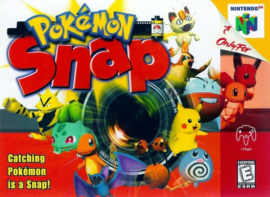
Beginning in North America, a camera lens occupies the centre space with a bevy of Pocket Monsters seemingly bursting forth... or maybe they're getting sucked in and 'captured'? It's hard to tell, but we like it all the same.
We're suckers for the logo, too, with its roll of film boasting 64 exposures. We're less enthused about the rubbish tagline in the bottom left corner, though.
Europe

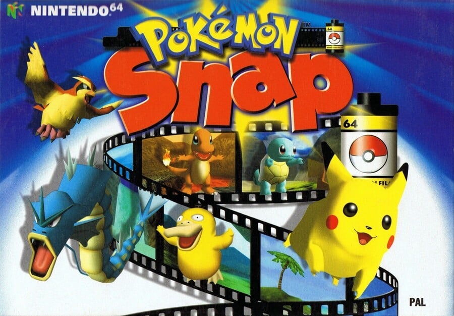
The blue European cover unfurls a larger roll of film and we see the Pokémon caught in their natural habitats as the film spools out.
Two rolls on this cover, with the same great logo, too, and we like the different shades of blue in the background.
Japan

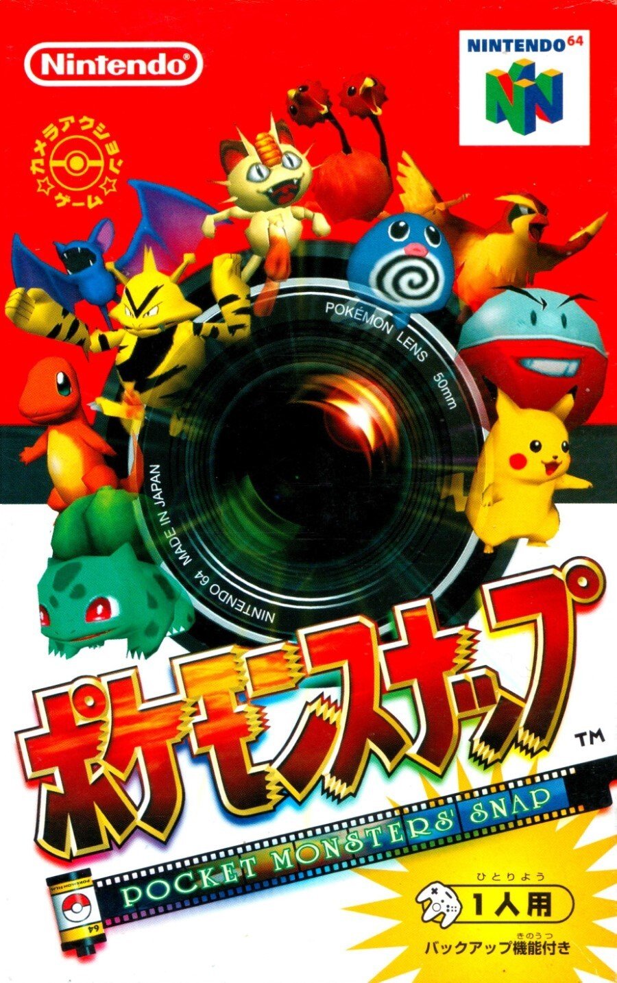
Japan got a portrait-oriented box with similar key art to the NA version, although the camera lens and the red/white colouring of the background gives the impression of a Poké Ball.
The film is also present here and we like the focus (pardon the pun) that the big lens right in the centre brings.
So, you’ve seen the three options, but which cover is ready for its closeup? Click on your favourite below and hit ‘Vote’ to let us know:
David Bailey? More like bathe it daily! We hope you're enjoying the new game if you're playing it this weekend. Let us know below which of these vintage snaps clicks with you, and we'll see you in a week or two (or three, in fact) for the next Box Art Brawl.


Comments 38
Tough one but I think it's between Europe or Japan and I think Europe wins it
As much as I like the North American cover, that European boxart is something else.
America's one just seems a bit too busy for my liking
For once the European on is far more lovely I think, no nonsense icons, clear, and higher quality models.
Not a fan of the big black hole style covers, or the way the ‘mon on them fade as they get closer to the pit - it’s confusing the focus, in my opinion
They're all good, but the North America one perfectly embodies the game to me while matching its 90's time period: a big ol camera with Pokemon arranged around it—all with bold colors and lettering that makes the artwork "pop". The colors especially match the N64 box art and labeling imo.
Europe easily wins this. One of my favorite box arts. Love the colours and the reel of film containing iconic first gen mon. Even the "64" on the film roll case implying 64 shots in the film roll is genius 👌
One of those times where Europe wins one.
i love how the european box art of Pokémon Snap, not just show some pokémon you can take photos of them, but the envioroment they are found.
Europe this week? Yeah, Europe. The reel of film guides the eye through the composition and whilst not perfectly composed, reflects the gameplay perfectly. The messaging of Pokemon being brought to life is really well communicated with some of them leaping out of their photos. Good stuff
(Hehe, that was as good an art critique as I can do lmao!)
Thinking about it (too much as the art world often does) are the Pokemon in the other region's covers being sucked into the camera lens? Horrifying, if so!
The European cover actually gives you a glimpse of what the game is about. The other two are busy messes
Europe gets the W
The Europe one is beautiful 😍
I picked Europe. The camera-lens concept of the other two probably seemed like a better idea on paper than in execution. It's just lacking for me as a cover. Also, missed opportunity for the US cover to have that little tagline in the corner be "Gotta snap 'em all!" Also related to the US cover, that peeled top-right corner was not a good idea and it takes away from a lot of box art. Anyway, the Euro cover does a nice job communicating the game's concept in a pleasing way.
For once, it looks like Europe made out best.
I like the North American one the most just because it makes it look like you’re going more on an adventure than the other two.
Box Art Brawls Current Total:
Europe: 30
Japan: 31
North America: 34
Australia and New Zealand: 1
@GrailUK i believe your right. I hadnt noticed that. Good eye 👌
Surprised nobody’s mentioned the “Catching Pokemon is a Snap!” tag line on the NA box art
Don't know why the US boxart flipped the red and white background. It was suppose to be a Pokeball like the Japanese boxart.
It's weird how each cover has a missing starter, and it's different on each one. The American one only has Squirtle and Bulbasaur, the European one only has Squirtle and Charmander, and the Japanese one only has Bulbasaur and Charmander.
@Krisi if you look closely NA actually has all three. Squirtle is just kinda hidden with eevee behind that strip on the edge
Love the blue European Art with the Film.
THE BACKGROUND WAS A POKEBALL? I just realized it looking at the Japanese cover, the inverted colours due to the logo being on top in NA stopped me from noticing in my Brazilian version.
They all look pretty poor but I'd go for the Japanese one here.
The USA one is just a swapped out palette of colours upside down of the Japanese one with the Pokemons shuffled into different angle position. The USA is for me the better part.
The Euro one looks like someone took a photo of the oceanic part of the game and slapped the camera roll and the Pokémons on the front Psyduck on the Euro cover looks like he escaped from an Asylum or something.
Easy win for the European one.
@Grim Wait... I did see Squirtle, but not Charmander for some reason. Even though it's right next to Bulbasaur. Weird.
This was tough. Europe had a very close (almost) tie with Japan.
I think the European box art best encapsulates the concept of the game. Australia ended up getting the US art.
The North American cover by just a hair. I like the camera lense art.
Europe's gives an idea of what you're going to be doing in the game, rather than the random camera lens and overload of Pokemon that both Japan and NA had.
I was gonna vote for Europe, but the fact that the Japanese box resembles the PokeBall really got to me.
Much as I love the Pokeball play on the American and Japanese covers (and the inclusion of Electabuzz!), gotta hand it to Europe here for composition and clarity.
Why is squirtle red on the american box art?
I usually don't vote, but I'll vote Europe here, it's just better.
At least when it comes to designing box art for Pokémon Snap on the N64.
For many other things, I'd almost quietly whisper "please come take me away here, we're slaves and prisoners in our own homes and countries"... or wink twice in the hope anyone knows that means I'm not okay here and avoid the watchful eyes of Big Brother.
But that's probably generally the case in US and Japan as well.
I say this one goes to the European one, with the Japanese being a runner-up.
When it comes to the cartridge art, the Japanese one wins though.
https://www.suruga-ya.jp/database/pics_light/game/247000107.jpg
The Japanese version uses a smaller box (size of a VHS tape), which totally doesn't look out of place with my other Japanase N64 boxes...
I like the USA one. Great tagline, Eevee is on the box, and all Pokémon are in a good position.
Show Comments
Leave A Comment
Hold on there, you need to login to post a comment...