Welcome back to Box Art Brawl, our regular box art-based poll to find the best regional variants from two or more territories.
Last time we took a 20th anniversary look at HAL Laboratory's GBC game, Kirby Tilt 'n' Tumble. With Europe out of the running thanks to the game never launching in that region, it was left to North America and Japan to duke it out. It was a close run bout, but in the end North America emerged victorious with just over 60% of the vote.
This week it's another anniversary: 16th April 2021 marked fifteen years since the US release of the phenom that was Brain Age — we've gone with 'Age' because it's the American anniversary, but it was better known as Brain Training elsewhere. Whatever name it went by, everybody and their gran were glued to their Nintendo DS in the summer of 2006 doing Sudoku puzzles and scrawling numbers on their consoles while a genial Japanese gentleman encouraged you to keep the ol' grey matter energised.
Subscribe to Nintendo Life on YouTube846k
Did it work? Are we smarter thanks to training our brains for minutes a day? Who can say, but Nintendo sure sold a ton of games, that's for sure. Let's see if brains really do beat brawn, then...
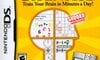
North America
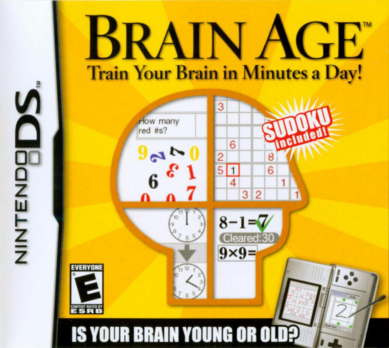
Brain Age: Train Your Brain in Minutes a Day! (to give the game its full title) gave an impression of high class and education with its elegant, serif-ed logo at the top, but the bog-standard capitals of 'IS YOUR BRAIN YOUNG OR OLD?' down the bottom belies its tabloid-y casual appeal. Rays of — what is that? sunlight? brainwaves? — radiate from the cranium in the centre, which is divided into quadrants that show the various activities contained on the cart.
Sudoku is included — did you spot that? — and we quite like the DS 'Phat' used to illustrate how you hold the console like a book to play this one. Functional.
Europe
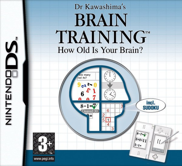
Dr. Kawashima's Brain Training: How Old Is Your Brain? takes a cooler approach with a light blue background fading to a clean white piece of grid paper (the sort that clever people do sums and things on). The cranium returns in blue form and calmly tells us that — yes — Sudoku is included here, too.
There were slight variants of this design with more information at the bottom and different languages between your country in the PAL territories, but they were all very similar to this. Europe gets a nice elegant white DS Lite to demonstrate how you should hold the console to play the game, too. What can we say? We're a classy bunch.
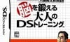
Japan
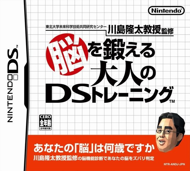
Japan bins the oddly historical-looking cranium for an oddly polygonal one. Yes, the Japanese version is the only one to feature Doctor K himself on the cover, albeit smallish and plonked down in the bottom right corner. The grid paper is doing a lot of work here, and if it wasn't for the splash of red livening things up, this would be a pretty bland cover.
So, you’ve seen the options, but which big brain is beautiful? Click on your favourite below and hit ‘Vote’ to let us know:

Congratulations to Dr. Kawashima on fifteen fruitful years as a floating face — we hope you bought a very nice house with all your Brain Training money. As for the rest of you, have a great week and we'll see you next time.


Comments 47
Wow, Japan really didn’t try very hard with that one. The EU one is iconic over here - it still litters the shelves of charity shops all over the UK...
Like trying to compare pupil's maths books.
D+ SEE ME!
Powerfull sega master system vibes on the European one
I always found the low poly face a bit creepy.
I voted Europe, the text takes the player a bit more serious plus sudoku is in the jaw area and the indicater hints at a text bubble now, which is a clever touch or nice accident ( any graphic designer worth it's salt would do such with intend I reckon).
Europe. It looks classy and relaxing.
The Japanese one doesn't tell you so much about the game (image wise) and the American one just looks tacky and shovelware-like! I think it's the font at the bottom and on the Suduko bit.
Europe. It's clean, has enough going on to still somewhat pop & be recognizable on a shelf and represents the game very well.
Japans boxart way to basic. It's boring and doesn't pop.
The US one tries way too hard. It tries its best to pop out but the Yellow is too garish and their's so much going on that makes toe box cluttered.
From a graphic design standpoint I really like the jp version. Way more than the others. Looks like a book. Which fits to this game.
The others look to much like a quiz show to me.
I guess North America, but none of them are very appealing to me.
Europe for me, I especially like how the Sudoku message is presented. I'm not sure if the US cover is trying to sell hard to sudoku fans or thinks people have issues reading simple text.
The only thing I like about the Japanese one is the render of Dr. Kawashima I think it gives a good idea of the visuals of the game. It's iconic.
May I suggest a Box Art Brawl for Sonic Heroes? It'd be cool to see how that fares here since all three regions use the same art but adds a unique touch to each.
Japanese sentence of red band is written like this.
"How old is your brain? Judgment your brain with brain function diagnosis of Dr kawashima."
three version were same things written, but Europe and North America version is written "include SUDOKU!".
was SUDOKU much popular in world?
anyway, Europe box art is popular but I like Japan version.
Europe version is too very simple. but no bad.
Europe. America’s honestly looks like a magazine ad and Japan is just text.
Nice to see the man himself on the Japanese cover, but otherwise Europe's looks nicest (not that any of them are wildly exciting).
As a suggestion for a future Brawl, how about Final Fantasy Fables: Chocobo Tales? It has very different box art in Europe and NA and I really like both.
And let's face it - the name "Brain Training" is just so much better than "Brain Age." Fight me, Americans!
Europe (and by extension Australia) for me. A great concept and I bought it at launch back in 2006 (I was in my final year of high school then. How time flies!).
The Switch instalment had become one of my most played games, and I'd recommend U.S. fans import a copy if they're keen as it's a rare case of a Nintendo property that is released in Europe/Australia/Japan but skips North America.
As for the design I like the NA version best. However, I do prefer EU's title of "Brain Training" because it fits what the game is better than just finding out your "brain age". Don't need a game to determine how many out there especially adults who's brain operates at a 14 year old's level
@samuraicop We might be able to help you there: https://www.nintendolife.com/news/2019/09/feature_the_worst_box_art_of_all_time_-_10_terrible_game_covers
I voted for the European cover, just because I like the shade of blue that's on it.
Very dull this week.. i'd like to see more obscure, fun, creative, game cover designs being compared.
Bring back more Japanise art / anime style Vs usa/UK realism. Not subtle shades of background colours or font comparisons please 😁
Europe. All terrible really
@mnnk2100
In that Time Period Soduko became very Popular (at leas here in Europe) and it was indeed a selling Point.
A fifty Year old Coworker had a DS-Lite only to play Sudoku.
Definitely Europe, the design and colour scheme just suit the genre of game. Clean design but gives an idea of the content in the game.
"SUDOKU included!" exploding from the forehead of the orange face is weird, but the blue one spitting out "incl. SUDOKU" just seems lazy to me.
Japan awful. Europe gets the nod over NA because the yellow is angry and the blue is chill.
About the "Sudoku Included!" on the box cover....
From my personal recollection of 2006, there was a bit of a Sudoku fad going on at that time (at least here in America), so I can see why they would want to specifically market that feature.
DS Phat (US cover) vs DS Lite (Europe)...
I voted for US. Maybe because it's the one I had...
I think Europe has the better cover, the relaxing blue tones fit the nature of the game more, but I prefer the name Brain Age over Brain Training.
I voted US, though they’re all fairly boring. Weird observation - the block lettering at the bottom of the US cover looks like the popular block lettering used in memes. Weird.
I like yellow in the American one
Europe wins this won with the better background and calm blue.
Not really a fun batch of candidates this week. Japan is my least favorite. The other two have elements I like. I prefer Europe overall. It doesn't hurt that it has a DS Lite on the cover as opposed to the original model on the NA cover. I'm not a fan of the original model.
Box Art Brawls Current Total:
Europe: 29
Japan: 31
North America: 34
Australia and New Zealand: 1
Europe for sure. Japan is super dull and North America reminds me of those 100 Card Games On One CD ROM! PC games of the 90s and 2000s.
Europe. Seeing it made me startup the ds again and give it a try. Still works perfectly. And so munch more portable then the switch. I hope Nintendo is working on a new mix console: switch en ds 3ds.
Voted for North America for it's yellow background, the others are far too basic to me.
@dartmonkey
Regarding this line: Congratulations to Dr. Kawashima on fifteen fruitful years as a floating face — we hope you bought a very nice house with all your Brain Training money.
Dr. Kawashima has ALL royalties from the game go to his research institute, not to him directly, and does very good work. Look up Ryuta Kawashima on scholar.google.com for the latest stuff he's done.
The US an European versions are so similar that it's tough to pick one over the other. It really comes down to color preference and I feel most would pick the blue over yellow. But for me, I'm bothered by the smaller head with a pointless circle around it. The US version doesn't have that useless circle and fills the entire box with the head. Color aside, I think it's a much better design with less wasted space.
The North America one just looks more enticing. The Europe one looks so boring.
I love the weird head in the Japanese version. The rest of it is just words and pretty boring, but that head wins it lol
The American box art exemplifying that golden rule of package design: if you want your product to be taken seriously, use generic meme font.
@Azuris
I see! thank you for telling
They all look pretty bland, but the North American one, the least so.
@AlphaElite It still shocks me that, out of all the things EA could've made with the Superman Returns license, they made a Sudoku game.
Then again, if the problems with Superman 64 were as much DC intervention as they say, maybe it is as well.
Definitely the North American variant for me! It definitely would be the most eye catching for me though I never enjoyed the Brain Training games much myself.
This is the Japanese cover, 1000%
NA is the least boring, so NA for me.
North America clearly wins this. Although they really chose the wrong DS model to put on there.
This one was a though choice because... they all SUCK!!
I decided to pick the NA version since it has more words that describe the game which to me it looks like better advertising.
Show Comments
Leave A Comment
Hold on there, you need to login to post a comment...