
Welcome back to Box Art Brawl, the weekly poll we run to find out which of two or more regional box art variants from years past is best.
Last time we celebrated the 20th anniversary of the Game Boy Advance with a look at launch title Kuru Kuru Kururin. The game didn't get a GBA release in North America, but fortunately Australia and New Zealand stepped in with a bespoke cover which caused quite an upset: it beat both Europe and Japan's efforts with a decisive 56% of the vote! Chalk one up for the southern hemisphere — one-for-one, in fact, as that was the region's first appearance in the Brawl. Hopefully we'll see them again in future bouts.
Subscribe to Nintendo Life on YouTube845k
Not today, though. Last week was the 25th anniversary of the original Resident Evil and the 19th for REmake, the GameCube... er, remake that's since been released across multiple consoles over the last two decades, including Switch. This is Capcom's sixth Brawl featuring its survival horror series (the last being DS port Deadly Silence which scrapped with itself back in January on its 15th anniversary).
So, grab your sunglasses and let's split up. What can go wrong?
Europe
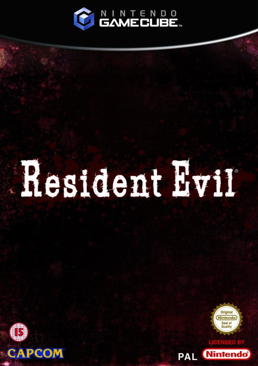
This bumper two-disc game's European cover is one of the most understated we can remember in a while. The white font of the title is plastered slap-bang in the middle of a muddy black/brown/red background with spots of blood faintly visible.
From a distance you'd be forgiven for thinking it's completely black — it's almost like placeholder art. It's not terrible, but there's not much to recommend it. Give us a bloodshot eyeball or a claw, at least.
Japan
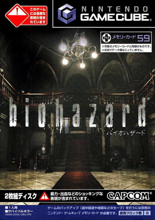
The Japanese Biohazard cover goes with an interior shot of the iconic mansion lobby, highlighting how much better it looks in this remake. There's a bunch of text at the top and bottom, which makes things a little messy, although that logo looks sweet. Gotta love the dagger-y bit on the 'h'.
Evocative of the original with a hint of what awaits in the new version, plus a decent logo. A step up from Europe, we think, although it's not done any favours by all the text and warning symbols.
North America
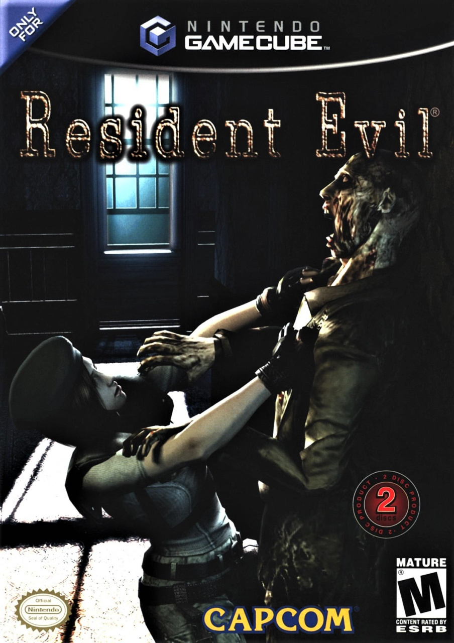
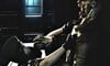
The North American cover gives us some character action; Jill grapples with a zombie as the light of the full moon shines in through the window and splays across the mansion's carpet. We like the contrast between light and dark, although the insipid logo feels perfunctory at the top and the negative space in the centre-left above Jill's head feels awkward.
Some nice elements, but a bit meh in its execution.
So, you’ve seen the three options, but which one resides in your cold, undead heart? Click on your favourite below and hit ‘Vote’ to let us know:
We hope you're having a great weekend — stay safe and we'll see you next time for another round.
- Further reading: Feature: Best Resident Evil Games Of All Time


Comments 51
As much as I enjoy the simplistic look of the European cover, the Japanese one always draws me in.
I voted Japan, but it would look much better without all the busy writing all over it.
I went with Japan as the Mansion just looks classic. The European one took all of 10 seconds to design so not sure why people would pick that when the topic is about box art?
Japan for sure, it really set the tone of this game.
They were all awful, as there was a big whoohaa over the violence in games. It was felt that the graphics were getting "too" realistic which is why Jill and the Zombie look like they are going dancing on the U.S cover. The backs of the boxes were much better. The cover that makes you turn straight to the back of the box is the European one "what's this? Is this?". Where you are greeted by a gory zombie taking up nearly a third of the space. Just incase you hadn't realised this is "that" zombie game haha.
This one might have been better served with both Front and Backs to vote on, as alot of horror games at this time "had" to keep the fronts toned down.
I ended up voting for the North American boxart, however, I do like the Japanese cover as well.
I looked at the european cover and said it's alright but probably no. Then I saw the other two and decided to go with Europe. The Japanese one feels too busy while I feel the American one hasn't aged very well.
The real monsters are the people who didn't vote for Europe. Less is more and all that.
A bunch of anime avatars voting for the Japanese version?? I'm shocked!
This one is close but the extra gunk on the Japan one at the bottom send it’s into last. Europe is classic. Simple and effective. USA in second. Japan without the gunk and it would be first
Japan for me. The European one has nothing in the background and tha art of the lettering doesn't do enough.. The NA one is a simple interaction with a Zombie (lol) that you will see a hundred times in a game or similar games anyway. The art of the mansions entrance hall sets a scene
Europe; less is more.
The back of the Europe box is even better in its summary:
Pure. Terror. Cubed.
‘nuff said!
The NA one has that over contrived candid photo look from an old magazine/news paper - just turn the image on its side...
—...Reunited with her father (Cpt. B. Johnson, Lancaster fire & rescue) for the first time after the disaster, Jill, age 17 proclaims “you’ve always been my hero daddy.” ...
The European cover has a nasty sense of foreboding. Understated but quite classy
I like the simplify of the European one so went with that...
North American for me. It sums up what you're about to get into. I do have to admit though I don't recall in the actual game ever facing the zombie of Kareem Abdul Jabbar.
I went with the European version as it is simple (Like with the Japanese and European versions of final fantasy games pre 13).
Nearly went with NA since I like covers that portray what you can do in the game, but I just had to go with the sweeping mansion shot on the Japanese box. It's more atmospheric IMO. Also, I prefer the formatting of the Biohazard logo.
Sorry Europe, but that cover is just boring.
Love the simplicity of the European one. Tells you a lot about the tone and premise without showing anything. Japan would be second for me but it's a bit busy all over, needs areas of quiet to draw the eye to the important bits. The US one is just bad imo.
Box Art Brawls Current Total:
Europe: 27
Japan: 30
North America: 33
Australia and New Zealand: 1
I like the simple style of Europe, but they should have used the image of Japan to make it very enticing if you see it on a store shelf.
Tough call between the Japanese and American.
Though I'm surprised how many votes Europe got, it almost seems like a joke.
I'd vote for Japan if it wasn't so messed up with the additional bits. America and Europe are rubbish. In the end, decided not to vote this time as I dislike all equally for different reasons.
If it weren't for all the text I would have gone for Japan, but as it stands I voted for the US cover.
Europe is a non starter this go around.
They're all pretty hideous, frankly, but at least the EU one is sort of elegant in its simplicity.
It's a close call between JP and NA, but Jill's face always seemed way too dead-pan in the NA box art. Not the face of someone in that nightmare scenario.
In context the mansion from the Japenese cover looks great, but out of context, seeing all three on the shelf... Europe for sure. I don't know what the ***** I'm buying, but it looks gross and I'm intrigued to know more!
Voted for Japan, North America's looks bad and Europe's is super boring.
Graphic Designer for the EU cover: $#!t I ran out of time and forgot to add the images!!!
Boss: Wow I love the minimalist design!
I hafta go with Europe, its minimalist while still creepy. Sometimes less is more.
Hm, all are bad
Japan gets my vote. I love these box art brawls.
At 1st I thought Japan and then I swung to NA. I like that it lets you know exactly what you’re getting into. It’s like the box is saying, “Wondering what’s this game’s about..?
This.
Any questions?”
Shocked Europe scored as highly on this poll as it has. Coin flip for me between NA / Japan, with Europe as a distant third.
Japan once again beat the rest by far. Second is the North American cover, and the European cover should not qualify even. It's terrible.
Easily the U.S. one for me.
The European one is too bland and boring (much like many of the earlier Western 'The Legend of Zelda' covers from years gone by), and while I do like the Japanese cover a little, I only like it BECAUSE I feel nostalgia for the mansion only after having played the original. If I had never played the original Resident Evil, then I would have felt no such nostalgia and found the cover to be bland and forgettable.
That European cover is so lazy and bland
Europe's cover is impressively unimpressive. The NA cover has composition issues and is a bit lifeless despite it trying to depict a moment of action. It's not a good fit for a game cover. Japan's cover isn't much either, but it's not as lazy as the European one, and succeeds in what it's meant to be more than the other two. Boring as it it, Japan wins this one for me.
Bloody Hell! Did the designer get paid upfront or something for the UK cover?
Went with NA. Always felt like the NA RE case art was one of the more iconic covers of the library. Japan's isn't too bad either. Europe's is....way too simplistic.
I've always loved the NA cover art. Really got me in the mood for the game.
Europe: Too simple
Japan: way too much text
America: simple but to the point
The back of the EU box
l don't really like Japan's because the box has a lot of writing all over it.
North America, easily. One of my favorite covers ever.
Japan looks like a preview of the game in Famitsu.
North America is like a missed opportunity, as everything looks misplaced, except for Jill's bREasts, standing right there in hd ('we remade those too!').
Europe is boring and uninspired. But not tasteless. Chose that one.
I like that the Japanese cover follows the two golden rules of Japanese graphic design:
1) Fill everything up with as much text as possible.
2) Have some space left over? Cram some more text in there!
The Japanese one has cool artwork, but the amount of text is soooo off putting. EU for me.
Not a big fan of any of these covers, but I voted Europe. Japan’s has too much text, and NA’s is the worst overall.
EU, because it makes you want to look at the back, and as you turn around the corner, you look into the empty eyes of a standing corpse, get three beautiful screenshots, and three words. Pure terror cubed. This is BOX art, not front-cover-art.
Show Comments
Leave A Comment
Hold on there, you need to login to post a comment...