Welcome back to Box Art Brawl, our poll series to find out which of two or more regional retro box art variants is the most pleasing to our modern sensibilities.
Last time we observed SNES brawler Final Fight 3 as it engaged in a fierce duel between East and West. It seems that ganging up was a smart plan for the two western territories as Japan picked up just under a third of the total vote, leaving Europe and North America to walk away victorious with 69%. Nice.
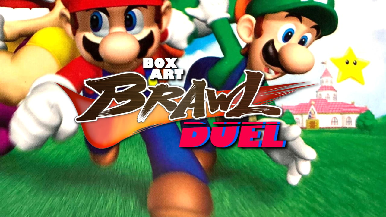
This week we thought we'd have something Mario-themed to tie in with the imminent release of Super Mario 3D World + Bowser's Fury, a game that in its original Wii U guise (sans the furious Bowser) boasted what is quick possibly the greatest box art of any game, ever. — certainly the most colourful. Yes, we're taking a look at the covers of Super Mario 64 DS, the only handheld port of the N64 classic that fans could enjoy until Super Mario 3D All-Stars came along. This version also added three more controllable characters and a host of bonuses, and when played on a 3DS (using that console's analogue 'nub'), it's not a bad way to play this classic at all — and the only way to wander through Peach's 64-bit castle as Wario.
L is real in this one, so hold on to your cap and let's a-go...
Europe & North America
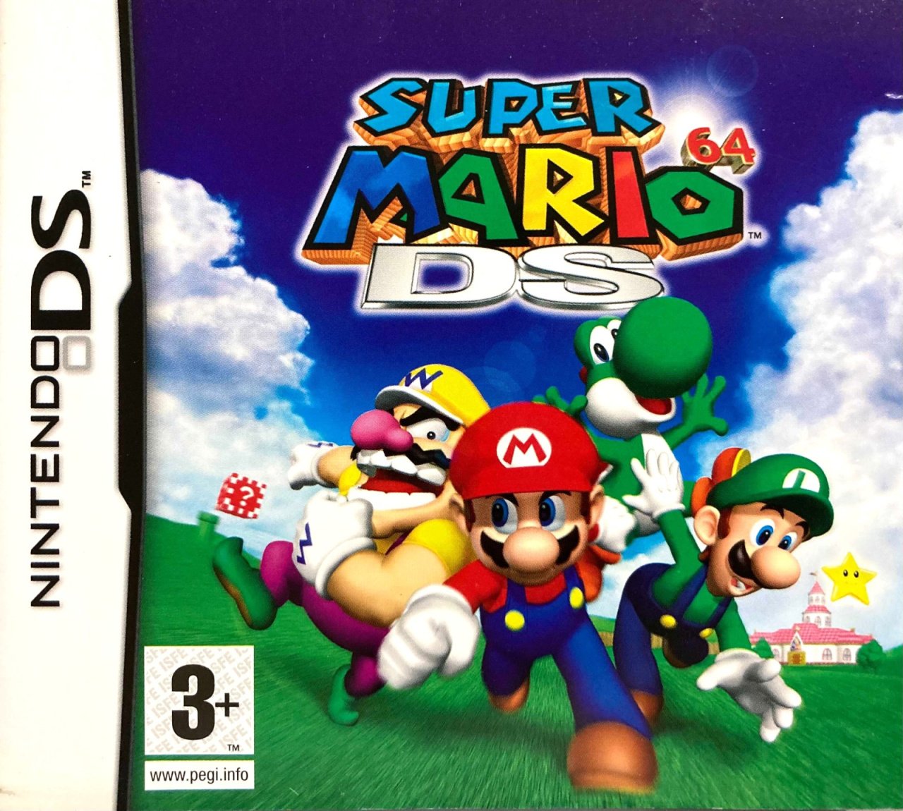
Western territories got identical art featuring the four playable characters bounding towards the camera on the grass outside Peach's Castle. Wario, Yoshi and the Mario brothers are jostling for position and a little bit of motion blue coupled with the slanted horizon gives the image a sense of energy against the rich blue sky in the background.
The lingering clouds part nicely so as to make the logo stand out at the top, with a drop of lens flare shooting out from behind the embossed '64', which comes direct from the original game's cover. The logo could be a bit bigger, perhaps, but we like this.
Japan
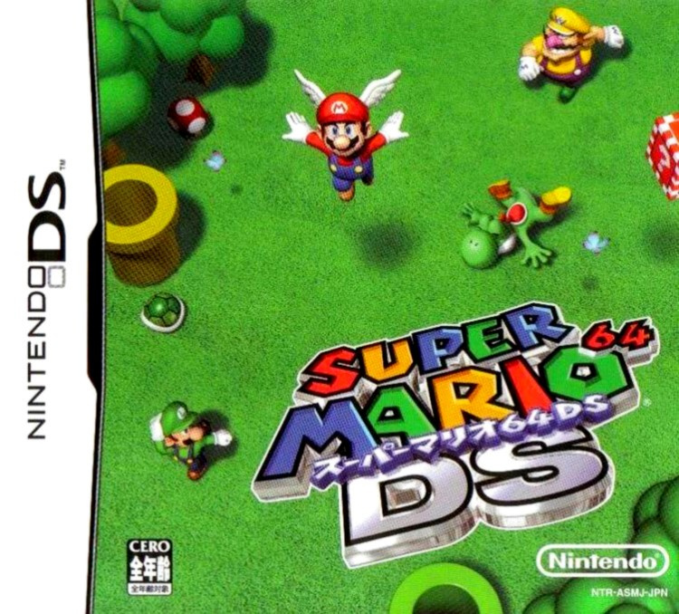
Japan got a totally different cover which we can't quite decide if we like or not. Looking down on the four characters from an extremely high angle, the green grass which occupies the entire cover is interspersed with items, pipes and a couple of butterflies. Mario is seen jumping into the air with a wing cap as Wario looks on enviously. Yoshi's either fallen over or is taking having himself a little siesta. And Luigi? Luigi's left scratching his head like the rest of us wondering who the hell is in charge of laying out the cover.
The logo stands out against the green, and the 64 has been redone to bring it in line with the rest of the type. Overall, this cover is an odd one, although there's something about it that we enjoy. All the green, perhaps? Maybe it's just because it's different to the one we know — more exotic, less generic.
But is it good? That's for you to decide.
So, you've seen the two options, but which one makes it to the summit to battle your Big Bob-omb? Pick your favourite and hit 'Vote' to let us know below:
And there we are! For (Nintendo) life reasons, the Brawl will likely be on hiatus until mid-March. Don't worry, though — much like James Bond, Box Art Brawl will return. Take care everyone, and we'll see you in a month or so.


Comments 55
As Meg from Dead Pixels says "I love rubbing my nubbin"
One of those times when the Japanese one just falls completely flat like Yoshi on its cover.
The worst thing to have one your box art is the main character(s) taking up a tiny portion of the box art. It's not an enticing look. EU/NA easily wins.
Japan's looks like Wario is rushing over to help Yoshi after Mario attack him and is now fleeing. Luigi was probably in on it too.
So yeah, I voted for that cover.
A clean Japanese cover? That’s a first. The NA & Europe has always been terrible..... but the Japanese one... the style doesnt fit.
Mario needs to be at least twice the size in the Japanese cover, and frustratingly there's the empty space next to him to achieve that with no other alterations.
USA & PAL covers looks exactly right.
Japan cover looks pretty vacant.
No contest on this one for me. Europe and North America is the most attractive.
Gotta love that motion blue
Japan feels Spartan, but the western logo feels like something an intern knocked up in Publisher in 5 minutes, slapping a cheap WordArt DS onto the original game’s logo.
North America & Europe all the way easily. The Japan cover to me looks like more of a outtake picture.
Easy win for USA/Europe
They both look bloody awful...
You know what? If this game featured full four player co-op I could get on board with the Japanese cover.
I like the top-down concept of the Japanese cover, but the execution leaves a LOT of empty space at the center of the image. Interest is pulled in different places, but not logically. It's hard to conclude what you're supposed to look at.
the japanese one looks strangely off, like those early cg renders of sonic
The Japanese cover is rather odd with its slanted logo and the distant bird's eye view of the 64 DS team. Yoshi offers the most personality by tripping over but I can't help but feel this is something that Luigi would be better suited for.
The NA/EU gives you a real sense of comradery with slight hints of rivalry and dysfunction among the game's cast. The posing of the characters is what really sells this, and for that, I believe it registers as one of the most memorable DS cover arts.
Box Art Brawls Current Total:
Europe: 27
Japan: 29
North America: 32
@abe_hikura 64 DS was originally planned to have 4 player co-op but it was dropped during development unfortunately.
@ImagineerNik So Mario was the bad guy all along? His status as a villain goes much deeper than his outing in Donkey Kong Jr..
Wow, I don't think I can remember any other box arts that go the direction of the Japanese one's...if any others really have...but I do like it for some odd reason. Not as much as the NA/EU one, but it does still have an odd charming feel still...
I gotta vote for the North American/European boxart.
Japan's is like... Oh shoot we forgot to make art for the box! Quick give me something to use.
Neither. Mario 64 wins
JP would look absolutely brilliant if there was a 5th character in that empty space
MORE FUEL FOR THE WALUIGI CONSPIRACY PURPLE PRIZES WAS A COVER-UP WAKE UP SHEE-
I missed mario 64. So, I have no attachement to a cover. I think both covers look decent. So, I can't vote for one over the other this time.
Although, the characters never run in packs like the EU/US cover shows. I find that very disingenuous.
EU version not much personality. Jap. really represents the 64 Look with the wings and also the red block on the right.
I've never seen the Japanese one before but I think it's pretty cool and unique, I'm surprised it's losing by so much.
Odd Japan one, but always hated the bland eu/us one
The Japanese one looks like it was rushed.
Japanese looks awesome
I really dislike the motion blur on the NA cover, but the composition is vastly superior overall. The Japanese cover looks like an example of bad composition in a how-to-draw-comics book. Despite the blur, NA wins this one easy for me.
24 per cent of people are wrong
NA/EU this time. The characters on the Japanese cover are too small and scattered for my liking.
I prefer NA/EU by a long shot, but I’m not at all a fan of either cover here. In my opinion, the box art from the original N64 game (any region) blows both of these out of the water.
Easy choice this week, the Japan cover is terrible.
I actually love the Japanese cover. My only 2 qualms are #1–the added perspective on the text (would look great if it looked like it was actually setting on the grass). #2–bump up the size of Mario by a few degrees.
Otherwise, I think it’s one of the most original covers I’ve seen.
Definitely Japan. If the Western cover had a cover that was more than just clouds, then it would probably win. As is, it just feels so empty. Ironic, eh?
If the game was co-op as originally intended, then I probably would've picked the Japanese cover, as it looks like it was designed to represent that aspect of the game, but since it isn't co-op, I'm choosing the international cover.
That Japan cover is poop.
I feel as though this is a case similar to Resident Evil 4 GCN vs Resident Evil 4 Wii. I think the Wii boxart is much nicer and pretter, but the GCN one works better as boxart/conveying the actual gameplay. I grew up with the NA cover and think it looks a bit cleaner, but for as strange as the Japanese one is, I think it conveys the gameplay a bit more and conveys what 64 DS is: a bit clunky and messy, but still Mario 64 with a lot of new features (new characters and levels)
I like the poses and stuff on the Japanese cover, but the characters are so small and there's so much empty green space that I just can't pick it.
The international cover is iconic, it's what sold the DS. The Japanese one looks like an insert not a cover
Big thanks to Nintendilife for another great Box Art brawl. Don't stop!
Europe & North America is better, too much empty space on the Japanese cover.
Super Mario 64 DS NA/EU is one of my least favourite boxarts. I hate the motion-blur on the grass. I hate the rendering of the background. The art doesn’t tell me a lot about the game, other than they added 3 characters. And the DS logo is such a jarring addition. Everything about this box art feels like it was hastily made by a fan. I’m not particular towards the JP box either, but at least it’s less generic.
Not sure what is happening with the Japan 1. NA & EU hands down this time for me.
Not voting for either, I dislike both of them
I can definitely see what the Japanese one was going for - and it's a Japanese design alright: unorthodox framing and all!
BUT, even though the western is more traditional, even "safe" and a bit predictable, in the end it's the more effective of the two, so it got my vote
I went with Japan
They're both kind of "eh", but the Japanese one is even less comprehensible as to "what exactly is going on in this shot?"
@Shiiva First reaction was that it couldn't get more dreadfully than the EU version.... I was surprised xD
Japanese one looks like Mario, Luigi and Wario is running away after rioting and Yoshi happened to be in the way and got murdered. What a strange choice of a cover:/
Japan’s looks like it was made in the Wii Photo Channel by a child who just stuck the logo onto a random in-game screenshot.
The Japan cover feels like is getting cut off somehow, it just doesn't feel right...
They're both awful.
Show Comments
Leave A Comment
Hold on there, you need to login to post a comment...