Welcome to Box Art Brawl, the weekly vote to find out which of two or more regional box art variants has what it takes to win your hearts and minds.
Last time we boarded the Halloween train with a trio of Resident Evil 0 covers. While Japan and North America scarpered to lock themselves in the WC when the ticket man came, the simple European cover proudly showed its 52% and was permitted to ride to victory. By the end of the journey, North America managed to just beat Japan to come in second.
This week we'll be looking at a Super Famicom launch title (and we'll be checking out a couple more throughout this anniversary month) — the mighty Mode 7 monster, F-Zero. While not necessarily our Favourite-Zero, it was an incredible debut for the series which helped showcase what the new 16-bit console could do. Nintendo Switch Online subscribers can catch up with it on Nintendo's current console, too — it's still a winner.
But which of our two racers this week will make it through the gauntlet of the Box Art Brawl? Start those engines...
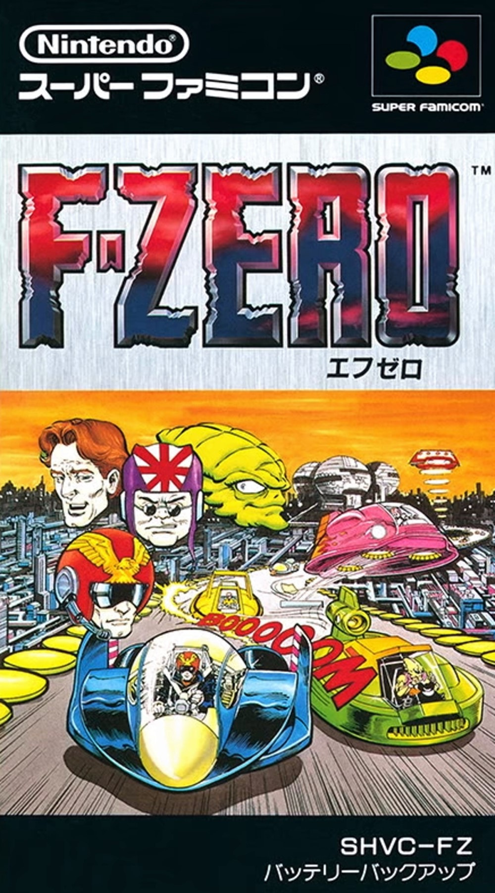
Japan

The SFC cover features a comic book-style key image with disembodied heads of several racers floating above the Blue Falcon in the bottom left. Comic book publisher Valiant were apparently enlisted by Nintendo to provide not only a comic book that came with the game, but also this front cover (thanks, Box Equals Art).
We're big fans of the big red 'BOOOOOM' snaking between the craft and the overall feeling of speed and action captured here, and those hovering heads didn't bother us until we started thinking about them. We like that they're giving us a peek inside the cockpit at the expressions of the racers, but perhaps they'd work better with a concentrated grimace or some beads of sweat dripping down their foreheads.
The logo's good, though — the embossed reddy-blue-purple standing out nicely against the brushed steel of the background, framed by a black strip top and bottom. We likey.
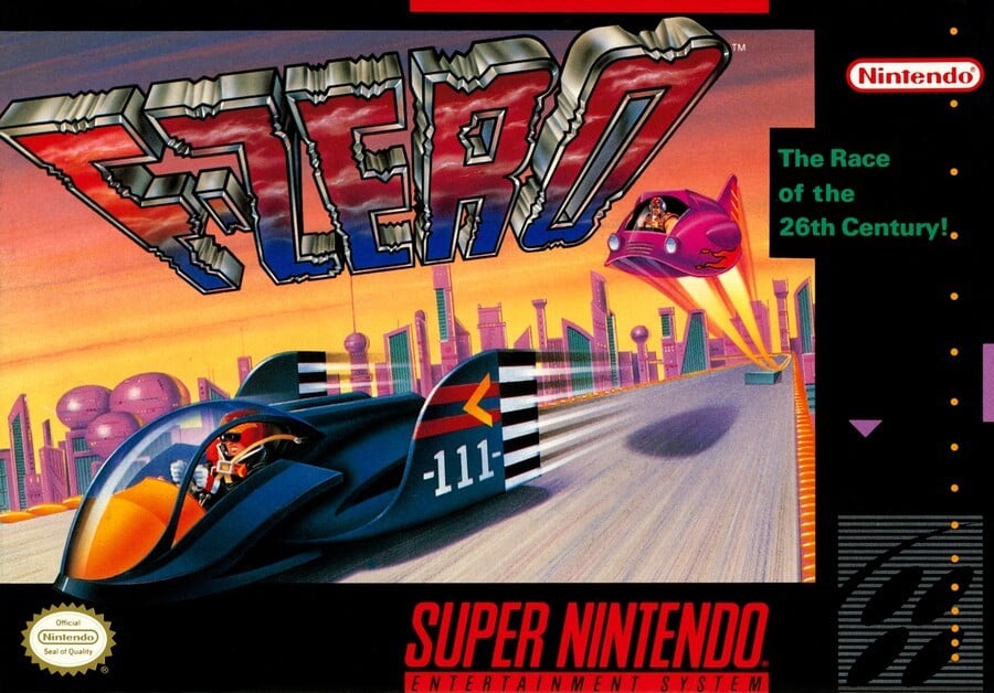
Europe & North America

The North American and European cover (which went with a black or blue border depending on the country) used an entirely different piece of art. Samurai Goroh's Fire Stingray is once again seen launching off a ramp, although this time he's only got Captain Falcon up ahead to worry about. The same basic logo from the SFC cover is used, although here it has its perspective shifted to induce a sense of speed (or vertigo) over the pleasant skyline of Mute City during golden hour.
It's very different from the Japanese cover, but we still like it. The rounded edges of the Blue Falcon — bearing its original '111' designation — gives it a cute, chibi feel, and it's good to see the Cap strapped in during the race. Not sure about the placement of the Fire Stingray's shadow, mind.
So, you've seen the two options, but which is best? Pick your favourite and hit 'Vote' to let us know:
We hope you all have an exceptionally lovely week, and we hope to see you next time for another round of good-natured, civil scrapping over video game box art. Ciao!


Comments 44
I do like the characters all being shown on the Japanese artwork, but the American one looks so much cleaner.
Do love that Japanese manga style.
Its got to be the European version for me, just looking at it brings back so many great memories
Japan for me. Looks like an old Judge Dredd / 2000AD comic.
The us/eu one is also fine though.
North American version all the way. It's cleaner and the Japan version looks like a 70's comic book cover.
The European one is much better.
I think the Western one for me, other than that annoying shadow placement. It’s crisper and cleaner.
I have the SF version of the game so that one for me. So many brilliant memories.
Japan for me although I think it would have been better without the floating heads. The EU/NA one is fairly 'meh' the Japanese one has some character about it.
Japan one looks like a comic book which is a style I like.
To the people saying the western cover is better: BOO.
Japanese one is kinda cool, but the floating heads make it look really corny.
Reminds me of flicking through the instruction booklet and wishing there was more comic strip adventures for these characters. Shame it took until GX to get that feeling into the games, though really the purity of the gameplay was the real winner in the long run.
Regardless, I vote Japan, because I still want more F-Zero comics.
@gaga64 Ah, those good old illustrated manuals. I was restricted in the time I was allowed to play games, but at least I had my manuals and boxart to look at and read. It's a huge part of the total experience of getting a new game for me, which is maybe why I stopped really caring about collecting, and started to just get the dirt cheap and interesting looking eshop sales after a review or three. Got some great games that way, and nowadays a €60 Nintendo new release seems insanely expensive because of that. And the empty manual storage within the new soulless boxes.
As for the poll: I like both. The European is the one I know, and the Japanese one is new to me, but I like them more or less equally, and this is one vote where I don't vote because I like both, not because I like neither option, as is the case with some... Other votes. Here I'm also not being threatened to be punished for not voting, and not blamed for the outcome BECAUSE I'm not voting. So yeah, nice, I guess.
Neither are that good but the art of the Japanese boxart is off putting! So the NA-Europe one it is
You really should be showing the PAL versions of these SNES box art duels. They’re much more colourful, instead of always having black borders and that dodgy grey SNES logo
I like em both but Europe a tiny lil better
Have to vote Japanese as yes, they were really pushing for the comic angle.
@Damo The Japanese cover does not have any logic. It's divided into 3 different parts and they don't connect with each other. It's like one designer made the drawing with the cars and the city. Another one made the heads and stuck them on the first picture. And then another designer locked in a different room, did the logo, put a grey background and they didn't know where to put it and patched it above the drawings by itself.
Both are pretty good this week, but I went with Japan.
@Dr_Corndog, it's American comic book style, not manga style. They even mentioned in the article that Nintendo commissioned Valiant (an American comic book company) to do the cover. They did a similar thing with some of the Japanese releases of the Metroid games, to give them a western feel.
Grew up with the PAL cover but superior Japan remains superior.
... remember a time they made new F-Zero games? Good ol' days of a bygone anti-gravity racing era...
The Japanese cover is just too crowded, would have been better without the disembodied heads.
Both are great imo.
The Japan version has some UGLY faces, so I'd say that the best one is the Like for Part 2!
I've always liked that traditional American comic-book style for artwork very much. For some reason, that style could get away with visual clutter, and I think it succeeds in that way here. And I love seeing hand-inked art like that with lots of deep black. The heads are probably unnecessary, but the characters are interesting enough that it works for me. While it doesn't convey speed, it succeeds in showing action. The western cover is too static and empty, and it lacks style. I think it's boring. Japan's box gets my vote this week, easily.
The floating heads ruin the JP one in my opinion. NA all the way
The japanese one was love at first sight, that one!(altought “the race of the 26 century’ slogan adds points to the western one)
Is the Fire Stingray shadow placement really that bad? It matches what's displayed in game after all.
Anyway, gotta be the western one here. The floating heads ruin the JP one for me as well. If not for those then it would've been the Japanese one.
For me it's the comic book look of the Japanese version all the way, the Western one was perfectly functional but a bit bland. There were a load of box arts from this era where I thought the more stylised look of the Super Famicom covers were so much better than their Western versions but that's largely due to personal preference.
I find the floating heads in the Japanese cover art kinda corny. Art style is nice though.
America/Europe for me.
STOP COUNTING!!!
The Japanese one is horrifying! XD
The US/European cover look much cleaner
I voted for the Japanese cover this week.
I am not a fan of the western version because of the 3D logo. And I like the colours in the japanese version better, the western version in general looks less appealing to me. Anyway, I agree that the original F-zero is not the best one, but it's still super fun to play. I miss this franchise a lot...
That Japanese box art is hideous!
Box Art Brawl Duels Current Total:
Japan: 3
North America / Europe: 8
They're both bad, but at least the western one didn't have the awkwardly placed heads.
The US/ Europe one is too bland for me. The heads on the Japan one are a little strange but I love the "boooooom" sound effect.
It’s amazing how faithful they were when recreating the notches in the logo for the American version. It’s almost 1-to-1.
It makes me so sad that there hasn't been a follow up to the racing masterpiece that was GX.
Its frustrating and infuriating.
This along Advance Wars, Pilotwings, and Kid Icarus make me lose faith in Nintendo.
Let's disregard the question that is has the super smash bros brawl logo
Genuinely shocked Japan did not win. I did not think it was even close, but I guess I have unusual taste.
This time EU/US cover wins. Also, the Japanese cover art is in the instruction manual of the EU version if I'm not mistaken.
Show Comments
Leave A Comment
Hold on there, you need to login to post a comment...