
Welcome to Box Art Brawl, the video game cover contest that pits regional variants against each other in a fight for your vote.
Last time we observed a thrilling duel between Okamiden North American / European cover and the Japanese variant. Ultimately, it was an easy victory for Japan with over 70% of your votes going to the tranquil cherry blossom-filled cover. Lovely.
Today we're observing another duel, this time featuring a game which recently arrived on Switch as part of the Nintendo Switch Online service — a 16-bit classic which will be celebrating its 25th anniversary next month. Yes, it's time to decide if East or West got the best deal when it came to Rare's Donkey Kong Country 2: Diddy's Kong Quest.
Subscribe to Nintendo Life on YouTube845k
The DK crew has appeared once before in this cover-based crucible when Donkey Kong 64 engaged in a three-way bout, but this is the series' first 16-bit brawl.
Ready? This shouldn't take Kong...
Japan
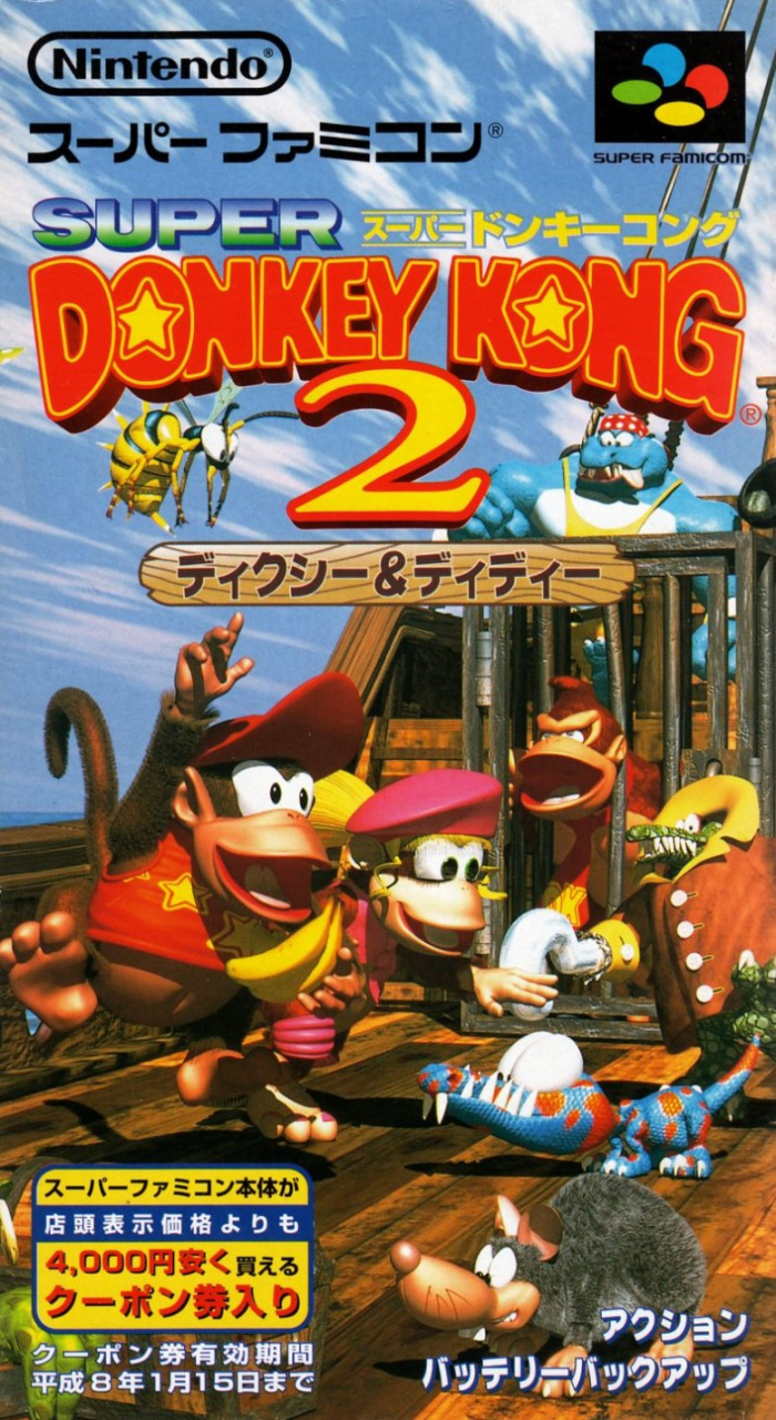
Known as 'Super Donkey Kong 2' in Japan, the portrait Super Famicom cover features Diddy and Dixie Kong on the deck of a ship surrounded by enemies with DK caged in the background. A rather fetching logo is set against a cloudy blue sky in the top half.
Full of colour and character, this is a good start.
North America and Europe
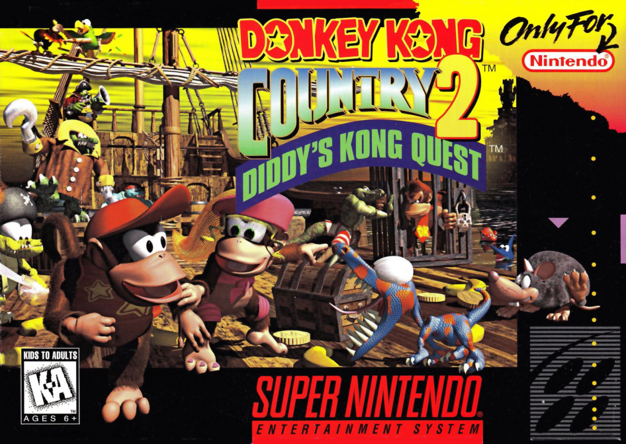
In some European countries, the black border was replaced with a purple one (the same colour used behind the 'Diddy's Kong Quest' subtitle here), but it's otherwise practically identical.
The western release features many of the same enemies and elements reconfigured for the landscape box, although the sky here is yellow and we can glimpse the ocean and land on the far right behind DK's cage.
Plenty going on, although it arguably lacks focus. A tough choice this week, that's for sure.
So, which is best? Pick your favourite and hit 'Vote' to let us know your favourite little Diddy:
And that's the end of this week's brawl. Take care out there and we'll see you next time for more box art-based battering.


Comments 60
First.... For the Japanese cover!
I would have to say Japan this time. The character art and background suit the more space given to it by the lack of the black border that is on the European one.
(The memories!)
Don't like the Japanese 1 . Also it's the first time i see it
I like the American/European better because you can see more of everything. Better view of the ship and the island in the backround. Also the color of the sky is more dramatic
Both fairly overcrowded and muddled to my eye, but I’ve never really been a fan of the DKC games’ art style to start with.
It still blows my mind that it’s Diddy’s Kong Quest and not Diddy Kong’s Quest.
The Japanese cover is too bright. The North American / European cover better captures the atmosphere of the game.
Blue sky > Piss void
The Japanese one is crap, but I picked it because of that sweet coupon ad. ¥4,000 off a Super Famicom is a great deal!
...oh, it expired in January of '96. Rats.
@nessisonett and my childhood was just invalidated.
Japanese cover makes me feel happy. NA/EU makes me feel sad. Simple as that.
I prefer the Japanese one but to be honest they both pale in comparison to the first game's boxarts.
I like both, bit the Japanese Art.
I hate both covers, but the western one is less confusing.
My first reaction upon seeing the Japanese cover was that it was really messy. Then I saw the other cover and saw that it was an even bigger mess, though it had less text. I don't like either one, but Japan is less bad to me, so that's my pick.
NA since looks as premium as the game was at the time!
Both are very hard to look at.
Not only the composition, but the CGI render is ugly as hell.....
Japan for me, both covers are a bit 'busy' but the NA/EU one has too much going on imo.
Voted for North America/Europe. In the Japanese one Diddy and Dixie just seem to be celebrating for some reason but on the North American/European they acknowledge that Donkey Kong has been captured.
I prefer the NA/EU one, but I like how the Japanese one doesn't have the black template.
I don't like busy covers and posters, thus I voted for the Japanese one this time around.
Japan. Because the mouse is on more close-up.. which i like
The japanese one has Donkey Kong screaming in jail. So that one gets an easy win from me.
In the Japanese cover, Diddy is pointing up at the subtitle "Dixie and Diddy" like "hey, honey, that's us!" That and that big Super Famicom coupon advertisement is kind of bad.
If we could compare commercials, tougher call. For "SUPAAAA DONKEY KONG 2!" I recall we had DK bullets.
But the US commercial had a monkey punching a TV. Tough call.
@AlienigenX Yeah, he seems more accepting of his fate in the western cover.
Since everyone knows by now that Kong’s Quest is a pun on “conquest”, did y’all know that Free Willy is a pun on free will?
Oh yeah, Dixie Kong had back than colored toenails and pink knee pads. I wonder why Nintendo removed them. Kind liked her knee pads.
Surprised that there are more ppl that like the American more...
Greatest game of all time in my opinion and an easy choice for Europe / NA.
Arguably lacks focus? Europe/NA clearly puts the focus on Diddy Kong, then one classic gator enemy who's actually threatening them in this one, then Dixie. Then there's plenty of space for the background to actually be in the background.
While a lot of the ship levels had blue skies, I think the dramatic yellow sky leaking out suits the entire game more.
DK is sad and being taken away in the background, instead of being right there and not fitting in at all.
NA all the way. This box art will always hold a special place in my heart. Also one of the best games of all time.
Japan mostly because the other is too busy and yellow?!?
The Western one is just too dark for me.
@Auggie_Plays_Games I like the European one more...
Love Donkey Kong Country 2, fantastic game (a top three SNES game for me). Anyways, I voted for the North American/European cover.
I guess the Super Famicom cover gets my vote for being "cleaner" and the Klap Trap not trying to take a bite at Dixie...
Very funny @Monkeido
@nessisonett
It's a pun. You know, "Kong Quest," like "conquest"?
Don't feel bad, it took me about a decade to realize it myself.
European purple box for me!
@TriforceBun Oh yeah, I do get the pun but I just read it as Kong’s Quest until my brother pointed it out earlier this year.
As amazing as the Japanese art looks, I don't like that Diddy & Dixie look like they are partying while DK is in the cage suffering, the NA/PAL art looks more adventurous and it highlights the perils quite well, so i think that version represents the game more.
They are both bad but I think the Japanese one is slightly better
How can you not vote for a primary yellow sky?
They're both equally good but the Japanese one at least doesn't spoil the final boss.
I really like this cover, especially the US/EU one, but the JP one is good too. The cover tells you all the background story you need to understand the game.
The Western cover is just too iconic.
@nessisonett I SERIOUSLY have never noticed that. Owned the game on SNES, read this article, voted, and I would have bet you $100 that it was Diddy Kong's Quest if you asked me. Although Diddy's Kong Quest makes sense too since he's off to get the protagonist from the first DKC, but still, I always call it Diddy Kong's Quest. Thanks for the comment. and all of your comments actually. I don't always agree with you on things, but for the most part your comments always have something interesting to them.
The Japan one looks like Dixie and Diddy are excited to play the game, while the US one looks like things are going to kill you in the game. The US one makes more sense for the game, but the Japan one looks way better.
Box Art Brawl Duels Current Total:
Japan: 3
North America / Europe: 5
Japanese one gets my vote. Even though I grew up with the NA version, it looks too busy.
One of the only games I ever got brand new... cost about $100 AU which I scrapped and saved for but could never get close. One afternoon my Mum took pity on me and slipped me the extra cash I needed my excitement levels when I held the box in my hands were off the scale.
The NA/EU cover because it reflects the game atmosphere more. This entry was about being in the enemy territory from the beginning (the ship is the Gangplank Galleon, which appeared in the first game).
Feel like the box art was clearly designed for the NA/PAL format, and they tried to cram it into the Japanese box instead of creating a new design to complement the orientation.
That Japanese cover is woeful! Definitely a win for the west this time around.
I prefer the blue sky to a sickly yellow one, but I'm still gonna go with the US/EU box art because it has more details and I prefer a game title that doesn't have Super in it for no other reason than it being on the SNES/SFC.
@TriforceBun I realized that JUST before you said that.
@Tempestryke I agree.
Honestly? I think these are both pretty good covers for the game. If there was an option to vote for a tie on covers I would have chosen that, but since there isn't, I went with the NA/EU version
I personally vote for the Japanese cover for this one
I appreciate the goofy nature of the Japanese cover, but the serious mood and colors of the NA/EU cover will forever be the winner in my heart ❤
Both are too filled up, the european managed its space better though. "Major" difference: in Japan, it's "Dixie & Diddy" 's game.
Show Comments
Leave A Comment
Hold on there, you need to login to post a comment...