Welcome back to Box Art Brawl, the series where multiple regionally variable covers of the same game fight for your vote in a deadly beauty bout to the bitter end.
Last time we had a duel between the East and West: two versions of Super Mario All-Stars went head to head following all those Mario 35th anniversary announcements, which put us in a plumbing mood. It was the manic North American / European cover which walked away the majority of your votes, with the shiny gold Japanese cover failing to catch your eye.
This week, we're going for a little counterprogramming. Right now, Mario is on the tip of everyone's tongue, but what about his old platform adversary? Next week is the 30th anniversary of the Mega Drive / Genesis' UK release, so what better time to bring the blue hedgehog back to the brawl?
We've already examined the cover of Sonic's Mega Drive debut and the third entry in the 16-bit platforming series, so let's take a look at the iconic game sandwiched between those two...
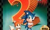
North America
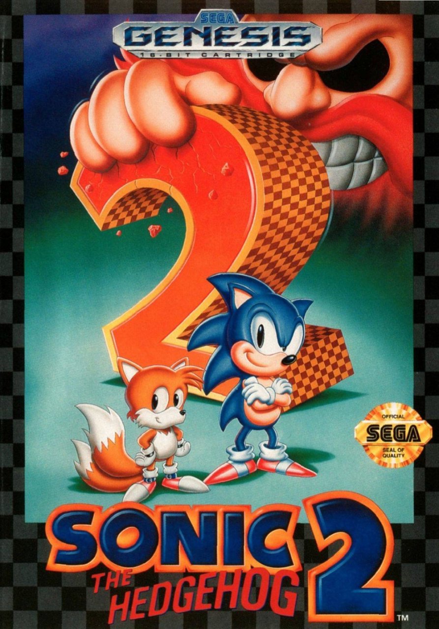
We begin with the Genesis cover. What can we say? Perhaps it's the nostalgia speaking, but we love this: the black-eyed Robotnik crushing the giant checkerboard-patterned '2' with his meaty fingers; the pair of heroes posing in front; Tails' wide-eyed, enthusiastic expression; Sonic all cheeky and chunky.
Top it off with a very solid logo at the bottom, the shining gold SEGA Seal of Quality and the black/grey border and the only thing dragging this down is the Genesis logo at the top. In our opinion, it's vastly inferior to the sexy Mega Drive logo, but different strokes. It's still a great cover.
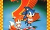
Europe
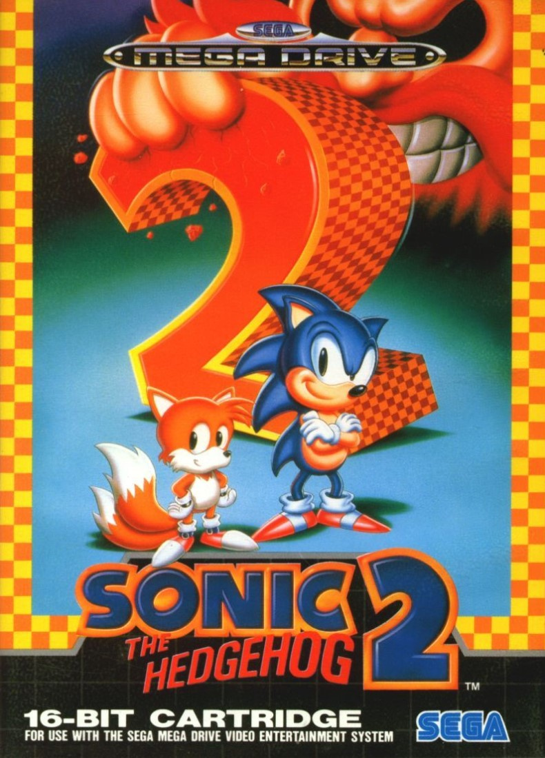
We were almost going to make this a Box Art Brawl: Duel--we've done so previously for games when only the border changes colour when you cross the Atlantic--but after gazing upon the yellow-orange border of the European cover, we couldn't bring ourselves to exclude it.
It uses identical art to the North American version, but the bright border, the classy grid pattern at the bottom (a trademark of Mega Drive boxes of the era), the classic blue and white SEGA logo, and the chrome-like Mega Drive logo at the top combine to make this far superior in our eyes.
And for foot fans everywhere, you get to see the tip of Miles Prower's right shoe, which is covered on the NA version. Insta-win!
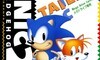
Japan
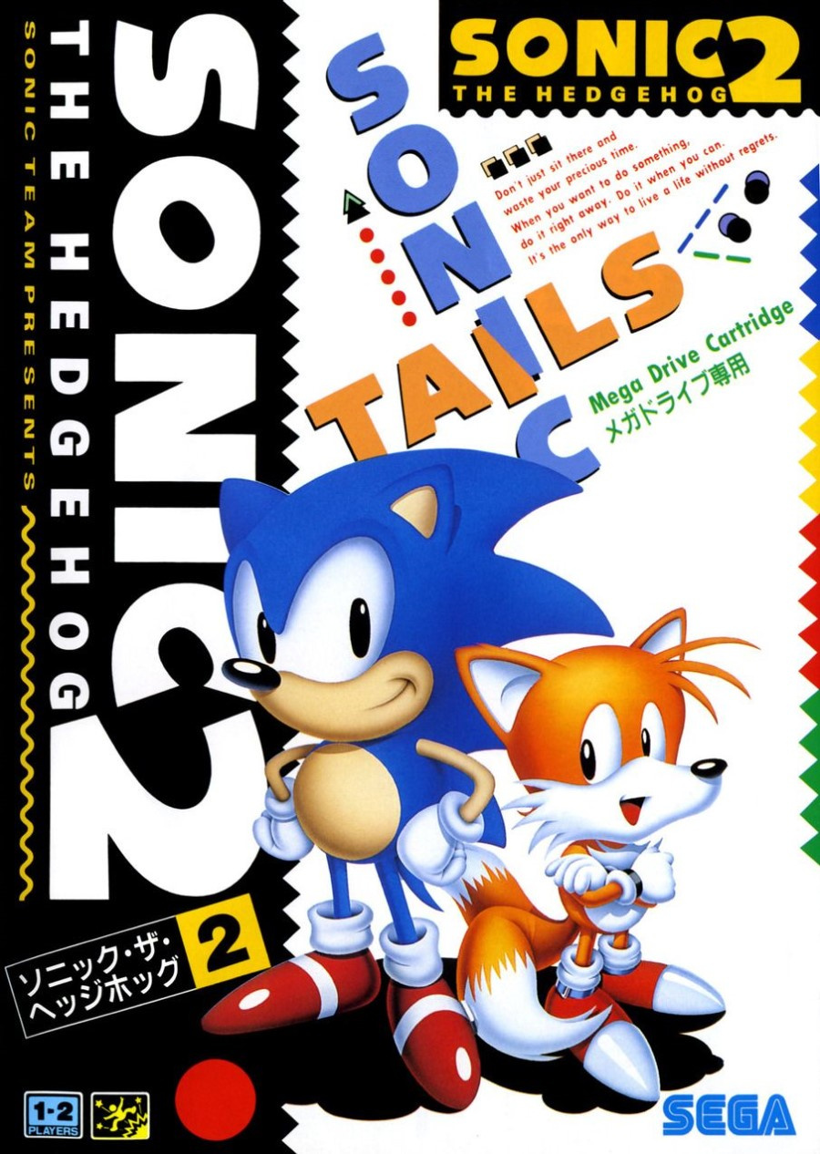
In keeping with the first game's cover (and Sonic 3, in fact), the Japanese version features Sonic and Tails against an abstract, predominantly black and white background with dashes of colour. The logo features not once, but twice, and there's also a neat intersection of the words 'SONIC' and 'TAILS'. It doesn't make much sense, but it looks cool.
Also returning from the previous game's Japanese cover is the following advice to avoid procrastination:
Don't just sit there and waste your precious time.
When you want to do something, do it right away. Do it when you can.
It's the only way to live a life without regrets.
We enjoy the tagline(s), the continuity between covers and the abundance of dotted, squiggly lines. It's all a little aimless and lacking in context, but then again it's a game where you run around as a Disney-fied blue hedgehog in red sneakers followed by a two-tailed fox half his size. Context, logic; these things are overrated. Fun is the focus, here.
So, iconic covers for sure, but which one is the best? Pick your favourite from the options below and hit 'Vote' to let us know:
And that's another week over. We hope you enjoyed this brief respite from the jovial plumber. We'll see you next time for another Box Art Brawl.


Comments 58
As a kid I left my sonic 2 box out in the sun.
When I came back, it all faded to a pink colour.
I've still got It, and laugh at its pink artwork.
I think the cheerier border around the European version is at odds with black-eyed Robotnic.
They are all terrible. Like they took a line drawing I made and coloured it in. Horrid.
Jap all the way
Definitely Japan. The dark gradient on the US one is so ugly and the huge Robotnic is too much! (Europe is a bit better with that nice border)
Out of nostalgia I say Europe, but I do prefer the character art style of the Japanese cover.
Easy, all the none japanese Sonic boxart looks ugly as sin to me. Sonic looks more like an alien and has butt face.
I guess Japan, but they’re all pretty bad.
Thought it was an easy win for NA myself. The way the Mega Drive logo cuts right across Robotnik's nose is quite clumsy and doesn't look as good as a result. And that border round the PAL version is just obnoxious.
My first ever video game (that I owned). So I had to chose the European one as that’s the one that sat proudly on my shelf.
I had to go for Europe purely due to nostalgia
The Japanese cover is kind of boring
The orange and yellow border on the european one hurts my eyes. And the japanese one is nice, and the one I grew up with (our bootleg latin america cartridges were sometimes north american covers, sometimes japanese, most of the times, random nonsense mix up, or no cover at all) but there’s way too many text on it for my tastes. NA get my vote.
I'd have said Europe by a country mile, but the poll results suggest it's closer than that!
NA and Europe artwork is better than Japan in my opinion - it's actually a pretty iconic artwork from the period - and I like the additional colour for Europe.
Europe takes this one. The coloring looks just a bit nicer than the US one and the Japanese one looks like random message clutter.
It’s Super Mario’s 35th today, and Nintendo Life goes with Sonic the Hedgehog?
Japan for that weird ass tagline alone
As a kid I LOVED the NA art. It’s a cool image. But once I saw the Japanese Sonic art, I realized that is what he really looks like up close. Still, I’d have either on my wall.
Voted Japan. The Western covers would look cooler, but Sonic's design is still gross there.
Bearded Eggman scares me, so I choose Japan.
NA definitely > EU. I get that EU's orange border is supposed to look like the in-game patterns, but it's just too garish and lacks contrast.
Japan is neat, but it looks like a magazine cover. Too busy for my eyes.
Too much Orange and Yellow on the European one, I prefer the NA version.
Gotta vote US/EU again. Greg Martin did fantastic work. The JP one looks a little bland with the white background, Tails's mouth looks off, and the inspirational quote at the top just feels out of place.
This is a tough choice, I'm fond of all three of these myself. The US/EU box art is iconic, but I think I like the bright colors of the JP artwork a bit more.
Man, Robotnik must REALLY dislike the number two.
Went with North America this time. I prefer the Genesis logo. I like Japan's overall, but it does seem a bit chaotic and aimless.
European, one I grew up with and know
I've always liked Japan's and America's isn't bad either, but guys, if you think that this European Art Work is bad, wait till you see Sonic 3's.
I had to go for the "fun" Japanese art.
Not quite sure why Robotnik wants to crush numbers.
As always my vote goes to the one I’d rather have as a poster. Japan for the win.
The international ones are the classics but I didn't grow up with them and I've always preferred Sonic's Japanese look to his goofy rubbery redesign.
I dedicate this comment to Sonic 2 which has been re-released 5 times on Nintendo systems! More if you count Fukkoku Archives 3 and the quick plays in Gems Collection.
NA looks like a movie poster. This is the first time in NL 'box art brawl' that I thought the Japanese art was the most boring. I'm usually jealous or fond of the Japanese box art.
A sonic boxart brawl on Mario's Birthday? How disrespectful 😅
JK, Japan box of course 😁
NA is the one I remember, because in England we had that same artwork with the megadrive logo at the top instead, rather than Europe's stripes and topless border (which looks weird). Tails looks deformed on the Japanese one...
NA looks cleaner overall. EU is nice but Tails foot overlapping the Sonic title just makes it look sloppy.
I was reminded of a certain TV program named "Double Dare" for a certain TV programming service named Nickelodeon while viewing the yellow and orange squares of the cover for Europe.
Box Art Brawls Current Total:
Europe: 15
Japan: 21
North America: 18
I had to go with Nostalgia and go with North America. How excited I I was to see that box art one Christmas Morning back in the 90s.
I sort of feel obligated to vote for real Sonic over the Westernized version, but that NA box art is so iconic.
I have never liked the Japanese box art for the Sonic games on the Mega Drive/Genesis. Between Europe and North America, I had to pick NA. While both boxes have the system logo blocking part of Eggman/Robotnik's face, it's worse on the European box because it's further down.
Never seen the Japanese cover before but it just screams 90s
The North American Sonic 2 is some of my favorite box at ever. Probably just nostalgia but yeah, I love it. I really wish the Sega Ages icon wasn't the Japanese picture.
...why does he have a beard??? And why does only one other person in the comments seem to have noticed/mentioned it?
I'm gonna go with NA, partly because of nostalgia and partly because I like the color scheme.
No offense to Europe, its just that orange and yellow aren't my favorite colors is all. But that one looks nice too.
The Japanese one isn't bad, it just looks more like a game magazine cover then a vg box cover.
I hate the weird Mohawk thing they tried with his spikes over here. Just so unappealing. Japan FTW.
The yellow border draws your eyes too much and keeps it away from Sonic and Tails.
Tails looks weird in Japanese art, and it’s too busy.
Ergo NA, and I generally hate the NA covers.
For me, it’s between NA and JP.
I grew up with the NA one so I’m biased but I do love that JP one; it’s beautifully 90s!
One of the few that the Japanese at is better!
The words on the Japanese one are like those badly translated t-shirts you see. Except the translation isn't that bad. It's really weird. I don't know how to describe it... it's obtrusive.
Japanese is supreme, people vote on american cover because feelings from childhood. But he is not beautiful... its generic
I don't see any substantial difference between Sonic on the NA/Europe art and the Japanese art.
All a bit rubbish
Japan just feels so cute and Sonic like. Europe...
The box art you have for North America is actually just for the United States. The Box art for Canada is the same as Europe, with the Mega Drive logo replaced by the Genesis logo and a different bar code on the back.
See https://i.imgur.com/3Q7pYl.jpg and http://i.imgur.com/HJZFul.jpg, and this thread for Canadian vairants: https://connect.gocollect.com/discussion/56182/segaage-variant-thread
@gcunit The Canadian release has the same box art as the Europe version with the Genesis logo instead of Mega Drive, which still cuts across his nose
@Tasuki North Americas is actually just the US version. Canada has the Europe box art with the Genesis logo. Up until 1993 I think, barring some exceptions.
Europe for me. Hmmm...
(What a great game)
JP was the only correct response. So much personality.
JP. It's the one they used for the Sonic 2 Free mobile game
Show Comments
Leave A Comment
Hold on there, you need to login to post a comment...