Welcome to Week 46 of Box Art Brawl, the poll to find out your favourite box art from a selection of three regional variants.
Last week we looked at SNES shmup Phalanx. Surprisingly, the infamous North American cover picked up over 50% of the vote for an easy victory. Japan came in second and Europe trailed in a distant third place. We totally understand your pick; we're quite partial to a some banjo ourselves.
This week, partly in honour of SEGA's 60th anniversary, Sonic returns to the ring with Sonic the Hedgehog 3 for the Mega Drive / Genesis. The game hasn't turned up on Nintendo consoles as frequently as the previous Mega Drive entries, but it can be found on the GameCube Sonic Mega Collection, the Wii Virtual Console, and also the (quite terrible) Sonic Classic Collection for Nintendo DS.
So, time to get in the zone - the Angel Island Zone, that is!...
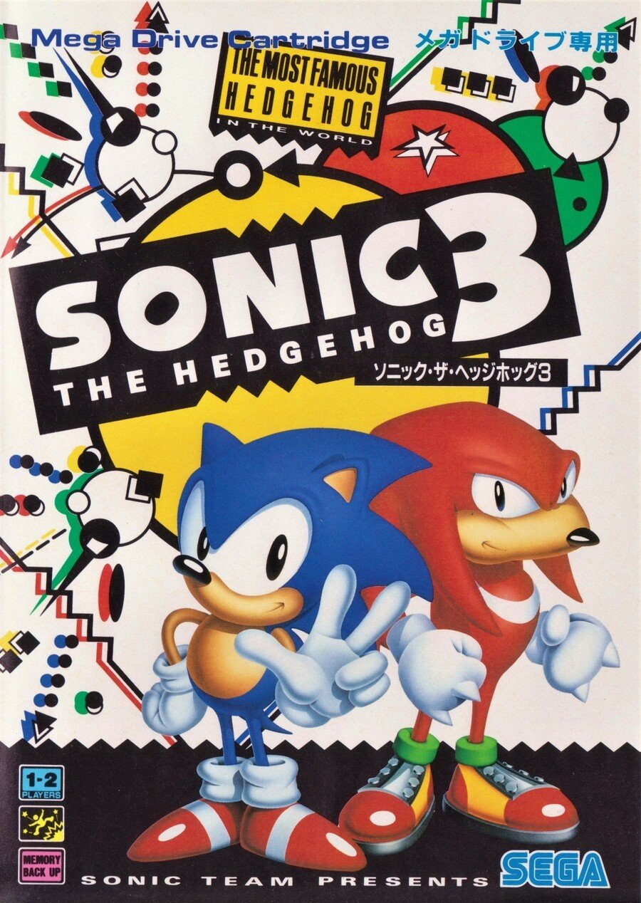
Japan

Very much staying with the theme of the Japanese cover of the original game (and the sequel), Sonic 3 gets primary colours, solid blacks and abstract, pointy shapes over a white background, and it also retains its THE MOST FAMOUS HEDGEHOG IN THE WORLD tag from the original - the difference this time, however, is that the tag was true by 1994.
We enjoy how the lineage of the Japanese covers carries across the games, although minus points for ousting ol' orange in favour of blue and pink alone. Sonic and Knuckles would get their own Tails-less outing in the next game--we forget the name--so it’s a shame Miles Prower isn’t on this cover.
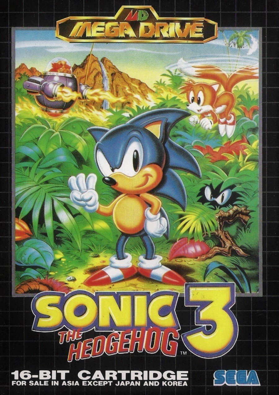
North America

We still have a beautiful supplement that came with SEGA Magazine with this image emblazoned on the front. We love the colour and we love how Robotnik is breaking the red border. We love that Tails is present and we love the creepy eyes of Knuckles hiding in the bushes.
A very strong entry, even if the Genesis logo is a bit rubbish.
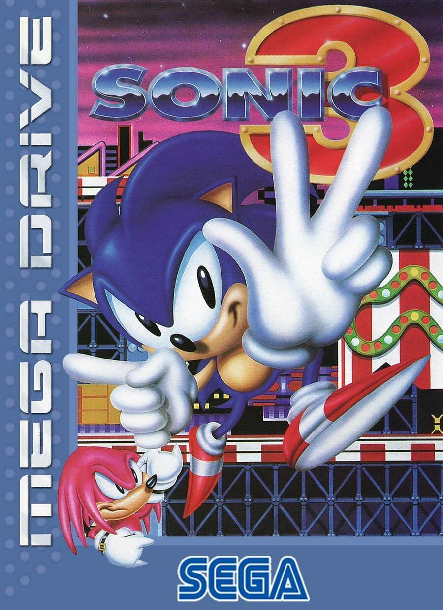
Europe

A 'blue box' from the later period of Mega Drive releases, Europe delivers a dynamic image with a ‘pointier’ Sonic; a Sonic that apparently can't count. Yes, we're being petty, but he's not even attempting to tuck his left thumb in.
Still, this is another strong entry, with a grouchy Knuckles shaking his fist in the bottom left corner, Carnival Night Zone providing a colourful backdrop, and a kickass '90s logo running down the left side. There’s a big 'SEGA' at the bottom, too - bigger than the others, at least.
We likey, except for the distinct lack of Tails.
Bonus
And as a cheeky bonus, here's the cover that Asia got outside Japan (and Korea, which enjoyed a borderless version using the same image). It uses the same art as North America, but with a black grid that European gamers will recognise from earlier Mega Drive releases. It's a little boxy, but very pleasant.

Just three Sonic 3s to choose from, then. We think it's going to be a close one this week. Click your favourite and hit that 'Vote' button to let us know which you prefer:
An article about Sonic and we didn't say 'blue blur' once - get in! Have a fine week, lovely people. Stay safe and we'll see you again in seven days.


Comments 64
No offense, but Americans had the best box art and is probably the most memorable one till this day.
I liked Japan. It reminds me of a painting, unlike a scene from the game, like NA.
No totally disagree the Japanese boxart was mostly superior.
@JuiceMan_V Ooh arrr I’m offended shakes fist at cloud
America wins this one and it's not even close.
Japan for me x
@nessisonett
lol
This is one of the few where the three are all different but also all good. I reckon I like the US one most though.
@dartmonkey Can I suggest Super Ghouls N Ghosts and Shadowrun for future Box Art Brawls?
JP is not only Line Vomit but it also completely cut out playable character Tails in favor of making it look like you play as Sonic, Knuckles, or both. I suspect I'd respect this idea more if it played on all 3 being present as they were like to do in the endings and file clear pictures. EU has Carnival Night, but once again shuns Tails and makes S&K look like a comedy duo.
NA has the Main 4 and plays up the island theme all on top of a fantastic color palette. NA wins handily, although using some gold graphics to match select game key art or using the same black lines to do some clever outlining/highlighting, Tails, and toning the number of lines back some could have given JP the win.
I must admit the Genesis art is good, but went with Japanese for the cooler look.
Sonic Classic Collection was a cash grab sure, but it's not like there are too many ways to play Sonic 3 on a portable, officially.
Glad to know I'm not the only fan of Greg Martin's Sonic!
While I feel that Japan has the best "art", the NA cover, while a little funky with things (especially Sonic's look) is the most memorable for the game. It nails everything you need to know about Sonic 3 where as the Japanese cover (while still looking hella rad) is more just a generic 90's graphic.
I want to like Europe's, but Sonic just looks off. Mostly, he needs to be brighter... and that face needs to be totally redone.
NA it is, then.
I never liked the Japanese box art for Sonic. It's too messy for me. I like the logo and border for Europe, but the depiction of Sonic and the overall composition is not so good for me. NA ends up being my favorite here.
While America’s is great, to me the more abstract style on the Japanese box has aged better. Also, I don’t really like borders.
The NA art always bugged me as it looks like Robotnik is going backwards and Sonic is just Standing still. The EU one is more angular and off-model, but at least Sonic is active.
Box Art Brawls Current Total:
Europe: 14
Japan: 17
North America: 15
The nose position of Sonic on the American art is wrong.
Never looked right to me.
What do you guys have against the Genesis logo?
In South Africa we got ‘Asia outside Japan’, which looks best to me, maybe just for nostalgia.
That European one hurts my brain 😖
Going with NA on this one. The Japan has that 90s vibe, but I like the Angel Island backdrop on the NA one.
All of them are trash. Why you ask? It has Sonic; the most overrated character ever.
I will say tho, Sonic 3 was a good title. One of the very, very few good Sonic games. Wouldn’t it be nice if we just retire the character and dwelled on better times such as this instead of all the recent and terrible games that have been released?
RIP Sonic. Your time has passed.
They're all winners! I like them all.
Japan is delightfully 90s, US is horrible and EU is not great, but not terrible either. Japan for me.
I do like Europe’s box art but I think I’ll stick with NA this go around.
@Tendogamerxxx Time has passed? Nah. Sonic Mania is fantastic.
I also don’t think he’s overrated. I do think that Mega Man is the most overrated, though. That’s just my opinion
Sonic himself looks better in Japan, but overall that American box art is incredible. I do love the "Most famous hedgehog in the world" line on the Japanese box, though.
The only thing that poor European box has going for it is nostalgia.
@Tendogamerxxx In a world in which Crash Bandicoot exists, Sonic will never be the most overrated character.
Japan all the way. That slightly Mondrian-inspired backdrop just screams Nineties in a way the other two covers can’t match. Japan’s box is Studioline, Beverly Hills 90210 and other awful things from the era that I didn’t even like at the time - but kind of miss now they’re gone. (Shame Tails is missing, though.)
@dartmonkey I think Sonic's left hand represents 3 and his right hand is pointing to the Mega-Drive logo.
I believe this is supposed to mean that Sonic 3 is only on the Mega-Drive.
The Japanese cover is like the most 90s thing, and I love it. Look at all those random, colorful shapes and swiggles floating around. It's tubular to the xTreme!
Seriously???????? THE AMERICAN COVER IS AWFUL!!
The art style, layout and even the font are way off. Typically awful US box art.
For once none of them look bad. This week is entirely based on preference. I went NA just because there's more to look at and like the art work.
Japan is quintessential 1990s so there goes my vote.
Turns out that if you're not logged in (I forgot) and try to vote, the site doesn't say 'you need to be logged in to do that' or 'whoops, you're not logged in' - it says you didn't select an answer.
Until I scrolled down the comments and realized my mistake, I thought the voting was broken because of this mistaken message!
Something about Sonic's eyes looks off in Europe. I voted Japan, it looks really clean!
I think US wins this week. Bright and colourful. Maybe a bit busy, but so is the Japanese version in a graphic design kinda way. And Sonic can't count on the EU cover. It's not Sonic 4 mate!
@BionicDodo I raised Shadowrun as a future box art brawl a while back, so hopefully it’s been added to the list. It’s good when all 3 regions have different box art. The Japanese one is my personal favourite for Shadowrun, probably one of the best box arts full stop.
I think all of them are pretty good, NA for me, Japan looks nice, but the abstract looking art in the background has seemingly nothing to do with the game, Europe has a weird face on Knuckles and Sonic is holding up 4 fingers...?
I remember the EU box art I always found it blech
LOVE the Asian cover. Here in North America, the early Sega Genesis covers had the same grid pattern border, until the new style became what you see on the Sonic 3 cover. But my vote went for Japan for being so deliciously 90s.
I love Sonic 3. So much nostalgia and still fun to play today.
For a bonus, there should be a comparison of the commercials.
It's a rare moment when when a '90s Sega of America commercial isn't the most insane regional variation.
(I haven't seen the European one, but Japan was a tough act to top: possessed box takes poor unsuspecting children for a wild ride through the sky, and I recall they were completely spooked.)
Going to have go with America due to said ghosts. ... or maybe I should have voted Japan to not upset the spirit.
Feel like the japanese boxart of Sonic are the only good ones. Its the only ones that got the design of the sonic characters right: proportions, color, and the aesthetic all capture how I've seen Mega Drive Sonic. The European and American ones always make the characters look even more like a alien, especially how hideous the NA ones looks imo. Why are Sonics quills detached from his head, bruh erase the dang lines.
@Ardisan THIS THIS AND THIS!
Japan ins better, best character design, flat format... nice background, with the 80s/90s elements design.
Its bolder.
The american is most voted because is more nostalgic for many.
But the american cover looks like a generic looney tunes old cartoon... very generic
The Europe boxart has a bit of 90's edge to it. I like it.
Those are all strong entries. I love the 90s art aesthetic of Japan's, but NA's jungle vibe is both good and nostalgic. Europe's with the carnival background is great.
Japan was still using the confetti-inspired art from the first game. Europe seems to be all about the hand. I choose NA.
I have the "Asia" one, which uses the US art, but has a black border. Fits in great with the earlier releases.
I gotta say NA takes the win here. The background really makes the difference.
The North American one is just a rip off of Sonic 2, but with an extra finger stuck in, it's awful.
The European one looks the best as it's actually interesting
Also hasn't anyone seen Inglorious B*stards? He is showing the correct way of showing three, not the incorrect way as per the US box
Japan has the better character design, but North America has the better background.
Personally, I give Japan the edge...
Japan got the best character design and USA the worst with Sonic looking like an alien. USA got the best background and it's perfect for the game. Europe got a very good layout and design. At first, I chose USA but I think Europe is the best. Sonic is pointing at Mega Drive with one hand and counting three with the other. The darker shade of blue is because of the Carnival Night scene. This still is the best Sonic game.
Europe one as he's the only version to have the same blue as in the game itself. The others look more like Sonic 1 and 2.
Id almost want to say the EU one for nostalgic reasons, but the US one wins here. The JP is a bit plain, whereas the English one just has odd proportions over a Carnival Night backdrop.
The US one encapsulates everything the game basically is. Its the only one not to how Knuckles, but then he is a looming menace that strikes and torments Sonic at any moment. While it might have been nice to see him featured on the cover, he also plays a pretty minor role beyond his brief cut scenes so it feels like there's (probably) unintentional logic and merit to it. He gets to feature on S&K anyway...
I voted for EU version, the one I grew up with... later on in life I saw the US version online and I still think it’s hella ugly! Haha
I just don't like any of them.
The US one is probably the best in terms of the art but at the same time it could also be for any sonic game after the first one.
Voted NA, it's very much t he best, most colorful, and reflects the actual game the best, but my actual preference is the bonus SE Asia box that wasn't an option in the poll. I never liked when they switched from the black grid in NA to the solid borders. It makes the later games really stick out like a sore thumb from the rest of the uniform looking boxes. Maybe it's an OCD thing. BUT THE BOXES SHOULD BE UNIFORM, SEGA!
I STILL have those cases in my wood-grained VHS storage drawer box....and they STILL annoy me by not being uniform!
@Nerdfather1 mega man x and zero are overrated. Regular mega man is exactly where he needs to be
I’m going for JP. The art style is the best and ages way better. The backdrop scene In The NA version is good BUT it’s drawn terribly like most American artwork for Japanese games
Japan just looks good!
I chose Japan by a small margin, they all look awkward, especially EU.
Show Comments
Leave A Comment
Hold on there, you need to login to post a comment...