Welcome back to Box Art Brawl, the weekly contest between box art variants from around the globe to find out which is the best, better than all the rest.
Last week Puzzle Bobble, or Bust-a-Move as it's known in North America, graced us with its presence. It wasn't a contest, really - Japan absolutely stormed it with over two thirds of the vote. Europe came in second and the Bub and Bob-less North American cover failed to impress most of you.
This week we're looking at Quintet's sequel to the brilliant ActRaiser, the logically titled ActRaiser 2. While the sequel was generally less well received (having ditched the top-down god sim gameplay of the original) each of the three principal territories got a different cover, so it's ripe for our requirements here at the Box Art Brawl.
Subscribe to Nintendo Life on YouTube849k
So, let's take a look at this Super NES/Super Famicom platformer, shall we?
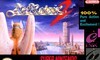
North America
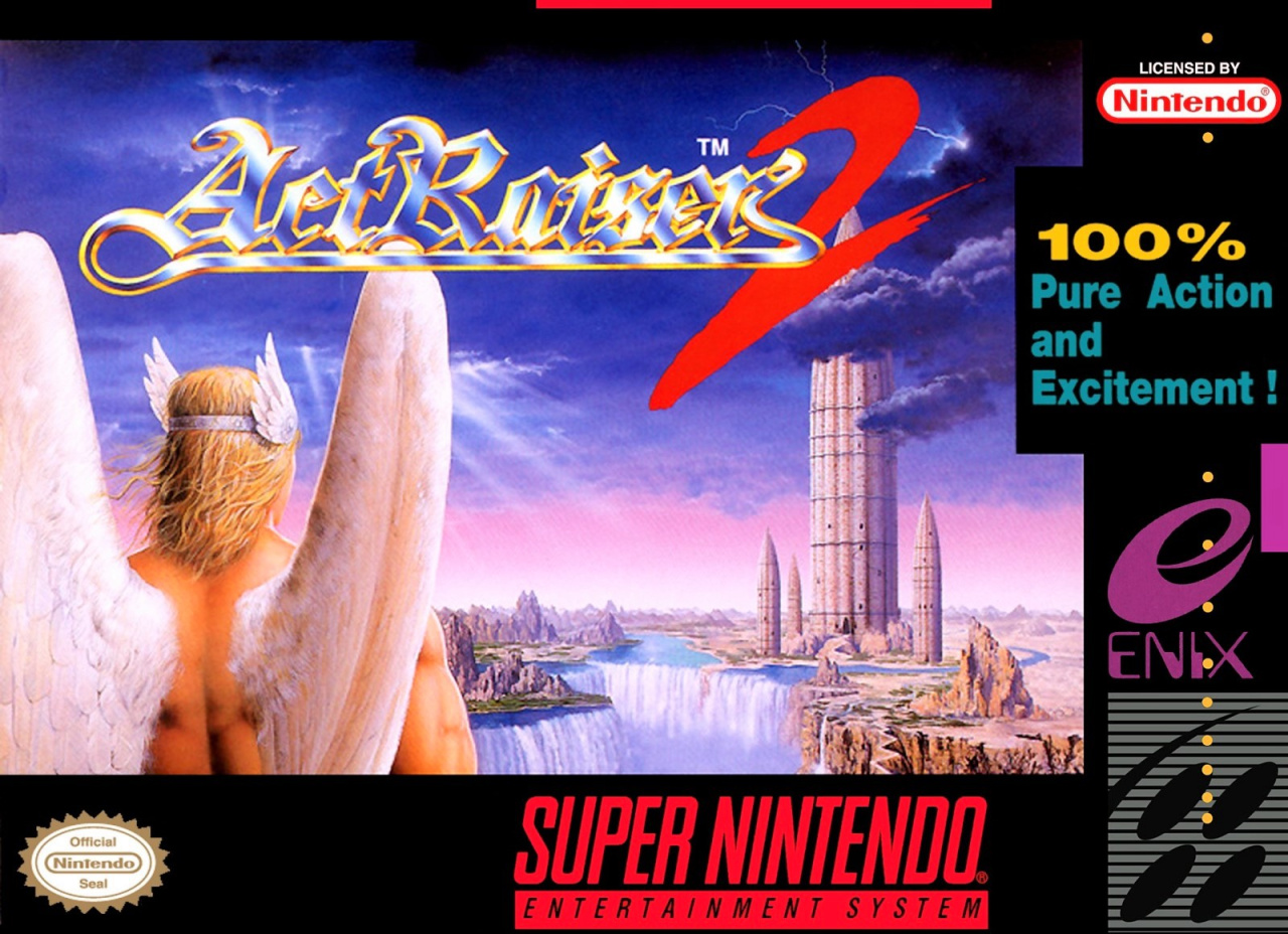
A winged hero stands (probably) overlooking a huge bullet-shaped structure surrounded by smaller 'bullets" perched atop a serene waterfall. God rays pierce through the cloudy sky as lightning crackles on the right. The logo is embossed and shiny with a scrawled '2' in red, and the tag promises "100% Pure Action and Excitement!".
There's a lot of empty space in the middle, and the border isn't doing it any favours, but it's not terrible.
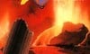
Japan
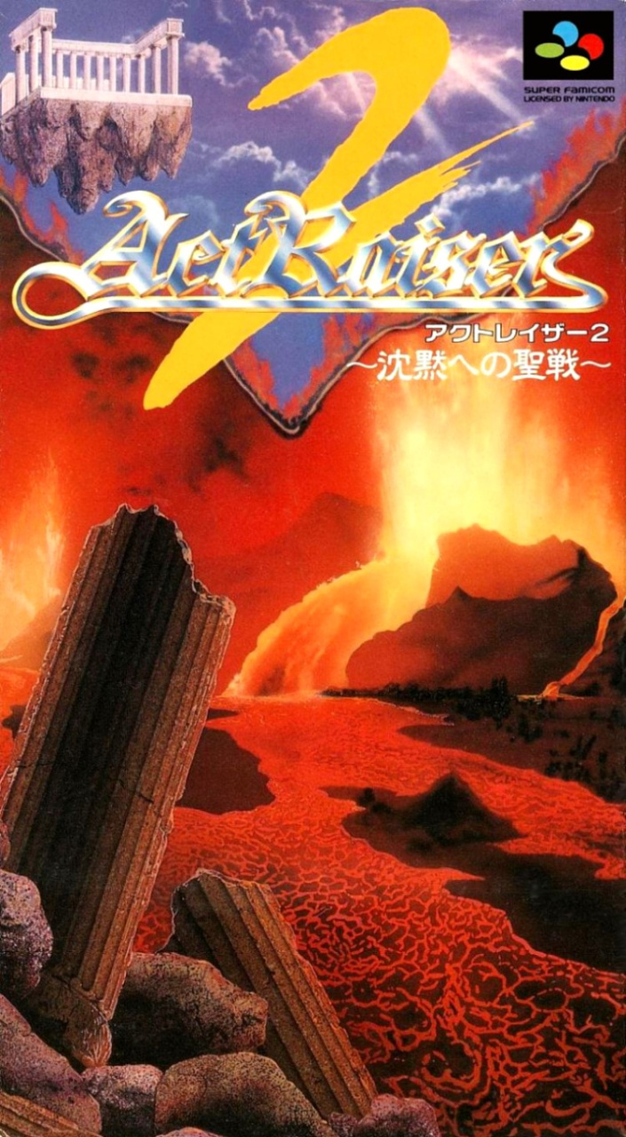
The Super Famicom cover features broken columns in the foreground in front of a river of magma. Volcanic eruptions spray into the air as Obi-Wan and Anakin duel just out of frame. The hot, red environment dominates the box, but up above is a similar sky to the North American version with a floating structure in the top right. The logo--a little hard to read here--features a larger yellow '2' positioned behind the lettering.
We like the colour and the heat here, but there's a lot of emptiness. We'd really liked to have seen that lightsaber duel going on.
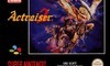
Europe
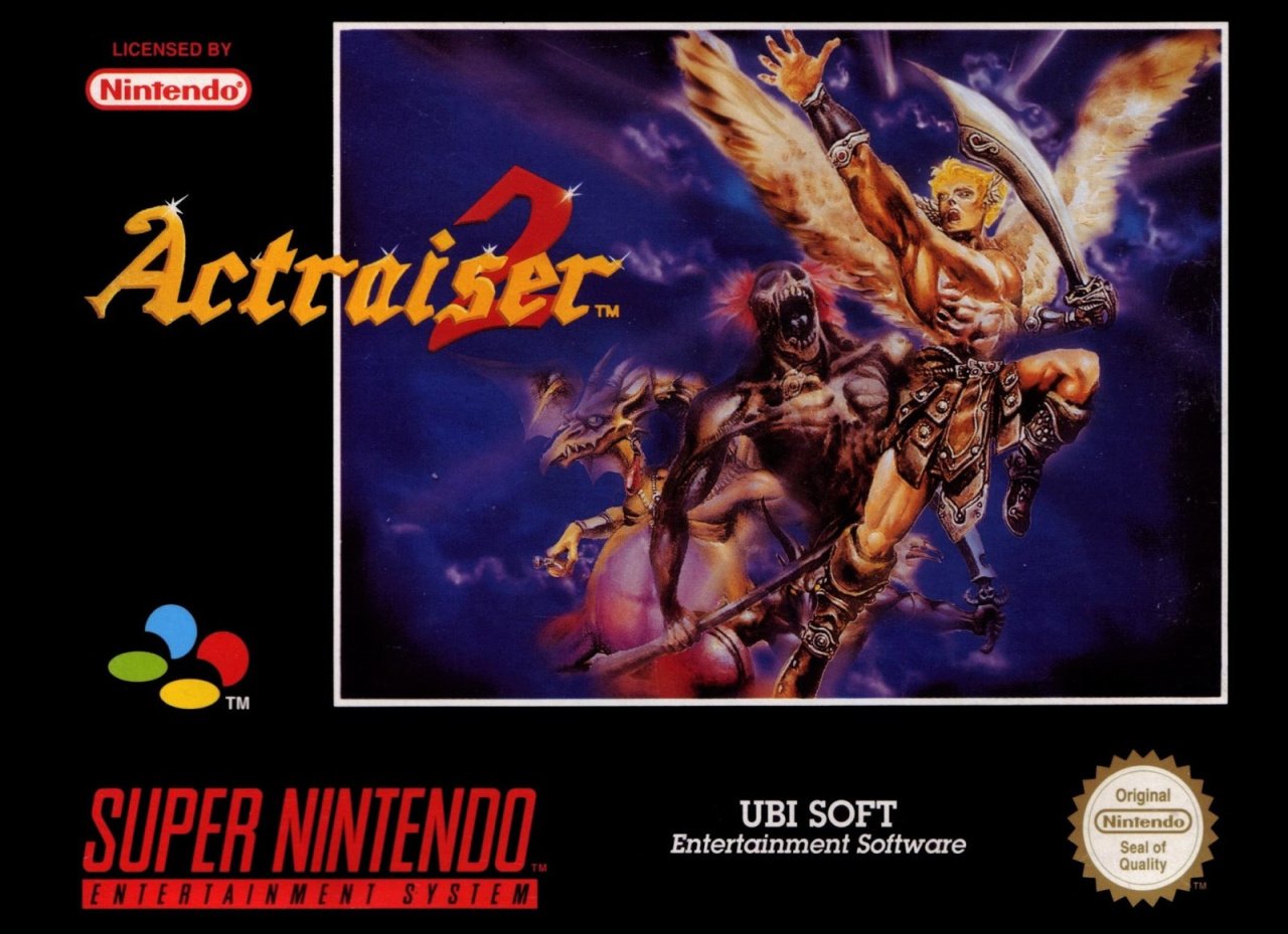
Published by Ubisoft in Europe (rather than Enix in the other regions), Europeans got a completely different cover again. The logo is less exciting but easier to read and the art shows the winged hero, here brandishing a curved sword and flanked by a demon-looking chap and what looks like a Jim Henson dragon-y thing on the left, possibly with two heads.
There's another horned nasty behind the hero's right leg, although it's hard to make out. Once again, there's an awful lot of dead space here, and while we like the elements we reckon better use of the available real estate could have been made on all three of these covers. Having said that, the space between the 'UBI' and the 'SOFT' on this one makes us smile for some reason. Whether that's enough to sway our vote, we're really not sure. Tough week.
Three covers, one vote. Pick your fave and give it a click below, followed by a click on the 'Vote' button...
That's all for this week. Join us next time for a trip down memory alley for another Box Art Brawl.


Comments 30
North America for me. I’m not prejudiced, but the scenery always gets me. Europe felt way to cluttered, and Japan didn’t put anything interesting, just... rocks. 🤔
America for me. Over the shoulder shot, god rays, fantastical buildings - it mostly works.
I like the Skeksi (definitely very Jim Henson!) appearing in the EU cover - but it’s so cramped, and the hero’s anatomy is weird. Japan’s cover is boring and tells me nothing about the gameplay - it could just as easily be a block puzzler.
Japan’s is just so good, though! As I previously mentioned, I like paintings in comparison to scenes from the game.
I picked Europe!
I'm honestly not a huge fan of any of those overall.
Love the NA one, but that caption is silly. Almost voted for EU on the caption alone.
I was a huge fan of the original ActRaiser when I was a kid, but the sequel was one of the biggest disappointments I’ve ever experienced.
I picked the American cover. I probably would have picked the European cover if I didn't hate the way the hero's head was drawn; it makes he want to rip his head off.
Europe without a doubt this time.
North America because Japan's art is a lot of nothing, and that Europe art is kind of ugly.
And about that UBI Soft non-logo, pretty sure UBISoft had a colored-shapes logo at that time. Or was that just its US division?
One of the few weeks I could have used a 'none of the above' option.
NA looks far more cinematic, definitely the one I would pick up over the other two.
"While the sequel was generally less well received (having ditched the top-down god sim gameplay of the original)"
Don't forget about the lousy control and the absolutely crushing difficulty.
I dont usually comment on these, but as I voted I kinda just realised that this was the first time I've voted for the NA artwork... obviously others do vote for it but it's just never appealed to me. Wonder why...
US - Action and excitement? Yet chilling out to some picturesque scenary? Yeah, nah.
Japan - You were the chosen one. You were meant to win this poll, not lose it!
EU - Scruffy. Crowded. Badly drawn in places. But heck, at least it's...erm...I don't know what lol. EU this week for me. (But I have no idea why lol.)
I wouldn't really consider any of these good as covers go. The art for NA and Japan is technically fine, though both have uninteresting composition for me. Europe's art could be better, but has better composition for cover art. Unfortunately, the black border takes up so much space as is often the case. While I'm not a fan of any of these, Europe is my preference.
None of them are great by any means, but I chose the US box as the scene has a sort of refined subtlety to it.
NA looks like the cover to some 80’s porn... dude looks naked.
All are horrible.
Pass.
These are all kinda ugly.
@Cotillion it’s almost like the 3 bears story, agreed, Japan has nothing on it, Europe has way to much on it, and NA is just right.
@Shiiva they are all awful, but NA wasn’t cluttered like Europe, or trashed like Japan’s, it offered a bit of mystery to it.
@LunarFlame17 Have to agree. While Act Raiser 2 was better than the action sections of the first game, it was still too basic to hold up on it's own. The first game being and okay action game mixed with an okay god sim, came together in a "the whole is greater than the sum of it's parts" sort of way.
Fun fact about the American cover art (which is gorgeous art in this case): the image was originally featured in the back of the Super Famicom version's box
The European cover, much like the PAL cover for Software Creations' Equinox, is simply crap in my opinion (also, the first "r" is supposed to capitalized)
To each their own
I want to like the European box, but I just...ugh.
I feel like the American box is apologizing for the god-sim portion of the previous game.
Box Art Brawls Current Total:
Europe: 15
Japan: 19
North America: 16
Japan's actually not as bad at first glance - notice the scorch marks in a 'V' shape implying the hellscape is consuming the heaven's above....okay it's still not great but it has subtlety.
Edit - looking at it again there's kind of a face in the smoke above the pillar.
Europe, easily. God save the Queen.
Looks like brazilian "catuaba" label
I've never played it, but I'm giving this vote to Europe.
At a glance I hated the European version but upon zooming in the demon thing was really creepy and really well done.
Europe gets my vote this time.
Show Comments
Leave A Comment
Hold on there, you need to login to post a comment...