And we're back with another edition of Box Art Brawl, your weekly opportunity to peruse covers of video games past and pick your favourite.
Last week we checked out Super C, although Super C didn't actually win the vote. Nope, it was the European Probotectors who took the title with a small but significant (and surprising) margin over North America’s Billy and Lance. Who would have thought a couple of robots could take the crown from the Contra legends?
This week we're looking at one of gaming's most infamous box art images, at least in the West. The story behind the off-kilter North American cover is an interesting one (far more interesting than the game inside the box) and it has gone down as one of the most notoriously covers in video gaming history. It’s got a high WTF-factor, but we've seen far worse and the 'banjo man' cover certainly grabs your attention.
Subscribe to Nintendo Life on YouTube846k
But should that be a factor in your voting? That, my friends, is up to you...
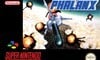
Japan
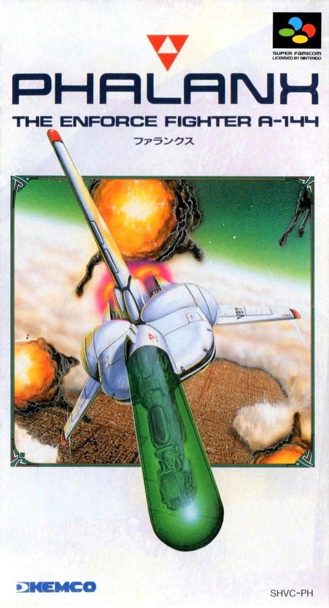
We begin in Japan. A ship (which resembles an Imperial Shuttle with a giant transparent green phallus bolted on the front) flies over a city revealed through an otherwise cloud-covered planet surface. Billowing orb-like explosions fill the air and the top fin and cockpit (careful with your emphasis, there) break the border of the square image, bursting out into the white/blue of the long Super Famicom box.
The logo is understated and effective, there's an upside-down red Triforce, and the Super Famicom and Kemco logos are both classily subtle. It's a shame that the game is a bit rubbish, but we don't dislike this cover.
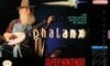
Europe
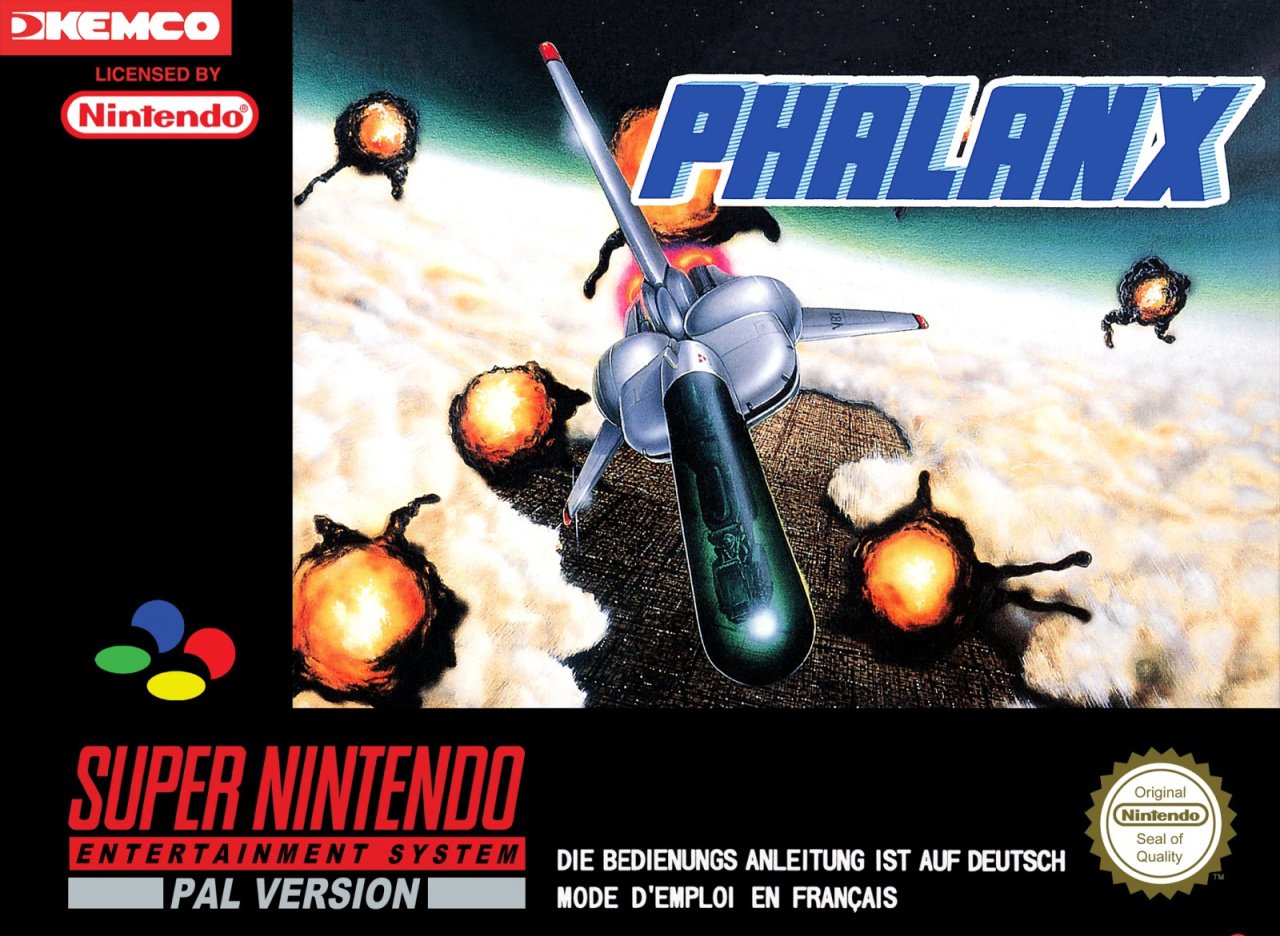
Europe uses the same key art as Japan, although the contrast has been blown out and the colours muted. We get a wider view of the planet below and more explosions are visible. The logo is a little generic, and there’s a lot of black space in the border here which might have been put to better use.
Not awful, but a better job could have been made using the same components.
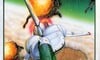
North America
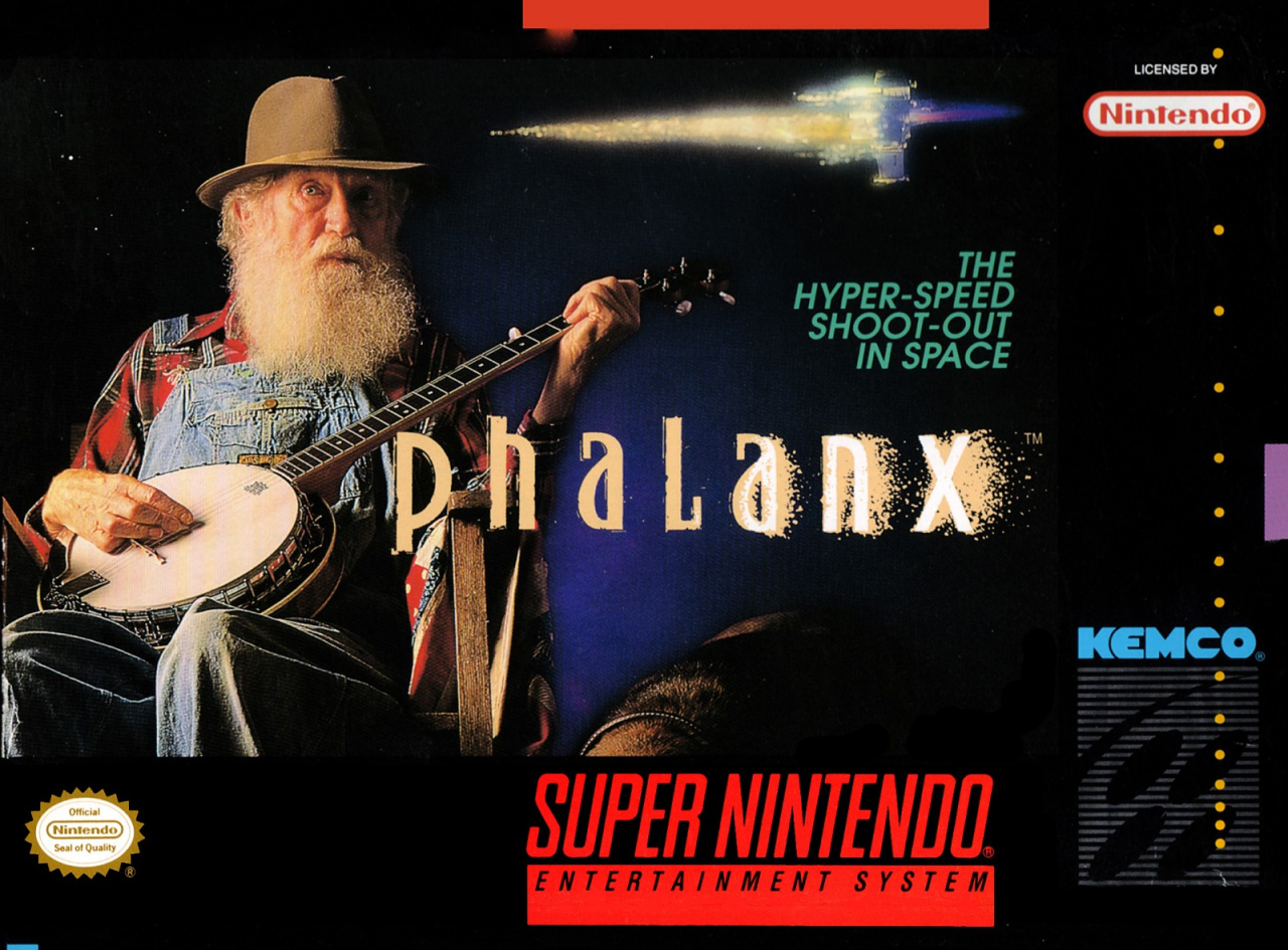
Ah, banjo guy. In order to indicate what the game actually is, the infamous North American cover gains a tagline: "THE HYPER-SPEED SHOOT-OUT IN SPACE". There's also a small ship added above the tag, although it's difficult to tell if it's flying towards or away from the old bearded banjo player.
The juxtaposition here draws your attention, and we also like the logo on this one, with the letters gradually shedding their pigment as 'dust', or something, as you move along the word to the 'X' (and the tiny trademark symbol).
As box art goes, it's a difficult one to evaluate. In many respects, it's incredibly successful at what it does. How many of us would never have heard of Phalanx were it not for this cover? In terms of capturing attention on store shelves, it did very well.
Many believe that great box art should communicate something about how the game plays to the viewer. We're not sure we agree, but we're not the ones voting - that's in your hands, dear reader!
Banjo dude or phallic gunship? That's your choice this week. Click your favourite cover and hit the 'Vote' button to let us know your pick below:
And so ends the 45th round of the boxiest of art-based brawls. We'll see you next week for Round #46.


Comments 55
Banjo as I love the randomness!
Gotta go with banjo. In all honesty, the other box art would fail to grab my attention in a shop. All I see is a weirdly shaped test tube rocket with flying oranges dunked in dark chocolate. (I know they're supposed to be explosions, but they don't look like 'em.)
I really don't get the NA one, banjo? If I saw that in the shop I think I'd just skip it as I usually tend to go with the mindset that the cover does represent the game content and that ain't enticing to me personally.
Japan and Europe kinda equal though giving to Europe as black border looks better that white.
The banjo cover is pleasingly insane... but I would look the other way if I were looking for something to buy/rent. I like the Japanese cover because it's reminiscent of classic Atari artwork.
Voted NA because BEARDS.
I always wondered what the hell was up with that old fart playing the Banjo cover? Honestly all the covers suck. The one with the ship looks like someone just drew a dong with wings added to it. 😜
@Incarna Yep. It’s real
Everybody's talking about the old banjo player and I'm thinking what's up with the ship having a giant green... (((you know))) attached to it...
It has to be banjo, absolutely love it. Although if i was a single minded kid i hate to admit i would probably overlook this as i wouldn't know what the hell its about.
The North American cover is memorably awful, but Japan has the actual best one, to me.
Hillbillies and spaceships for the win! Back in the day I rented and tried for that cover alone.
Decades later I can’t even remember the gameplay (a same-y side scroller shootemup?) but that bizarre box art Americana is hard to forget.
@Jakiboy
Notice there are two orbs towards the rear of the ship?
They’re all pretty terrible, for different reasons. Europe is just bland, but probably does the job best for the game. Japan is, er, to the point (call Freud) - that is a really awful ship design! NA, on the other hand, is ludicrously, historically bad - and easily the winner.
Banjo Man needs to be in Smash!
Is the game called Phalanx because of the ship or was the ship designed after the game was named?
I am dissapointed at how often the JAP boxes are the worst. US is absolutely the best. Top 10 best box arts ever.
@shaneoh If the final boss is a giant mutant space vagina then this game would be an instant 10/10
Actually I think the ship looks more like an endoscopy capsule. They should have made the game take place inside the banjo playing guy!
"Sometimes a spaceship is just a spacehip, ja?" - Dr Freud.
The ship looks so dumb that I have to go with banjo dude
Banjo Man all the way. I've never played this game, and I may never play it, but if you say "Phalanx" to me I can instantly picture this box. It's bonkers, and I love it.
US one!!! It is a totally nonsense... I love it 😂
Why is NA winning? That's a bad cover art. Japan should be winning by a mile and no way EU should've won last week either.
I actually remember now that our video rental place had the US one. I probably rented it too. At the same time I don't remember ever having seen the EU version in stores here, so either it was never released in Holland or the banjo player just made a huge impression where the EU one just looked dull to me.
Could you guys do a story on the history of these box arts? Why was the banjo guy used? Who designed the ship? Also, at the end of the year, maybe take all of the winners so far and do a tally of US vs Europe vs Japan to see who comes out on top.
"it has gone down as one of the most notoriously covers in video gaming history."
Most oddly sentence.
Box Art Brawls Current Total:
Europe: 14
Japan: 17
North America: 14
@pipes They already did. Type in phalanx in the NL search box. 6 nov. 2017.
Banjo player could have saved Animal Crossing Amiibo Festival. I normally go with the EU covers as they bring back personal memories, but there was only one real choice for this. Well done you lucky Americans.
NA for pure absurdity.
Sorry but as inaccurate as the NA cover is. I LOVE IT. It's very bizarre and because of that it is probably one of the most memorable SNES game covers EVER. It's VERY funny.
So Japan and Europe covers have a phallus, and North America a banjo string...
@JohnnyC That's about all we have going for us at the moment.
Fun facts about the Banjo Guy, from Destructoid:
"His name was Bertil Valley. He was a volunteer Santa Claus for over 25 years, and he owned his own successful construction company for over 20 years. By all accounts, he seemed like a pretty upstanding citizen. Unfortunately, he passed away back in 2004..."
The American box art is legendary! I was so close to picking the SFC box art, just because the cock pit flies out of the frame and in your face! Unlike with Mega Man, I'm choosing the bad box art here, but I will leave you all with this:
Well now it makes sense what is with the Banjo playing guy on the NA cover. Nintendo would have probably got a lot of heat if they released the game with the Japanese cover with that spaceship looking like a dildo. Makes sense now.
@Spoony_Tech I am thinking that Europe won last week cause well this is mainly a European site and alot of the people here remember that one the most.
I vote Japan. I always hated that US cover. I still do. It may have stood out for that cover, but I would not have even checked the screenshots due to the cover and would have actively avoided the game.
Japan for me, the NA one is garbage really, I would have completely ignored that if came to Europe back in the day.
Maybe I have a dirty mind but that ship looks like a giant phallus. It looks so phallic that I'm a bit confused as to why the box art was green lit in the first place. The NA version is attention grabbing to the point of amazement, so that gets my vote.
I like the NA one because it gives me the idea that the old man is telling a story by campfire that is known throughout the galaxy.
Europe makes the ship's... unfortunate shape not stand out as much, which makes it the best IMO
It's funny seeing the US one leading the poll. At the time is was a laughing stock. Proof we are getting dumber lol*
*Of course I voted for US! Lol
This is a great game, mostly avoided thanks to some plonk playing a banjo on the cover. The Jap, UK cover wins hands down. Whoever gave the green light on that ridiculous cover should of been sacked.
The EU and Japan covers are so bland that I think NA just wins by default.
I read the title and thought "Santa with a banjo" so I guess that wins by default.
The banjo guy was the main reason I wanted to try this game when I saw the box art in Nintendo Power back in the day.
@Tasuki Yeah I know but that wasn't even the real intent of the game that's why I figured it wouldn't win.
@Spoony_Tech No it wasn't the intent but, it's all Europeans knew untill the internet.
"It's a shame that the game is a bit rubbish"
Lies! Dirty lies!
Ok the game is just mediocre but not the bad kind, it has good snes graphics lots of effects and you can adjust your speed to match the pace of the current encounters.
Normally I'd say something like NA's cover is bad, but I think Phalanx is a special case. It stands out on a shelf, everyone remembers this cover because of how bizarre it is, for that it's the best cover here (particularly as the other two just scream "generic space shooter" which may be more accurate to the actual game, but not unique at all).
That ship is very phal- ooh.
How couldn't I choose the nonsense American one. Its the most iconic, and the only one I know.
AVGN probably said it best. "It's a bad cover... but it's kept it fresh in our minds for over twenty years."
@syrupdash
'' 'Sometimes a spaceship is just a spacehip, ja?' - Dr Freud.''
Was this an actual quotation of a certain "Dr Freud"?
Show Comments
Leave A Comment
Hold on there, you need to login to post a comment...