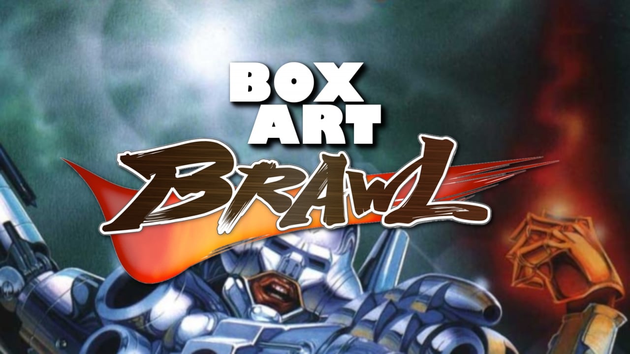
It's time for another round of Box Art Brawl, your weekly opportunity to get uppity and opinionated over regional cover art that once adorned the packaging of video games around the globe.
Last week the European cover of Pikmin 2 emerged victorious after scrapping with its brethren from Japan and the United States. Yes, the EU cover (which was also used in Canada) won with over half of the total votes cast, with the US version not far behind and Japan languishing in last place.
This week we skip backwards two generation to Factor 5's Super Turrican on the Super Nintendo. Super! This run-and-gunner released in 1993, although more recently you may have seen (or played) the nifty 6Mbit Director's Cut of the game integrated into every Analogue Super NT.
Let's cut the talk and take a look at this week's candidates, starting in North America...
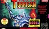
North America
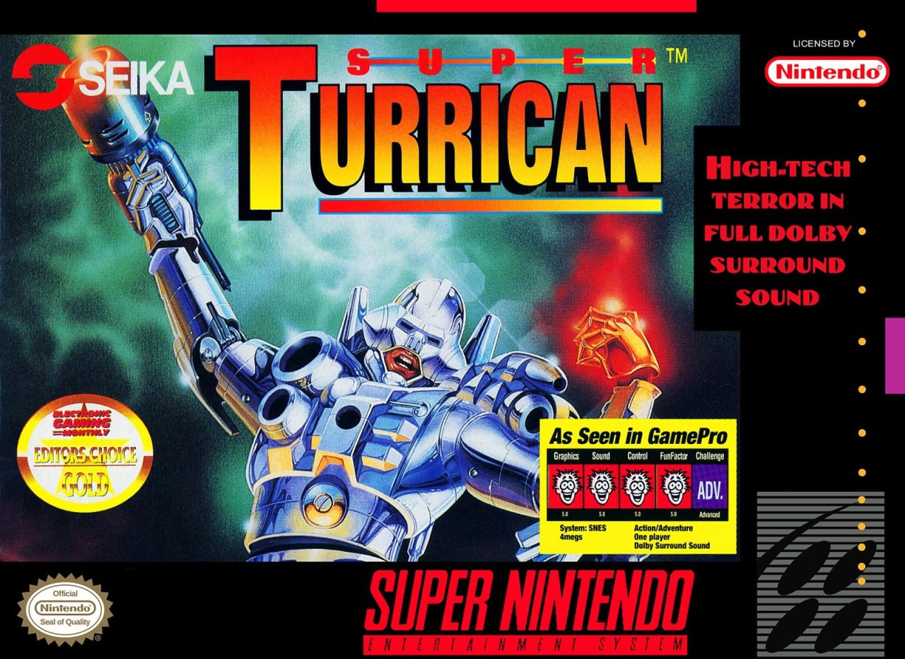
The North American version uses art from Turrican II: The Final Fight (as did the European version and the sequel), a game which released on other platforms. It is surrounded with the usual NA Super NES cover accoutrement, including a tech-brag tagline. We're suckers for that sort of thing and "HIGH-TECH TERROR IN FULL DOLBY SURROUND SOUND" pushes our buttons just right. Less welcome are the endorsements baked into the cover here from GamePro and EGM. Actually, the EGM one is fine, but while the GamePro one gives us a shot of nostalgia (ah, remember the days of 'Fun Factors'?), it's a distractingly ugly box that hides the quality key art below.
Top it all off with a pleasant red-orange-yellow logo, not to mention that snazzy publisher logo from Seika, and you've got a strong opener that could have been better.
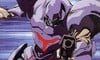
Japan
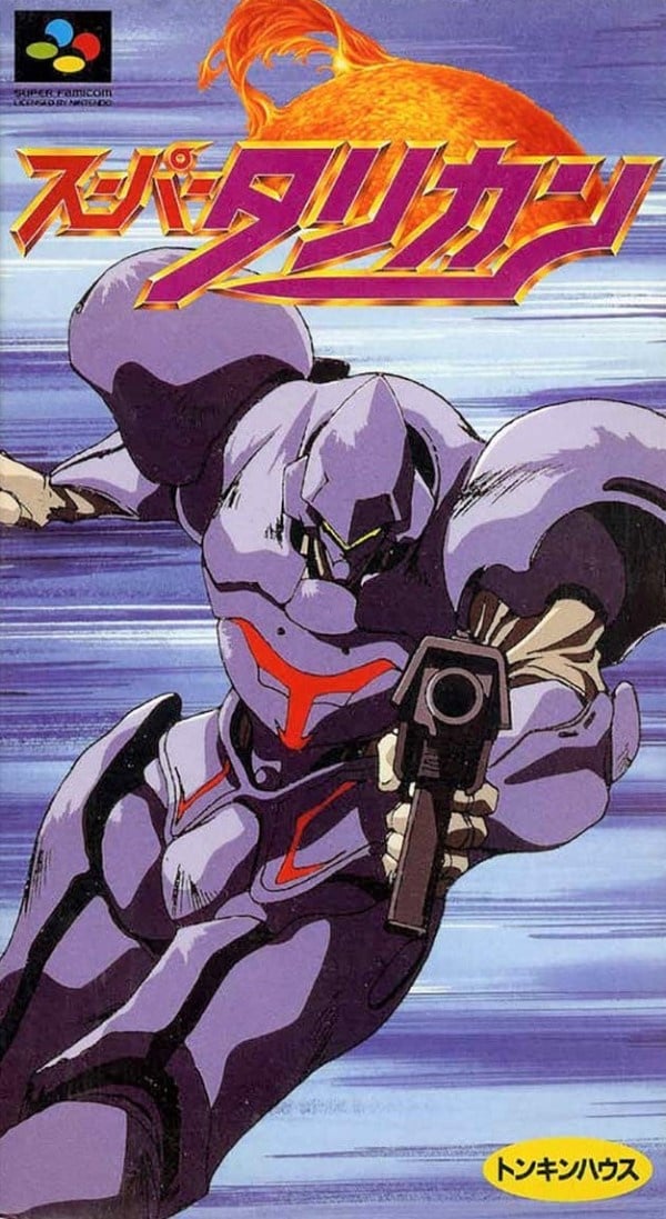
The Japanese cover used totally different artwork which focuses on a figure with a gun who looks not unlike the Guyver. We like the gold embossed logo over the flaming ball-thing and the background conveys a sense of movement well enough. The blurred blue backdrop feels a little bland, though. And Tonkin House's publisher logo (the yellow oval in the bottom right corner) is, frankly, rubbish.
So once again, decent, but could do better.
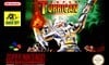
Europe
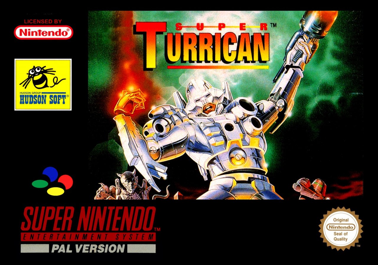
The European version flips the art used in the NA variant (presumably so the logo could stay in the centre without blocking our view of the big gun) and we get a glimpse of some creatures flanking ol' Tony Turrican. The entire image is reduced in size compared to the American version, as is the logo, and there's an awful lot of black on this cover which might have been better used.
This version has its token distracting yellow box thanks to the Hudson Soft logo, a real mood killer if we're honest. It also loses the tagline and feels (to us) like a watered-down, conservative take on the North American cover.
So, there they are. They've all got their faults, but which one floats your boat? Click your favourite and hit the 'Vote' button to let us know below:
And that's your lot for this round. Join us again next weekend when three more candidates come on down for some rough-and-tumble. See you then!


Comments 42
Europe this time, the as seen in Gamepro killed the NA one.
Great game. Quite like all three of these, but they all have faults. Too much black border on EU, too many logos on NA, too much generic anime styling on Japan. That said, even though it looks nothing like the Turrican of my memories, I quite like the angular anime style, so going for Japan.
The character on the Japanese cover looks nothing like the in-game hero. Or maybe I'm just too used to the shiny silver representation. I had 1 and 2 on my trusty C64. They were both simply incredible. Anyway... I went for the NA cover, despite all of the logos on it!
Turrican 2 on the Amiga is still one of my all time favorite games so I’m biased towards that artwork
Both Turrican games on the SNES are decent as well, would love to see these added to the Nintendo online roster of games or even have someone do a Sega Ages style individual release
@Sszx09 there’s always Gunlord x on the eshop closest thing you will get to a modern day Turrican has great music as well
@Gs69
Oh yeah, bought that the moment it came out. Really enjoyed it and the music is indeed fantastic.
@Sszx09 it’s a great game have it on Dreamcast but it’s quite difficult switch version is a bit more finely tuned
Easy
Peasy
Japanesey
Honestly, none of them are very good. I picked Japan even though I find it bland because the suit design is just so silly.
The Western art is ridiculous. His gun hand defies all logic, and his mouth looks like the College Humour Batman videos. Overall looks like a Rob Liefeld castoff.
Can’t decide if the EU one is better or worse, for letting you see the Gargoyles from Disney’s Hunchback laughing behind the main dudes back.
I love both snes and mega turrican games. As far as art I’ll take th NA version but not really a fan of any of them, too much blank space on one hand and garbage filler on the other. Japan’s never will win for me simply because I don’t like the box shape. Turrican 2 looks so similar to turrican 1 snes. But in this games case don’t judge a book by its cover because it’s a great series.
Japan easily. The other ones just don't look good imo.
Eh to them all. I like the Hudson Soft logo tbh, more than any of the box art, it brings back memories. So I went with Hudson Soft, the logo.
I voted for Japan, lovely art and reminds me of Cowboy Bebop which can only be a good thing.
This is a toughy this week. None of them leap out at me to be truthful.
North America for "High Tech Terror" and the nostalgic (and correct) Gamepro scores, cheesy as they are. Japanese one is kind of neat, but also super boring to me.
The series wasn't that good without Manfred Trenz developing the games anyways
But the first Turrican had the best art.
I picked the NA one because of the Gamepro rating.
None of these are particularly good, but I went with Japan as it's the cleanest (it could definitely use a bit more flair, though).
Japan by a landslide. I like the classic anime aesthetic, plus the realism on the other two covers looks a bit cringe-y.
That's 6 megabits, not 6MB on Director's Cut.
Well, at least the GamePro rating removed the "Available Now" info, but left in the "System: SNES" part.
Though Seika had also used the same ratings stuff in the magazine ads which also advertised the NES version which ended up only released in PAL.
So Hudson did publish the PAL version of Super Turrican. I had wondered if they had just replaced Seika's name on the copyright for the Wii VC release (whereas most games had been released, keeping in defunct original publisher info).
Japan, obviously. But the NA version gets bonus cheese points for the "As seen in GamePro" box.
I understand how the Japanese Art could be seen as generic, but the movement and energy of it is just so darn cool. I like judging these with the consideration of how I would've felt picking these up as a kid and the Japanese one definitely would have drawn my eye.
While the US one is fun with the tag lines and critical reception, it just doesn't beat the smooth coolness of the Japanese cover for me.
Tricky this week as I'm not a fan of any of them really, the japan art wins out for being an unusual take on a box art. You could call it it lazy but it just seems better than the other two which are basically the same.
Box Art Brawls Current Total:
Europe: 13
Japan: 17
North America: 13
Definitely Japan for me. Europe has too much border. The art used for both NA and Europe has some problems. As mentioned by someone else, the hand with the gun looks off. The worst thing I can say about the Japanese cover is that it looks like an unused frame from an unrelated anime. With that said, it's dynamic and very well drawn(I love that it looks drawn rather than computer rendered). And I really like the anime style of the time in general, and definitely for something like a power suit. I think it's just a nice piece of art, and it works well for Super Famicom's vertically-oriented boxes.
Can I vote for none of them?, they all have the most ugly video game box covers I have ever seen.
The Japanese cover art just looks like a screenshot from an anime.
@RPGamer Let's petition the return of Hudson Soft, first game a game based off of Cowboy Bebop.
I voted for Japan.
Easy win for Japan this week.
I like the anime inspired one. SOmething about the US always rubbed me the wrong way...and it was definitely the gamepro thing.
R.I.P Electronic Gaming Monthly & Gamepro magazines. I miss you both.
Japan by far. That guy looks awesome!
I have never heard of this game, but the European one sticks with me. (And I have a giant soft spot for the Hudson logo)
Japan is going to win by a 1000 miles ¯(ツ)/¯
@CurryPowderKeg79 Gamepro was my go to mag until they have Masters of Teras Kasai a glowing review. I thought "Yes, a great star wars fighting game!" I bought it immediately and it was one of the worst fighting games I ever played. Never bought another issue.
Man, these were all terrible. Went Europe because the NA one was ruined by endorsements and Japan just looks like a generic mech from Neon Genesis Evangelion
The Japanese one is way better than the others, and I'm relieved to see the majority agree with me.
@KingMike I've added an 'it' to the 'MB'. Cheers
NA wins for me. Always loved the Gamepro review faces.
Tap here to load 42 comments
Leave A Comment
Hold on there, you need to login to post a comment...