Welcome to round number 9 of Box Art Brawl, the series where box art variants from different regions go through a rigorous training montage before cracking their knuckles and duking it out under the watchful eyes of you lovely people.
Last week Michael Biehn made a very much uncredited appearance on the three covers of Metal Gear on the NES, but it was the North American version which ultimately terminated the competition, with the Japanese variant going the way of Bill Paxton's punk early on and Europe taken down not long after like Sarah Connor's best mate. We honestly thought it was going to be closer, but you never can tell with the crucible that is the bagarre de box art, as they almost certainly call it in Cannes.
Subscribe to Nintendo Life on YouTube845k
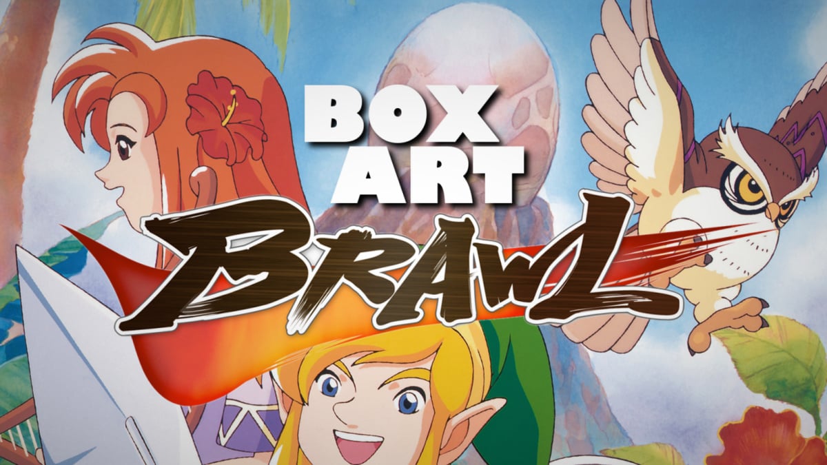
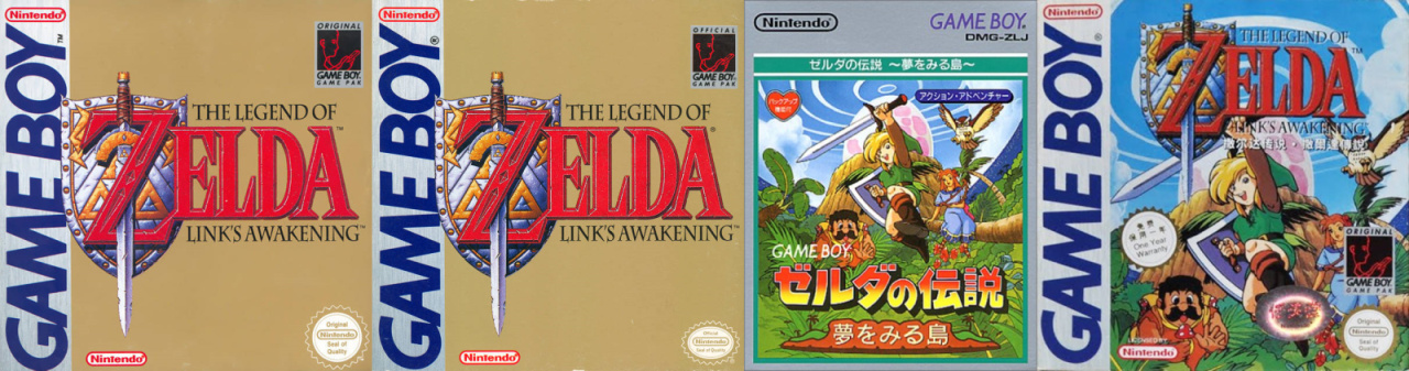
Today we welcome our first contenders from the world of portable gaming - a handheld classic which has very recently made a comeback with a shiny new version on Nintendo Switch. You might have heard about it? Yes, The Legend of Zelda: Link's Awakening enters the arena this week in its 1998 'DX' form. Why this one and not the 1993 monochrome original, you ask? Well, the box art for the Game Boy Color version is a little more diverse and Box Art Brawl thrives on diversity!
So, let's rouse ourselves from slumber, grab a coffee and cast our eyes upon the castaways...
Europe
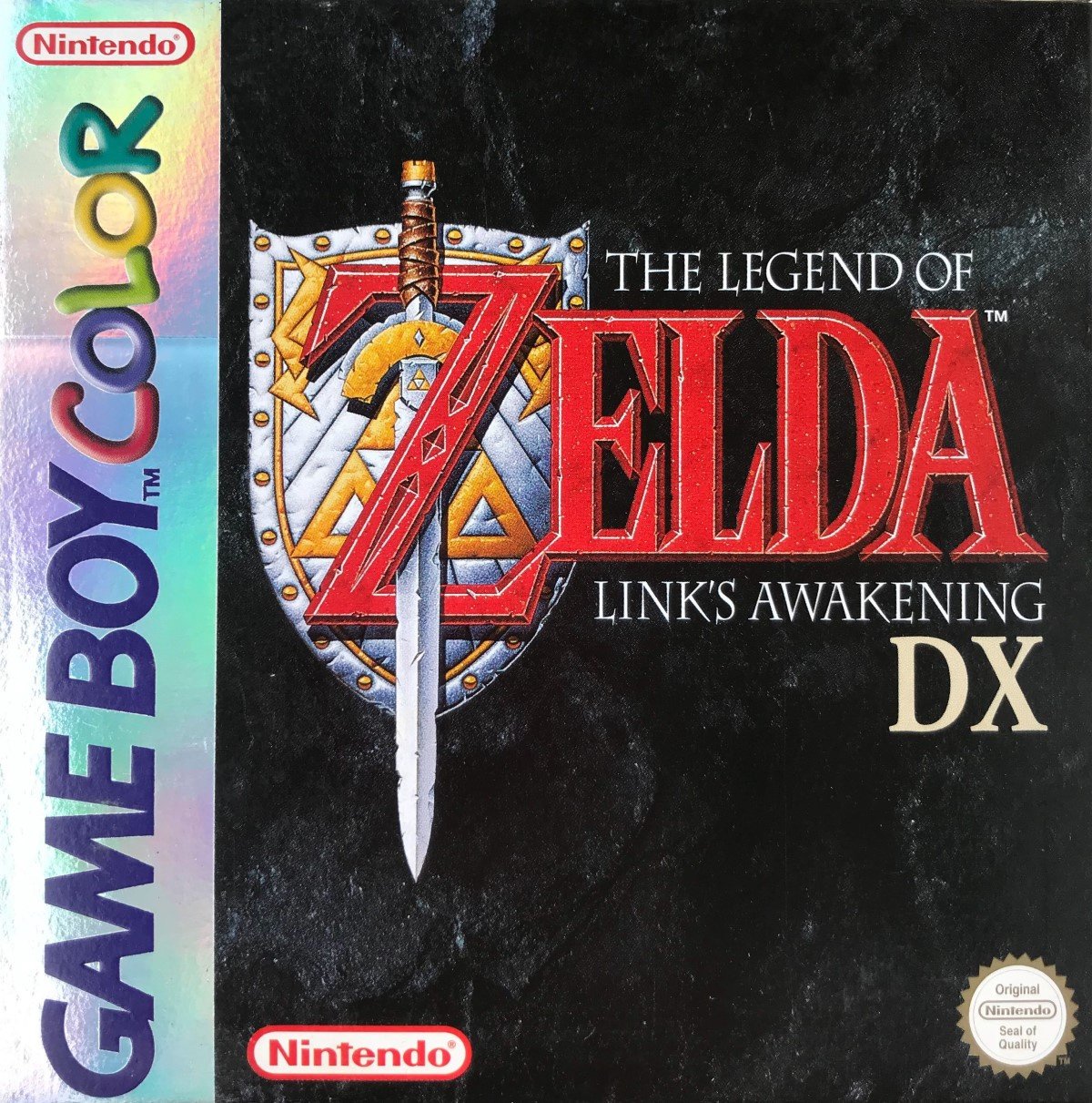
North America
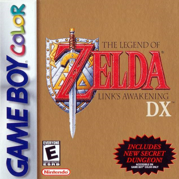
Similar to the European variant, the NA version more closely resembles the cover for the original game (see below in the bonus section). We get the same lovely sword and shield combo and the same red Zelda logo and text (this time in black) over a golden background. The Game Boy strip sits on the side again, although Nintendo of America managed to restrain itself to just one logo here. We also get the information about the extra colour dungeon in the bottom right corner which appears almost sunk into the gold background. Effective.
Japan
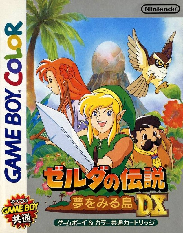
The sparse covers in the west were a significant departure from the Japanese version which showed off an arguably goofy-looking Link, Marin and Tarin, plus the owl, with the Wind Fish's egg in the background against a blue sky. The logo below has Koholint Island built into it with an embossed, golden 'DX' stood in front. There's another grey background behind all that and the Game Boy Color strip runs up the left side of this longer cover.
It's certainly colourful, but does it all hang together? That's for you to decide.
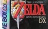
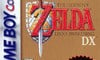
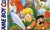
Bonus dungeon
And as a little non-poll extra, here's a look back at the original Game Boy version's box art. As you can see, both of the western covers are practically identical while the Japanese one is rather nice, if we say so ourselves. We've also included a Chinese variant which we like a lot:
There we go! Feel's like a dream, doesn't it? But who is the dreamer? Choose your favourite below and click that 'Vote' button to let us know:
Assuming you're not already full to the windy gills with hot Link's Awakening content, definitely check out our look back at the original from the beginning of the year as we anticipated the remake on Switch. That's all from the Brawl this week - feel free to share the adventure of your deliberations below and then you can get back to playing the remake. As you were.


Comments 69
Is this.. even a contest? Two boxarts featuring just the logo, versus one that has some actual fun artwork to look at.
I guess the other two can be good for simplicity, but come on.
God, I just loved the shiny multi-coloured "hologram" type strips on the left hand side of the European Game Boy Colour releases!
@Yosher Busier =/= better
I like the European the most, but none are particularly great. Japan could've had the edge with the illustration, if only Link didn't look so derpy
I always prefer the art over just a logo
First time seeing the Euro variant, and it’s quite stately on the textured black. The “secret dungeon” stamp on the NA takes up too much of the composition. If the Japanese cover was a comic book, I would read the snot out of it, but it just doesn’t read like a video game cover to me. My two cents.
Europe walks it again...
Every single time for me so far.
@8itmap_k1d Not saying it's better because it's busier. I don't even think the Japanese boxart IS very busy. I just think it's some lovely artwork which I also happen to think beats having just a logo slapped on a black or brown background.
If the artwork really was incredibly busy and just awkwardly put together then I would have agreed it would be worse but that is absolutely not the case here.
Different strokes for different folks I guess.
The original GB Chinese one.
Europe all the way here. Let's be having you!!! Arrrrrgh!
"As you can see, both of the western covers are practically identical while the Japanese one is rather nice, if we say so ourselves."
Did you create the Japanese box art?!
You would expect the country of origin to have the nicest cover, but my goodness, it looks like it was drawn by me, and that is not a compliment. Europe is the clear winner for me, though the tone of the game doesn't really match the tone the cover invokes.
NA for me. Like ALttP, I love that sword/shield Zelda font on the gold background. So iconic and brings back memories.
I am probably going to get stoned on this website for saying this but, despite how much I regard the actual games, western Zelda cover artwork has always been uninspiring. Sure, it's an iconic logo, but so is Coca-Cola...and I wouldn't vote for that either lol. It certainly stands out more against the black background than gold anyhoo.
So I voted Japan, but I will concede by default. The composition is a touch crowded and Link looks like he forgot himself. It's not a great illustration but at least it's colourful. Going by past brawls, I dread to think what the Western versions of it would have looked like lol! Maybe that's why they went with logos hahaha.
Not a fan of the Japan box artwork myself, so I went with the NA artwork as it's background seems to fit better than the black one in the EU cover.
I went Europe. Not a big fan of the artwork of the Japanese version so it was between the other two. Tough choice but the new secret dungeon cost NA.
Japan gets my vote. At least it has some artwork on it and while it's not great artwork it's not terrible either. It's more interesting at least then a plain logo.
Japan because it has character. I never really liked how all the old Zelda boxarts in the west were always basically just the logo on a plain background.
For me, the Chinese one wins this week. I can't bring myself to vote for any of the others.
The Chinese one is easily the best.
I like the Zelda logos on a gold background, but the NA cover looks more like a weird brown than gold. I didn't know NA covers didn't have the holo strips near the spine where the logo is. So Europe it is.
Surprised Europe won. It's just a logo with a black backround
Box Art Brawls Current Total:
Europe: 3
Japan: 4
North America: 2
Europe for me this week. I like the gold background with the Zelda logo, together with just the logo it gives the box legendary look,a legendary look for a legendary series and keeps with the tradition of Zelda 1/2 / LTTP and then OoT. However it's been spoiled by the ugly 'new secret dungeon' logo. So the black background without clutter is a good alternative. Japan's just looks silly to me.
I remember when the first one came out, I was decidedly unimpressed and despite the fantastic Rik Mayall doing the advert, I still wasn't sold. Then I borrowed it from my friend from school a year later..... Omg, i was blown away!! The simple cover was so misleading, if anything it tripled the whole gaming experience of it. Apart from the name, logo, and sword and shield, the 13 year old me didn't know what great surprises were in store. When the DX cover came out I now thought "Less is more"
It still works.
🇪🇺🇪🇺🇪🇺🇪🇺🇪🇺🇪🇺🇪🇺✌🏾
Also,the Chinese cover of the original blasts the Japanese DX out of the water. The Japan cover must've been the result of a lost drunken bet..🍶
I stared at the Japan boxart for a while before I voted for it. I couldn't decide if it was fun or derpy. I eventually decided it was ok and interesting. Otherwise it would have been that lovely black marble European box
Yeah I voted Europe here, because I like that elegant black and gold color combination.
If we were to include any edition of the game, I’d give it to the package art (not cover art for game) that the recent European Limited Edition got. That image of Koholint Island is beautifully composed and leaves a lot to the imagination.
@talgore
"Got a light?"
I went with Japan; I'm slightly biased towards more artfully descriptive covers. Europe is a somewhat close second though.
Interesting to see some say that the simplicity of the Western designs turns them off. I've always felt that the simple design choices invites the imagination to run wild with the possibilities of the adventure within. I remember being very small and just staring at my brother's gold NES cart with its simple label, and longing to know what it was about.
I like the European art here. It doesn't have that obnoxious ad for the color dungeon, and the black background makes it stand out in comparison to the traditional gold of the series.
Japan easily.
It’s our turn to win
Why is the European one black? The whole point is that the game isn't in black and white anymore
Was going to vote Japan but I can't get over Link's face so Europe gets my vote this time.
The Japanese box art would look so much better if they simply removed Link.
Derpy Link is funny. Lots of people are so serious about their Link. Do you remember what he ends up looking like in the remake? Derpy Link is perfect for this game.
Europe. I love the rocky black background with the logo resting on top. Very eye-catching. The North American one second as I prefer more simplistic covers to the busy ones; speaking of the Japanese one does not gel with me at all.
The Japanese cover looks like bad fan art you see on tumblr/DeviantArt.
Probably the nostalgia talking, but the European one gets exactly the right feel of a stone from an ancient dungeon which I want to explore. With the "ancient writing" (the logo) on it, I know I must do somethig with this stone to further my quest. This makes unboxing the "stone" part of the adventure, even before you begin your adventure on Koholint Island. 😊
I would've liked to pick Japan, but the art looks... off. Failing that, I went with NA since it's the more familiar for me of the remaining two.
The North American and European boxarts (mostly the NA one) are just lazy version taken from A Link to the Past both the logo and the background. At the very least the Japanese one is showing you that it's a different adventure altogether. Some of my friends who own a Game Boy back then thought they are getting A Link to the Past on the go when really they are playing a different game. Some of them even ask me how come they never meet Zelda, I was like dude that's a different game.
Pretty sure that the source image to that Chinese GB box was used in Nintendo Power once.
Was not the American boxart GBC logo shiny as well?
Not into the japanese art, link looks like an idiot lol. EU takes my vote
@Yosher I feel the same way. Before I voted, I thought for sure Japan would be running away with this one. I would even put the NA cover ahead of Europe (it’s Zelda, you’ve gotta have the gold).
Honestly, I gotta say I like the EU one here. It's simple, but effective. You know you're in for something epic when you look at that. The NA cover is similarly effective too.
The Japanese cover? If I'm being honest, it's a bit goofy and cluttered. Not a fan.
Japan again for me.
Europe for me. I like how the black cover looks with the logo.
I chose the european because it’s clean and simple. The american looks like the regular version with a cheap ”DX” add-on and i don’t like the ”Secret Dungeon” sticker.
The japanese looks silly, i don’t like the anime style.
The EU is nicest. I’d like the NA backround more but that extra dungeon-sign..
The Japanese one is just awful.
That Japanese one is kinda bad. Europe for the win
Europe, no contest
@KryptoniteKrunch 100%
Not a big fan of Europe's black rock background. I almost went for NA but that color dungeon bit is rather obnoxious and takes up a lot of space so I went for Japan's rather pleasant, light-hearted art.
Japanese box art for the original release is pretty sweet.
I have no idea why they couldn't have kept the old japanese one. Link looks way cooler than the dx version!!
Japan for me for the same reason many have mentioned. I appreciate the actual drawn cover art over the logo-on-background approach. Western Zelda covers have never really impressed me, though I give them credit for using the gold which stood out back in the day.
Also, the Europe and NA versions don't have a cool owl. Japan has a cool owl. Extra points for that!!
The European version clearly outshines the North American version (even somewhat literally), but both of them are rather bland compared to the fun, colorful Japanese version.
Gotta go with the European one here. Love the black!
Japanese version is obviously the best. If you're voting for a plain black cover your soul is damaged.
Europe for sure. That reflective area on the left side really made the box stand out and easy to spot in the store.
The Japanese one looks really good except link looks ugly as hell. So I voted for the European cover. It looks like it's a quality product.
How is this even a contest?
And why isn't the Japanese cover winning?
I have to vote for Japanese box art if only for the fact that the European and American shield and sword logo was recycled from A Link to the Past! That disqualifies it for me.
The original Japanese art is pretty nice, but the DX version art looks a bit derpy.
Can I vote for the Chinese one? Please?
Man! Now I'm 9-0 for agreeing with the popular vote! Let's see if I can make 10!
This was actually tougher than I thought, though. I was able to rule out the JP version right away. But I struggled a bit between the more stunning and arresting EU design and the more classic, and "traditional" NA design. In the end, I just couldn't say no to that EU version! Sooooo beautiful, triple Nintendo logo thing be damned.
I wished the Chinese one was an option. Its even better than the new Link’s Awakening box art.
The Japanese artwork is fun and all, but I went for simplicity (European version).
Japan win by far, the others box arts is only the logo of the game in a background.
The art on the Japanese one is a bit average. The European one wins it as the black background works best with the lettering and the art design on the shield.
Show Comments
Leave A Comment
Hold on there, you need to login to post a comment...