And we're back once again for a Box Art Brawl! This is the series where we look deeply at three video game cover variants (yep, games used to always come in physical boxes, kids!) and use some good old fashioned democracy to decide which one is best.
Last week we looked at three versions of Goemon's Great Adventure on Nintendo 64. It was decreed by your lovely selves that the European version was the Mystical Ninja to rule them all, followed by Japan with the North American version a distant third. Congratulations to PAL, commiserations to NTSC.
This week we're looking at three competitors that you'll no doubt recognise even if you never actually played the game. The piercing eyes on these covers caught our attention many times on shop shelves back in the day. Yes, we're looking at the Delphine Software classic Flashback (or Flashback: The Quest for Identity as it's known in the US) this weekend, specifically the Super NES version. The game saw release on multiple platforms - indeed, it came to Switch last year so you can check out our review if you want your memory of this cinematic platformer jogged.
Ready? Okay, let's stare deeply into those eyes...
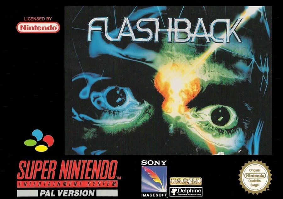
Europe

Flashback was released first for the Amiga and many of the box art versions across platforms used the same basic art in various configurations. A beam of energy hits the face on the cover right in the T-zone and it’s hard to tell if it's painful or pleasurable or maddening. Regardless, the stark blue/green colouring in conjunction with the beam and heavy black shadows set up the sci-fi feeling of the game well and the border doesn't interfere in any way like the usual PAL versions do with a seemingly arbitrary colour.
The logos stick out like a sore thumb against the black border, but these eyes stared at us many a time from the shelves at our local gaming emporium. Effective.
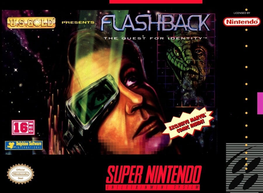
North America

The North American version is similarly dark in tone, although it substitutes the ‘eyes’ artwork. If the eyepiece with its green rays or the encroaching pixellation don't clue you in to the sci-fi theme, the morphing reptilian face on the grid to the right sure will.
Featuring the standard NA layout, it's a different tone to the others, but the more we look at it, the more we like it. Also, we might be going mad - do let us know in the comments - but after a while we started seeing Carrie Fisher. Maybe it's the eyes, maybe we've had a little too much caffeine as we write this, but we can't unsee Princess Leia.
Carrie Fisher. Tell us we're not alone.
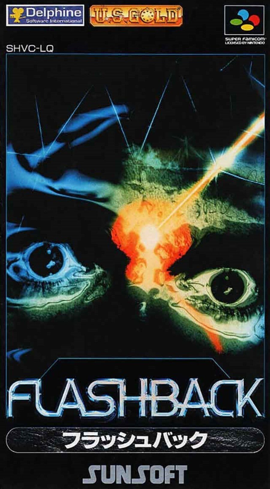
Japan

A return for the classic image, this time in portrait orientation. This means there's more black, but all the familiar elements and logos are present and correct. The Sunsoft logo also appears at the bottom (they published the game in Japan). Compared to many Japanese covers, this is remarkably restrained, but is it the best of the three here? That's for you to decide.
Those eyes! If you can stop looking at them for a moment, click on your favourite of the three covers below and hit the vote button to log your opinion and break us from the spell we're under:
Carrie Fisher, no?! Just us? That's all for this week, folks - have a fabulous remainder of the weekend and we'll catch you next time for another round of Box Art Brawl.


Comments 37
Every time I think of this game...
Carrie Fisher? No. The US one reminds of that old sci-fi series V, though, starting Robert Englund (aka Freddie Krueger).
I don't liek any of these
but ill go with Japan just for the simple starkness.
Then the NA cover because it's so different.
And the PAL cover limps behind, because it's an over complicated clashing mess, with all those fugly logo's against the stark cover.
Fantastic game! Blew me away when it first released. I massively enjoyed playing it again last year, too. But anyway. The NA cover just looks bizarre to me... and the Japanese one is a bit too close-up... so Europe gets my vote this time.
Europe wins again and easily.
I like the cool eye piece on the North American version, but otherwise the Japanese version is the best
Honestly never heard of this game before. It seems I’m missing out.
Love this game, great story and have the switch collectors edition at home
They're all not great
Never heard of this game
For those who never heard of flashback.
It's one of the first "cinematic" games.
With rotoscope type animation. ( ie very smooth think prince of persia )
https://www.youtube.com/watch?v=C5cu5h_150Y
But extremely difficult trial and error game play.
it was originally an Amiga title I believe.
They are all ugly.
The US one is...poor.
Great game through
Wow that American cover is terrible.
The American cover is one of the ugliest boxarts I've ever seen (it could give Karnaaj Rally a run for its money in the 'weird awkward head' stakes), so it's between EU and Japan. I'll go Japan because I don't really like the big black border on the EU one.
I can also see the resemblance to Carrie Fisher. You are probably still going mad, for other reasons, though. I don't love any of these covers. I voted for Europe's box. I think that art doesn't work as well in the vertical orientation of the Japanese box, so Europe it is.
Weird week were none are hugely appealing.
I like the North American cover.
Erm. None of them do anything for me this week I'm afraid. If my life depended on it, I would probably go for the PAL cover, but I am grateful it doesn't lol.
They are all pretty bad. I guess the NA version has the most going for it. The others are just some weird closeup of eyes with a laser beam going between them.
I never saw the US cover before, sooo ugly!
Box Art Brawls Current Total:
Europe: 4
Japan: 6
North America: 4
The Japanese one was the most striking so I went for that.
The US Cover is the least aesthetically pleasing, but it also is the one that piques my interest the most as someone who is unfamiliar with the game (What's the "quest for identity?" What is that morphing thing in the top right corner of the box?).
Recently picked this up on Switch per NL's recommendation, so I look forward to figuring out [Gilmour voice] "wot's . . . uh the deal?"
As a kid I think the NA one would have caught my attention more as a sci go nerd but the Japan cover looks nice and clean and aesthetically pleasing as an adult.
Japan and it isn't even close.
I would have said Europe but the Japanese one is the same thing only bigger and more impressive. Looks like a movie poster actually.
It should to be 100% for Japan. No question about it.
The American box art is a little generic and the European version obscures much of the art so Japan takes the gold once again.
Japan FTW because of Sunsoft!
Europe, obviously. That American cover is a thing of horror and an absolute atrocity. The European and Japanese covers at least show a picture that is relevant to the game, seeing as that was also the splash screen that you see when the game starts.
@Shiryu What the hell have I just watched?
@ThanosReXXX A youth well spend among the great classics of EDM my friend.
@Shiryu EDM Classics? They must have been scraping the bottom of the barrel with that one, then...
Japan for me. Second (though not close) would be NA - sure it's kinda ugly but it does catch attention. I don't like the one for Europe - the art is really crammed into the corner and those logos plastered all over a flat black border somehow feel more obnoxious to me than the admittedly messy NA cover.
@aromain150
Just like you! So you all win!
@SVO Lol
@Bunkerneath
Honestly that is the best cover for this game.
Show Comments
Leave A Comment
Hold on there, you need to login to post a comment...