When Diablo III: Eternal Collection unleashed hell on the Switch at the start of November, the game was widely praised for being a port that didn't cut corners or content just to make the experience function and fit on Nintendo's hybrid device.
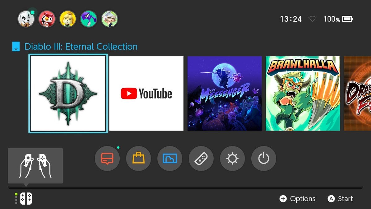
One of the few criticisms around the time of the launch was linked to the game's Switch HOME Menu icon. If you bought the title on release, you'll no doubt be used to seeing the rather dull logo (above) on a regular basis by now.
Over on the game's subreddit a week ago, Blizzard's community manager said it was only intended to be a temporary icon:
It was intended as a placeholder and the final one missed the submission build by JUST enough. Apologies for the flub up on our part!
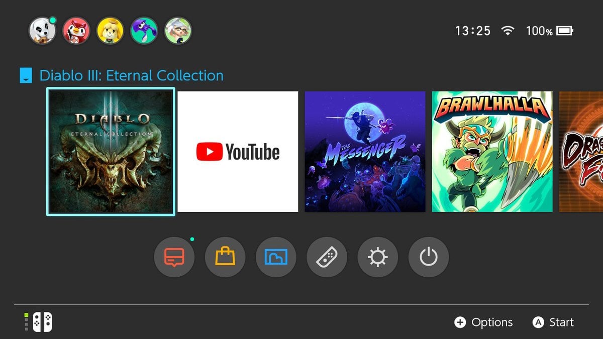
Fortunately, the game's latest update has now arrived. Apart from fixing a few bugs, it also replaces the existing icon with a much better one. Take a look below:
Unfortunately, this patch reportedly doesn't solve a recently discovered glitch with the Necromancer class, where its curses stop functioning. Blizzard has said the issue is currently being investigated and will be dealt with as quickly as possible.
What do you think of the new Diablo III icon on Switch? Are there any other icons you would like to see updated? Have you been enjoying Diablo since its release? Tell us below.


Comments 51
i was fine with it if it meant not downloading anything new
it was completely unplayable until now.
Man that original icon was bad, even for a place holder. It's like they were trying to trick somebody into playing it who thought it might be one of those 8-bit indie farming simulator games.
@Rika_Yoshitake I've played it a pretty good amount and no problems so idk what ur talking about, unless you just mean necromancer
So it took them that long to give it a good icon? Well at least I don't have to look at that weird D now.
Supposedly this patch is causing keywardens to not be tracked on the mini-map (purple arrow), but I may update anyways if it means I won't have to deal with enemies that sit at ~0hp and just stand there instead of dying. I had plenty of times where an elite or bounty kill would get glitched and I couldn't finish.
What a difference the change in icon makes! The game plays so much better now thanks to this new icon. Now I understand the power of marketing.
Tried playing last night after the update, the game actually crashed about 6 times in the hour and a half I played, anyone else have this problem?
I don’t mind the logo itself but since I opt for the black background, like the screen shots, the large white square is pretty off-putting
@Kurrenai
r/woosh
Now, if only Octopath Traveler would follow suit. It’s the most boring icon ever. A black square, with the title in white font. Lame.
@Frenean Dammit you beat me at it LMAO
The icon is more important than the class breaking bugs ofc!!!
Strikes me as a very minor detail, but I did think it was oddly simple.
@edgedino your comment is pure honesty. Love it
Does it matter what the damn logo looks like !!!!!
The Devil is in the detail.
It doesn't "matter" in the grand scheme of things. It doesn't affect my enjoyment of the game. But the old logo was ugly, and I'm glad the've changed it.
Now only Skyrim needs to update the icon to what the eshop shows and all will be rightnonthe menu screen.
@Kurrenai I see you're new around here. When Rika said "It was completely unplayable until now", (s)he is referring to how a terrible icon impacts your home menu's "look" greatly.
Back when we first got a few terrible icons, people had so many issues with their looks that they flat out didn't buy the games. Some games updated their icons because of a HUGE influx of emails asking them to.
So usually on topics like these (changing an icon), most people joke about the game being "unplayable" because they didn't want to buy it and have that godawful icon on their home menu
So the old icon is the one I've never seen before & the new one is just the ancient cover you can find anywhere on Google. Right. It's unfortunate that there are problems with the Necromancer as that is the class I wanted to play as most. I guess I'll have to buy it next year instead. This whole situation paired up with Ganondorf reminds me of Nintendo games on CD-I.
The Diablo III icon was the hardest thing to develop at her than the actual game it seems?
@OldMcGroin I don't play Diablo 3 but had a similar issue with another game and it was gone after I restarted the Switch.
Breaking news: Blizzard does more work on the aesthetics of Switch HOME menu in one week than Nintendo has done in a year.
"Hell, it's about time." isn't that a Starcraft quote? I get that it's fitting and both are Blizzard games but... Stuff like that just bothers me for some reason. 😂
Great, it was a bit unsightly. Just started chapter 5, after a slow start for me it’s getting really good
I'm surprised the switch could run this logo and in1080p/60fps!
@JohnnyC That's because the Switch home menu doesn't need any aesthetic work. It's simple and fast, which is exactly as it should be.
@Razieluigi Just having a laugh. Themes would be nice though.
Not that it effected my enjoyment of the game...I am glad they changed it. The original icon was fugly.
@Blizzia jokes are lese funnier when you have to explain them
Strangely I find this one of the more compelling news articles of the day.
@xpromisedx Usually I/others don't, but sometimes it's necessary.
So much nicer.
They should also add a clickbait arrow to Youtube's icon.
First World Problems.
After reading the past few days of article comments, I finally found one where someone didn't call something "insulting".
@Blizzia I still would have found it funnier that he/she wondered forever if it is really unplayable because of an icon haha
@ed5275 The old icon was insulting to my eyes.
@Flowerlark i stopped using curses cause they were pointless time waste didnt realize the game was broke for that.
YEEESSSSSS!! IT sounds like a minor detail but that weird teal Windows desktop icon was pretty ugly next to all the box art tiles...it made a mess of the home screen. Especially when the pretty art was on the other consoles.
Now....WE NEED FOLDERS, NINTENDO
@Gen0neD I agree, I feel like the Octopath icon was a temporary one that they just never bothered updating. It looks like that generic cover art they stick up for game pre-orders after E3 reveals before official box art exists.
I likes the old one.
Meh, an icon is an icon....it does look nicer now but the old one wouldn't have stopped me from wanting this game. I'm hoping I get it for Christmas!
Good grief. Never have I seen a website make such a big deal over home menu icons.
@SmaMan Kind of what I was thinking XD It seems like every other week. To be fair, it's not just this website. Just crazy that so many Switch owners really care about an icon to that extent.
I didn't really mind the original icon. I thought it was odd to be teal vs. red/orange, but otherwise, I didn't really care. I spent a grand total of 1.4 seconds looking at it before I started actually playing the game
I can't believe Blizzard gave us the D and Nintendo didn't do anything about it.
@Gen0neD It's because Bravely Default had the same one.
The Icon, that's always the most important part of a game!
It is important... it shows pride and attention to detail from the developers.
Ive got my own opinion on D3 but the port is pure awesomeness! and I am glad for the new icon! looks great!
I preferred the old icon
Show Comments
Leave A Comment
Hold on there, you need to login to post a comment...