
Gaijin Games' BIT.TRIP series hits all the right notes for retro game enthusiasts over the course of its six games: Clever and varied design, formidable challenge, pregnant storytelling and an audio/visual style that quotes the days of the Atari 2600 without the baggage of age.
We've spent considerable time telling the tale of the series' development, and in light of the complete series seeing release on both Wii and 3DS, we now hand the spotlight over to Gaijin CEO and BIT.TRIP designer Alex Neuse for some visual insight into the concept art and influences that helped create and define the neo-retro series.
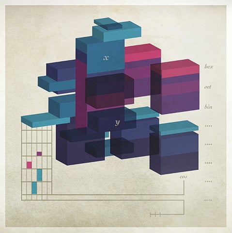
Early days
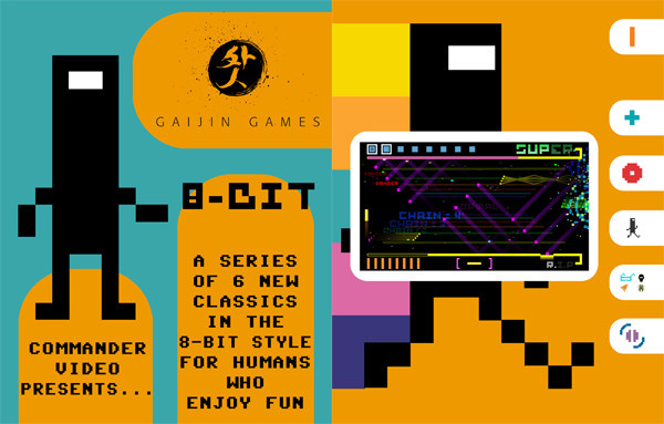
Alex Neuse, Gaijin Games: The sellsheet was meant to give publishers a broad idea of what we were trying to do with the series. It's meant to be something that publishers can take away from a pitch meeting and reflect upon on their own time.
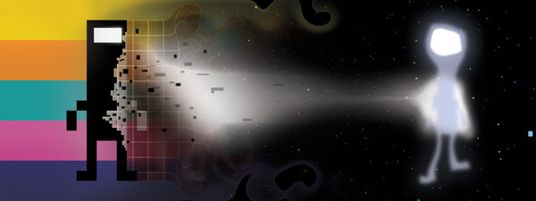
This image was made in answer to an interview question back in August 2009 when Nintendo Power interviewed CommanderVideo. The question was "What is your mission?"
The name 8bit was always a working title and we wanted something that better described the story we were trying to tell. The story is all about a person's trip through life, and we were telling it in a retro style, hence the bit.
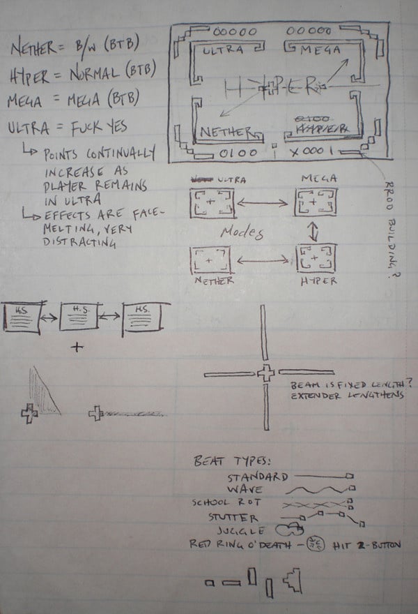
BIT.TRIP BEAT
While designing the levels for BIT.TRIP BEAT, we basically listened to the music and made the gameplay dance around the tunes. We wanted it to feel like the player was interacting and reacting to the music with their paddle. Comparing it to dance is very accurate — especially during the boss battle in Level 1.
Whenever we start working on a new game, we do some sort of gameplay mock-up. This one was to prove that using 3D in BEAT was the right way to go. We had been toying with straight-up 2D or 3D, and this proved that 3D should win out. Simply making the choice to do the original games in 3D instead of 2D probably influenced our decision to bring them to the Nintendo 3DS.
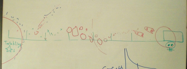
These were the original drawings that illustrated the AI for all the unique beat types. As we implemented them, due to technical constraints as well as gameplay concerns, we ended up cutting several of these initial ideas.
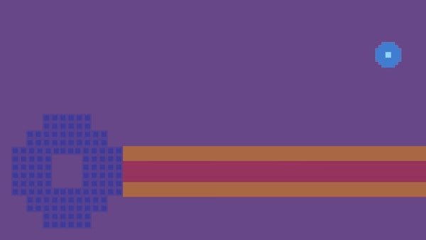
BIT.TRIP CORE
This design doc image was the first thing created for BIT.TRIP CORE. Each game starts on one piece of paper with a pen.

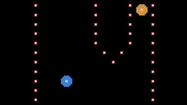
BIT.TRIP VOID
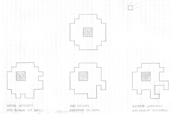
For the original concept of VOID, the player was going to have to protect their core (the shaded portion) within their shield (the outlined outer portion). As Beats flew in, the player had to move the core around with the Control Stick and control the shield with the Wii Remote pointer. As the shield got hit by Beats, it would deteriorate, and if the core got hit, the player would mode down. This proved to be A) too difficult to control, and B) not fun at all, so we totally changed it up.
BIT.TRIP RUNNER
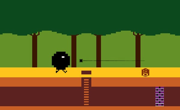
We were really bummed when we cut the Laser and Void abilities from RUNNER. What it came down to was that having seven abilities for the player to keep straight was WAY too confusing. So, even though the moves were cool in the game, we had to cut them. With the Laser (from CORE), you could shoot bats that would swoop down and hurt CommanderVideo. And with the Void ability (from VOID, duh) you could absorb black beats that flew across the screen.
BIT.TRIP FATE
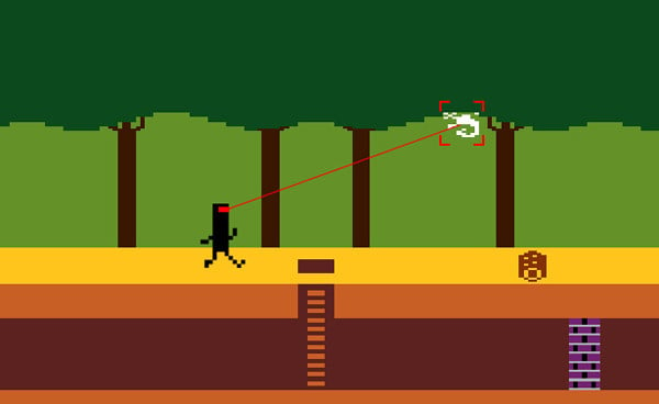
In this screen, you can see a very early mockup of BIT.TRIP FATE, when CommanderVideo (and his friends) were going to be piloting spaceships. Eventually the spaceships were scrapped in favor of the more iconic floating CommanderVideo, which fit both the theme of the story and the artistic style much better.
You can also see the competitive/co-op Dominator/Parasite feature illustrated in this image. When players were co-operating well, and their scores were within a certain amount, players were in balance. But if one player pulled ahead in their score, they became the "dominator" and the other player became the "parasite". In order to balance the scores out again, the parasite could hover over the dominator and syphon their points away, adding them to their own tally. This would encourage strange co-operation as well as competition among the players. This was removed when we cut 2-player.
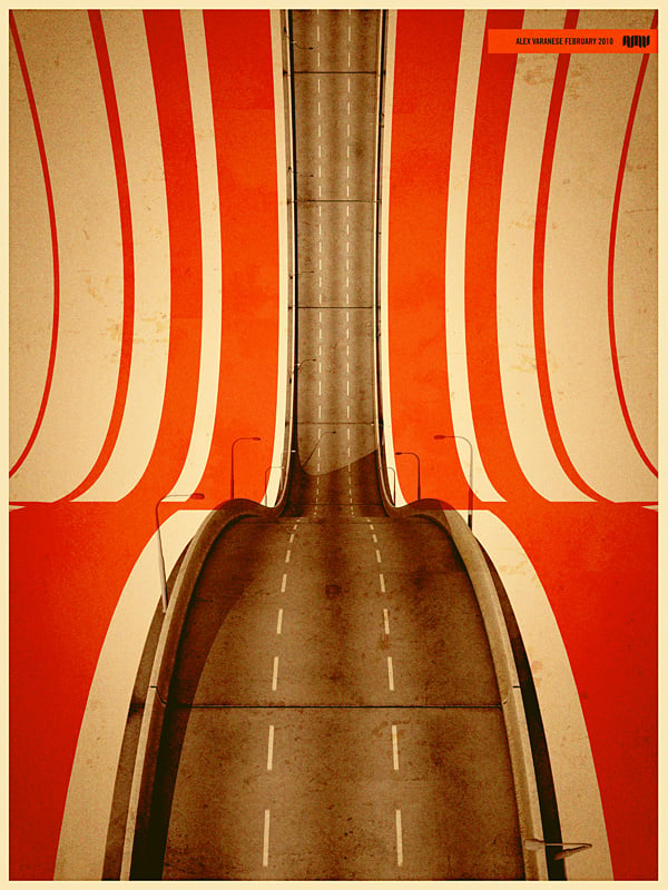
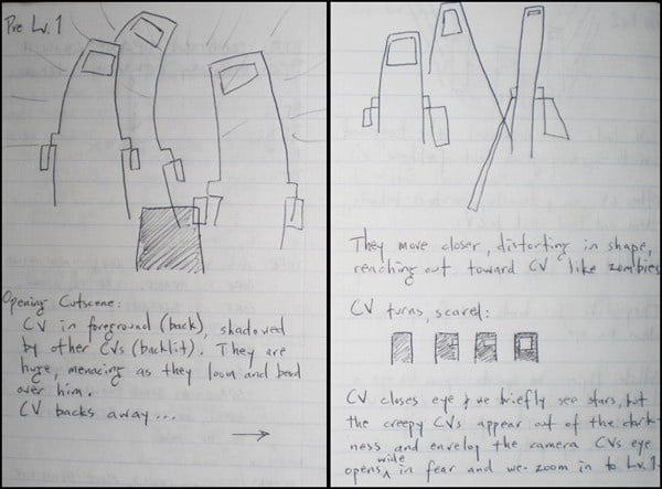
Once our Art Director saw (the top) image, he felt that it represented the Fate Line very well, and as we were exploring themes from each of the previous games in FLUX, we moved forward with this sort of ribbon-style interpretation of the Vibe throughout FLUX.
(The bottom image) just felt like an abstract representation of some of the buildings that were seen in FATE, and we felt that the abstract and ethereal presentation of these "buildings" truly belonged in the final game, after CommanderVideo is dead, and after all the stuff we've experienced in the previous games are also dead, these ghostly buildings were a huge inspiration.
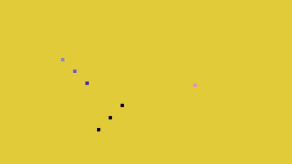
This animation was created for use in a psychological study conducted by Fritz Heider and Mary-Ann Simmel in 1944 titled "An Experimental Study of Apparent Behavior."
We first saw this video at IndieCade 2010, and it was a total mind-blower. Hemisphere Games designer Andy Nealan did a presentation that illustrated how amazingly simple stories can be told, and we were downright inspired. Therefore, in the cutscenes of FLUX, we opted for abstract shapes that represented CommanderVideo and his friends as he bid them (and the world) farewell.
Comments 18
Awesome article! Love seeing this behind-the-scenes stuff.
wow this is awesome. more features like this pls! great work!!
holy crap i love that ribbon/road image... it's trippin' me out, man D:
Alright that's it. I'm getting Saga.
Awesome article. Bought the Bit.Trip Complete Wii disc day 1. Love it! Future classic!
Picking up Saga when ihave the chance. Wonder if thier next project is 3dsware or wii u ware.
@3: That is really cool.
Anybody know where I could get a poster of that?
Amazing how much care was put into this game. Such unique styles.
Ultra =
Teleporters in CORE? Well.
That last video totally blew my mind too, gosh I love this series. Thanks for the write up!
Wow. That is cool.
"Ultra = f*ck yes": you gotta love it when a developer can get that into their own concepts.
The term "beatstiary" is AWESOME.
I'm going to recommend that my psych teachers play or at least watch that video at the end. And I can't be the only one who got a vibe of "abusive father" from it, can I?
Its beautiful!
Really it's very nice
This game is epic, but I am horrible at beats. I can't even finish the Demo on the WII
Interesting stuff here. My favourites are the video, ribbon/road image, "f*ck yes".
And more than ever before i hope i can find the time and patience to play through the entire series one day.
Edit: The alien picture isn't bad either.
How did I miss this feature? Anyway, that video at the end is epic.
None of the images are loading.
Show Comments
Leave A Comment
Hold on there, you need to login to post a comment...