
In today’s gadget-obsessed world, design is key. How a new piece of tech looks and feels communicates wonders about what type of product it is and the experiences it hopes to bring to the table. Form is important, but colour makes the most immediate impression: companies do not merely settle for a pretty shade when flipping through a Pantone booklet.
Of all game hardware manufacturers, Nintendo knows this best. Having put out more colourful bits of kit than both of its current competitors combined, the Big N is no stranger to the impact that colour can have on the air surrounding its products.
There is no more obvious example of this than the 3DS, launching in three-colour gradients dubbed Aqua Blue and Cosmo Black. What Nintendo plays on here is the handheld's stereoscopic 3D screen with the portrayal of dimensionality, and the shimmer of the top shell works quite well at communicating that what you are holding in your hands is capable of much more than its predecessor. In fact, it's no surprise that these two base colours were picked for the handheld's debut: the DSi launched in similar solid shades, and the 3DS's amped-up versions are almost like before-and-after shots from 2D to 3D.
Will Nintendo continue marching on with a casual-friendly white console?
The DS also saw its fair share of colours, launching in a rather dull grey and really picking up steam with the white DS Lite. An assault of colours followed, but when it came time to release the DSi XL Nintendo sought to target an older audience and tinted the jumbo-sized portable in classy shades of burgundy and bronze, changing the machine's image to appeal to older or more refined tastes.
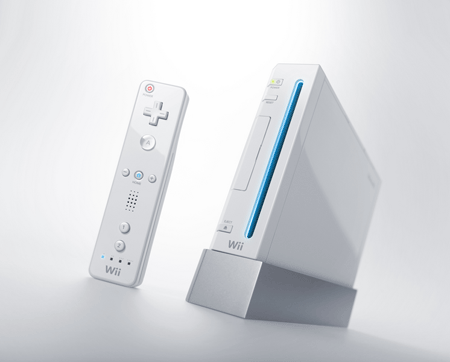
Wii's white worked three-fold, aping the iPod's slick look, linking itself to the successful DS Lite while simultaneously presenting itself as an inviting form of entertainment for broader audiences that video games had yet to really crack. If the Blue Ocean crowd could be persuaded to pick up a controller, it need be presented in a familiar, friendly way, and if the Wii accomplished anything at all it was this. A black model was released over three years into its lifespan along with a price drop, hoping to draw in the crowd of players who may have felt overlooked as Nintendo had targeted new audiences.
For GameCube, Nintendo wanted to drive home the fact that it was a dedicated gaming unit designed for ease of play and good times among friends, which it communicated with a playful purple and lunchbox handle. Black units were made available for those who wanted their hardware to come in a bit more of a serious shade, and who knows who Nintendo was targeting with the "spice orange" model.
There are plenty more examples in Nintendo's history, such as the VR-inspired red Virtual Boy or the crisp silver of the Game Boy Pocket, but we've had enough of looking to the past for now. With Nintendo’s new piece of home console hardware ready for its E3 unveil in Los Angeles tomorrow, now is the perfect time to speculate wildly.
Will Café brandish a bold new colour scheme a la 3DS to show off its new experiences? Will Nintendo continue marching on with a casual-friendly white console, or take things to a more intimidating level with a darker shade? Or perhaps go back to a full-on transparent shell like the N64 eventually toted? Sound off in the comments!


Comments 84
A two tone layout similar to the 3DS would be a slick look I think, but who wouldn't want a transparent console sitting at home!
I thought the GameCube was an exciting console because of the eccentric colours and design. The XBOX original, while pretty mean looking, aged horribly and reminds me of some of the relics from the 90s.
TRANSPARENT REDDDDD!!!!!!!!!!!!!!!
I hope the rumours are true that it sports a design and colour similar to the SNES:)
On a related note, games consoles seem dog ugly these days!
I like sleek. Gimme a black box with smooth lines and I'm happy.
Red would be pretty cool. Would remind me of the red-boxed Mario games.
A black one will do me fine. No need to go too crazy.
I'd really like to see the Wii 2 in orange D:
Coloured consoles are the best. I still want a purple 3DS dammit.
will be good if its colourful an sparkly like 3ds making a statement just had a notification on 3ds about update for tomorrow seen some pictures of big wooden nintendo boxes at e3 dont have xray vision though think bright is best colour wise be able to see soon what were dealing with!
I'm going for Black or White. If I had to pick between the two I'd say black because the rumors seem to suggest they're aiming for the "core" gamers. Black says powerful I think......
but I don't think we'll know the actual colours for a while. Remember the Wii at 2006's E3? They showed colours from Black and White to Red and even a Lime Green! We only just got the black version.........
I like black. No particular reason. The only white consoles on my stand are the Super Nintendo, the PSX, the Wii (bought on release, there was sadly no other option available back then) and the Dreamcast (because the black version never made it to Europe). Also only my 1989 Game Boy is white among my portables.
The Gamecube was indigo. :V
Nintendo Wants a color that everyone will get (I think they made a mistake with white) Bringing a black wii could have been code for "We are trying to reach the casual gamer in a diferent way" Which is probably why the wii has been bundled with Wii Sports Resort, Mario Kart Wii, and Just Dance 2.
Also it seems that lately they've been pairing black with blue (and once it was burgundy) With the release of the DSi 2 years ago and the 3DS A couple months ago.
THESE
http://static.gamesradar.com/images/mb/GamesRadar/us/Features/2008/06/White%20Consoles%20Always%20Win/Finished/061208_whiteconsole_obs07--article_image.jpg
It's rumoured to be styled like a Japanese/European SNES. So it'll likely be two shades of grey. Should look like a cross between a SNES and the original 360.
I'd like to see a metallic blood red-to-black gradient or splatter pattern. If the rumors are true, they're trying to re-capture some of the hard-core market, so make it "metal"
http://www.zagg.com/community/blog/wp-content/uploads/2011/05/7a432_project-cafe-your-wii-2-designs-20110506024355765-000.jpg
New "LEAKED IMAGE" showing silver ,white,and black.
I call dibs on SILVER!!!!!!!!!!!!!!!
ITS FAKE
Although some prototypes are these colors
The console will probably be only available in a single color within a year after launch.
Whatever they chose, it should be a neutral color that fits into every home setup with DVD/Blu-Ray players, TVs, Speakers etc. without looking like the peacock of the lot.
That pretty much leaves black, white or shades of gray. They can still do funky colors at any later point, but it's important to not turn off people from the beginning. And if they go for stupid colors, they have to offer alternatives.
Purple... urgh Great way to sell your console to an older audience when it screams "child's room".
Pink. And Im talkin hot pink. like a highlighter.
Transparency sounds cool. I'll hope for that.
I personally favour old-skool C64 beige.
or maybe zx81 dull black
Hang on, the new Nintendo is supposed to look like a SNES? Do they mean the UK SNES or the US SNES because the US one is as ugly as sin.
I like the idea of a mocha colour.
@24
I know it's called Cafe and all, but... I think you may need to cut back on the coffee this morning.
i think i would like the shades of black and white for the current wii. the white is friendly but the black is a little bit more serous which is what i would like to get.
It should be very very blue. Kind of like the face paint of the Blue Man Group.
Matte black, the controller too.
Silver.
Simple And Slick For The Modern Feel; Subtle And Two Toned For The Retro Touch
@28: Yes that would be perfect.
It would go so well together with most of my furniture.....but black would do feng shui good in another part of the house
Grey
I'm hoping for a dark green since its my favorite color.
i hope it goes back to how the GCN design. Though I know it won't GCN was my favorite design. Was so perfect for carrying anywhere I went.
this is just my hangup, but i hate the slick, shiny surfaces on handhelds. i have just enough OCD that fingerprints drive me nutz!! i spend as much time wiping the outside off as playing.
however, the compact size and handle on the cube was great. when my daughter was battling leukemia, we were often in the hospital for weeks at a time. we'd just grab the cube, games and take it with us. she'd play it for hours, and when she was too ill to do so, she loved to watch me play. i still have a fond place in my heart for that old cube.
@Joetherocker: Likewise. I'd love a nice dark, metallic green...
I'm expecting a colour that no one's ever seen before, just to catch us off guard...typical Nintendo
Gold and Diamond Encrusted!!! Nah, in all honesty, i don't care much, but don't do anything like the XBOX's weird green light. Sheesh it looks like someones threw up all over your console...
change colour depending on mood bright red when playing retro platformers
My guess is that it will be released in one or 2 boring colors. I wish it was released with all of the Funtastic colors of the N64.
Camo O_o
It'd be awesome if it had those transparent colors from the N64 days, or have it gray like a SNES or Super Famicom.
Straight up CLEAR
Flat gray.
next console? hope it's white again.
white is the best color for everything.
i could live with black too, but white is nicest.
Famicom Red & Grey for classic feel
Puke green.
Not indigo.
Silver and Black, but very similar to the cosmo black like the 3DS. Or, even a translucent console would be nice as we'd only see a partial view of the inside but not too much.
Silver with custom LED that you can change in the menu
Nice article. Personally, I'd like to see some sort of color gradient or a simple pattern with nice colors. I'm looking over at my TV now, and here's what I see: a boring white box (Wii), a boring silver box (PS2), and a boring black box (Blu-ray). They're all functional designs, but none of them really say "fun" to me.
When I think back on my old Nintendo systems, I remember my NES, SNES, and Gameboy all being the same dull shade of light grey. I've also owned both models of light grey PS1, and I bought the silver Gamecube because it was the best deal at the time. I've also had a white DS Lite. Finally, last year I bought my second DS Lite, and this time I got the dark blue one. It took over 20 years, but it's my first video game system with some color!
So, I'd like the Wii 2 to launch with something other than solid white/grey/black/silver. A color gradient would be perfect. I want something that looks modern and classy, but also fun. Some laptop designers know what I'm talking about.
I like what they did with the Wii, best looking console ever. White and Black colors would be cool.
I'm hoping the rumors are true and it follow the SNES color scheme, buttons and all.
Seeing as it's been called Project Cafe, I don't see why they shouldn't release a light Mocha color. As long as its sleek, it'll be amazing looking.
wow just 20 more hours. My friends think im crazy just to skip school to watch this,but hey its e3 so why not
Ugh. Really guys, another black one? Well, if it turns out to be some other color, just hide it behind any one of your other black devices.
You know what I'm hoping for? A color-changing console. And it could flash rainbow colors when something good happens in your game. Or blood red when you lose a life. Or you could tell it to stay whatever color you want it the whole time. What gleeful overkill it would be!
Mirror!
I like the changing colors idea. That would be absolutely brilliant.
It should be like SNES/N64/GCN kind of color... THE BUTTONS IN THE CONTROLLER MUST BE COLORED, IT'LL MAKE DIFFERENCE TO ME! Can't see a 'soul' in a monocolored console... like white, black or red...
I've seen transparent graphing calculators and I don't think they are as pretty as solids, such as red or black.
Hoping for the blue/black combo like the 3DS. It's just so gorgeous
The Spice Orange Gamecube was actually made for me, unfortunately they forgot to release it in North America.
I dont like transparent but i think colour options would be great. White is still popular but definitely far passed its prime. I don't like silver because that usually involves painted plastic, i prefer plastic to be dyed. I also prefer matte over glossy.
Oh and sorry 3DS, I'm not a big fan of two-tone either.
I would like the console to be wing or aerofoil shaped and stand upright. Silver in colour.
As long as it's not high gloss.
lime green, forest green, sea foam green, metallic green...
any color green will do for me!
its my favorite color
For crazy people like me, console color is important. I never bought a GameCube because they never brought the ZOMGAWESOME orange one to the states.
I want it to be shiny. I disliked the appearence of the dsi because it just didn't look fancy and new. But color doesn't matter quite as much. White, black, red is what I can foresee.
I love black. I really do.
But... I like it when Nintendo doesn't go for conventional console/handheld colors. I may always aim for black, but I love looking at the choices that others love so much.
I love colored consoles. That's why I'm glad I waited to buy a Wii, so I got a beautiful red one. I think they should follow like the 3DS did. One plain color (black or white), then one color. Like blue, red, ect.
I CAN'T WAIT UNTIL TOMORROW. I want to know more about the Wii 2 already.
like, a nes, but a shiny silver cover and on the top, and black on the bottom with shiny red lettering
anything but white, or a variety colors. red N64 was badass.
How about a transparent console with interior lights that let YOU pick what color your system should be!
Bright yellow for the win.
I purchased a DSiXL for the sole reason that it came in yellow. I didn't need one, but I had wanted a yellow console since I have been playing games (way back to the NES days)
Doens't matter the color of the console, but seriously, I WANT THE BUTTONS IN THE CONTROLLER TO BE COLORFUL ):
I WANT TO HOLD A CONTROLLER AND SEE AN UPDATED CHILDHOOD MEMORY...
Black seems like the most likely color to me.
I like my devices to be in black, though I also like wii's white color. I was never fond of the purple gamecube, so I was very happy that there was also a black version when it hit Europe. I have a silver DS, though I had much rather a white one. But that wasn't available back then. As for the 3DS: Maybe I do something radical for once and go for the blue one. It looks very cool.
As for the Stream: It depends on the road they want to take. If they really want to recapture the hardcore gamer, it must be black. If they want to go further on the casual/non-gamers road it must be white. I don't expect bold colors, but we'll see!
@Meowgravy There have been a few re-designs of NES and SNES.
I'd love a super shiny silver colour like the silver DS lite. _
I rather like the 2-tone 3DS colors haha but if they made a green transparent one like the N64, I'd be all over that one.
I'd really like for Nintendo to release their new console with a variety of different colors from the start. I'd like to see a white, red, green, or even navy blue console. If I could only choose one, I'd go for the green!
I miss the Gameboy Color and N64 controller days. THOSE were some colors!
i don't care really. Simplicity is best, so a throw back to the nes but even more subtle would be good. Just a box thats grey and white with a door on it like the nes and a glossy black stripe. everyone likes a throwback, right?
The gamecube's signature purple colouring is legendary.
I've always wanted a red console, but if they want something neutral yet different I think dark blue would be a good choice. It wouldn't be that imposing but it would stand out from all other consoles.
Show Comments
Leave A Comment
Hold on there, you need to login to post a comment...