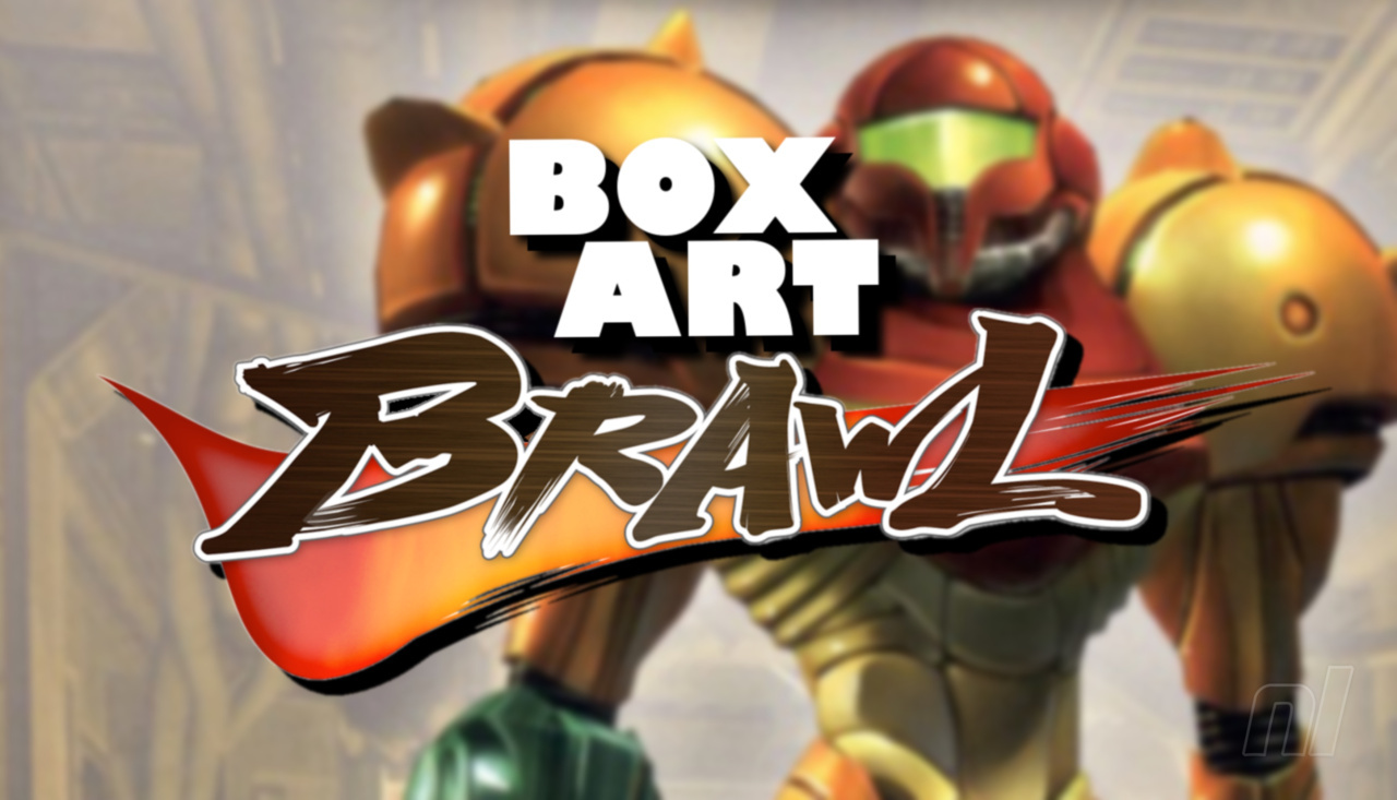
Hi folks, and welcome to another edition of Box Art Brawl!
Well, last week's brawl was certainly a big one, wasn't it? We decided to ditch the regional rules for the week and boshed a load of Street Fighter II box arts into the ring all at once! While all variations of the game were pretty nice, all told, there were definitely a few front runners.
Coming in 1st place with 24% of the vote was Street Fighter II: The World Warrior on SNES, which isn't entirely surprising given how iconic it is. Next up was Ultra Street Fighter II: The Final Challengers for the Switch with 15% of the vote, and we'll be honest, this was a bit of a shock! It's a nice design, for sure, but the key art leaving out certain characters while duplicating the likes of Ryu is a bit weird... Finally, in 3rd place was Super Street Fighter II - The New Challengers for the Mega Drive with 12% of the vote, which utilised key art from the Street Fighter II Animated Movie for its design.
Subscribe to Nintendo Life on YouTube849k
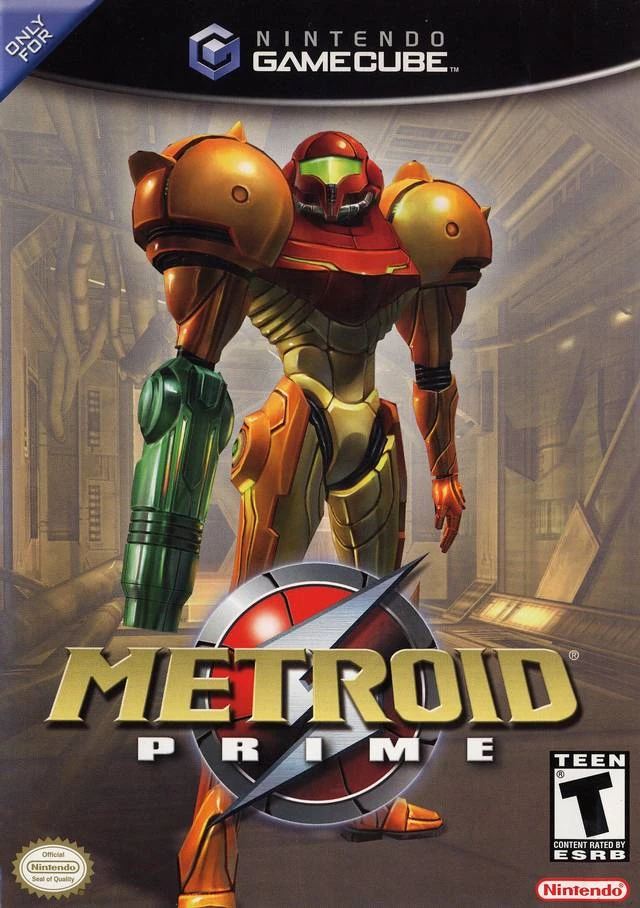
Next up, we're going to be looking at one of the greatest first-person games ever created: Metroid Prime. For this one, the designs for North America and Europe are pretty much identical, so they'll be teaming up to go against Japan. We love both designs for this game, so we reckon it's going to be a close call (then again, we'd said as much in the past and it's always wound up being a pretty one-sided brawl!).
Be sure to cast your votes in the poll below; but first, let's check out the box art designs themselves.
North America / Europe
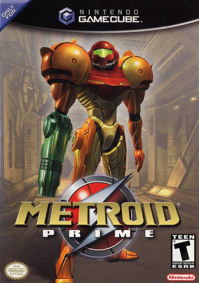
This is probably the design you're all used to seeing if you're familiar with Metroid Prime. We love its simplicity: it depicts the heroic bounty hunter Samus standing in a corridor in what we assume is the Space Pirate Frigate 'Orpheon' at the start of the game. There's no bombastic action or creatures attacking from the sides; it focuses solely on the character you'll be inhabiting for the 10-15 hours it'll likely take to get through the game. Nice.
Japan
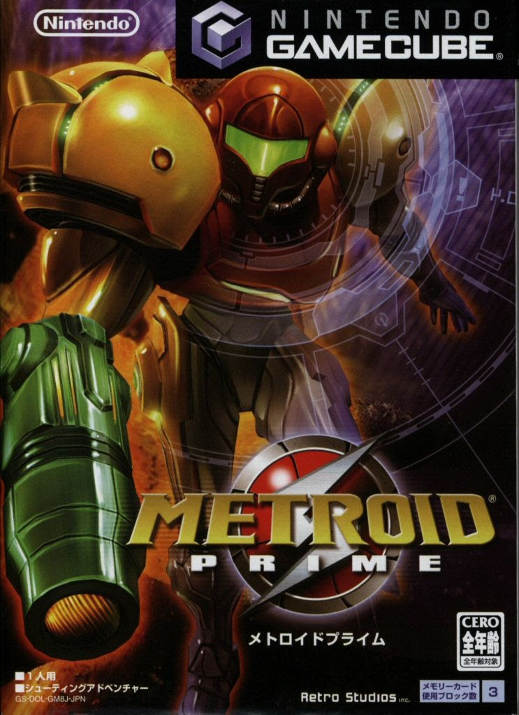
Japan's artwork for Metroid Prime is a bit more, shall we say, impactful than its NA/EU counterpart. Yes, it still solely depicts Samus, but her pose is undeniably more action-focused, with a rather nifty futuristic overlay surrounding her; kind of like some sort of heads-up display, almost. Maybe this was to represent the game's 'Scan Visor' in some way...? Hmm, not sure. Either way, it looks pretty awesome!
Thanks for voting! We'll see you next time for another round of the Box Art Brawl.


Comments 67
As iconic as I personally find the NA box art, it is very static and lifeless. Japan's is much more appealing.
NA/eu for me,i know Samus is just standing,but she really pops,unlike the japanese boxart.
I akways thought the western ice was iconic, but a bit dull. So I went with Japan!
NA for me. The box art isn’t overwhelming in design and color, and it says what it needs to.
Both are close for me, but I went with NA/Europe this time. Both showcase Samus well - and the more action-y pose ALMOST convinced me to choose Japan - but I really like that background art on the NA/EU cover. Plus, you can see all of Samus.
Both are good but I prefer the NA box art. Metroid dread cover is better than both though 😃
I like the NA a little more. It shows Samus up front and center in a "it's a new Metroid adventure but in 3D!" kind of way.
The NA version feels like the right choice because it’s so familiar, but it kind of just seems like Samus with a brown background.
As iconic as the NA/EU cover is there's just something about the Japanese cover that's more appealing. It almost feels like a Mech related cover and I'm guessing that's what they were going for.
The NA box art is super iconic, and her pose is awesome
@AnnoyingFrenzy I swear I didn't copy part of your comment lol. I commented first then scrolled up to read.
10-15 hours to beat? Seriously? I think that I spent that long just on having to continuously retry boss fights. One in particular had me absolutely despairing (no spoilers!). Maybe I am just rubbish at the game, but I found it crushingly difficult at points, to be honest.
NA and Europe here, I'm not the biggest fan of how close Samus is to the "camera" in the Japanese one and how she goes on front of the GameCube text box. If it weren't for those two things it probably would've been Japan because I like the rest of that box art a little bit more than what NA and EU have going on.
Both are good though!
Never played Metroid Prime, but the Japan one looks awesome, with the action-focused, futuristic design.
At 287 votes, I'm surprised how close the results are so far.
Went with the NA/EU boxart. It feels less cluttered than the JP boxart, and you get a better shot of the environment (I'm guessing the Chozo Ruins, judging by the lighting) than in the JP boxart.
@Ooyah I was able to beat Prime 3 in less than 24 hours. Not only beat it, but 100% complete it, in less than 24 hours. Of course, that was stretched over several days, but the actual game time itself was less than 24 hours.
I think Japan would win if the cover had been zoomed out just a little bit so that Samus didn't quite consume almost the whole cover.
@Spoony_Tech You know what they say. Great minds think alike.
@AstroTheGamosian I actually think it's a brightened shot of the interior of the Frigate Orpheon based on all the metal walls and pipes.
@AstroTheGamosian i could be wrong here because it wasn't clear, but are you saying less than 24 hours?
Tough one, can tell by the results so far.
Went JAP, just stood out a bit more.
Japan, easily.
A much more interesting pose and angle, and had I been hankering for a Metroid reboot at the time, the Japanese artwork would have piqued my interest a lot more than the rather generic-looking Western art.
@AstroTheGamosian
I never played Prime 3, so I am just thinking of the first one.
Jpn version for me! That’s the one I own.
They had to use bigger/closer-up images on the smaller GC disk cases in Japan. This one works really well!
I picked the Japanese cover. It reminds me of Echoes and implies a sense of cautiousness and hints at scanning. US is iconic, but but plain and kind of tacky. When she's on Frigate Orpheon, despite it being a tutorial for the player, feelings of... ahem dread are high.
@Morph @Ooyah
Prime 1 should take you somewhere around 20 hours to beat first time plus or minus a few hours. It is completely normal to struggle with some of the boss fights. Prime 3 is a few hours less than that thanks to things like restarts directly from the boss fights and being a shorter and easier game in general. I think what @AstroTheGamosian is trying to say is that it took them less than 24 hours to 100% prime 3 and that it must be less than 24 hours to beat prime 3.
Prime 2 is the longest of the three as it is the most difficult and has lots of backtracking. I would say 2-5 hours longer than prime 1.
I love how we all become graphic design experts on these posts.
Box Art Brawls Current Total:
Europe: 35
Japan: 41
North America: 44
Australia and New Zealand: 1
I'll be honest, actually neither box art is particularly exciting or evocative, but the western one has nostalgia factor for me so that's where i went
@Spoony_Tech @garfreek @AnnoyingFrenzy I was honestly confused scrolling through the comments, reading very similar comments and seeing very similar avatars
On topic
Neither. The game went first person, it was all about exploring a desolate alien environment, and both focus on the character. While I do like the character, as box art, it doesn't represent the game to me.
The Japanese one is too busy, and let's not forget that it didn't convince very many people to buy the game.
@Kevember, do you not know what works on you and what doesn't? The target audience for graphic design is everyone.
@Thomystic It's just a lighthearted remark; no need to get too serious, buddy.
I'm going to be completely honest here. I think Metroid Prime has arguably the worst box art in the entire series. She is literally just standing there... Menacingly! At least we see a bit of a space station in the background, but still. It is just a really boring boxart, that has nothing going on.
The Japanese version is worse in my opinion though. Now she is running towards the player. Nothing interesting is really happening outside of that. No background elements, nothing. At least the first picture had something going on behind her that was kind of neat. Now it is just her, and there is nothing particularly interesting going on. It feels like the art is trying to make her look cool when Metroid Prime 1 wasn't really about that. (In fact I'd argue that Super Metroid, Prime 3, and Metroid Dread have the best cover art in the series by a long shot.)
the japanese purple background would have looked cool on the na release to match the gamecube. the pose looks off on japans so I went with na. super metroid, dread and prime 2 are still the best
its a shame they censored her kneecaps in tge na version, cmon nintendo we can handle it
Is there a place to vote 'Neither?' ; )
@Morph Yep. My game file on the file select screen read less than 24 hours of playing on that game file, and I 100% completed the game.
Now, as I said, I did this over the course of several days, but the actual playtime was less than 24 hours.
@I_commented Exactly what I said: it took me less than 24 hours to 100% complete Prime 3. Even less to just beat it without getting everything.
@AnnoyingFrenzy It could be the Frigate Orpheon, but it could also be the Phazon Mines, too. Maybe even the Space Pirate parts of the Phendrana Drifts. But the Chozo Ruins did also have pipework and technology, and since the lighting is more reminiscent of the Chozo Ruins, I'm just assuming that it's in the Chozo Ruins.
This is especially the case since it's the first major area of the game that we really get to explore after we land on Tallon IV. We don't get to explore much of the Tallon Overworld (which includes the wreckage of the Frigate Orpheon), Magmoor Caverns, Phendrana Drifts, and Phazon Mines until much later in the game.
I had to think about this one for a bit. I think both designs have pros and cons. The framing of the Japanese one is perhaps too close, but I like the composition and the pose of Samus. The target reticle effect doesn't add much. The western cover had Samus in a pose that's overly stiff and uninteresting compared the the Japanese cover. I do like the background for the western cover. Overall, I prefer the Japanese design, but only by a little bit.
Voted for the North American/European one. It has a better atmosphere to it. The Japanese one has more style but it looks like Samus's cannon has a car headlight jammed inside.
@Shambo totally agree!! I think I would have kept the shooting pose, but done a 4 seasons thing with 4 different areas. Phendrana drifts, the grassy entrance etc.
Or just Phendrana, that area was gorgeous! 😂😁
I definitely didn't buy Metroid Prime back in the day for it's box art! These both look so dull!
NA/EU looks like an action hero movie poster,
Japan looks like her body is at a odd angles,
Both look like she is ready for a American Football game, but with a blaster.
If I saw both at a store, I would buy the N/A version.
I voted the Japanese one. Sorry, as iconic as the western one is, it doesn't say anything about the game beyond the main character. I also like that the developer gets acknowledged in the cover.
There's also a Korean version, unlike other Korean GCN games, they used the western cover art, and it shows us how the western cover would look like in a Japanese/Korean box, which are way smaller. Anyone with an American Game Boy Player probably has its disc in one of these.

@BloodNinja A lot of people felt the same way about Ico, specifically, the North American version. It look so terrible, compared to the work of art that graced the cover of the Japanese/European version, that many attribute it to poor sales of the game in North America.
But as the old saying goes, "Don't judge a book (in this case, game) by it's cover. Metroid Prime is an amazing game, full of nooks and crannies to explore, lore from both the Chozo and the Space Pirates, and a wealth of exotic locales and enemies unique to each region of the world.
Both are a bit naff but Japanese is better
Neither's great but I think the Japanese one's framing just looks really wonky. It looks less like Samus is running and more like she's tripping.
Definitely Japan. Samus is actually doing something rather than posing heroically for the camera like in NA.
How is it this close, the Japanese cover looks so much cooler
Japan's looks nicer. The US looks bland and lazy.
Honestly, even though MP is one of my favorite games of all time, both covers are pretty boring. I went with Japan just because there's a bit more going on, but I don't love that one either.
I think I'm going to go with NA on this one, Japan's radiates stock image energy (especially with how they cropped the suit overlay over Samus). Plus it's both iconic as all hell and captures the whole 'alone on an unfamiliar planet' vibe remarkably well.
This is a really tough one, but I gotta go with JP. It's just a little more dynamic and interesting.
@HammerGalladeBro thank you much for sharing the Korean box art and the bit of info about it.
@Franklin the best comment on these articles. Always look for it first. Thank you.
@AstroTheGamosian I did some digging because I was curious to figure it out and I discovered that the background is an official render of the Frigate Orpheon, so not a room used in-game. I've tried a couple of times to post a picture of the room, but whenever I did it would just show up as a blank line with no text or image, so I'll just post the link to the site. It's in the Gallery section scrolling down as the third image. Compare it the image HammerGalladeBro posted above and you can see its the same room, clearest with the orange lights coming from the floors and walls. https://metroid.fandom.com/wiki/Frigate_Orpheon
I like the NA one because at the time it was mind blowing for me seeing Samus in a 3D render, it captures that feeling of the series jumping into the future.
The Japanese one however is better for giving Samus a more action based pose, it fits with the series transition into 3D like its Samus jumping out at you.
Forget the box art!
https://www.youtube.com/watch?v=WLLE_PvJ5mY
@Jacoby No problem, people usually forget there are Korean version of some Gamecube games, they come in the smaller boxes, like the Japanese versions. For whatever reason, the box art and back of the box are based on the Japanese version but using the western logo.
Metroid Prime is the exception when it comes to first party games, as it uses the western box art and back on what otherwise would have the Japanese images.
Here's another example, taken from Gamefaqs:
Korean Smash Bros. Melee
https://gamefaqs.gamespot.com/gamecube/516492-super-smash-bros-melee/images/1631379
Japanese Smash Bros. Melee
https://gamefaqs.gamespot.com/gamecube/516492-super-smash-bros-melee/images/126249
Now a full look at Metroid Prime
American version
https://gamefaqs.gamespot.com/gamecube/447244-metroid-prime/images/150741
European version
https://gamefaqs.gamespot.com/gamecube/447244-metroid-prime/images/121808
Japanese version
https://gamefaqs.gamespot.com/gamecube/447244-metroid-prime/images/143978
Korean version
https://gamefaqs.gamespot.com/gamecube/447244-metroid-prime/images/1782548
Sadly, I don't know if the in-game text in these games is in Korean or in the language the games are based on.
Some other first-party games confirmed to have Korean versions are Super Mario Sunshine, Kirby Air Ride, F-Zero GX, Mario Golf: Toadstool Tour, Mario Kart: Double Dash!!, Mario Party 4, Mario Party 5, 1080° Avalanche, Zelda: The Wind Waker, Zelda Ocarina of Time GC, Eternal Darkness and the Game Boy Player.
They need to release Metroid Prime on Switch already.
@AnnoyingFrenzy Ah, I can see it now. Makes sense, considering it IS the first part of the game you get to explore.
This one's close. I like the action shot of the Japanese cover, but it's zoomed in too close and too busy.
I'm still picking NA/EUR.
While it is a bit static, but it's clean and iconic, you'd make a statue of Samus like that.
The JP version is more active, trying to fold in the visor effects makes it busy. The reversed 0.4 is a nice touch to communicate the overlay is on her perspective, but it's a clue I had to pick up on.
I guess the Japanese version as it's more dynamic. I don't find either terribly exciting though.
American here. Prefer the Japanese CA. More aggressive and fitting.
Neither do much for me.
These are both great covers. I give the edge to the Japanese cover.
Show Comments
Leave A Comment
Hold on there, you need to login to post a comment...