Hi folks, and welcome to another edition of Box Art Brawl!
In last week's edition, we threw Assault Suit Leynos / Target Earth into the ring, with the North American box art squaring off against Japan. It was a ruddy close one too, with Japan's more restrained take on the game garnering 56% of the vote. It's clear that plenty of you liked the more "out there" artwork for the North American release, however!
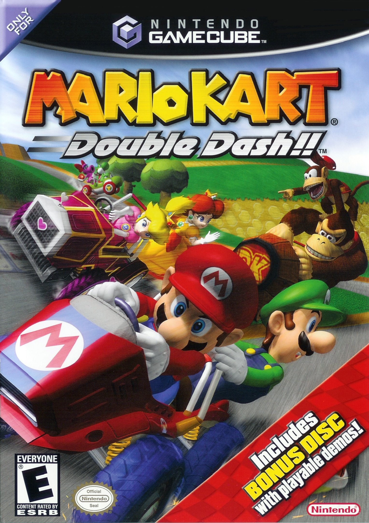
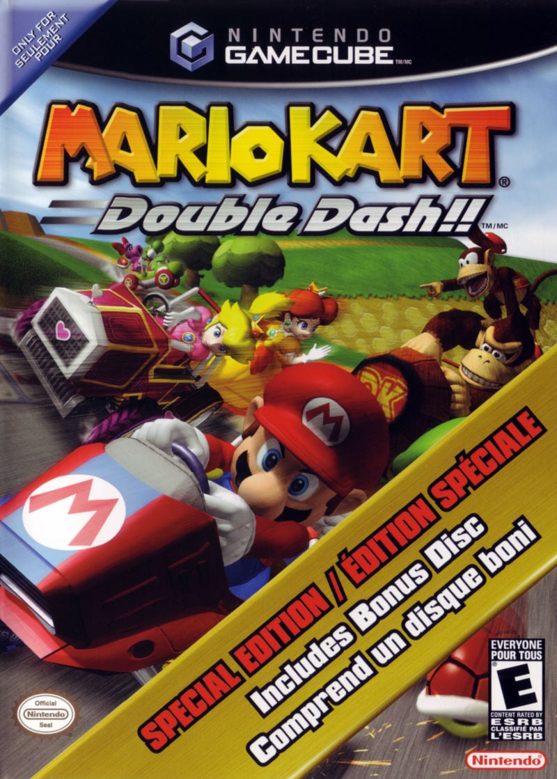
This week, we'll be taking a look at Mario Kart: Double Dash!! for the GameCube (a game that we declared to be the best in the series, thank you very much), one of the more unique entries to the Mario Kart franchise. We're going to lump North America and Europe together for this one, because while the two designs feature slight variations in their composition, they're nevertheless a tad too similar to compete with each other.
Japan, on the other hand, showcases a vastly different box art design, and it's going to be interesting to see which one you folks prefer!
But enough chat, let's get on with the show.
Be sure to cast your votes in the poll below; but first, let's check out the box art designs themselves.
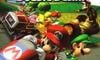
North America / Europe
So as we mentioned earlier, Double Dash!! for North America and Europe feature very similar designs; in fact, the characters and environment are identical to one another, but the composition is slightly different, with NA's version significantly more zoomed in. This means that characters like Donkey Kong and Diddy Kong have been moved to fall more directly behind Mario and Luigi, with Yoshi and Birdo pushed further to the left.
We're not sure which design came "first" with these two, but we're tempted to lean more toward NA on this one; the EU version has a lot more unused space that's taken up by blue skies and green hills; it's nice, but perhaps not as "punchy". Either way, we're not pitting these two against one another, but do let us know in the comments which one you prefer.
Japan
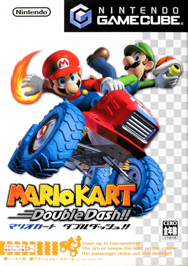
So the Japanese version of Double Dash!! is very different, showcasing Mario and Luigi in full glory against a white background with a checkered pattern running down the right hand side. It's understated, to be sure, but there's definitely a "racing" vibe going on here. We also like the fact that the key art for Mario and Luigi demonstrates the ability to handle two different weapons; a trope that, at the time, was brand new to the franchise.
All in all, it's a nice design; perhaps not as busy as the NA or EU versions, but it's the kinda thing that we reckon would look pretty neat on a steelbook or a collector's sleeve.
So that's your lot for this week! Make sure to cast your vote and let us know in the comments which design you like best and why. Peace!
Thanks for voting! We'll see you next time for another round of the Box Art Brawl.


Comments 55
I think the contest between America and Europe would be closer. That JP does the job of showing the game's gimmick, but that's about it!
I voted USA version.
I prefer the purity of Japan. US is stronger than EU
The Japan art actually looks a lot like the MKWii cover art, so I voted for that one. Both are pretty great, though.
Wow, a BAB where both boxes are good?
Would love to play this game again! Port it full-price to Switch and I'll get it at launch (or take me up on my suggestion of GC Racing All-Stars and bundle it with F-Zero GX and 1080 Avalanche - you're welcome, Nintendo!). Back on topic, NA/EU for the win.
I find the Japanese box art more aesthetically pleasing, though the US box feels far more indicative of the game's actual experience.
NA/Europe cover is better, but, best in the series?? It's the WORST Mario Kart ever.
Japan really got that ‘Photoshop PNG’ vibe going on.
EU/NA cover is the better one here. I feel like simplicity doesn't really suit Mario Kart, especially a hectic version like Double Dash.
"Good, twice the pride, double the fall."
-Count Dooku, 19 BBY
NA/Europe this time. More characters and a background, not to mention that I think it captures the franchise's chaos better.
The poses/silhouette on the Japanese boxart is really good
NA definitely, anything else just looks wrong to me (even if they got Luigi's hat wrong). Plus I think it captures the chaotic nature of Double Dash much better than just Mario and Luigi on a white background.
Really hope someday they remake double dash or include a double dash mode in a Mario kart game.
As for my vote, I chose the US/EU version. Clearly shows just how chaotic this game can get.
@nessisonett Reminds me of those fake transparent images that you only realise are fake when you highlight them. I can't begin to tell you how many presentations I've had scuppered because the image I wanted to use wasn't transparent.
Is it me, or does the Japanese version look almost like it has a more modern render of Mario and Luigi? The way they work with shadows and reflections looks alot more similar to how they designed them for Wii U/Switch games than something like Mario Sunshine or the GCN Mario Parties
I prefer Europe to NA. NA is too busy, I prefer having space around the logo. Maybe there is a little bit too much space though.
I prefer the clean cut Japan one to be fair.
I don't really like either. They both look generic, and Japan's is rather sparse.
People generally say that less is more, but in this case I think more is more. The Japan one is too simple.
It keeps surprising me that they would choose almostnidentical but still different designs almost every time for US and EU. I just don't get it.
I don't really have a preference here. Cheap-looking Western art or Japanese minimalism?
Meeh...
I'd love a Mario Kart All Stars release with this and Mario Kart Wii on a Switch cart though.
Gotta go with the American/European box art; the busy scene with multiple characters gets the chaos of the game across better than just Mario and Weeg's key art floating in a white void. Less is usually more but might be too less for a game like Double Dash.
I like the Japanese cover, simply because that’s the version I owned back in the day. And the GC game packages were much smaller in Japan than those DVD-sized US cases in the West - the minimized approach was a better use of the limited space, I’d say.
My local game shop owner in Tenjinbashi convinced me to get a GameCube because I missed playing Mario Kart, and he insisted Wind Waker really was great despite the cartoony look.
I’m glad he persuaded me, since Double Dash really is outstanding, and WW grew on me like it did for most!
@Fizza I’d never noticed the hat before. Juigi FTW
@Fizza On Google Images select "tools", then "color" then you can choose to only see properly transparent images.
Yours truly,
A png finder who wanted to tear her hair out.
There have been a few Mario Kart boxes with just a kart on a pure white background, and it really doesn't suit the chaotic nature of the series imo (Mario Kart DS has possibly the worst box art Nintendo's ever come up with). The western cover is much better here.
@xiao7 THANK YOU VERY MUCH.
I really like Mario and Luigi's pose on the Japanese box art, but the white background doesn't do it for me. I prefer seeing lots of characters in action as shown in the US one. Makes it look more chaotic.
I went with the North American/European version.
I think the Japanese cover just misses the mark. The minimalism is disappointing here. The angle with the prominent view of the tire treads make it look like they're on farm equipment rather than a go cart. Between the US and EU versions, both have issues, but I think the NA is too cramped. EU might be a bit too zoomed out, but only slightly. It's still my favorite of the bunch.
The US/PAL versions are mirrored, as revealed by Luigi's cap.
I voted Europe - As pure art I like the colorful Japanese cover, but the European version actually shows you what the game is like which is just better for a cover. Oh, and I would vote Europe over NA purely because it amuses me Europe bans 2 year olds whereas NA allows everyone.
@JohnnyC Nintendo need to hire you now as I'd be all over that bundle.
Japanese covers are always more stylised... I really like that. But the EU one is a lot of fun in this case! US looks too crowded and zoomed in. "Unused space" is one way of putting it I'd say in EU vs. US there's more breathing space, and the blue is a necessary backdrop for the title.
Japan’s one is too bland and doesnt show off enough characters.
@JohnnyC Add Kirby Air Ride and I'm on board for the proposal.
As for the box art I prefer, maybe the Western one, it shows an actual race and the concept of 2 drivers per vehicle. The Japanese one isn't bad, but it follows the conventions of Japanese Mario Kart box arts (Mario in his kart on a mostly white background) seen in Mario Kart 64, Super Circuit, Double Dash!! and Wii (no kart here, though), maybe 7 to a certain extent.
Both are great in my opinion, but the Japanese one shows a bit of false advertisement by having Mario as the driver ready to fire his Fireballs, something that doesn't happen in-game. Or maybe it's just a pose he's doing due to the turning of the vehicle.
Still the Mario Kart with the best Battle Mode.
EDIT: No mention of the North American Bonus Disc versions?
USA Version:
Canada version:
so mario is a jedi while luigi is a sith lord.
I like how clean the Japan art is. Na looks better than EU though.
North America & Europe, Japan's is too simplistic for me.
I think I speak for absolutely everyone when I say Double Dash!! is the best game in the Mario Kart series.
NA and Europe version for me. As others already mentioned the japanese art looks too minimalistic and Mario games have to be colourful. I like the EU version more because it does not feel like it is too much and because the sky feels soothing.
By the way just today I completed Double Dash. It is still a great game.
'MERICA!!! Not even a competition.
I think the Photoshop transparent checkered background is meant to invoke the checkered flag in racing. The only problem is that if you go full-on black, then it clashes with the foreground.
The JP box art is very minimalist, whereas the NA/PAL box art better captures the chaotic experience of playing the game.
Box Art Brawls Current Total:
Europe: 35
Japan: 40
North America: 44
Australia and New Zealand: 1
I like both, voted NA though... something about the kart in the JP version feels off?
Honestly I far prefer the Japanese boxart for all gamecube games
I prefer the NA version. You know how sometimes in design, less is more? In this case, more is more.
Neither of them's good but that faux-transparent square texture always looks terrible.
I'm surprised nobody mentioned the relatively well-known error on the NA / EU cover — part of the image is reversed. Look at the backwards "L" on Luigi's cap.
Probably the biggest cover goof ever on a first-party Nintendo title. Japan's art should win by default.
Didn’t care too much for Double Dash, so it’s hard to get excited for either cover.
IMO, i'm honestly not a fan of the white background for the Japanese Version of Mario Kart Double Dash's Cover Art. i think the North America and Europe versions of Mario Kart: Double Dash's Cover Art looks a lot better.
why are the Japanese ones so boring
Show Comments
Leave A Comment
Hold on there, you need to login to post a comment...