Hello everyone, and welcome to another edition of Box Art Brawl!
In last week's edition, we took at look at Resident Evil: Gaiden for the Game Boy Colour. It was actually a fairly close call too, however the majority of you fine folks preferred the simplicity of the EU box art, with the blood drenched life ring taking centre stage.
Now, in case you happened to miss it, the Sega Mega Drive / Genesis app for Nintendo Switch Online gained an additional four games this week. One of these was the run and gun classic Target Earth from publisher Masaya. We took one look at the North American and Japanese box arts for this game and knew straight away that it should be the next focus for Box Art Brawl!
No Europe this week, but be sure to take a good look at the below box arts and cast your vote for your favourite one - let's get cracking!
Be sure to cast your votes in the poll below; but first, let's check out the box art designs themselves.
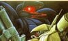
North America
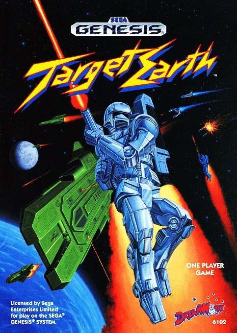
So let's just clear up something before we continue... Target Earth is actually known as Assault Suit Leynos in Japan, but came with a drastic name change for its North American release. Now with that said, how cool is the logo for this box art?! It's very rough and ready, but it just works, y'know? The true star of the show, however, is the artwork itself. The composition is just wonderful and the character design is excellent - we love this one!
Japan
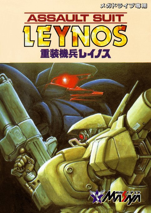
The Japanese box art for Assault Suit Leynos / Target Earth is a lot more restrained and, well... "artistic", we guess. The logo is, again, absolutely fantastic here but for an entirely different reason; it's slick and neat, and it works well within the overall composition. The artwork, meanwhile, is expertly done and would look absolutely beautiful hung up on a wall.
This could be a tough one! We're definitely torn, but what about you? Vote in the below poll for your favourite box art!
Thanks for voting! We'll see you next time for another round of the Box Art Brawl.


Comments 42
I hate all of it.
Hmm, neither of these are all that great. I think the NA one is just a bit better, though
I am surprised to see this game never received a @Shiryu review in the past.
I've really got to go with Japan.
The US one certainly is more dynamic, however it's a glaring example of the trend of the time of trying to de-anime/de-Japanese game box art making them feel more western, which is an instant disqualifier IMO, making the game into something it was never supposed to be.
The JPN box is certainly more restrained (and maybe a bit derivative), but darned if those mech designs don't scream cool, like real heavy pieces of military equipment.
The Japanese cover is so much better this should really be no contest, but judging from the results so far, it seems not everyone agrees with me!
I remember seeing Leynos on the shelf of my local import store in the early '90s, and I wanted it so badly, but I never picked it up. I didn't get a copy until the latter part of the decade, and it remains one of my favourite Mega Drive covers. That mech design is amazing.
Not as much of a blowout this time. But the JP version looks like a much more higher-effort and serious work.
I voted for the Japanese one, there's just something off about the North American one.
Both are sold boxes but I like that darker muted scheme for the Japan box just a tad more. Even though the NA one also channels the era/Genesis better, I’m still sticking with Japan.
I'm sorry but those mechs on the JP cover look awful, they're so bloated and in- your- face.
I thought this was going to be a blow out for NA when I clicked the vote button.
I probably wouldn't have even picked the Japanese box up to check out the back cover back in the day.
I always go with the one I would prefer in a frame on the wall. Japan wins this time.
I always vote in these polls because its fun to see if my opinions match others - but I very rarely actually comment. For this one, so far its relatively split down the middle, and I think I see why, so allow me to overanalyse for a minute... feel free to skip if you don't like long posts
I far prefer the mech designs of the Japanese cover, they are more creative, geometrically and stylistically interesting, and are more faithful to the actual game. Taken by itself, I slightly prefer the logo too - fits the theme better rather than being generic "90s rad", which is a cool aesthetic in itself but not really suited to this game. The Japanese art is arguably better drawn and painted too, not that the American one is bad.
However, the layout and perspectives of the American cover is much more dynamic and interesting. The angles of each element are designed to either draw your eye to the character and/or title, or to underline the title to show it's significance. This subtley works on a lot of people (around 40% from some advertising/marketting studies) to remember the important elements, or come away with the a positive opinion of the product just from the image, because it psychologically plays on our "confirmation bias" and the "wisdom of crowds" meaning we are evolutionarily more likely to see importance in people or things that other people assign meaning or importance to, and advertising agencies worked out you can tap into this by implying importance and significance in imagery. The logos and text also feel like they match the art, both stylistically and with the colour pallette, also making it a better overall result, regardless of whether I prefer the Japanese art style and feel its from a more skilled artist.
However, crucially for me - the thing that swings my decision - is that the American art takes up the whole surface/canvas and was designed to fit the logo into it. Its a real pet hate of mine when art for games/movies/books/records is only part of the image and there are massive borders or blank areas, with only text or logos. It feels lazy, empty and imbalanced, sometimes even amateur.
In the case of this game, to me it feels like an artist hand painted a really nice bit of artwork that was square. Another artist digitally made a decent logo. Someone else put the square painted picture and the digital logo separately on top of each other on a plain coloured rectangle. Which part is your eye meant to be drawn to? Do we view it like a comic book and read the top panel first, then look at the mechs after? They feel so disparate that you can't really just quickly llook at the image and take both in (very important when people are looking through shelves of products and need something to catch their eye. The two parts of this image are so unconnected that it plays with my head - the extreme unbalance makes me feel slightly uncomfortable to look at it.
I'm all kinds of neurodiverse so I'm aware this is an irrational overreaction and others don't care. But this kind of thing does massively affect sales in a real world situation, as people will subconsiously discount something that doesn't immediately scream that it deserves their attention. Subtlety in art is very valuable - a piece you frame on your wall can have all the complexity and depth that you want and invite the viewer to stare at it and get their own interpretation. But that's precisely what you don't want if you have a product on a shelf and are trying to sell it rather than have it passed by in a fraction of a second to look at the alternatives. My over-obsession with layout, framing, colour design, logo and text integration etc means I've been relatively in demand for designing covers for movies, games, novels, advertising posters and banners for many years, so being bothered to this degree by this is both a blessing and curse
Related thoughts with a perspective of both a collector of retro games, and a designer of cover art for modern games & movies:
For the above "unnecessary borders / art that doesn't fit the canvas" reason, most PAL SNES and N64 boxes are super ugly to me compared to their American and Japanese counterparts. Often beautiful art, usually at the exact aspect ratio required for the box, but they decided to shrink them down and put massive black or plain coloured borders around them for seemingly no reason. Its also why, as a Master System owner circa 93-95, I was jealous of Megadrive games covers, as the Master System usually chopped off the top and bottom of the same cover art to replace them with "graph/math paper" square pattern for no apparant reason, diminishing the original artwork, chopping away cool stuff and replacing it with blank space.
And from a modern perspective - this obsession for making the art be as balanced and aesthetically pleasing in its framing is a nightmare for designing artwork for modern games. The Switch, PS4/5, Xbox One/X/S, and PC all have completely different shapes for the visible artwork - ranging from a tall rectangle, to a literal square - and all of them have different conventions as to which parts are covered by compulsary logos, ratings etc. Its the same, and arguably worse for designing artwork to for movie posters, DVD covers, Blu-Ray covers, and the Square and horizontal rectangle images used by many streaming services!
In recent games, you can see a fairly extreme example of this if you look at all the blank space at the top of the Shredder's Revenge Switch box, compared to how things are centered and balanced in the Playstation version, and slightly cramped in the Xbox version. To be 100% clear - I'm not criticising the artist of the Shredder's Revenge box, I LOVE the picture - its just the nature of drawing one piece of art that will be cropped in many different ways. This is the route most artists seem to take - design for the middle option, then have slightly unfavourable results for the others, still fitting in all the elements, but either mildly cropping them or having large areas of empty space.
Personally, I can't do that - I value the ever dying physical market, so I make sure the art for each version is as perfect as it can be because I know a lot of the people buying it are collectors who want to look at their games, hold them in their hands, display them proudly - I want every version to look as nice as it can. Whether its "hand drawn" on a computer or a composite image of real life elements, I make sure all parts of the image are separate layers and can be subtly resized or shifted in position to reframe everything as best as possible. In cases where that doesn't work for certain elements, I make sure that I never have blank space, theres always something interesting, but can be cropped out without leaving half of them showing or something jarring.
As a collector who mostly prefers to buy games for Switch, and movies on Blu-Ray, its annoying that the art usually looks worse for those formats - nice Poster/DVD art gets the top and bottom chopped off for Blu-Ray, and nice PC/PS art gets the left and right chopped off for Switch... or else both are just resized smaller (losing detail and quality because of printing limitations) and annoying blank space is left where the cropping would have been.
I voted for the Japanese box art, as someone who loves mecha anime, I love the vibes that the artwork gives off.
I get "Battlestar Galactica with jetpacks" from the NA box while Japanese box is straight-up "Gundam". Both have their merits but the absolute chaos of the NA box is calling to me just a little bit more.
I’m honestly shocked the NA version has any votes. That generic sci-fi box art with the contorted robot-y thing front and center is a disgrace compared to the quality Sunrise mecha anime-inspired game within.
At the time, Western artists always seemed great for sci-fi capital ships and fighter spacecraft, but never came close to the amazing designs for super robots and powered suits coming out of Japan.
Legit surprised how many votes the US version is recieving. Sure, taken out of the context of it being very generic (and poorly drawn) 90's styling I'm sure folk who don't know any better might find something to appreciate. Me? Man, it's naff. And yet anther case of what were America thinking with their box art.
@Slowdive I love how SOA were so lazy they even mis-spelled the title on the cartridge! 😂
I expected that I’d prefer the Japanese box, and the front mech itself is beautifully painted, but it just looks static and like maybe it’s going to be a visual novel inside? The title does nothing to help.
The American mech is okay from the waist down and a disaster especially in the head, but there’s no doubt that there’s an action game inside and it even gives a hint at how epic the game can be. I thought the title was okay but not great. Even back then I though the style didn’t match the gravity of the name itself.
As for people commenting on westernizing they artwork… anime was barely a recognized thing in America back then and only in small circles. They may not have done a great job most of the time, but the market took a long time to look at typical examples of manga and anime styled artwork without the first reaction being “huh, this is weird”.
I was all for it thanks to watching “Robotech” at the time.
I thought it was sarcasm praising the US version. Why did they ruin the Japanese name and badass cover?
Box Art Brawls Current Total:
Europe: 34
Japan: 40
North America: 43
Australia and New Zealand: 1
@OorWullie Good one innit? I was focused on Super Famicom titles back then rather than Mega Drive ones, but I surely love this. Maybe one day someone will translate the Saturn entry...
@Shiryu I have never played it before and I'm not sure I even knew it was called Target Earth in the West. I'm definitely familiar with the Japanese name though. I think I remember reading about it in some 90's mag. I watched some gameplay there and it looks quality. The Saturn one looks even better.
I appreciate what they were going for with the US cover. It's more dynamic for sure. The artist tried to convey more action to match the game. But it's not nearly as dynamic as it could be. The art is stiff. The designs are not the best in my opinion.
The Japanese art has, perhaps, a worse layout. It's more static. But the mecha designs are very strong and striking. I love Japanese robot designs, especially from that era. To me, the strength of that carries it entirely. Japan was my pick this week, and it was an easy choice.
The "One Player Game" note on the cover instantly made the NA one lose my vote
@Damo I'm as surprised as you honestly, but I've seen before the US covers being overrated, probably because most voters are from the US and nostalgia is a thing, unfortunately. Of course they will justify it by claiming the US cover is more 'emblematic' (for who?)...
The US one looks like the sort of art you'd see in on a star wars knock off toy in poundland
@RR529 yeah the westernized armor design is horrendous. that alone makes me lean to the Japanese version. and honestly i do like the restrained nature of the latter
But if you compare the cart labels, I'll bet there's no contest.
DreamWorks (who surely is not related to Spielberg) used boring white labels (see also FireShark).
Japan kinda wins by default.
The Japanese cover is just way cooler imo.
Japanese one is a bit better. Can’t get over NA’s cheesy font
Great brawl! Enjoyed this one much.
The American one looks like a cover for a music album while the Japanese one looks like a simple good/evil image. I think I'll go with Japan this time
Neither are that brill., to be fair. I think the Japanese one just shades it as I like the foreground, background imaging on the picture. Gives it a move feel of depth and timelessness. The other looks like it has more going on but isn't special. Looks like a 1980s seaside, pinball arcade image or something
@Ryan_Again What is an "assault suit"? They probably wanted an understandable name, at least.
I went for America but I really like the very "Japan in the 80's/90's" aesthetic of the Japanese art
I'd go for the American one. The Japanese one is kind of boring.
The Japanese one is kinda cool, but also kind of generic. The American one, though, is like... "WOAH HAY DUDE BRO HERE'S THAT TOTALLY RAD GAME YOU REALLY WANTED TO PLAY BACK IN THE 80'S BUT DIDN'T BECAUSE YOU'RE DUMB!!!!" It's just rubbing its awesomeness in my face.
These are absolutely amazing, I want these on my wall!!!
@KingMike Yeah, but what is a “Metal Gear” or “Mobile Suit” either, right? “Assault Suit” makes sense to me, it’s all there in the name. The suit you wear when you’re assaulting. But I hear you, on reflecting the English title is actually pretty cool too.
@Ryan_Again I thought gears were typically made of metallic substance but I have learned that plastic gears do exist and were even used in old disk drives.
Though playing Final Fantasy III, I had to wonder if the item Time Gear was a "rigid disc" or "equipment." I recall needing to look up the Japanese name to distinguish it. I want to say the JP term was "hagumi", the former meaning. But then it was described in way that suggests maybe the devs knew of that English naming ambiguity.
My dad illustrated the cover of Target Earth.
Show Comments
Leave A Comment
Hold on there, you need to login to post a comment...