Hello everyone, and welcome to another edition of Box Art Brawl!
Last week, we took a look at Final Fantasy VI for the SNES. It was quite clear that you fine folks preferred the more "traditional" visual style of the series, as the Japanese box art won the week with a resounding 90% of the vote. Perhaps renaming the game Final Fantasy III in the US and giving it a drastically different box art design was not the most wise decision...
This week, we're back in the world of Resident Evil. We've covered off most of the major games on Nintendo systems already, but have neglected to pay any attention to one of the most bizarre, maligned entries in the entire franchise: Resident Evil Gaiden.
Subscribe to Nintendo Life on YouTube845k
The game launched in PAL regions first back in 2001, with other regions following in early 2002. It's not held in particularly high regard by fans of the franchise, and indeed is no longer considered to be part of the wider canon. In terms of gameplay, you explore a luxurious passenger ship called the 'Starlight' in which all the inhabitants have turned into zombies, with the environment displayed via a top-down viewpoint. When you encounter zombies and other such nasties, the camera shifts to a first-person perspective, with a reticle moving from side-to-side to indicate your attack accuracy.
Enough about the gameplay, though - you're here for the box art! We're going to throw all three major regions - North America, Europe, and Japan - against one another this week. Europe and Japan share a very similar design for their respective box arts, but the Japanese 'Biohazard' moniker justifies its own standing in the competition.
So with that all said, let's all board the Starlight and take a peek at some box art!
Be sure to cast your votes in the poll below; but first, let's check out the box art designs themselves.
North America

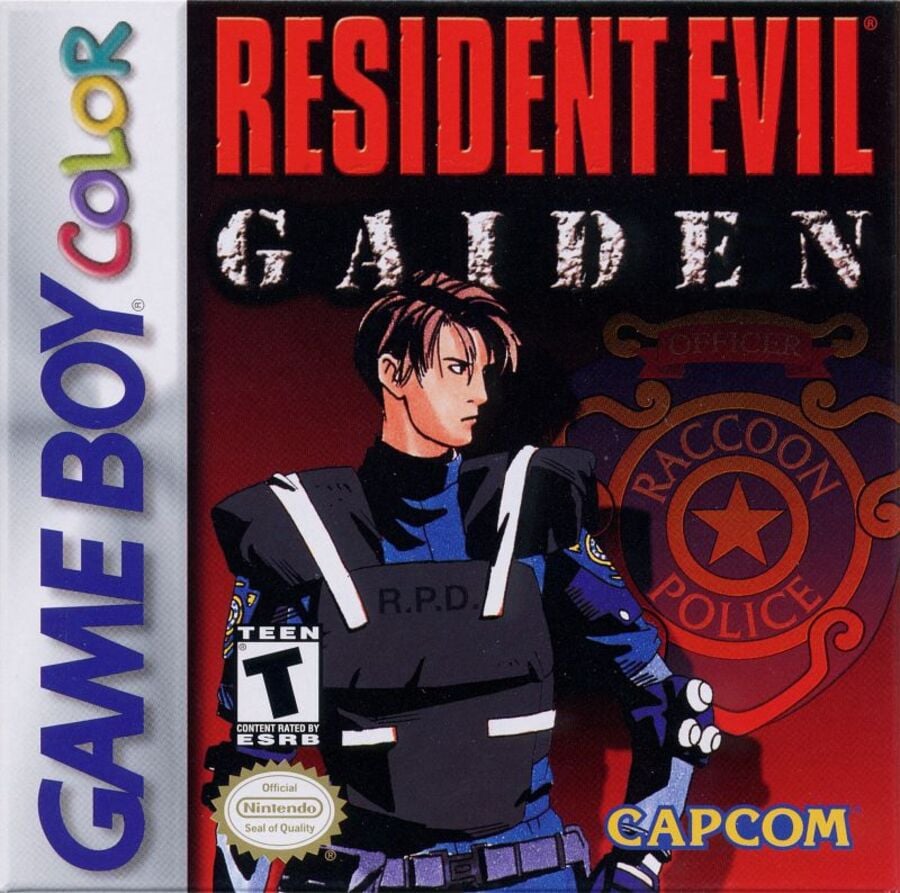
North America stands as the outlier in this week's brawl; the box art here depicts Leon S. Kennedy looking all moody and macho with his signature R.P.D uniform. The R.P.D badge is also seen to the right against a dark red background. Overall, it's a pretty good depiction of what Resident Evil might be like as a franchise, but perhaps doesn't do well to indicate what Resident Evil Gaiden is about, specifically. On a more positive note, however, we love the 'classic' font used for the RE logo; it's iconic for a reason and we're glad Capcom has returned to it in recent years!
Europe

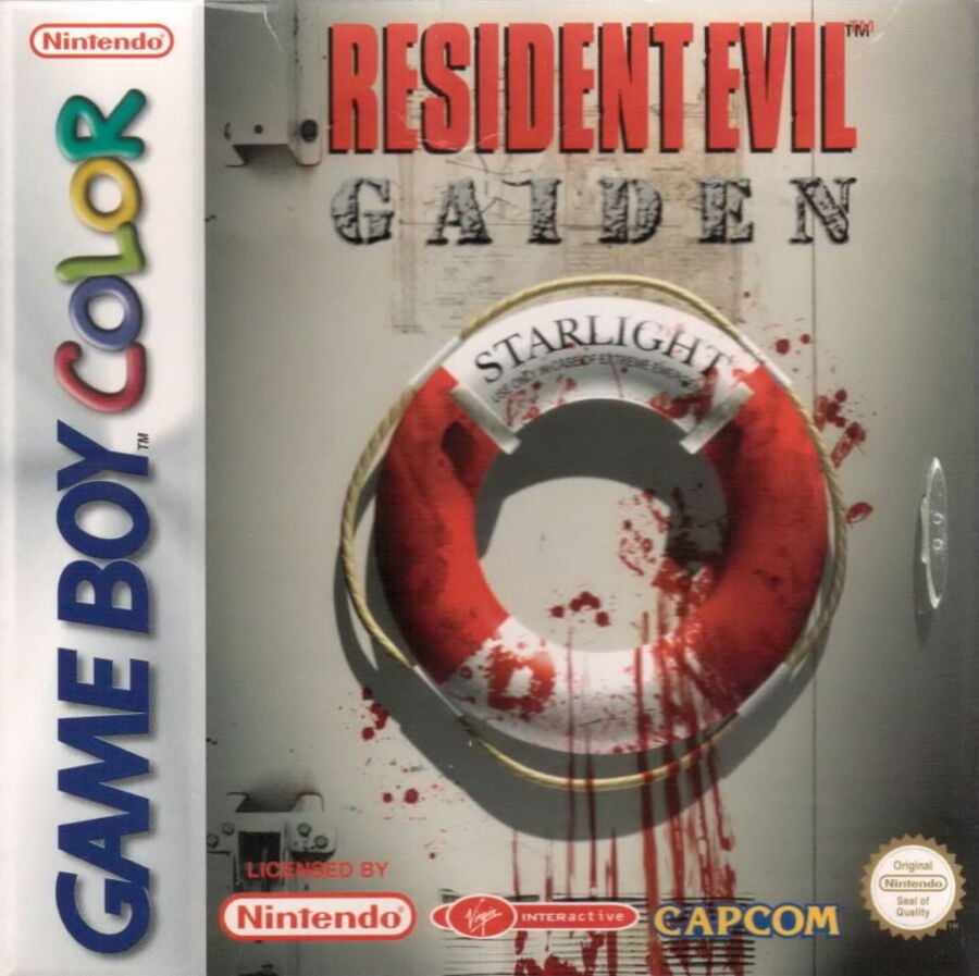
This is perhaps the more "iconic" image related to Resident Evil Gaiden. We see here a life ring adorned with the 'Starlight' title, giving a strong indication of the game's setting. But there's something wrong... What could it be? Oh yes, the blood smeared over the ring and streaming down the wall - lovely.
Something random to note here, too. The game was actually published by the now defunct Virgin Interactive in PAL regions, whereas Capcom itself published the game elsewhere. It was one of many Capcom games to be handled by Virgin, including the likes of Dino Crisis, Street Fight Alpha 3, and the core PS1 Resident Evil titles.
Japan

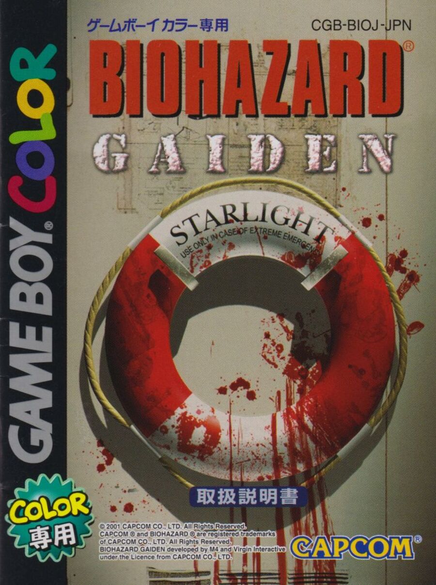
So as we said earlier, the Japanese box art for Resident Evil Gaiden is more or less the same as its European counterpart, but with a few key differences to note. First, the obvious one: it's called Biohazard instead of Resident Evil. The font is the same, of course, but there are plenty of fans who simply prefer the Japanese title, which is cool! Aside from this, there are minor differences in colour, such as the column down the left-hand side, plus a few extra bits and bobs in the Japanese language. The image in general is slightly more zoomed in, too.
So that's it! Despite the fact that Resident Evil Gaiden sits close to the bottom of the franchise in terms of quality, there's no denying that the box arts are at least pretty interesting. Make sure to make your voice heard and vote for your favourite one in the below poll!
Thanks for voting! We'll see you next time for another round of the Box Art Brawl.


Comments 27
Europe/Japan. The US cover looks like a bad photoshopped rush job.
The European one wins this time for me.
The Japanese one is way too cluttered with all the logos and text, while the US one is straight up ugly.
There's a certain level of 90's charm to the US art (that art-style screams it) but the EU/Japan one is definitely better. If I had to pick one though, definitely EU. They're basically the same, it's just that I prefer how the EU one has less going on compared to the Japan one, what with all those taglines and whatnot.
@Fizza Yeah. I love the US artwork's '90s anime style.
It reminds me of shows like Neon Genesis Evangelion, Mobile Suit Gundam Wing, and Cowboy Bebop.
It makes me wonder how a '90s-style anime adaptation of Resident Evil would work out. But the only anime studios nowadays that can faithfully replicate the analogue '90s cel animation style are Studio Ghibli and Studio Ponoc (and the latter is an offshoot of Ghibli).
Ghibli and Ponoc are more associated with making family-friendly fairy tales than something like Resident Evil, but Hayao Miyazaki was planning on adapting the manga Parasyte at one point during production of Princess Mononoke, but it was cancelled because New Line Cinema held the film adaptation rights.
Studio Ghibli making an anime adaptation of Resident Evil would be amazing.
Going with Japan myself. I think the slightly darker color palette (compared to EU) works better for a gritty box art like this.
Really surprised NA went with the anime art though, especially when JP didn't take the same angle.
I love the European cover, just the perfect amount of creepiness, without all the crowdedness of the Japanese artwork.
This is a tough one. EU/JP have a certain impact to them, but the NA one has the most character (literally), so I have to go with that.
Part of me prefers the silly kid-friendly US cover, but the European/Japanese cover betters conveys the notion of this being a game intended for adults (and a rather bold concept for such limited hardware).
I was disappointed that this had never come to the 3DS eShop. I’d love to see this alongside the earliest Resident Evil games in a classics compilation one of these days.
Is there an option where you can opt for none of them, as they all look pretty poor to me.
While I enjoy the 90s anime-esque art on the US box, the Japanese/European box art just has that classic "Resident Evil" vibe a lot more.
NA for me. I love this game.
Damn I hate all of them.
None are bad IMO, but I went with Japan. The life ring (and accompanying blood) hints about the game, plus I've always preferred the "Biohazard" title.
Box Art Brawls Current Total:
Europe: 34
Japan: 39
North America: 43
Australia and New Zealand: 1
J/E for sure.
I liked this game for a while, but eventually I got real sick of how buggy and unfinished it was. I know I got real close to the end of the game, but I can't remember if I finished it or not, or if I hit a game-breaking bug.
I have a confession, sometimes... I watch 90s anime purely for the art style (never DBZ) so America win this one for meeee
I prefer Japan over Europe and US simply because of the better cover-side, really like the black.
the european box art of Residen Evil Gaiden help set the tone of the game and is similar to the box art of Resident Evil Revelation.
Love the 3 way brawls between NA, EU and JP!
Though I do consider the EU and JP art for this release to be the same.
North America wins for me, the European and Japanese ones are just dated CG.
@Uska I love that old anime aesthetic. I won't watch something just because it's from that time, but I'm much more likely to keep an open mind just because of it. It just speaks to me in some way.
I don't like any of them. I want to like the US version because the art is good in some ways. I like the black shadows and coloring. The pose isn't dynamic enough to work as a cover. Leon himself would look better with a bit more of an anime treatment than he actually got there. Europe and Japan's covers are incredibly close. Europe's looks slightly blurry, but that's likely the image used and not the actual box. There's a bit more space than the Japanese one. Today, I pick Japan because Japanese writing looks interesting. That's all I got.
Gotta go with the Leon Character art. A life preserver is never a good call for your horror game cover, or any game for that matter. I don't care how blood spattered it is, it just doesn't entice me to play.
On the one hand, the US cover is a pretty generic old-school anime style interpretation, and not a great one at that.
On the other hand, the bloody ring is INCREDIBLY boring and feels like it could belong to pretty much any bloody action or horror game on a boat. At least put some claw marks or an eye or something, come on.
I'll pick the admittedly-kinda-lame US cover because at least it feels more recognizable and less bland.
NA just sucks. Japan’s is a bit complicated (No idea how to explain it), but i like the simplicity of Europe’s one.
Going off topic to one tangent in the article, Virgin Interactive lasted longer in Europe? (well, I'm not surprised since they're an arm of a UK conglomerate)
I remember their US division at least, got bought out in 1998 by EA. Most notable because EA immediately stopped a certain PS1 game they were going to publish called Thrill Kill, which I've heard probably would've been a punchline game for news reporters to blame all video game violence on, in the days after Mortal Kombat was getting a little old and GTA3 was years away (GTA1 existed, but I don't think that franchise got much attention until it went 3D?)
EU and JP easily win, but I agree, the very cartoony and kiddy Gameboy colour logos everywhere is jarring next to the bloodstained life preserver 😂
Show Comments
Leave A Comment
Hold on there, you need to login to post a comment...