Hi folks, and welcome back to another edition of Box Art Brawl!
Last week, the original Super Mario Strikers entered the ring, with North America / Japan going up against Europe with some pretty definitive results. It's clear that you fine people prefer a busier composition for your box art, with NA / Japan bringing in a staggering 86% of the vote! It's been a while since we've seen such a one-sided battle, but we've a feeling we may witness something similar for this week's edition...
Continuing the Mario Strikers trend ahead of the launch of Mario Strikers: Battle League, we're going to be looking at the next major release in the series: Mario Strikers Charged for the Wii! We've had a bit of a role reversal here too, with Japan's box art now siding with Europe's, leaving North America as the sole competitor this week.
Next week, of course, is the big one: Box Art Brawl #100! Thanks for sticking with us on this journey so far; let's keep it going to #200!
Be sure to cast your votes in the poll below; but first, let's check out the box art designs themselves.
North America
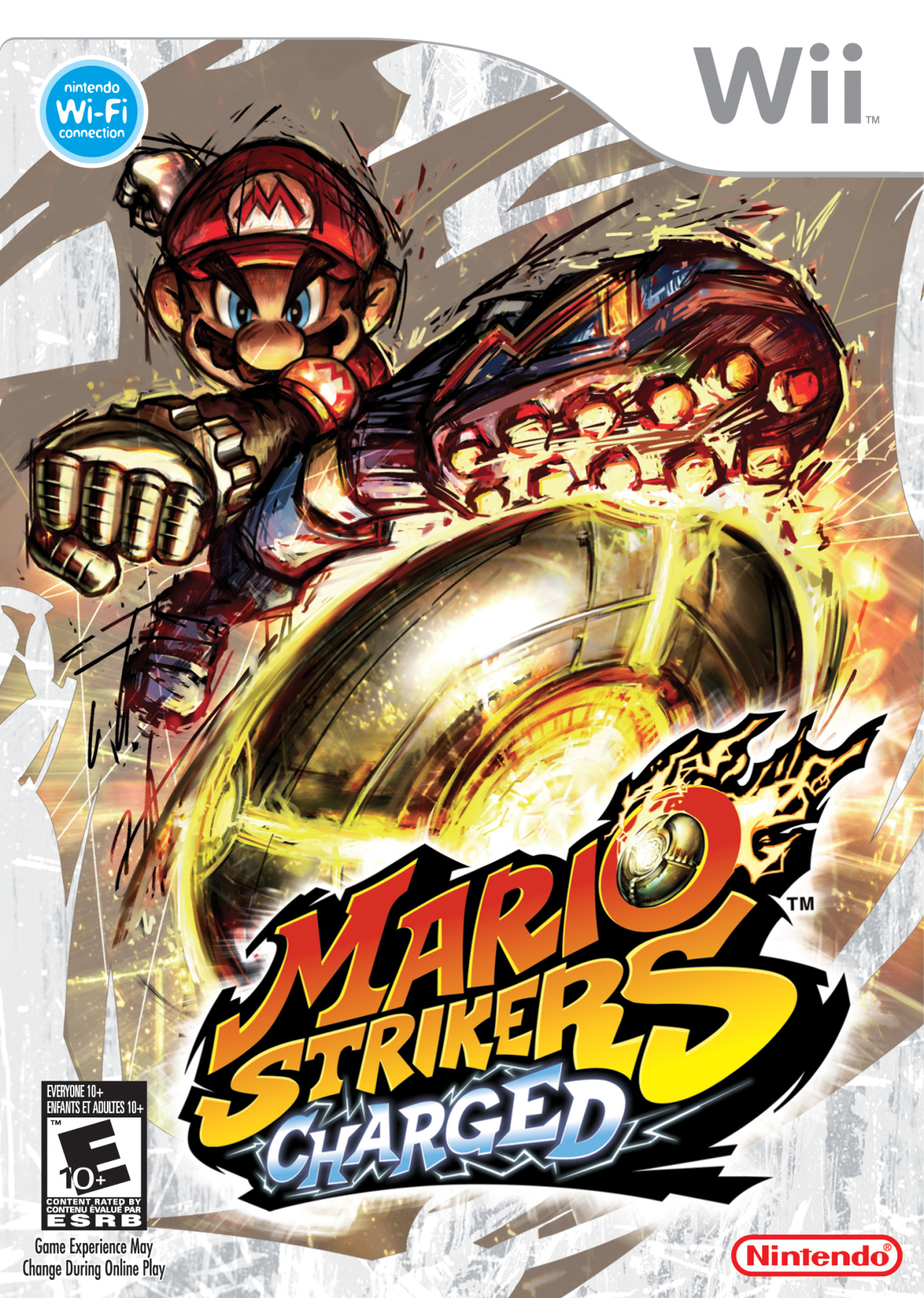
The North American box art for Mario Strikers Charged takes on a more restrained composition when compared to the previous game on GameCube. We've got the big guy himself, Mario, booting the ball toward the logo, looking mighty angry in the process, too. The art style itself carries over nicely from the first game, with the same haphazard brush strokes to convey a suitable sense of attitude.
Europe & Japan
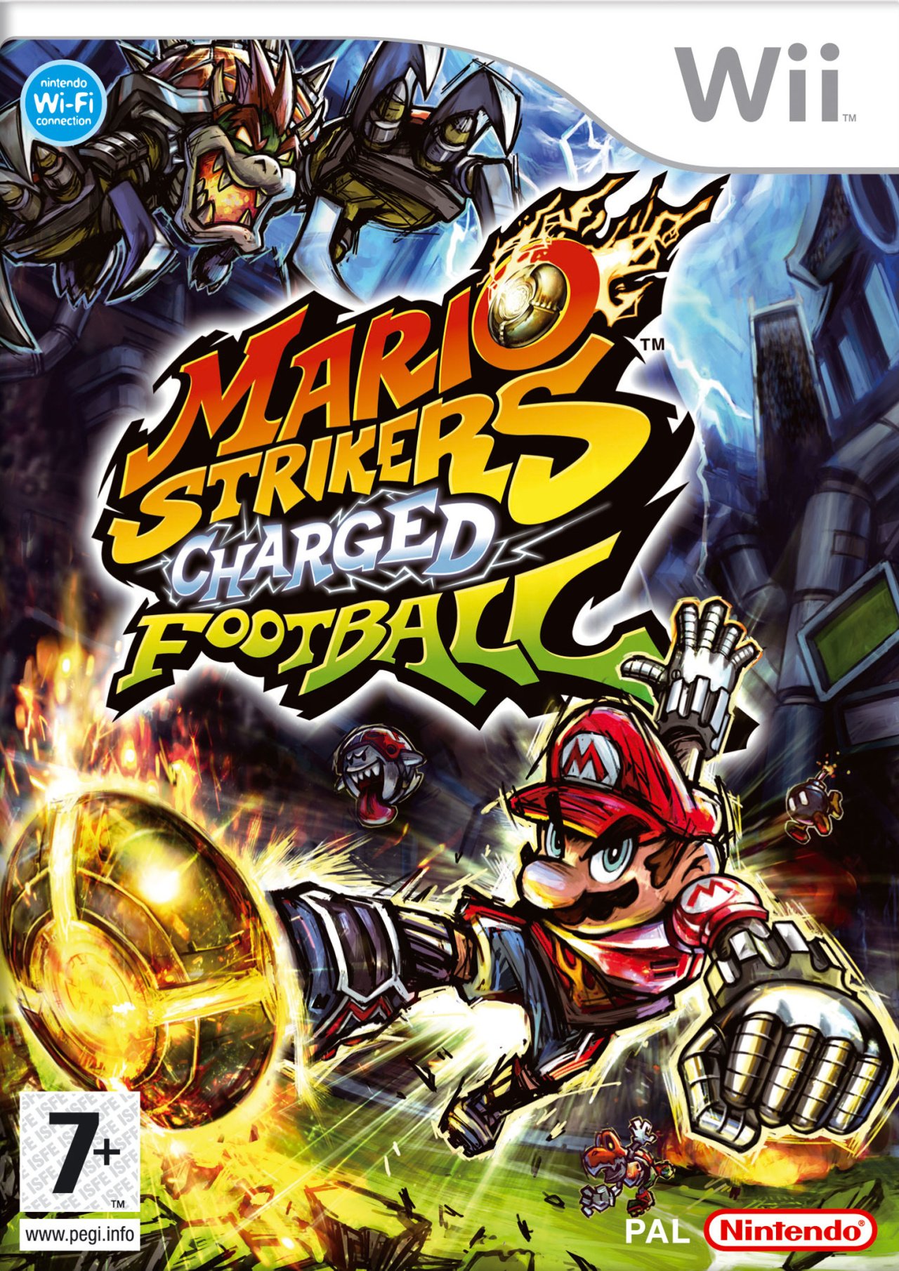
The box art for Europe and Japan is much more traditional, comprising multiple characters in what we reckon is a much more energetic composition. Just look at Bowser in the top corner; how cool does he look?! Mario is also looking pretty cool too; maybe a bit slimmer and fitter than we're used to seeing, but it works.
We're pretty confident on which box art will come out on top this week, but hey, we've been wrong before. Cast your vote in the poll below, and we'll see you again next week!
Thanks for voting! We'll see you next time for another round of the Box Art Brawl.


Comments 38
Looks like North America stole Europe's art from the last game. I went with Europe and Japan this time cuz there's just more going on in that picture and I like it.
Both are amazing tbh.
pops way more with a bg. feels like an actual match with characters in the bg too
Europe and Japan by a good margin honestly, but both are good at least.
However I think the American boxart of the first game beats both of these, honestly.
They both work, but EU/JA is more exciting.
It’s like a role reversal of last time
Hot Take - Wii had the most lifeless, box art compared to other generations & consoles. That plain minimalistic look that stemmed from the original plain white Wii console & box design did not make for an interesting theme. I think a large Wii collection has nothing on a moderate sized Gamecube collection when you have them on the shelf and in your hands. Gamecube had some of the best box art as did the Gameboy Advance. I think the GCN & GBA era was the best era of Nintendo box art. Also I think the GCN, PS2, and OG Xbox had the best box art; but some of it was for sure ugly. It could all be nostalgia but so many Gameboy Advance covers are etched into my memory. I've always had a habit of saving high res images of box art for my favorite games through time that I look back at and it evokes many memories of where I was, who I was with, and how I felt just gazing on it. I know this likely sounds a bit strange but box art rules.
Europe & Japan win big here. The US art isn't awful but by comparison to EU and to the previous game's box art it's not even a competition. Super Mario Strikers is my favorite game in the series, it was like the NBA Street (Basketball), equivalent to soccer/football with Mario Party. I still think that original Gamecube game was fantastic and to be honest I didn't even know they made any games after that. I'm glad Battle League is heading to Switch. Just playing the tutorials on the First Kick network test/demo I can tell it has quite a bit of nuance and challenge to master it's gameplay.
Europe japan
There probably was an employee exchange program, and they just so happened to swap the designers of the Gamecube box art and gave them the same job again. So my opinion of last time still stands: both are amazing in their own right, and I won't vote.
Although I must say: the more 'street' US one is a tiny step backwards from GC's EU one (great angle of lighting, perspective, and motion deformation though), the more 'chaotic' EU one is a slight improvement in Mario's pose, and I'm not sure who wins, Bowser in the background or DK in the foreground.
they both capture the kinetic energy of the game, but the Japan/Europe box art shows real action and stakes.
Going with the European/Japanese box art for the same reason I went with the American/Japanese one the last time. So far, Japan has been consistent with the box arts showing a crazy match.
Fun fact: ln South Korea, they kept the American box art and released the game as Mario Power Soccer.
The dynamic box art captures the essence of Strikers Charged pretty well, which in my opinion, outside Smash Bros., is the most aggresive and violent Mario and co. have ever been. Unfortunately, it feels like that aggressiveness and violence has been nerfed considerably in Battle League.
Speaking of Battle League, that game's box art feels a bit like a mix of both the "solo character box art" and the "crazy match box art", only without a match due to the box size of Switch games.
Going with JP/EU this time, for the same reason I went with NA/JP last time.
I always kinda liked the NA box art for this game...until I saw Japan/Europe's. Both use a great art style, but character variety and substantial backgrounds win in my book.
I always connected Mario Strikers with the European boxart, it has a special place in my heart but I think it genuinely looks the best too.
Both are cool, but NA is more compositionally cohesive, and more likely to catch my eye on a shelf.
EUR/JAP wins just because of that Bowser!
Box Art Brawls Current Total:
Europe: 32
Japan: 38
North America: 42
Australia and New Zealand: 1
It seems they reversed it from the gc game. Eu/jap ftw
Europe wins for the first time, it seems, hehehe. The NA one is great too, but EU/JP cover is just so much better.
The colors of the Europe Japan stand out more I think edging out the North America one.
Is Mario fighting off a UFO invasion in this game?
Way too much going on in the EU/JA version. Go for simplicity!
neither, very ugly
The European/Japanese box art gets my vote.
EU/JP is better for me because having one character on a sport game box art is kinda dumb.
Mario's eyes are drawn on his hat in the Japanese one. Hahahahaha... Who missed that awful mistake.
NA
the european/japanese box art of Mario Strikers Charged covey better the tone of the franchise.
Europe & Japan. North America's is too plain.
They're both good, but I picked EU/Japan just because it's nice to see some characters besides Mario.
Voting for the EU/Japan box's artwork, despite the clunky title.
Europe and Japan are the clear winners; it's got more going on and is more colorful while still just screaming Strikers' unique art style.
Once again, I like both and I could go either way. I voted for NA because of better composition for a game cover. I like the extra stuff going on in the Japan/Euro cover, but the composition is messy having Bowser above the title. They could have arranged it differently for a better use of space. For example, moving the title to the upper left section and having Bowser to the right of it might have been even better.
north america, for me.
Sweet art work! Awesome style!
I really like Bowser in the Japanese version, but to me the NA version has the stronger composition. Japanese one feels a bit busy.
Bowser looks so BADASS in this, about to charge some balls!
Both are great honestly, but I vote for Europe solely because of Dry Bones and Boo.
Both are pretty good.
Show Comments
Leave A Comment
Hold on there, you need to login to post a comment...