Box Art Brawl..? You're sure you remember those words, and yet... It's been so long, you're not quite certain of what it all means or even who you are anymore.
Just kidding.
Yes, we're back with a brand new Box Art Brawl! It's been a minute, for sure - 7 whole months, actually! We're excited to bring back the subtle art of pitting regional variants against each other to determine which territory has the fanciest, most eye-pleasingly, mouth-wateringly gorgeous box art around.
Back in August '21, we checked out Chrono Trigger for the SNES, pitting Japan against North America and leaving poor Europe on the sidelines. North America's more action-focused box art won the round comfortably, bringing in a whopping 69% of the vote.
Subscribe to Nintendo Life on YouTube847k
This week we're looking at the Wii release of Super Paper Mario, which incidentally celebrates its 15th anniversary this month! The game took the typical RPG elements that the Paper Mario series is known for and blended it with more traditional Mario platforming action.
So be sure to cast your vote in the poll and make your voice heard as we determine which Super Paper Mario box art is the super-est!
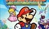
North America
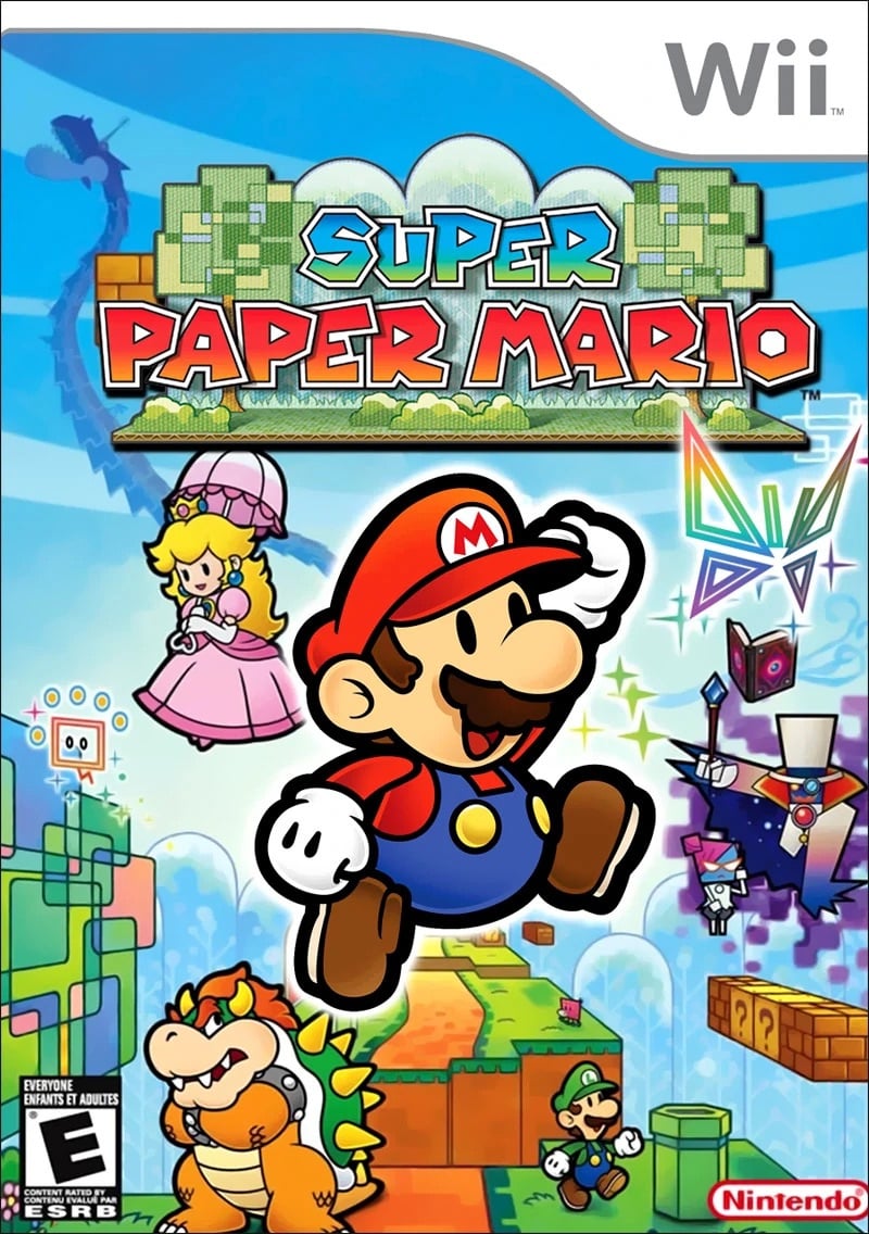
Our first lovely box art is very Mario-esque, isn't it? Lots of pretty colours bursting from the screen. We love the focus it puts on the terrain going off into the distance - almost reminds us of art classes in school when we learned about perspective.
Finally, we can't help but notice how Bowser and Luigi are facing away from each other, almost as if they've reached the end of argument and simply can't be doing with each other's nonsense anymore. Love it!
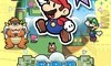
Japan
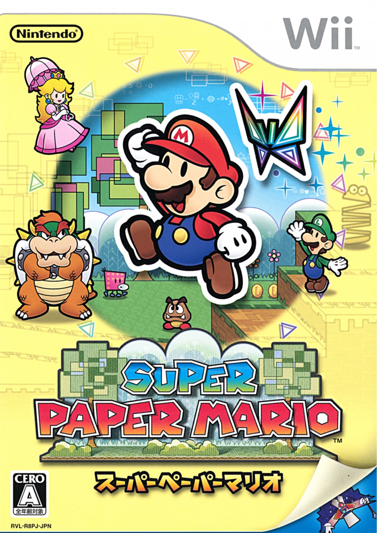
The Japanese box art for Super Paper Mario uses the same sprite for Mario himself, but the other characters have been altered slightly. Bowser is still sulking about something and Luigi's off on the other side waving at him. We like to think that Luigi got the upper hand of whatever argument they were having and is now just goading Mario's nemesis. Good ol' Luigi!
In terms of composition, we've got a bit of a spotlight centred on Mario, with most of the box art given a creamy kind of colour. It's also turned up at the bottom - like paper, wheeey - to reveal the dastardly Count Bleck.
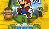
Europe
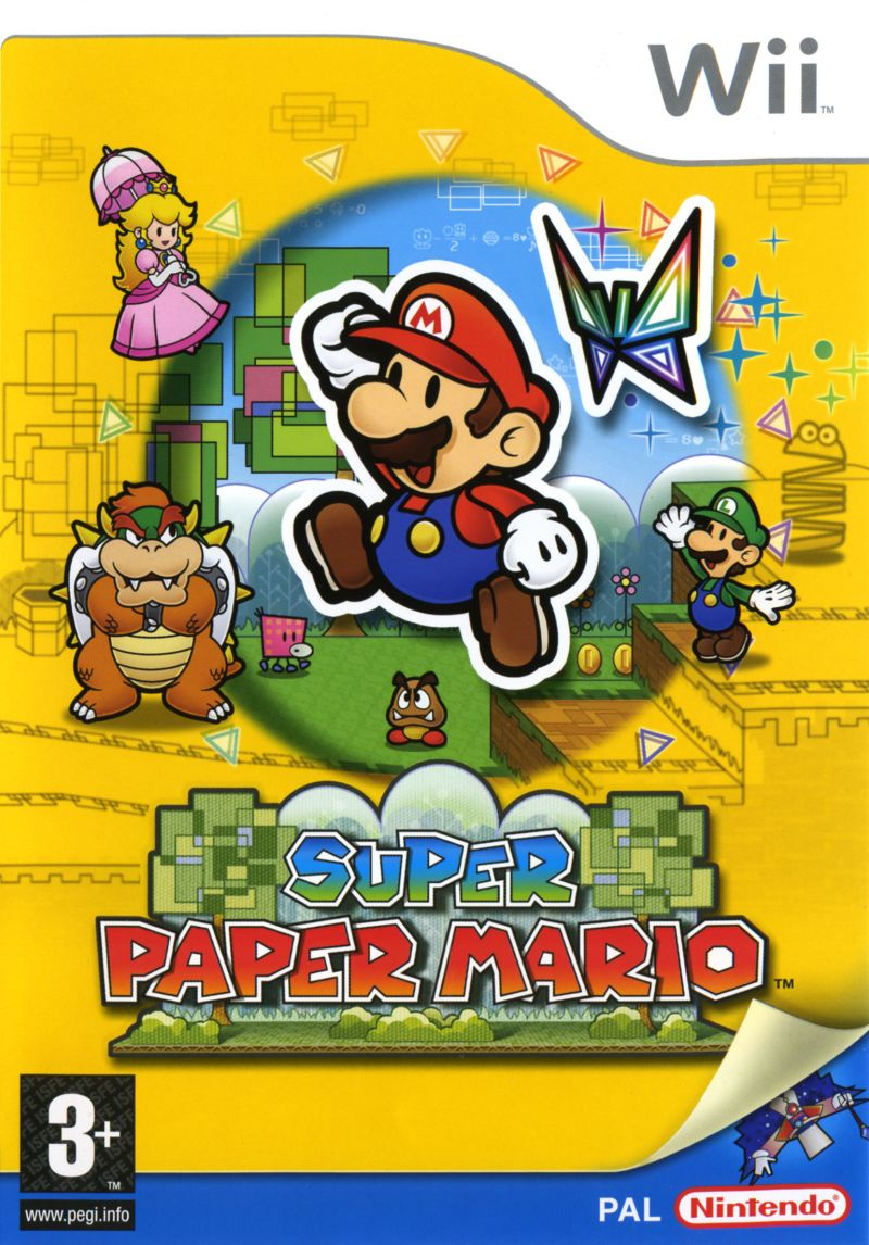
There's not a great deal to say about this one as it's very similar to the Japanese release in terms of the general look. The overall colour palette, however, has been darkened, with the deeper yellow colour reminding us of earlier Mario artwork like the Japanese release of Super Mario World, or the Super Mario Bros. 3 box art.
Its overall composition has been shrunk ever so slightly from the Japanese version, which looks to account for the inclusion of the 'PAL' and 'Nintendo' logos at the bottom. Whatever works, we guess!
Thanks for voting! We'll see you next time for another round of the Box Art Brawl.


Comments 66
Too close to call, too similar = redundant choice.
I have never played this game but things I knew from this game after watching from YouTube were the creepy World of Nothing, twisted head spider creatures, the disturbing sound of Styx river.
Even putting my nostalgia aside, I think the NA boxart just looks better without that cramped yellow border the JP and EU boxes have.
NA’s is the best. It has the most color and detail, and looks different from the other two
Yes, Box Art Brawl! What a great battle!
More Brawls!!!
Never liked the yellow overlay design, so US wins for me.
This is the last true Paper Mario game and is one of my favourite WIi games of all.
Welcome back box art brawl!
Erm, I find myself nit picking here and can't lean towards a favourite, so I will abstain on this one.
I knew something was missing from my life. Thanks NL for bringing Box Art Brawl back! As far as this go around, I think the NA box art has the most vivid use of colors and already immerses you into the world rather than viewing the "vivid" through a circle. Fortunately, none of these are eyesores
Gonna be completely biased and go with North America. More art isn't always better, but it works so well in this case.
I'm glad that Box Art Brawl has made a return! It's a nice Sunday bit of fun.
Ooo I like this idea.
America for this one as it much better represents the mechanics of the game.
IT LIVES!!!
Also, for my money, I'd have to go with NA on this one. The page turning to reveal Bleck is cute on the EU and JP ones, but the NA one just has a lot more going on and is just generally more nice to look at personally.
North American, easily. I usually go for the European version for familiarity/nostalgia, but I hated the box art for this game back when it first came out before I knew what the others looked like.
The European and Japanese box art corner reminds me of Funky mode on DKC Tropical Freeze.
@GalaxyGreg 'New Count Bleck Mode! Activate on the title screen for 50% more depression!'
Why did this feature go away for so long? I always looked forward to it.
Super paper Mario is a great game. All of them win
The one that actually shows more of count black. Great game though like really. More deep and dark then the cover suggests
I really enjoy this series. I know most of the drastic cover variations have been covered in earlier polls but it's still fun to vote.
Yes! It's back! I've voted every week even though I never leave a comment!
Nice!!!
I like the Europe one this time, reminds me of the Japanese boxart of super Mario world on the SNES.
They're all nice, but I'm going with North America.
They all suck IMO. Just looks like character concept art pasted randomly.
I tried this game out, but I just could not play it anymore after the mimic fight. It was just so boring and slow. It takes forever to get anywhere and the platforming is so mundane. It’s not challenging or entertaining at all. To me it just felt like filler. Stretching out the story of the game; which I may mention, is almost nonexistent at the beginning. There is just a bunch of boring text. I’ve also been told that the story picks up later, but I don’t have the patience to get to that.
@bobzbulder Similar for me. I liked the game, but forced myself to finish it. I enjoyed The Origami King more.
I'm gonna say the North American box art for this one. I prefer colorful box arts.
The Europe and Japan ones pay reference to the scan feature of the game, hence the spotlight effect. I’ve never took notice of that until now. I’m also a sucker for the cheeky Count Bleck at the bottom. I’m team Europe on this. The bolder colors look nice.
Well I'll be damned if I'm going to go back through my previous comments to find the previous total.
Nice to see the feature back.
I do like the darker yellow of the European cover over the Japanese one, however, I voted for the North American box art as that's my favorite of the three.
@Mauzuri I consider Super Paper Mario the absolute worst entry into the series tbh. although yes, only the first 3 (including Paper Mario RPG) count to me as well.. The rest was just never any good tbh
Guess what came back, the 3DS, Wii U eShop, Box Art Brawl, this person writing???
Well I guess 2 outta 3 is good.
@Mauzuri 100% agree. This game is amazing and the others don't hold a candle to them
I quite like all of them! But NA for me.
Let's not ignore the cool dragon on the NA cover.
Ah yes. NL’s Box Art Brawl. The poll that’s told me over the years that’s there’s no accounting for taste.
They don't differ that much. The NA one has more of a generic feel of a Wii boxart with the background compared to the others IMO I've gone for Europe.
@Franklin that’s a bummer, but I understand. You still rock!
I think the blue sky and gameplay background in the NA box are much better than the yellow border and random shot of a goomba just sitting there right below Mario.
Honestly, without looking, I would have believed any of these is the box art mine has, and I would be equally fine with it.
I’m going with NA. EU still looks pretty cool though.
I missed this feature!
@Franklin Well I found this in your comment on the Chrono Trigger Box Art Brawl, in case you feel like continuing.
"Box Art Brawls Current Total:
Europe: 30
Japan: 34
North America: 36
Australia and New Zealand: 1"
North America wins for me. I don't like the yellow border on the other two.
I was not sure which way to vote at first. They're all good. I decided to pick the Japanese version as my favorite. For NA, I like the concept and the color choices. Obviously, Europe and Japan are almost the same. In that case, the pale yellow of the Japanese version works better with the line art around the edges in my opinion. So as to why I prefer it over the NA version is the framing. I think it looks better with the title logo on the bottom than the top for this particular group.
I consulted the family! 😂
We came to the Japanese one. But they're all great!
Not only is the North American version the best cover among the three but also one of my favorite video game covers of all time.
Japan and Europe's aren't bad, but NA is best without those borders.
@crosslice
That indeed is a more logical way of finding it.
Alrighty then.
Box Art Brawls Current Total:
Europe: 30
Japan: 34
North America: 37
Australia and New Zealand: 1
Japan = europe -> north america.
NA design is not as inventive.
Europe’s looks off to me due to the coloring and I don’t think Japan’s is overly interesting, so I’m going with North America’s.
WOO! It's back!!
NA easy on this one
I think this is one of the rare cases where Japan comes out in last place. Too many borders are clashing between the Europe and Japanese boxart, the yellow background isn't doing much for it iehter.
The NA boxart has a much cleaner background with nothing clashing in between and overall looks the best by far to me.
And I like Europe over Japans a bit more because it has better saturation for the background colors and especially characters.
NA >>>>>> Europe > Japan
Yes! I have missed these so much! NA hands down is the winner this week.
First off, I'm so happy that Box Art Brawl is back. It was always a great thing to read on Sunday while drinking my coffee.
I love the NA box art because the colors scream classic Nintendo to me. Bright bold blues, greens, reds, etc. My friends and I used to call the sky in level 1-1 of Super Mario Bros. Nintendo Blue!
Went with NA. Livelier overall.
For JP and PAL, not sure how I feel about the random Goomba right in the center. But love Count Bleck popping out of the corner folding the paper up - really sells the aesthetic.
In Australia we had the same box as NA, I remember renting it and seeing that box. Quite a few years later I went to an electronics store to buy a used copy, but it was a European copy, so that's now the one I own.
I voted NA because I preferred that box. I find the yellow too strong. I do like the folded corner on the Japan/Europe one.
How strange, the NA one is the one we had here in Australia, which is odd, considering we usually follow Europe
Super paper Mario is an absolute classic. Fun characters, gameplay and story.
yay Box Art Brawl is back, the north american box art of Super Paper Mario is the better one(it don't clash with the other elements).
American one wins because I'm not the biggest fan of the yellow border.
@Mauzuri A shame, considering two of the three games released after it are way better.
Can you please do Rayman 3?
Wow, it's really been 7 months since the last one??? Countless stars have flared into existence and then gone supernova in that time. Probably about the same number as new Netflix series that have been cancelled.
At least I still have my copy of this game. All I should need is Mario Galaxy 2, Wii Remote and Nunchuck, and I feel like I'm back in 2008 again
I chose America because it has Bleck more prominent.
Thanks Nlife for bringing Box Art Brawl back!!
Interestingly Australia got the same artwork as North America, despite being a PAL region.
Show Comments
Leave A Comment
Hold on there, you need to login to post a comment...