The Nintendo Switch has been in our hands for more than four years now, but the console's home screen and user interface have remained largely untouched.
On the one hand, you could say that the system's simplicity doesn't need altering and works just fine as is, but we've seen enough 'WHERE ARE THE FOLDERS, NINTENDO!?' comments to know that plenty of Switch owners wouldn't mind a few handy new features. So long as these tweaks don't interfere with the console's impressive speed, we'd have to say we agree.
Subscribe to Nintendo Life on YouTube848k
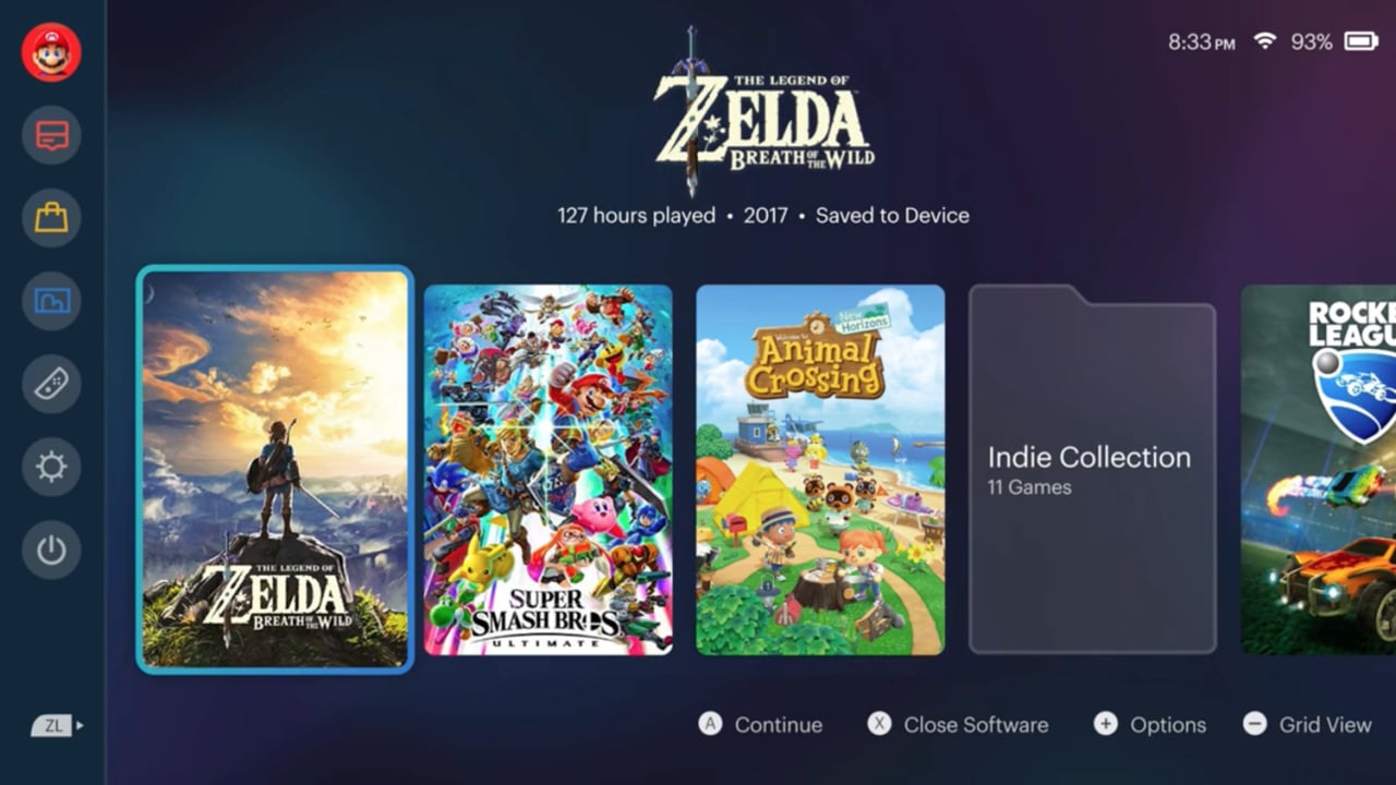
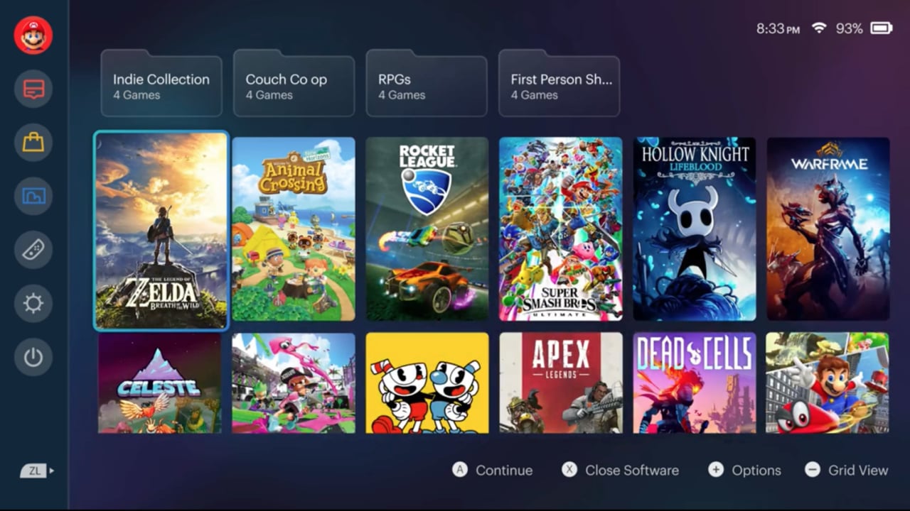
We've seen fans take on Switch UI redesigns in the past, but this new effort from Reddit user Frieznburg has us particularly impressed. The design maintains Switch's current focus on the games themselves, keeping them front and centre and arguably making them even more gorgeous in the process, while adding the folders we so desperately crave and key stats, all right there on the home screen.
It's not too complicated – we're glad to see that Frieznburg hasn't ruined the idea with CPU-intensive dynamic themes or any major overhauls – and the whole thing would be a pretty welcome change in our view.
But what about you? Would you like Nintendo to spice up the Switch's UI in a similar way to this concept video? Is there anything else you'd change, or do you think the Switch is already perfect as it is? Let us know in the comments below.
[source reddit.com]


Comments 86
I prefer the current UI. This one looks kinda ugly, especially the re-designed game icons.
I would prefer themes over folders (tbh I'd still be down with folders though). I said this before but I think amiibo should include themes and new profile pictures related to whatever amiibo you have. I've got a ken amiibo and would love a street fighter-themed switch lmao.
This is very nice, I would definitely prefer it to the current.
Nintendo Legal Department: OBJECTION!!!
This UI looks too similar to the PS5. I would rather keep the squares (to save developers and graphic designers headaches) and then it might work out better.
There is my 2 cents worth.
@rasterize ...over what? This is a mock up.
10 times better than the basic UI we have now I'd like it if they could make it like the Wii when in docked mode so you can navigate the menus using gyro
Danggggggg that looks really nice but there's to much gray area at the top, but I'd really want folders and themes
There is nothing wrong with the current UI. Go to game, press a button. Happy days. Why are folk starting to overthink it? It's not broke and it's not clever. I spend about 5 seconds in my UI. HAhaha. This is just a none issue for me.
@nessisonett He's trying to be funny and cool by doing what everybody does to anything fan-made, even though it's quite an annoying comment to see, and it's old and not funny anymore. Obviously he can't have read much for him to say that though.
This doesn't look that great.
Not sure why this is getting attention out of the hundreds of Switch UI mock ups.
I'm kind of mixed on this, there are some aspects I like like the folders and seeing the game logo, but other things look a bit ugly.
also I think we should keep the square icon because that might cause a bit of an annoyance for the icon designers
i'll never fully understand the obsession to redesign this. don't you just turn the thing on and go straight to your game? what else does it need to do?
Looks nice. Forgot how the switch ui looks like as my switch is always loaded with a game
@Would_you_kindly That would be awesome, since you would be able to use the touch screen to navigate as well.
It's pretty, but I don't see the point of folders unless you've got many dozens of games. And most Switch users won't. What's the average number of games owned? I guess it's under 20. Maybe adding a few extra Theme colours other than black and white might help. Some people read better with coloured backgrounds
Get the F*lder out of here!
(see what I did there? I made folder look like a curse word.😉 We can definitely use a folder on the Switch. Especially for my shovelware.)
Gimme gimme gimme
@nessisonett
Its a joke because of the craziness of the lengths they go to protect there IP.
Love it. Using the full box art would save developers from cropping and squaring up a whole new image for the menus. Yearly updates would be appreciated
@TheRenegade908 I like how you said the exact opposite thing that DDStuff said lol.
Not to crazy about the box-sized icons, but... FOLDERS!!!! If only Nintendo would give us the bloody things!
And it would be way slower than the current UI that is snappy as .... (If is not broken don't fix it)
Honestly, I don't spend much time in the home menu to warrant a better look. Better organization, not unlike folders, would be very welcome, on the other hand
I guess it's a nice UI if you like....ugly things?
The 3DS had tons of customisation added over the years, and it only crippled the system. The Switch is very much about reducing the barriers between you and your games - and I'd say the home menu reflects that.
@DDStuff This design would be easier for the devs and artists. Because it match's the cover art. dimensions. Right now they have to design a custom square.
I'm fine with the current UI. I actually preferred the N64/NGC days when you'd just turn the system on to play games. The Wii Menu was pretty cool too. All I want at this point is for Nintendo to announce actual new games. E3 can't come soon enough.
So, it definitely looks nice but you can clearly see it being a bit laggy compared to the current one so I prefer the current one. Sure, it's super basic but switching between games and accessing the options/store is so fluid I'd never want to trade that for some fancy visuals.
The overall layout is perfectly fine in my opinion. But I would like the ability to change icon sizes and put more on the screen, as well as the ability to manually sort them. Folders would be very nice too, so I can put collections of games in one spot.
I think I can understand why they might not want complex themes with music and animations, but being able to change the color beyond light or dark mode or have a static image for a background shouldn't be an issue.
More player icons would be nice too. Why did we never get any for Xenoblade or Fire Emblem or any of a bunch of other major releases on the system?
This looks very nice besides a few ntipicks about the length of the game icons.
I've mentioned this before in another article but Sony and Microsoft got this kind of thing right with the PS3 and XBOX360 with their UI customization and it baffles me that Nintendo has yet to catch up yet and even though this sort of thing isn't necessary as some have said, it's still a nice feature to have to make the console feel like it's yours, not to mention the folders make navigation more convenient with those of us with larger game libraries.
Really don´t like it.
A part from some folders I don´t need anything more I am petty happy with the slick & fast Switch UI
It does look better to me, but let's face it: It's just cosmetic. I have more than a hundred games saved to my Switch, and I really don't have a problem finding what I want. If they wanted to make an easy change that wouldn't mess up their basic motif, how about letting people pin games to the front of the line, or maybe to a favorites bar?
Looks like the PS5's UI's ugly sister. No thanks.
Just keep the current UI but give us folders. Win win.
@rasterize "Nintendo Legal Department: OBJECTION!!!"
Phoenix Wright is on the case as we speak.
@earthinheritor Considering how far into the Switches lifecycle we are, I rather not see blur effects on games that remain squares on my Switch screen.
For example: I have a few games in my Steam Client that have not updated their artwork icons to fit the newer design they came out with years ago. So I am stuck with these blurred smears top and bottom of these tall rectangle images on my games list.
Next non-Switch hybrid system can try a newer UI. Because long term when the servers go down in 20 or so years: older icons will clash with this design. I rather they keep the squares.
@GrailUK it take me maybe an extra 15 seconds to find the game I want, the way things are now. If we had folders I could
Knock that down to 13 seconds it’s all about ease.
about 10000 times better than the ugly original design that has not been changed at all since the release....
@BenAV they are not redesigned icons but artboxes and it looks much better IMHO
This is incredible. I would love this.
I'd love to have more options, this one included, but I'd personally not choose this and much prefer what is available now.
Looks iOS design much...
No thx, this is more design above functionality.
It's fancy sure but not functional, prefer the current Switch it's design.
@Rayquaza2510 not functional? you must be kidding
Eh, I prefer the simplicity and snapiness of the current UI. I also prefer the squares. Only notable thing the current UI is missing is folders, and maybe different colors for the background. At least this mock up isnt unnecessarily too busy like I've seen with past mock ups. After all it's just the UI don't understand why people like to over complicate it.
It would be a nice change. Maybe some new "themes" too
this is exactly how i imagine the new UI of Switch with themes and folders would look, i love this, i getting tired of my extended battery Switch gray UI.
Probably the only thing I really want them to add is some goddamn music to the Main Menu and the eShop. That's all I really ask for. Without it, it feels like the Switch has no personality.
I don't really care about folders, though they would be nice.
I'm someone who before turning off a console, especially a Nintendo one, I let the Main Menu idle to listen to its rather-soothing music while I ponder about things or check my phone. So, yeah, like at least 15-20 minutes of my night gaming sessions are sitting on the Home Menu.
This is cool, but at this point my expectations have been whittled down to being stoked if they added a couple more color options other than black and white. Blue, green, red, and I'd be set.
(Seriously though... Why is there no red background motif? Its basically been part of thier branding for the last 5 years now. And don't try to tell me that loading a different hexcode for a different color will slow down the UI)
I like it as is. Not too bad
looks better than the boring version we got
@TSR3 I've over a hundred and have two switches and consider myself to be like most switch owners.
Switch crossbreed with a PS5. Not exactly what I wanted by "improvement" and the offspring still would lack folders.
How much time do people want to spend in the UI for this to matter?
@GrailUK
People are super super dumb about this it led to games like anything Dice put on PS4/Xbone taking up to a minute to load a main menu because they’d stuff them full of 3D assets that wouldn’t be keep in RAM while actually playing the game so any trip back to the menu has you staring a loading screen for a minute so you can have pointless 3D models in the background and like most of gaming’s worst trends this goes back to Half-Life 2
I actually like the current switch UI more. Ppl complain that its too simplistic but who cares. Its clean, simple, fast, and it just works.
@andjahiam like most Switch owners on this site, I'd bet! You've got over twice as may games as me anyway, so do you think folders would be any benefit to you?
The only thing I'd like the UI to have is a way to move the icons, so I could personalize my home menu rather than using preset options. Don't really care about folders.
The mockup is quite pretty though. Just didn't like the logos on top of the screen. I would remove them, move the games icons up and return the side buttons to the bottom.
I am perfectly content with the UI, it is fast and snappy.
This fake video actually makes the UI look more sluggish.
That background is roasting my eye. Nope. I like the current UI just fine.
Granted I barely see the UI as I can quickly get to my game and start playing.
The menu at the side pushing the rest off centre irks me. The doubling up of the logo for the selected game is unnecessary and the smooth fades slow the whole thing down. Other than that it’s quite nice.
For me the current one really only needs 2 things: a row of customisable tabs/ folders above or below the main squares, and themes.
Just keep the current UI and add folders lol.
I assume there are many like myself totally frustrated trying to navigate the Switch eshop! It’s sooo annoying to attempt to scroll through more than a thousand games on sale each week and then out of the blue the page refreshes and brings you back to the top leaving you no choice but to start all over again- If you even want to bother at that point!! They have to do SOMETHING! Jeez! The Wii U eshop is even better!! I’d be happy with that at the least! 🤪
I want folders so badly. I have over 240 games for my Switch. Before anyone asks, yes, I have a backlog. Yes, it was expensive.
@joey302 Perusing the eShop is extremely frustrating because of that refresh. Not to mention all the videos that either don't load or just show a black screen and you can hear the sound.
I like the approach, but think the game icons should remain squares instead of rectangle portraits. Folders would be great. I like the colors of the mockup too.
But I can't think of a time a system's UI was overhauled in the middle of its own life cycle. If it ain't (totally) broke, don't fix it, I suppose.
I fear we are stuck with the Switch's design as is until updated or new hardware comes out.
it looks pretty sleek, but not everyone would want an overhaul design after being used to the old one for so long.
i think folders and more custom colors is all we really want with the current menu tbh
@TSR3 I have over 150 games, but even I don't need folders.
@DaDebbil someone had mentioned that it may be my internet connection but it can’t be. Yea it’s a terrible experience. If they categorized the games on sale by genre at least that would help a little and you can zero in more on what interests you. Yea Same here 1/2 the trailers you can’t even watch!! 🙄
....You'd think we would've had an update to this by now...remember when the 3DS got it's updates for the main menu? Was fun, Switch...still the basic...boring...lifeless menu. No folders, no themes...no music...it's just...there...hasn't changed since launch.
It's always disappointing when a game has really cool box art but you bought digital or used and never get to see the art a lot so I like that about using the box covers over a (usually) simple icon.
Reminds me of those in-store Wii U consoles that had demo selectors and would display the games with the box art.
If each game when highlighted had a background it would really help with the negative space in this design...or more info like age rating, player count, dlc options etc. I much prefer this design though.
Don’t like the loss of space on the side bar and also feel the folder icons, resembling physical folders, is a dated design trope that has no relevance on a video game console where we aren’t sorting “files”. Folders implies a hierarchy data structure where what is likely needed or intended is user defined collections or tagging capabilities.
I like the colours on the mock-up though.
I really only care about themes and folders, the icons could stay as they are.
If Nintendo would just refresh the UI, it would make the Switch feel not as old as it is. This is a fantastic concept for a UI refresh, and I hope we can see something...anything from Nintendo on this subject.
One very simple thing I wish was an option for the Switch to NOT have your physical games display. About 2/3 of my games are physical, but when I want to play one of the downloaded games, everything's a jumbled mess. It was so much nicer when the physical games weren't clogging up the UI and the downloads stayed wherever you put them.
Nintendo hire this person this looks so much better
Just themes please, sick of just black and white, why bother making a section in the settings if its just going to have 'two' themes
@Crockin what about if you have large amount of games? I'd like to be able to have an 'Unplayed' folder, or perhaps I'm in a mood for some retro fun and I want to go to my 'Arcade' folder instead of having to browse through a massive grid of hundreds of games. The current UI is very poor if you have a lot of games and you don't know what you want to play.
Customisable tags would be nice. I think themes and folders would probably slow the system down a bit, but being able to tag the games by genre/unplayed etc would be useful.
I really want something like this. Please.
I would have loved for Nintendo to have taken the initiative and jazzed up the Switch UI at some point over the 4+ years. But at this point, it's probably not gonna happen in any shape or form. In the end, no big deal. It's all about the games after all. Though a little pizzazz in presentation wouldn't hurt
I immediately see flaw of this design looking at it. Currently design up simply tap down on joystick to go to system icons and up again to go back to game icons.
In that design left and right would move between games but with the system icons on left the intuition of gui wouldn't immediately make you think up/down do anything and that you'd have to first go to left most game to get to the system icons via left navigation.
It looks nice for someone who uses touch screen a lot but some people actually do prefer to flick analog stick a couple times to get to something than touch screen. So it's clear person who thought this out was designing it without sticks in mind and going purely off aethetics and touch screen usage. Nintendo actually thought of both.
Concur with many above,,, I’d be happy w more color palettes and either folders or a way to organize your games manually. Alphabetical or by developer doesn’t always bring games of the same series together, and sorting by play time is no longer accurate as I upgraded my switch and it reset my hours:/
It;s nice. I just don't like folder ic ons on top
Okay, please forgive me if this post is long.
I am a graphic designer and this menu, like most other menus, just doesn't have very strong UX. These mockups focus so heavily on the look and are so married to the original design that they forgo designing a menu worth getting excited about.
My issue with this menu as well as most of Nintendo's games (to be honest) is the complete under-utilization of the buttons on the controller and the goal of putting form over function. These menus usually only use about three or four buttons. A selects a game, B backs out, X closes, + opens the menu. Why couldn't hitting Y open a UI wheel and the user could select the folder like selecting a weapon in Ratchet and Clank? Why isn't there an Auto-Update All function? Why isn't there a way to sort games by date, length, Metacritic score, etc.? I have seen menus like this over 100 times on Behance and Dribbble. Designers are going to need to think outside the box if we really want to make a good menu. To me, this redesign is just the same clunky menu with the same clunky folders we have seen in past generations.
I really don't care, because I spend my time on the Switch playing games, not staring at the UI.
Looks cool to me!
Show Comments
Leave A Comment
Hold on there, you need to login to post a comment...