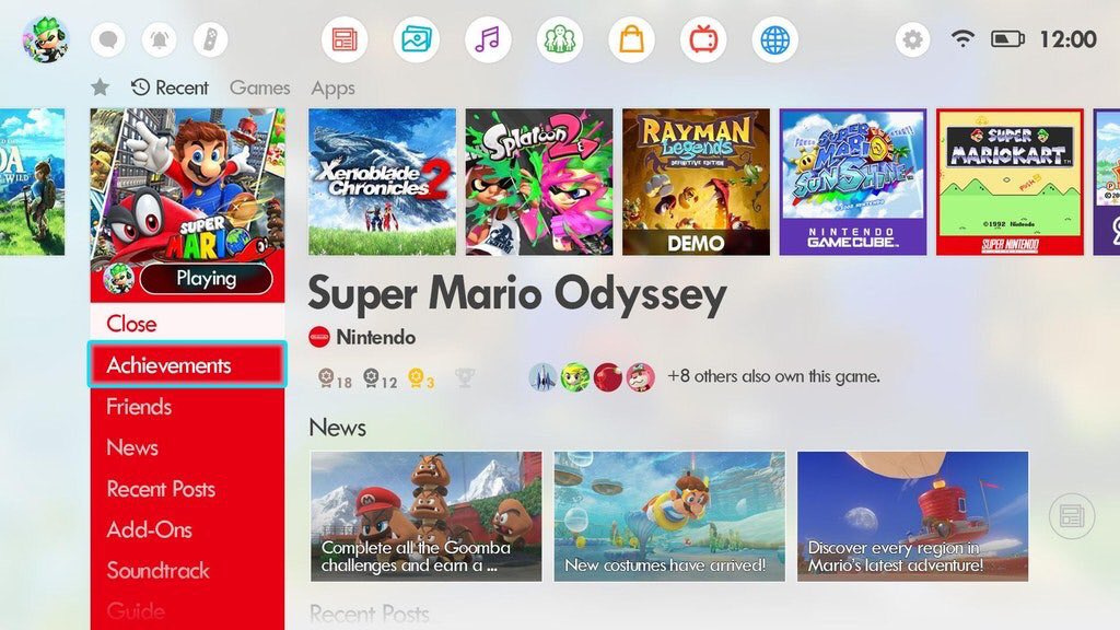
The Switch's user interface often sparks endless debate amongst fans, with players taking to the likes of social media or these very pages to share their wildest dreams on what they'd like to see. Now, this fan-made mock-up provides a glimpse at how a revamped interface could look and we're madly in love with the entire idea.
It has to be said, there's something smooth and sleek about the Switch's current minimalist design (which you can see below); with the only real options being 'light' or 'dark' themes, the whole interface is left incredibly uncluttered to the point where the games themselves really catch the eye.
Subscribe to Nintendo Life on YouTube846k
Having said that, we can't help but long for more features and other goodies that could be implemented onto the screen. The mock-up, which has been shared online by Twitter user @NGameTheCube, shows a handy way to see in-game achievements (which still don't exist on Nintendo platforms), additional information about your friends, access to extra info on the titles that you own in one convenient place, and even a lovely icon design for Virtual Console-type games such as Super Mario Sunshine on GameCube.
Other things are included, too, such as the sadly defunct Miiverse (which probably won't ever return now that you can easily post to Twitter and Facebook from your console) as well as an internet browser and what looks like a music player. The layout looks fresh and pleasing to the eye, but it also shows how easy it could be to have these things ready and waiting from the home screen should Nintendo want to add these features in the future.
Would you like to see the Switch's home screen have a large overhaul? Or would you be happier to see it keep its current, minimalist state? Share your thoughts and ideas with us in the comments below.
[source twitter.com]


Comments 141
Far too busy - looks like the PS4 theme. Makes me understand why Nintendo wanted the UI to be "all about the games", plus this would be impossible to read when in handheld / tabletop mode!
Mario Sunshine... lol
Beautifully depressing.
Far, far too cluttered.
I like the minimalist theme.
I despise the PS4 menu. Too much nonsense on there. Remove like 80% of that nonsense
So "the dream" is for the UI to look almost identical to the PS4's...?? xD
I'll take the Mario Sunshine & Gamecube games running on Switch though!!
I just want retro games on it (that aren’t arcade or NES).
Achievements would be fun, but I’d prefer Nintendo wait until the next console rather than start them this late into Switch.
A couple of extra features (like folders and activity log) would be nice, but one of the things I like about the Switch's interface is how simple and streamlined it is. Reminds me of games consoles of the past that purely focused on being, you know, games consoles. Sometimes I go on my friend's Xbox One and its interface looks more cluttered and convoluted than a NASA control deck.
Too busy. Looks like the XMB, which I hate. I don't need all that crap in there. I want the ability to make it look more like 3DS, or Wii-U, or you know, any mobile device. I hate the single-line-of-icons approach.
One can dream.
Yeah...that is too busy.
There are some nice elements to this but overall it feels cluttered and messy. Needs a bit of further refinement over squishing in all those extra hopeful things like a web-browser, achievements, GC titles and streaming apps.
There is info and functionality I would like adding to the main menu, but sadly this doesn't really help with them.
Looks cluttered. I just want to keep it simple and play games. The e shop could use a bit more features though.
Add themes to the current UI and I'm a happy man.
I like the soundtrack idea. Everything else is unnecessary junk.
You know whats funny?
That mock-up misses the single most important thing.
BLOODY FOLDERS
No. A big no. What we have is much better. Thank you.
I don't give a dam just fix the chat!
Way too cluttered - imagine trying to read that in handheld mode!
"We can accept you like Super Mario Sunshine, as long as you also accept that you're wrong."
That is way too busy. I know some folks love information glut, but not everyone and it doesn't make an intuitive GUI. Folders and themes is all I need.
That better be an updated take on Super Mario Sunshine that fixes the camera and controls.
@loconathan Did you see the above? it is 100% about the games, in fact it gives more news, info and videos of the games, it's more about the games than the current one is.
I like the current set up. I wouldn’t mind themes and folders though.
If the switch had a folder system I would be happy.... I truly don't need anything else in terms of an overhaul
@earthinheritor Yeah but it's less about actually playing the games, there's space dedicated to who else owns the game, posts, news, etc. Ends up distracting you from actually opening the game up and playing it.
I think all we need ASAP is folders so we can group games.
This is just a cluttered version of the PS4 menu, no thanks.
Just give me folders and I'll be happy
Not exactly sure if it’s an improvement on design
Looks exactly like the ps4 menu
Good idea as long as they keep the 'album' button, so that I can enter Homebrew
.... It looks an awful lot like Ps4.
I would like an update but not like that....
Add ways to increase the row number if desired, folders, icon on the bottom that says all games (next to the news and eshop icon), way to lock games to the forefront, themes, music?, sound effects?.... But I still like the minimalistic look because it runs fast and does its job really well.
Maybe add this way to the eshop so that we can have less clutter and easy way see more about the game without having to go to the news section. And have more of an idea of the game.
For all the complaints I'd toss at Nintendo lately...I really love love love the simplicity of the UI, even in the eShop, everything is quickly in and out and perfect for handheld. I just think their news section needs a lot of work, maybe a folder option to sort my games - with Playstation it's so dense and time intensive (comparably speaking).
I LOVE this! But please... please... don't forget the AMAZING "Activity Log" app that the 3DS has. I REALLY want Nintendo to implement this app onto the Switch. It's one of my favourite features of the 3DS.
Like others have said, they pretty much just copied the PS4. I'll take the current uncluttered UI, thank ya.
I'd still like to see Miiverse return. I found it quite entertaining and often very helpful. I really enjoyed the fact that I could post that I was stuck somewhere and then get some help. This is much more useful than Facebook or Twitter, particularly for those that don't have those accounts such as children.
Current Switch UI - near perfection
Mock up (aka PS4) - cluttered and terrible
Xbox One UI - turds smeared on a screen
Wow, they even added achievements. Not the most thoughtful mock-up, is it? More of a "kitchen sink" approach.
No. The Switch UI is fine. It's a good concept and very well designed, but the Switch doesn't need this.
The only thing it needs is the All Games icon brought to the front of the list with the games sorted A-Z. Maybe two lines of games on the home screen as well. The top being for favourite games while the bottom one retains the last played timeline.
I just want an internet browser and a way to sort games in folders and such. I don't understand what it's taking them so long, literally the Wii U and 3DS had this.
I liked it at first glance but soon realised how cluttered everything was. I'm ok with the minimalist interface for now but folders would be great.
no achievements plz
All the Switch needs is folders.
End discussion.
@Paraka,
And more stability.
As others have said, it is literally just a copy of the PS4 OS. There is nothing "special" about it.
god no
I never understood why some people want a UI with all of this extra stuff. You usually what, spend 30 seconds tops on the actual menu itself during one sitting/session? All it needs is to be fast and easy to navigate.
I'll definitely take the Switch's minimalist approach.
I like 3DS Menu U/I.
Simple and Clean yet colorful.
Switch Menu U/I should be like 3DS.
My eyes!! What have you done?!
OMG that's horrible. It turns the Switch into the trainwreck of an interface the PS4 is. PS4's interface is just terrible, X1's is very unique, good, but can't be duplicated because it's tied to Metro/Win8/Win10 design (and still has its foibles) but PS4's is simply horrible. Even the XMB was better. This...just no. Turning Switch into a PS4 isn't the way to go. I don't need links, video clips, youtubers, twitter trends, and fan favorite screenshots splashed on the screen every time I cursor over a game. X1 has "game hub" for that junk nobody cares about. PS4 throws it all over the screen. Switch just gives it the finger and tells you to go to the website. That's really the best way.
Truthfully the biggest flaw of the Switch UI is it's already too PS4-like with one long unsortable list of games, with a Library/All Games button at the tail end. Making it more PS4 like makes it worse. I love my Pro but if I could delete the OS and still play games I'd have done so already.
If Nintendo ever come up with such a horrible, confusing, cluttered user interface, I hope it will be optional.🤢
@NEStalgia
I thought 3DS U/I was the Best looking.
Simple and Clean, Replaceable App icons, Colorful Theme & Changeable Icon size display.
One thing that stuck out to me was the “x others have this game” feature. That’s a nice little touch that would be cool. Otherwise, this is far, far too cluttered. Much like my room. Except I can actually navigate my room with ease.
Too much noise and a cheap copy pf what others offer. Well i like and love the simple Design of the shop.
it is a year from the release of the Switch and UI looks absolutely without a change ...it is a shame that there is still tons of features missing
i absolutely love that fanmade UI
I wouldn't mind simply being able to rearrange games, or even make folders like on 3DS and WiiU
@Anti-Matter 3DS did have a good UI! WiiU had a fantastic UI that was really hampered by it's absolutely terrible performance. If it wasn't so slow to switch between screens and menus, it might have been the best. But New 3DS's improvements really put it on top.
But this thing is hideous. It's everything that's wrong with the cluttered mess that is PS4. X1 is tame in contrast (excluding the home screen but you're not actually ever supposed to use the home screen on there) which is sad since it's the Win8/10 Metro UI which is the worst interface that doesn't say Sony
I really like the current switch interface. I worked in mobile development for 10 years and getting a render that works on Mobile and TV is not an easy task. The example here is clearly a TV gui and as many have said just wouldn't work in hand held mode.
The 3DS' abilities to resize the icons and add folders would be good on Switch but apart from that the gui just needs to get out of the way and let me play games!!!
Absolutely not. This cluttered interface does absolutely nothing to improve the user experience, and would almost certainly result in a slower and more sluggish front end.
One of the best things about the Switch is how quick and snappy the interface is. Loading it up with PS4-esque crap isn't an improvement.
I love how the whole comments section is like "Ugh, please no". xD
Honestly, just themes would be enough for me, and folders for those who want them. But we certainly don't need achievements. Or all this news clutter on the main screen. The News section does its job just fine.
muh achievements
That UI is horrible. It looks like the PS4 interface, which isn’t bad but wouldn’t suit the Switch.
The Switch UI in its current state is probably the best UI on a current console. No nonsense posts getting in the way, no in-built streaming platform nobody watches and no crap from the community at large.
Microsoft basically baked Twitter and Twitch into the X1 UI and it’s hideous.
I just want to play games on my games console. Anything that gets in the way of that is bad UX design.
I am so pleased to read these comments saying no thanks to this mock UI. Speed, speed & more speed. The current UI while not perfect is lightning fast and that’s the most important thing.
Offer gold coins as a reward for a few substantial achievements on first party games. Offer this UI or something similar as am option for those who want it. Most people would be happy.
I just want the "All games" view to be the default view, or a folder system similar to Wii U/3DS. I have over 20 games in the short time I've owned a Switch (since November), and it can be a bit frustrating scrolling through my cartridge games to find something I downloaded. As it is right now, the Switch's UI is way too simple, which is a complaint I never had with the Wii, 3DS, Wii U, or even the NES/SNES Classic; at least those had tiny thumbnails at the bottom to help with navigation, and you could organize the games alphabetically!
This mock-up is just replicates the PS4's menu structure - which I don't find intuitive at all.
That said, the Switch's lacklustre menu still feels like an alpha. I don't understand how Nintendo haven't given the Switch a proper menu yet, it should be at least on par with the Wii U's.
Looks good
It reminds me of the old video of what would happen if Microsoft did packaging for an Apple product.
https://youtu.be/EUXnJraKM3k
As others have said, folders and themes are all we need. This is waaaaaaaaaay too busy, much like the PS4's terrible UI.
This looks like garbage. Too much like the PS4, and filled with all the same useless junk nobody cares about. I'd be lying if I said I didn't want more features added to Switch in the future, but there is beauty in the simplicity of its UI. It's honestly refreshing to see a video game product, actually embrace the fact that its a video game product, and not an omni-present, all purpose entertainment/social hub like the other two.
It reminds me of a retro console in a way, and that's what's great about it.
Less is more
Just wish there was some music playing while browsing eshop.
Lol everyone hating on the PS4 UI because it's too busy or cluttered no wonder why Nintendo Switch UI it's empty and soulless this is more like an example of what most people want like trophies/achievements, folders, themes and I would love the return of activity log from the 3DS
I run hot-or-cold for mock-ups like this. I'm definitely running warmer on this one. Nice.
It actually looks quite horrible, with far too many menus to be convenient and without something as simple as folders that would potentially make it cleaner. Introducing achievements is pretty bad idea as well. I can understand them in games with multiple paths to take, but that's it.
No thanks. Achievements are cheap attempts at psychological manipulation and the less of them we see the better.
This looks like total crap. Way too similar to PS4 and Xbone.
@GKO900 It is cluttered. It's filled with a ton of useless social features nobody cares about. I mean, if I want to see a constant live feed of what my friends are playing, I'd go to Twitch or YouTube. I don't need that feature baked into the UI. The Switch could use more features, but it's UI is no nonsense and to the point, as it should be. Any features that are added in the future, should for the most part, only be those that people actually use.
This looks like garbage, especially if in handheld mode. I would be the "Ken Jeong squinting at tiny piece of paper" meme.
The Switch could definitely use more features, but stuffing the user interface with all that nonsense will make the whole experience unpleasant.
If you were going to copy any Dashboard you'd be better off copying the 360 Blades Dash. That would allow R and L to swap between useful menus without clogging up one particular screen, and would be closer to the Wii and Wii U dashboard.
This mock up looks like PS gamer really wanted the PS4 menu on Switch. PS. the PS UIs have been the worst designed menus on any console, but much like the PS pads, people who only play on PS consoles seem to think they are the best thing ever.
Yeah, no thanks. Just add the web browser icon and that's it.
I like the current simplicity, however I would like to have a little customisation (like the DS) or maybe just a little features here and there. Such as: hours friends have played on the same game on the home screen rather than the friends screen. I'm personally not a fan of the XB1 and PS4 dashboards... there far too busy and it's like Facebook. It's about the GAMES after all
@Sihy yep web browser would be good. & Netflix. I played the demo of Biohazard... the switch has a web interface that works well..... WHY DONT WE HAVE IT !!!
Everyone is complaining that it looks cluttered, I actually like the UI to be honest. Everything is shown rather than going back and forward between pages to see everything.
After reading all the comments I realise that almost only the author of this article is so much in love with this mock-up design. Talking about understanding your audience.
so to make it good they should make it more like the PS4 interface? o.O I prefer it the way it is now.
Please I want a option who can change the interface to this or who can leave it in minimalist design ! Personally, I think it's a very good idea to add this design ! It's such a dream ! I'm agree !
Looks a Facebook page. No thanks! Every time I load up my PS4, I appreciate the speed and simplicity of the Switch UI.
UX 101: Less is more - especially when you are between me and the thing I want to do.
@TheMisterManGuy Well if to you social features are useless it's fine just ignore them and don't use them simple as that but not everyone thinks the same as you there is a reason why PS4 and Xbone have this kind of features and you realize that the Switch UI it's basically the PS4 UI but basic and barebones
@GKO900 Social media integration isn't a bad thing. The Switch has basic social media features in its Album tab and that's fine. What I have a problem with, is the constant live feed of info and streams that are present on screen at all times. It feels needlessly cluttered, and it makes it less of your own personal device, and more like one big commercial for other users stuff.
Having useful functionality is one thing, but features for features sake is never good design.
Achievements are just nothing content. Add more levels or something more interesting instead.
All I want are folders, themes and manual sorting.
Of course I want the retro games too - but that is less to do with UI than other issues.
Achievements would be nice too, but at this point I think it is safe to say that isn't happening and I am okay with that. While I do like the little ping and unlock notification - it feels like a nod from the devs saying "good job" - it is purely superficial and unnecessary.
Please, no achievements. They are just meaningless fluff for small minds, and developers end up abusing them for really pointless crap and filler.
And I utterly despise all the "social" media stuff that infiltrates every facet of our lives these days. I don't ******* want to see how many of my friends have collected the blue badge, or when they last read some news on their own system, or how many of them pressed a random button once in their lives on their Switch!
It's all just meaningless fluff that does nothing but keep us in these systems long enough and provides enough stats of our every waking moment for companies to better market crap to us.
Hey, I too would like to see a few more [genuinely useful and worthwhile] features, but I still like the current simpler and cleaner Switch menu design more than the mockup above.
One thing I tend to fear with these fan works is that when they try and get ahead of companies, those companies might feel obligated to go against the grain, whether for creative or legal reasons.
Essentially, "Wow, that's a great idea, non-employee! Too bad we can't use it now!"
Also, I wish these designers would try to show a bit of restraint keeping their wish fulfillment out of the designs. Achievements currently go against Nintendo's universal business model, and Miiverse just isn't coming back (as far as we know).
@Perryg92 is the PS4’s layout really THAT cluttered to you? I love the layout and don’t think it’s very confusing to navigate or convoluted, and that’s even after not owning a console for several years.
I’ll admit this design for the Switch seems like overkill, but I could see a few of those sections like browser being added to the lineup.
@TheMisterManGuy The live feed info only appears if you go deep into an specific game it's not on the main menu but I can agree with you that it's not necessary and also this is a mock-up design base on the PS4 because that's what the Switch is based on Nintendo just need to follow this feedback and add that Nintendo touch I just find hilarious that people hate the PS4 UI when the Switch uses the same UI but more barebones
@GKO900 The problem is that the live feed and social settings show up whenever you highlight a game, whether you care about them or not. And while the Switch's UI is similar to the PS4's, that doesn't mean it needs to adopt every aspect of the PS4's UI. Really, the Switch's UI is a much better version of the PS4's layout. It's simple, clean, and to the point, which I feel is way more important for a game console than adding as many features as possible. Of course, I want the Switch to be updated with more features, but it's simplicity and minimalism should be left in tact, and not end up as another PS4 UI monstrosity.
@BlakeMorris I think achievements can help some gamers to understand more that a game has in it. If not for the achievements in Hollow Knight, I wouldn’t know some of the stuff to look for in the game - which kinda is like finding that additional content you’re talking about. I don’t like time based achievements such as speedruns, though.
That "achievements" button makes me wanna throw up honestly.
@TheMisterManGuy @GKO900
Psst...
I found another Mock Up User Interface for Switch.
Miiverse was such an underrated feature with so much potential. It was the equivalent of achievements for a huge Nintendo fan like me who plays almost exclusively Nintendo platforms. It sucks that they chose to end it rather than improve it.
@TheMisterManGuy I'm not saying they have to copy paste the same UI just take notes and make it better and I was with you until you say the Switch UI is better 🤣 how can a barebones UI that offers nothing can be better to the fully upgraded PS4 UI it's like saying you like a dollar hamburger that has only the basic stuff compare to a complete and fully make hamburger that has triple or more stuff but saying you don't like it because it has to much for you
@Anti-Matter Not bad it's like a mix of the Wii and the 3ds one I think that one will please this guys that hate social stuff
@GKO900 Less is more. I’d prefer a simple burger rather than a burger that has 15 toppings on it. Especially since the simple burger takes less time to make and in the end I’ll probably enjoy the simple burger more then the burger that tries to appeal to everyone’s trusted buds.
While there's a lot of potential for the UI, the streamlined look is worth appreciating. All that we need are some features from the Wii/U/3DS UIs, like being able to shrink the menu and game icons, put them in folders, move games around, add in an internet browser and NSOnline with the other functions, and of course, themes. LOTS. AND LOTS. OF THEMES.
@Anti-Matter Just like that. Needs more themes.
I want Netflix and I want an option to have the "All games page" to be default.
I also want rating or review system in the eshop.
@Mrtoad Well if you think that a simple basic burger its gonna fill you that's ok but not everyone thinks like that
Hire this person, Nintendo. They get it. Also, props for not creating this and passing it off as a leak of a prototype UI build like others would have
it looks like a mess to me. I prefer the clean look of the Switch's menu and eshop to the mock up. I don't care about achievements (think they get in the way on PS4 & PS3), and don't want to be advertised to while taking up half the screen. Otherwise, there's just too much information on one screen, of things that aren't important to me, though I guess it would be alright as an option. All that I'd like to see is themes, and folders, and maybe a grid view for when you have a lot of games.
I don’t want “apps” or music or any of this on my switch. I want games. And sometimes I ONLY want games like not having to “sign in” everywhere. The switch is a minimalist’s dream AND I’M LIVING IN IT!
All joking aside, A for effort on the mock up but I don’t need to see all that stuff on my switch. I turn it on, check any news that may show a cool game or feature coming up and I’m gaming on my video game console (not my center of entertainment). Nothing else.
Now, I would be open to additional themes however. I spent a good dime on quite a few 3DS themes.
I have no frame of reference when it comes to the PS4 and it’s UI. So I have no real opinion on its quality or usefulness.
As for this mock up, it’s not that bad. It is a bit busy. But not too busy that enough time spent with it couldn’t help. I do appreciate the Switch’s approach to minimalist design. Being that it is competing for the attention of consumers versus other devices (not just other home consoles), you can’t completely dismiss the need for some of the features or just more in general
As for achievements, Ive never inherently dislike the idea of them. I just couldn’t stand the superfluous nature of quite a bit of them. It’s the achievements that don’t seem organic to playing the game and really end up taking you out of the flow of the game
Reminds too much of ps4 ui and all it’s clutter. Less is more and i like how it is on the switch.
I actually like this idea (and the ps4 menu as well) more than what we actually have. The ps4 ui has folders, and you can see more than 3 games on the screen (I JUST WANT TO UNZOOM THE ICONS NINTENDO PLS JUST MAKE A GRID LIKE THE “ALL SOFTWARE” MENU)
Also I would love to be able to sort my games and maybe folders : I recently finished Fe, and it’s still hanging in the first page :/ When you have 30+ games, finding one become hard. So I would definitely make a folder named “finished games” so my menu is cleaner
Also themes
If you look at the evolution from the WII to WIIU and then the Switch, the Switch's is definitely the dullest. It's perfectly serviceable but does feel like it's missing something dynamic. I am not in the least bit fussed about any extra streaming services or anything like that, i like the Switch being purely a games machine.
Liked it at 1st glance but i rather keep it simple like it is now. The only thing thing the Switch UI needs is way to put games in folders and so you can choose whuch game you want as a cover for that folder.
Like if you have a folder for action games you can put a Bayonetta thumbnail for that folder as an example.
Way to crowded in my taste.
That’s a cluttered mess if you ask me.
If I'd have written this article, the title would've been:
"This Switch user interface mock-up makes me glad that the person who designed it doesn't work for Nintendo!"
...different strokes, I guess!
@justin233
You want retro games but not retro... That is an amazing comment. There are plenty of retro games. I think people are being a bit dumb with this.
Way too crowded and messy. You can tell the person whom did this doesn't do UI design as a day job.
Appart from being cluttered, it is also just messy. The menu system works as it is.
@Abes3 Because it's a massive attack suface. With a browser the Switch can connect to any site in the world. Virtually all web sites also now require JavaScript to run, this site wants to run scripts from 12 domains. At the moment the Switch connects to Nintendo servers only.
More to the point Nintendo are a business. The inclusion of a browser doesn't make them any money. How many Switch owners don't already have multiple other devices that have a browser?
I recently got my hands on a new 3ds and hearty hated almost everything on the UI (No1 prize to awful eshop where I could not find anything and sluggish as hell). The only good feature is the activity log. On another note I would like YouTube. Now get that garbage in the article out of here!
With mockups like these, Nintendo should really just fire their entire design team and hire these people.
This looks like the PS4 menu. Nothing special.
What would make Switch menu special would be a way to make it work equally comfortably both with controller and touch screen.
I actually quite like this version however they should streamline it a bit and add more personality to the menu like themes and whatnot and maybe add a virtual console section called "retro classics" while the other is just the normal version of the menu and maybe add few more things to the hug
I would rather they kept it simple for the Switch and just add some customization options.
@Sabroni and as a business perspective I totally get. I just want a good web browser with a mouse (joycon pointer) on the TV. I have 3 smart TVs with AVERAGE browsers, xb1 edge browser is awful. Although it doesn't make money it's a "perk" adding to why we should buy a switch.
@R4z0rGr1nd3r What’s wrong with not wanting to play the same NES games they’ve released on the VC 3 times now? I’d just prefer to play some games I haven’t bought 3-4 times already.
I don't get what's wrong with achievements, I mean, you can ignore them, but if you are interested in the game or you are really a fan of it, you can keep playing it until you got all of them, its like a replay value.
Is the same as the games that shows percentage, if you just beat the game, then is fine, but maybe you can still do more things on the game, explore more. Why achievements are a bad thing?
@Abes3 i agree it would be a nice perk, but with hackers trying to get the switch to run bootleg games i really don't see Nintendo opening up this attack vector.
I have a pc connected to my tv for browsing/streaming, have you thought about getting a raspberry pi for this? Relatively cheap way of getting a genuine desktop browser running on tv.
@EvrgrnCmln To me it's a great addition. I love to have reason to beat the game and collect stuff because there is a little reward with that. But with most games without achievements it doesn't really feel rewarding at all. I can't be bothered with items to collect that are hard to find and doesn't really add anything to your gameplay. Well each his own
@Whalehome I never mentioned the ps4 UI being too cluttered in my original comment... 🙄
I just asked if this is what people wanted. Felt it lacked Nintendo's trademark shot of originality.
As a ps4 owner since launch, theirs is nice albeit a bit sluggish. And that's a more powerful piece of kit... I love my Switch being super snappy thanks to the simple interface.
I never minded the Switch's UI myself. The only things I would add are folders and more themes. Maybe have an option to toggle music for certain themes, as well.
One thing in the mock up that was clearly stolen from Playstation (and Xbox? I haven't played one of those in 10 years) is "achievements." Maybe I'm missing something, but that's the most pointless thing I've ever seen. "Congratulations, you did a thing in the game!" Am I supposed to feel proud? It's just so pointless. And just for a clean look, I'd rather news and updates stay off the main page.
I have no idea why some people love to have everything full of irrelevant social media feed and "who owns this" statistics all the time.
@Sabroni an even cheaper way would be to have the switch with a free update or as part of their online. Hackers ruin it for everyone !!
@Whalehome From your comment (I haven't played HK), it sounds like the game was designed pretty well around that system. The majority of the time with a system-wide achievement system, it's just "Hey, we need achievements, throw 'em in."
I love the Switch. It's my favorite system of the current generation, and possibly even my favorite system of all time. But I definitely think the UI is completely uninspiring. I mean, it's functional, and I guess it's clean, but it could be sooooooo much more. I would love to see something like this render happen in real life.
However, I think the higher priority is the absolutely the eShop. That place is a right mess. I definitely think that needs to be worried about first. It would be nice if they added music (with maybe an off toggle for those who don't want it. But that certainly is secondary to the rest of it.
@GKO900 Just shut up fanboy!
Not as good as the Xbox One, not as bad as PS4
Show Comments
Leave A Comment
Hold on there, you need to login to post a comment...