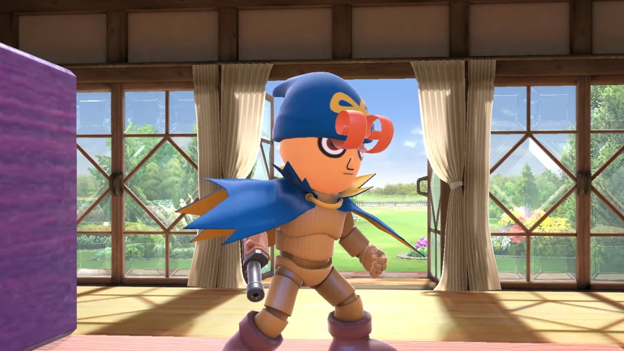
Geno, as you've likely heard by now, has returned to the Smash Bros. series once again as a Mii Fighter costume.
It might not necessarily be the news every Geno fan wanted to hear, but hey - some acknowledgment is arguably better than nothing. To celebrate this special occasion, Super Mario RPG's character designer, Kazuyuki Kurashima, has shown some original concept artwork of what Geno looked like before his design was finalised.
Here's every shot, courtesy of Kurashima's official Twitter account:
Subscribe to Nintendo Life on YouTube845k
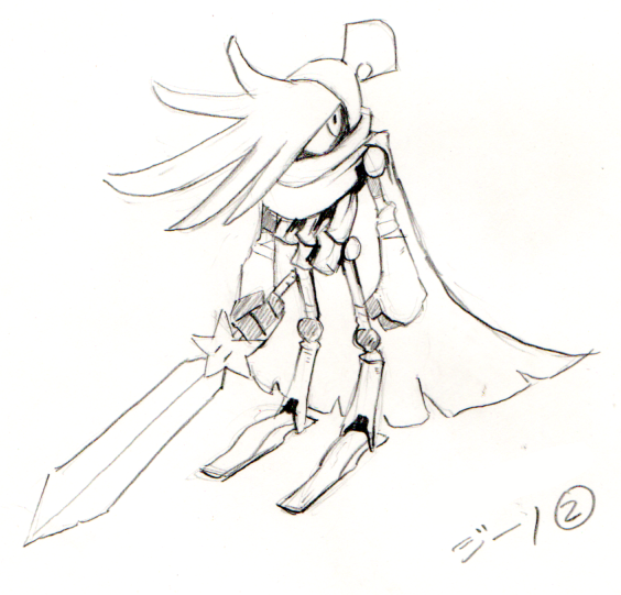
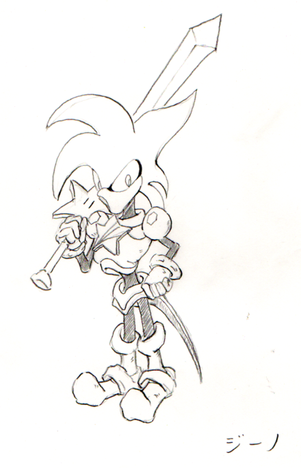
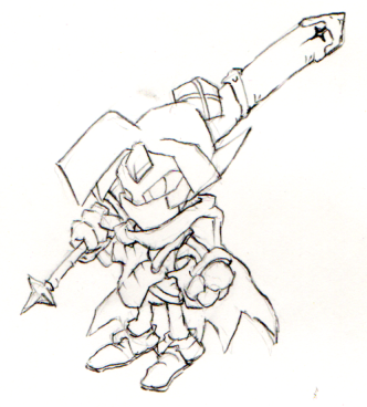
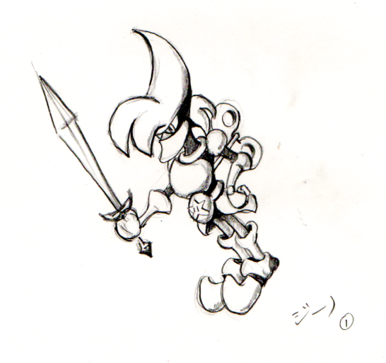
Different, huh? Obviously, we all know what Geno ended up looking like, and well, the rest is history! Which design do you like the most? Have you decked out one of your own Smash Bros. Mii Fighters as Geno yet? Leave a comment down below.
[source twitter.com, via gonintendo.com]


Comments 26
The final design turned out much better. Also these look like designs for a rejected sonic team game.
Some of these look like they belong in a Sonic game. XD I do really like that first concept though. Overall, I'd say Geno's official form is best.
@Tyranexx Agree, these really gave me Sonic vibes when I first saw them.
First and third designs are the best.
Sonic
Ristar
Bomberman 64
That last one could actually be an Anti-Geno that Smithy forged. It already has all of the hallmarks of Smithy's handiwork: Yaridovich's shoes, a turnkey like the Ninjas or Bob-Ombs, Boomer-like armor, Domino's eyes, etc.
Either way, I'm sure glad we got the Geno we know!
ME EAT YOU WHOLE
These designs are awesome, my favorite is the second one. The final design still looks awesome as well, and fits the best with the Mario universe by far in my opinion.
Small shame they didn't update the Geno costume to be one of the premium ones like Sans, Cuphead, Vault Boy, and Bomberman, with a fully modeled head and not just a hat.
While on the subject I wonder if we'll see anymore of such Mii Fighters, and if so, who. I could see Viewtiful Joe as one and since Bomberman can double as assist trophy and costume, I think Shovel Knight could happen too.
They all look like really bad forgettable Sonic characters like Jet the Hawk. I’m definitely glad we ended up with the Geno we all know and love.
This makes me appreciate Geno's design more because those are...not appealing.
It looks more like he'd be one of Smithy's henchmen than an ally.
The third one really does look like a Bomberman 64 boss character.
Hey NintendoLife, don’t forget to report on Nintendo shutting down the PlayVS Ultimate-only collegiate league. Thanks.
#FreeUltimate #SaveSmash
@Dr_Lugae You can definitely see where some aspects of these designs found their way into Mack, Bowyer, and Yaridovich as well as Domino and Cloaker and even Jinx. It makes you wonder if Geno had a different backstory as part of the Smithy Gang...
I'm "♥♪!?", but it's hard to pronounce...
@Merry_Blind I’m surprised there hasn’t been an article. Goes to show it’s Nintendo’s attitude towards all competitive play, not just Melee.
I like the first one. That could have worked as well. I do agree with the comments though. A lot of these designs look like Sonic character designs.
I like the first and third ones. Very cool!
@nessisonett Exactly. That’s why I kept telling some people around here that #savesmash is about more than just Melee.
@Tyranexx Beat me to it. Geno redesigns courtesy of deviantart.
The second one looks like a Mega Man boss to me.
Why dose the last one look like edgy daffy duck?
How I would love an HD remaster of that beautiful, beautiful game.
@darkswabber It looks like Bean the Dynamite.
Wow. Those are all rubbish. The second and last especially. The fourth has a wind-up key in his back. I always thought Geno's Bow on his hat was supposed to be a wind-up key.
@damien33ad Oof I feel your pain. It's a glaring omission from the Switch Online library.
Show Comments
Leave A Comment
Hold on there, you need to login to post a comment...