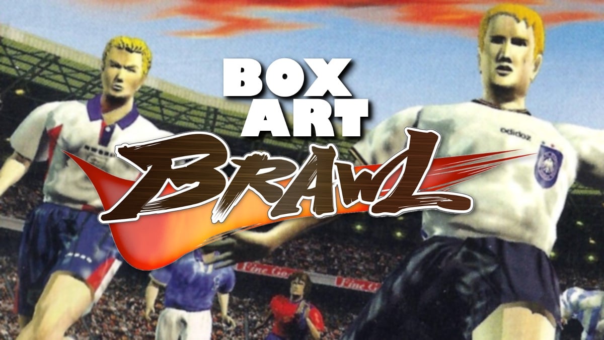
Welcome back to Box Art Brawl, the series where we throw a rosette and a bunch of regional box art variants into a pit and see which one emerges victorious with the bloodied prize pinned to its chest.
Last week we watched as Mario Bros. battled for your amusement and pleasure. In a shocking turn of events, the sneaky reissued European version triumphed over the classic North American box which left the Famicom port of the arcade game in third place. We honestly thought the pixel art cover had that one wrapped up, but it wasn't to be. A valiant attempt, but thwarted.
This week we're jumping two generations forward to the Nintendo 64 and one of the best digital interpretations of the beautiful game ever made with Konami's ISS 64. This game is a particular favourite at the Nintendo Life office that we fire up on a regular basis not only for its silky gameplay, but also for the exquisite delivery of its excitable commentator. The commentary jumps hilariously from calm to INCREDIBLY ANIMATED at the drop of a hat - usually mid-sentence - as the lines are hastily wedged in between your play. Team names are a particular highlight, especially when "GREECE!" or "BRAZIL!" are on the pitch. It's priceless and we wouldn't have it any other way.
Enough of this banter, let's kick things off.
"Welcome to this live broadcast. This is glorious football weather."
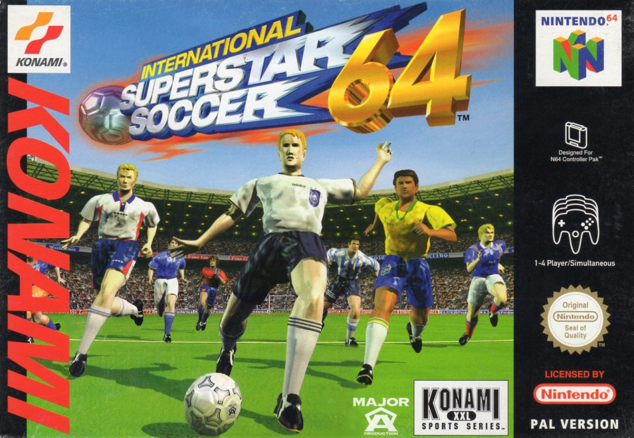
Europe
"First half kicks off..."
Forgoing the usual black border of the European PAL boxes, ISS 64 starts strong with a mixed international team on the cover. The logo has an old-school Sky Sports feel to it with plenty of colour and impact. The image itself is dynamic and really puts you on the field, seemingly in the boots of the goalkeeper as this bunch of bleeding-edge renders drive play towards you.
Throw in a packed stadium and this team has the makings of a great one. The red 'KONAMI' on the left gets a bit lost, but Europe has come out fighting with this effort.
"YES! Wonderful cover! Will he take a shot? He's hit it first TIME!!!"
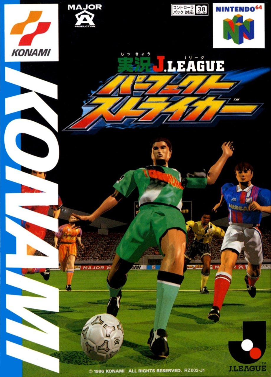
Japan
"Consummate skill, there!"
Heading to Japan, here we have the original Jikkyou J.League Perfect Striker. The game released in December 1996 and formed the basis for the ISS 64 we know and love before it was adapted for the west. Now, it should be noted that ISS 64 went back to Japan in the form of Jikkyou World Soccer 3 which released two months after the western version in September 1997, with international teams replacing the original's Japanese League teams.
So, in a very real sense Japan has two versions of ISS 64, the lucky so-and-sos . We've chosen to go with the original Perfect Striker because 1) the players from this officially-licensed J.League cover were simply re-skinned for the European release, so that sets up a nice parallel, and 2) we find the faces of the players on the Jikkyou World Soccer 3 cover even more unnerving than these automatons. Please feel free to register any complaints or concerns about editorial bias sullying the integrity of this hallowed video game box contest in the comments. They shall be diligently filed with the ones from last week.
"THE REFEREE SAYS PLAY ON!"
Once again we get players from different teams together on the pitch, although the dark night sky here was traded for blue in the west and while the black helps contrast against the logo, a floodlight or a few stars might have livened things up. Despite sitting on a dark background, the title still gets a little lost. The 'KONAMI' is white this time and punches out a bit more, though. Overall, it's another decent effort, but has it done enough to see off the competition?
"This COULD be a chance! He's looking around for openings..."
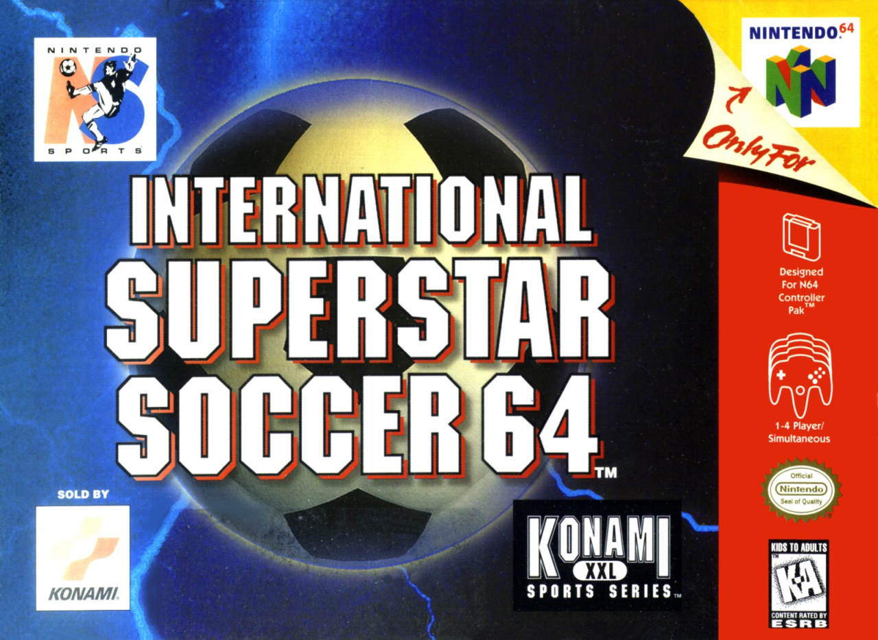
North America
"It sails to the... Right."
Ah! The North American cover is nothing if not succinct and to-the-point. It's got a soccer ball on it and you're not going to miss the title on this one. You get the standard red strip down the right side of the cover and the peeled-back corner with the 'Only For Nintendo 64' logo. It's easy to overlook, but this one does in fact feature a player as part of the Nintendo Sports logo in the top left corner.
Not much else to say, really. It's not our favourite, but we're not the ones voting, are we?
"WHAT A HOWLER!"
"He has players waiting for the cross! He centres the high ball. WHAT AN OPPORTUNITY!"
So, three different covers for one of the best football games ever, but which one gets your vote? Click your pick below and hit the 'Vote' button:
"Let's see that again..."


"And there it is! Full time has been blown! A stunning victory for..." We'll catch you next week for Box Art Brawl #30.


Comments 47
They are all pretty bad to be honest 😂 me and my brother used to have such a laugh playing this I’m sure you could create players used to create a really tall striker so he could just nod it in from a cross switch needs a good arcade style football game
Wow, North America cover went straight to the point. Like, directly to the point, no small talk, no "Hey, look at me guys!". I'm torn on this one. I want to vote Japan, but I actually love the all business NA cover. Now pardon me, I'm going to eat some unsalted, unseasoned potato chips.
Have the people on the European cover ever been in the sun? That’s an unusual pigment for football players.
Japan gets the goal.
I'm looking at the article picture and all I'm seeing is this:

Shave the dude's head a paint him silver and it would be a match
Japan, I guess? They’re all awful.
I loved this game. Europe easily for me
North American one is awful, I don't mind either the JP or EU ones but I think the EU one gives the greater sense of a football stadium soI'm going with that
Wow that NA one is awful. Like they gave the work experience guy 5 minutes and no more. Europe shades it, and not just for nostalgia (this was the best football game around at the time and one of the main reasons I bought an N64). Very ‘of its time’ though.
Oh, hey N64 games pity its not Quest 64-Holy Magic Century.
These are all three barfworthy though
Uh. PAL but because I had to make a choice not because I think it's any good.
NA could have slapped a big 'Soccer Game' sticker on the box, it would have looked the same. I chose Japan because the illustration looks more dramatic vertically.
For me, that Europe one is one of the most iconic covers ever (even with the blocky, overly-shiny late-90s character models). Japan's is OK, but I don't like the black background. US one is extremely bland and all "just the logo" (or near enough) covers must die.
I actually played this game this Christmas... huh...
The North American one is a rip off of sensible soccer. Same font and everything. I love sensible soccer so I voted that way but EU has the best one technically again... EU art departments had crazy tekkers compared to Jap and NA week after week we are seeing that
So the EU and Japan covers have the same footballers bodies but different heads. Weird.
I loved that game, it was great for his era. I was choosing Italy with Carboni FTW!!!!
Lol the England player was clearly supposed to be Alan Shearer. This was an amazing game
@Kantenstain I still play ISS 2000 regularly. It's my favorite arcade football game.
The European cover is the winner. Mostly because it has Matthias Sammer, Alan Shearer and Romario in the front. Three of my favorite players of the 90'ties.
To be perfectly honest, none of the box art covers, are particularly good. Having said that, for the third week in a row, I went with the European cover.
Euro Cover, not close. These players looked stunning at the time. The kits took it to another level. So detailed. All these beautiful 96 kits plus the 98 England jersey. Fifa was awful then. The freedom you had controlling a player in ISS was unmatched for years. Still worth playing today, the 98 version is much improved tho.
Why does the European version call it 'soccer'?
Owned this game on Playstation. Actually had the game about a month before I got the console. Had read the booklet cover to cover in excitement. In the days before consoles clocking your hours played, I dread to think how many hours I sank into this game. Id hazard a guess at over 300.
@BarefootBowser Just did a YouTube search. Wow! Very different games. I prefer the look of the PS version.
Didn't know that though. Hat tip!
NA for me.... Lazy? Yes. Generic? Yes. Memorable? No. Scary, bad, straight from nightmares character models? Thank God No.
Funny how, between Japanese and European box art, the poses are the exact same, but the heads and colors have been changed.
That's really hard because the US one is super boring and generic but the other two look absolutely terrible. I'm going to go with the US version because it tells you it's a soccer game, which is all it really needs to do, without subjecting you to extremely off-putting imagery.
The people who say the North American cover is awful are absolutely right. But the European and Japanese covers are also awful. This is one of the worst, perhaps the worst, Box Art Brawl yet. So this becomes a case of which lover is least bad. While the concept of the European and Japanese covers is fine, the quality of the 3D models is horrendous. NA may be plain, but that just shows superior judgement in my opinion. Best cover for me is NA.
I couldn't vote as they are all beyond terrible...
Box Art Brawls Current Total:
Europe: 8
Japan: 11
North America: 10
I don't like Sports games but Japan. It looks cleaner and has way more character detail. I guess the lack of white guys is hindering this vote pole.
These are all bad, but I went with NA as the least bad because it's the only one that doesn't fill me with dread.
@dres Who are the 90 Ties? Never heard of.
The way thos game says Wales always made us laugh
Voted for Europe (yes I may be biased!)
Loved this game especially the commentary: "he's hit it with his ... right foot!"
Great game for its time, especially the first to nail the through-ball. We'd play for hours and I even created a website called the ISS Realm. What I also liked about the ISS series above the PES and FIFA is the AI, especially when going forward, was so good. FIFA still can't get that done.
@cmk8 What about "There's a fight for aerial domination". I created a bot in Quake 3 Arena called ISS Girl that used commentary from the ISS games for the character phrases.
All of these look horrible.
I remember when this first launched. 100% seriously fantastic game. I used to score with the corner taker every time by just curling the ball in to the net. My mates to to quiver with fear if I got a corner. Most fun I've had playing a footie game and I HATE football!
@KitsuneNight Quest 64's Box Art was terrible, the EU Holy Magic Century Box Art was a lot better. The game wasn't much to write home about either but some on the music for the title was actually pretty good....
They knew they'd sell only maybe a hundred copies in America so why pay an artist.
@Dethmunk
They are all three hideous.
But fussboll is more popular in europe.
@BANJO
I know its a pretty terrible game.
but I have been playing it on off as of late.
Those're some tanned japanese players!
@KitsuneNight Yes the large open areas between town's is very bland. The town's themselves have character though. The nostalgia element keeps me going back to it....
Its like usa want to have the worst one every time.
@BANJO
I have no nostalgia to be honest.
I played it once 20 years ago.
And i was bored by it then, these days i can look at walkthroughs and stuff.
And nostalgia is best when something is out of reach and half forgotten when its brought back to the cold harsh light of day and easily accessible it usually doesn't' hold up all that well.
Like someone said I would pick the European because of how iconic it is. Don’t know how many hours I lost playing this.
The through ball was so well implemented.
I hate the 98 version don’t know why and then got so addicted again to the 2000 version and its freak career mode. Good times.
My vote goes for the European cover even though the art is terrible. Overall it's more composed than the Japanese version and more nostalgic to me as well. The US cover is plain rubbish and a clear work of laziness.
Tap here to load 47 comments
Leave A Comment
Hold on there, you need to login to post a comment...