Come one, come all - we're about to begin the Box Art Brawl! Yes, welcome back to the weekly battle where we throw three versions of box art from the same game into a ring to determine which one wins the beauty pageant and which one(s) deserves to be boxed up forever.
Last week Super Mario took on his continental brothers in a hard-fought bout that eventually saw the yellow Famicom cover for Super Mario Bros. crowned mushroom king, with North America trailing close behind and Europe just behind again. It was close, but an undeniable Japanese victory. Congratulations all.
Subscribe to Nintendo Life on YouTube842k
Staying in the realm of platformers, we're jumping two console generations onwards to the Nintendo 64 and into the third dimension this week with Banjo-Tooie, Rare's 2000 sequel to the only game on the console to truly give Mario a run for his money. When deciding on worthy contenders, we try to choose entrants with as much variety as possible, but it wasn't until our recent interview with character artist Ed Bryan that we realised the North American and European versions of this game are actually different. Similar, yes, but distinct enough to make this a more interesting competition than if the only difference was a black border.
So, take a look below at the bear, breegull and bone-faced one in their regional guises...
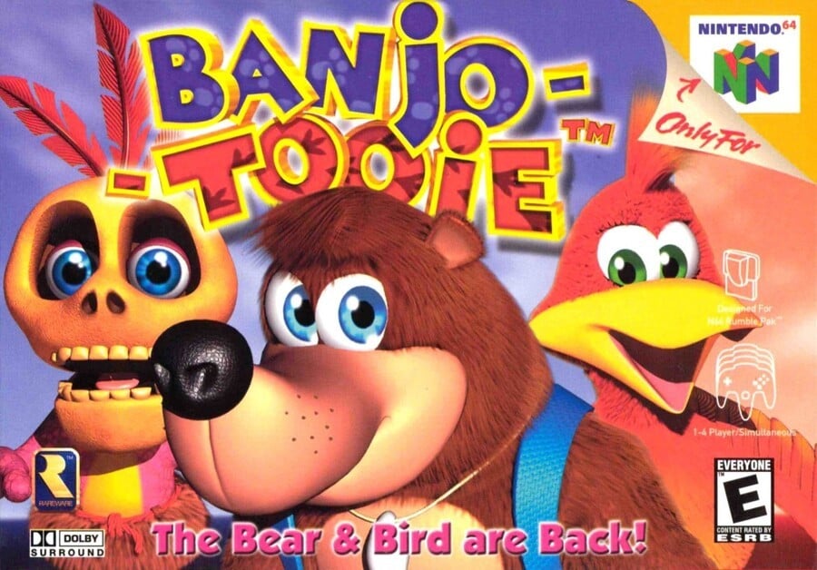
North America

The Bear & Bird are Back! reads the text at the bottom in a slightly insipid pink that could probably stand out a bit better. The North American version gets Banjo front-and-centre, with Mumbo on the left behind him and Kazooie on his back to the right. The breegull is looking uncharacteristically doe-eyed and docile but the three faces give the cover impact, that's for sure. A blue sky background doesn't distract from them in any way, although the cover arguably lacks subtlety - once you've taken in the three characters there's nothing much left for your eye to follow.
It's a bold, bread-and-butter cover and we admire it, even if it lacks a little class.
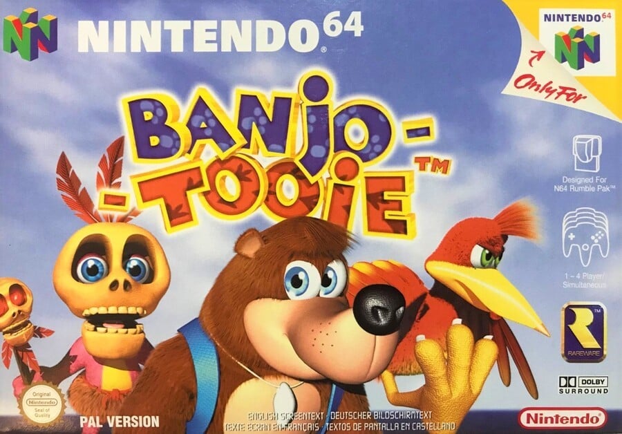
Europe

In our memories the EU and NA versions were the same, but as you can see they were different. Of course, they share most of the same elements, although they're given a little more room to breathe on the European box. Both Banjo and Mumbo have been flipped to face the other way and Kazooie has been unleashed from her backpack prison (as she can be in the game itself). Her scrawny leg and claw could be mistaken for a strange hand rising from the bottom of the box (imagine her leg is the 'thumb'), but we enjoy the steely look in her eyes here. Don't mess with this breegull.
The standard black border of most EU N64 boxes is absent (which probably contributed to our mistakenly thinking this and the NA version were dupes). Zooming out from the three characters conveys a better sense of place, even if it's just a cloudy blue sky and there's plenty of room to fit not only the game's logo, but also the 'Nintendo 64' at the top.
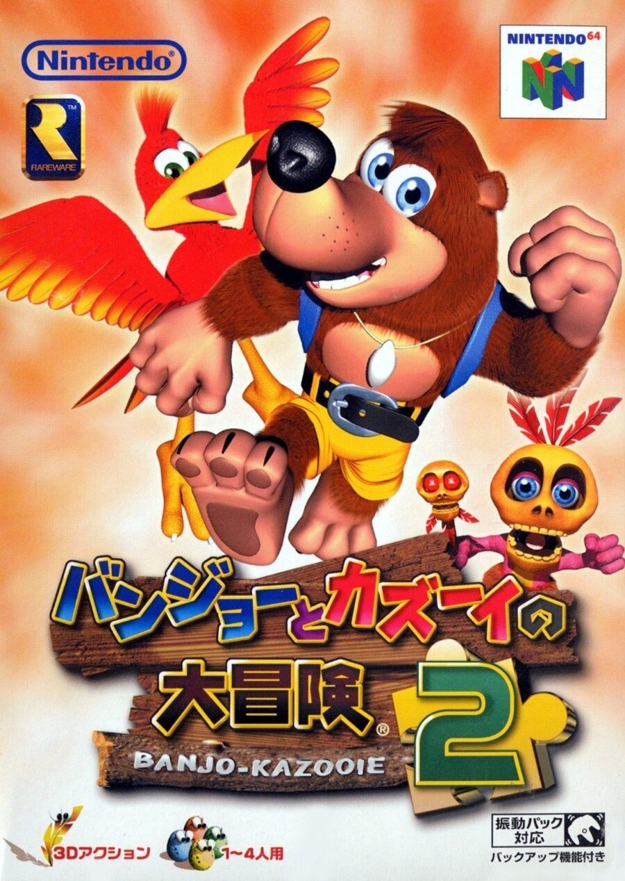
Japan

The Japanese version arguably manages to be more dynamic with its character poses, but perhaps blander overall. The same three characters appear, although in a different configuration with different art. The logo gets a wooden log background with a Jiggy under the '2' and we very much like the Gold Feather and Eggs at the bottom, but the orange-y/white background feels a bit wishy-washy.
On the whole we like it, but we'd probably put a 'could do better' on its report card.
So, which one of these do you think wins in a bear-on-bird-on-bone battle? Take a long look below, tap your favourite and hit the 'Vote' button to bestow the power of your approval on your chosen combatant:
Ah, such poor souls. That's all for this week - have a great one and we'll see you next time for another beautiful Box Art Brawl.


Comments 32
I knew i was right %100 of people agree. Or maybe i was just first to vote!
I like the box for バンジョーとカズーイの大冒険2 the best.
they all kinda suck, huh?
Europe by far the best.
The sky blue background makes the characters stand out.
The way Kazooie does a death stare at the Rareware logo on the EU boxart makes me believe she knows the company is secretly dating Microsoft.
Japan wins this round. Kazooie looks pretty upset on the European box. Of course changing the title to “Tooie”, effectively cutting her name out of it, led to tensions on the set. To quote her in an interview: “It really is a bear’s world”.
Thankfully you wouldn’t be able to do that to a bird nowadays.
How do I vote for all of them? xxx (They are all loveably naff lol)
I voted Japan, but I don’t think any of them are particularly good.
If anyone is randomly curious the name of the Japanese release is Banjo & Kazooie's Big Adventure 2. Not quite as popping as the English name.
Europe, simply because I love the blue sky background.
I'm surprised Japan is winning this one. Is Mumbo in front of Banjo, or behind him? He's peeking out from behind the logo that is in front of Banjo's foot, but his feathers are behind Banjo's elbow. One thing is clear: Mumbo is small.
NA wins for me at least. It feels like the trio were gathered for a photo together, and convinced Kazooie to smile rather than storm off right when the camera went off, like in the PAL version.
Japan this week!
Japan. Because you can see the characters' full bodies (rather than just headshots) there's more shape to it and is thus more aesthetically pleasing. Though I do prefer the blue sky background of the EU version.
Gotta say, it was a bit difficult to choose, because none remotely appealed to me. I remember this when it released, too. Those early days of CG rendered art had the short-term impressiveness of cartoony, but with 3D detail and lighting, but so many of the fundamentals of art and design were not applied well. To me, it is just generally ugly and unappealing. It makes me want to look somewhere else and it always has.
(First Banjo was a classic and amazing game, especially for its time. Unlike the box art, it pushed boundaries AND kept the game play and fundamentals in tact. Rare took the Mario 64 fundamentals and refined things and had its own character. The franchise really fell down since then, though, in my opinion.)
Definitely Japan this time around. I like how the cover is more action oriented, plus there's something unnerving about Banjo's stare on the other two....
Oh wow, a PAL version without the horrible black border.
@kepsux That makes it sound like an off-the-wall '80's Hollywood comedy movie, and I love it (even though the game doesn't actually have that tone).
All 3 of them are pretty bland, but I’ll go with the Japanese one...
They are all three pretty awfull.
But out of this line up of mediocrity, the Japanese cover is the best.
Nostalgia almost got the best of me but I voted for Japan. This was one of my favorite games back in the day but I know when a cover is ugly haha
I really like the friendly "We are back" look on Banjo's face on the EU box. And Kazooie looks ready to take on anything.
Mumbo’s tooth gap is on the wrong side in the North American image.
I love this game to death, but I always hated the genericness of Banjo-Tooie's box art.
I picked Europe, but I don't like any of them.
@NotTelevision Amazing comment.
Giving this one to Japan. Just has a little more excitement to it.
The background and expression on Kazooie's face sold me on the European version.
Japan for sure. It's the only one to give full-body poses of the characters. The EU cover just confused me, for a while I thought Kazooie's talon was Banjo's paw holding her up and was up with his thumb. But all lose points because of the boring backgrounds - it should have been one of the locations from the game, not just clouds. The box art for the original BK is much more dynamic and full of detail.
Box Art Brawls Current Total:
Europe: 4
Japan: 8
North America: 4
North American cover: Kazooie makes a happy face for the group photo
European cover: After the photo's taken, Kazooie instantly storms off to go kick some butt
Stop with the Banjo teasing. It’s too much to handle.
The Japanese one has the most energy, so I chose that one.
Show Comments
Leave A Comment
Hold on there, you need to login to post a comment...