Welcome to the fourth round of Box Art Brawl, the series where a classic retro game takes on its doppelgängers from other territories to see which has the greatest cover art. Last week we saw GameCube titan Resident Evil 4 knock itself sideways as its moody European self won a very comfortable victory over its North American and Japanese counterparts.
We're travelling back nearly thirty years this week to see how Technos' River City Ransom fares against itself. The third game starring Kunio (in the Japanese original Downtown Nekketsu Monogatari), its western localisation took some liberties with the source, as was the custom of the day, and that goes double for the box art.
A bout of fisticuffs is nothing new to this side scrolling beat 'em up and, as you'll see below, its three versions have very different personalities, so this should be a very interesting match. We've included a couple of bonus looks at the GBA EX versions, but the poll is Famicom/NES only. Let's get down to it and meet the contenders...
Japan
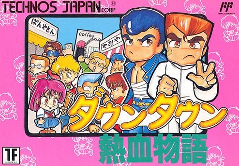
The Japanese original makes the high school setting clear with its cartoon-y take on series protagonist Kunio, rival Riki and the gangs of high schoolers they beat their way through. The cute characters punch out of the black border into the surrounding pink and it's certainly a world away from the interpretation players would get in North America.
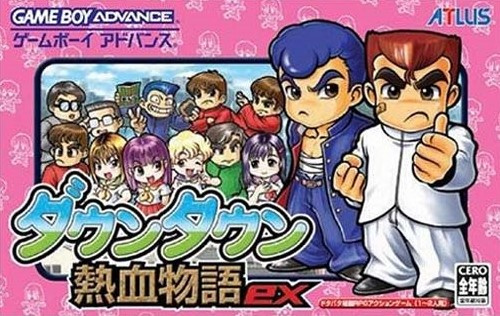
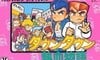
Bonus: This cover would be revised slightly for the Game Boy Advance release River City Ransom EX which came out in 2004. It retains much of the same colour but pulls Kunio and Riki out of their frame and rounds off their character designs a tad.
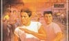
North America
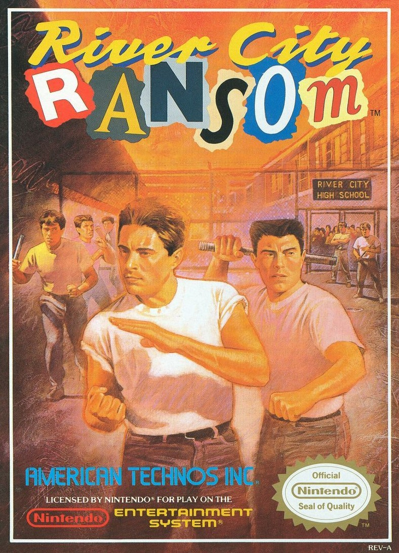

The sprites of the characters were redrawn for the west with the t-shirts and jeans reflected on the new cover. Kunio and Riki became Alex and Ryan and they appear to have aged a decade or so. We reckon we could chop onions on Ryan's impressive flat top and the white t-shirts and sign for River City High School give it a West Side Story-style '50s flavour. Perhaps evoking the Jets and the Sharks from the much-loved musical made the idea of teenage gang violence easier to swallow.
The 'Ransom' in the new title gets the cut-out letter treatment and there's a pleasant harmony to the colours used on this cover. It's certainly different.
Bonus: The GBA box for River City Ransom EX recreated the lettering, but let's not dwell on the rest of it. Oh dear.
Europe
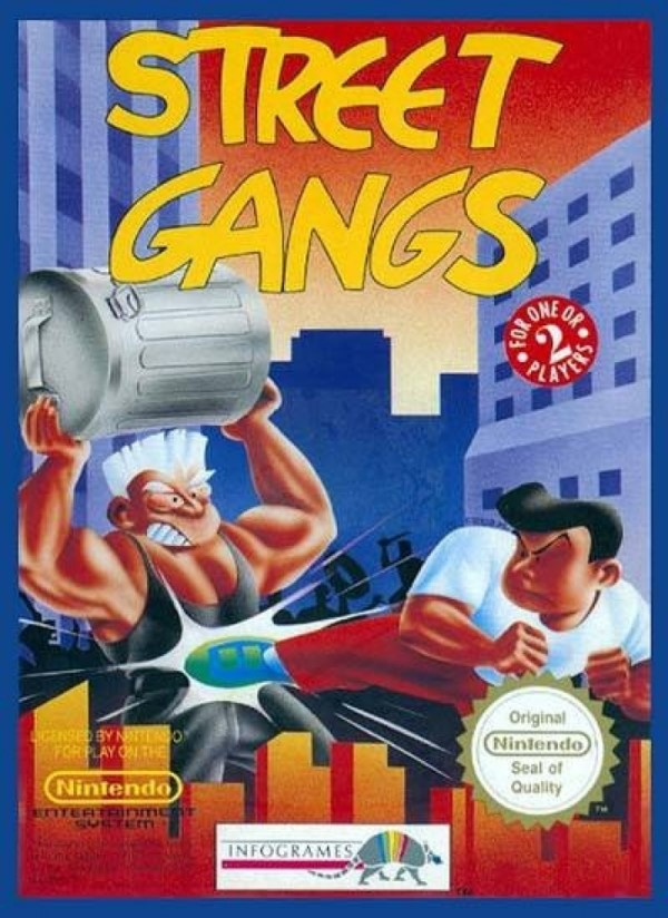
Further removed from the idea of high school students belting the living hell out of each other, PAL regions saw the game renamed to Street Gangs and the box reworked entirely. A blue border frames the protagonists with an orange/red cityscape oddly positioned at the bottom and other brawlers obscured but silhouetted in the background. The title is... well, it's legible. That's probably the best thing we can say about it.
So, those are your three options this week and it's time to pick your favourite. Take a look below, click the favourite and hit the 'Vote' button:
Which region got the best River City Ransom box art? (454 votes)
- Japan
- North America
- Europe
Please login to vote in this poll.
That's all for this week! Feel free to voice your thoughts and predictions below and we'll catch you again next time for round 5 of Box Art Brawl.


Comments 39
Had to be Japan, the others are just so... not Kunio-kun. I still find the whole dodgy localisation thing annoying, it’s never fun to play a game that’s unnecessarily westernised.
This has to be the best co op NES game. Straight forward, fun, rpg elements, and you get a smile from the waitress for free! The only thing I loathed was the password system, with over 30 characters to input and some were too similar too each other.
This is the toughest one yet, I think. Three completely different designs. Although the European one is just awful! Man alive. I went for the Japanese one, although the NA one is strangely cool!
The Japanese version by an absolute mile, reminds me of kochikame and a whole 70's/80's kitsch aesthetic.
Wow, these are all bad.
The NA looks like the cover of some bad, cheap novel you'd see near the checkout of a grocery store.
The Japan one...well it's anybodys guess what this game even is going by that. The pink border, the guy in front in what looks like a chef outfit and a band aid on his face. What is this about?
The EU one at least shows that the game might be a brawler type game, but the art itself is awful (and don't get me started on mixing numerals and text like that).
This is less picking which is best and more just picking which the least bad.
Japan should walk with this one
Love the NA box.
Seemingly contrary to popular opinion, the European one takes the cake for this one for me! Normally I love the japanese illustrations of famicom games, but this one ain't doing it for me this time...
I'm going with Japan on this one. I like the chibi designs there. The European one is kind of meh, and the American one....Too much machismo there.
I...kind of hate all of them. But the Japanese one the least I guess?
NA because it reminds me of 80s film posters like The Goonies.
Japan as it's the only one that isn't ridiculous.
The American box art is probably more fitting for a game where you beat the crap out of everyone, but I like the Japanese box art better, if only for the Chibi art style and for the fact that the girl on the bottom left looks triggered af!

EDIT: As a side note, the American box art for the GBA version is horrible. It looks like the cover for a low-budget shovelware title. Actually, it kinda reminds me of GameStop's stock cover art for pre-owned games that weren't traded in with a cover.
I can only imagine the disappointment of being sold by the U.S artwork. I can't imagine anyone being sold by the E.U one at all! There isn't much to say about the Japanese cover, only it, at least, resembles the video game, and it's bright, fun design cheered me up looking at the other two...so it wins more by process of elimination.
Japan and NA both look good in their own right, but I think NA eases out as victor as while it may not better resemble the actual style of the game, it gets across the fact that there’s gonna be rumbling in high school in a superior fashion. Plus, the style of the cover is good as well.
I’m going with the Blood In Blood Out-ish NA cover this time. I remember seeing the cover in some videogame magazine or a mailorder catalogue and then ”Street Gangs” showed up in stores, I didn’t realize it was the same game until i took a look at the gameplay pictures on the back.
Going with NA on this. I’m an 80’s kid, so that style did the job for me.
Japan is the best. The others look pretty bad. The European box art looks absolutely ridiculous. And the NA one looks really bland.
The bad dudes on the cover of the North American box look like they've been held back a grade or seven by the time they got to high school.
They're all ugly, tbh
@FarkyValentine A fellow man of culture, I see.
I really like the NA cover despite its near overdose of testosterone. The European cover is trash and the Japanese is cute but TOO cute.
They're all awful
The European one is hideous and the characters in the North American one look like they're about 45 so the Japanese one kinda wins by default.
Love the 80’s vibe of the NA version. Nice mix of macho-cheese, I went for that one!
Gotta go with North America - he’s carrying an invisible poodle!
I love the design of North American title, but I think the Japanese sells the game better. That North American GBA game is horrendous.
I have to go with the Tommy Lee Jones and Lou Diamond Phillips North America Box art.
This one is tough. They're all so different.
This is proof we need a none of them option!
Why do the states always get the worst looking art? Was it just a 90s style thing ?
@Abes3 Probably their stupid need to localize and westernize everything? It's absolutely stupid and insulting, like they're dumbing down the cultural references because they think we're too stupid to get it.
Japan's cover art was the most faithful and dedicated art style to go along with the game.
I'll probably the U.S. version as second for its grittier appearance with the European version being third by default.
River... City... Ransom... Underground ported to Switch please!?!?
One of the best co-op games on NES. I'll go with Japan, North America box art looks like The Outsiders: The Videogame.
This one goes to Japan by a long shot. The NA cover does nothing for me and the European cover is dreadful.
I like it when the boxart resembles the game. Japanese cover all the way, for every Kunio-Kun game in existence. They have a distinct quirky original anime style, should be proud to stick out of the masses, especially because all the games are quality.
Anyone else gonna mention that the Japanese box art totally looks like Yusuke and Kuwabara?
I give the nod to NA because I LOVE the magazine letter cut outs to spell “RANSOM”
Tap here to load 39 comments
Leave A Comment
Hold on there, you need to login to post a comment...