We've all got plenty of fond memories of Nintendo 64 - which is why we're excited for the inevitable N64 Mini and its third-party friends - but that doesn't mean we look back on every game with a smile. In fact, just thinking about some those box art covers makes us a little queasy.
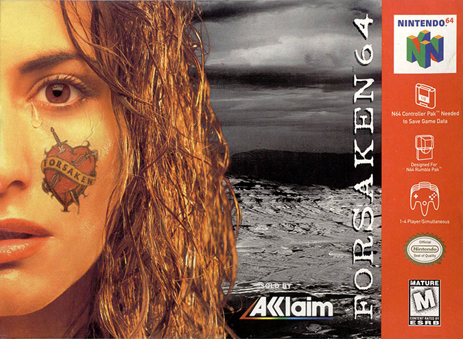
Over on N64 Today, erstwhile Nintendo Life contributor Martin Watts has put together a new feature on some of the worst box art covers to ever grace Nintendo's 64-bit beast. And no, time hasn't been kind to them, either. We get to look back on the sexed up NSTC cover for the forgettable shooter Forsaken (we just got the letter 'F' burned on the surface on a planet, which in retrospect, probably has more to do with the actual game than a wet model with a tattoo on her face).
Subscribe to Nintendo Life on YouTube848k
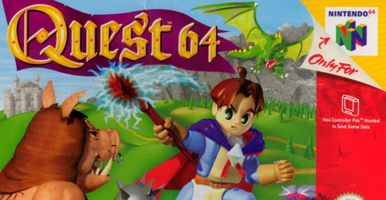
Anyone remember the middling Holy Magic Century (as it was known here in the UK and Europe)? Well, the game might have been a little shallow for an RPG, but at least it had decent box art. Not only did our US chums get a name change (Quest 64? Really?) they got some really terrible artwork as well, too. Yikes.
What do you guys make of these old covers? Tell us about some your favourite terrible covers on Nintendo consoles in the comments below.
[source n64today.com]


Comments 71
Not as bad as the cover of virtual Chess 64.
Forsaken wasn't THAT forgettable, but it sure wan't the Descent killer that I had imagined when I first saw it.
N64 Today sounds like the kind of website that would suffer from horrible news droughts.
Haha, that Forsaken cover! 😂😂
I LOVED Quest 64. Used to rent it at Blockbuster all the time!
@Melkac Nah, we just dine out on stuff everyone else already wrote about 20 years ago
Thanks @Dom for featuring my post — and congrats on your newfound editorship!
@Pod : Descent is good memories. I remember playing Descent 2 with VR headset and motion control. (Virtual I-Glasses)
It's not like they were ever good.
Most game boxes don't actually look particularly good these days.
Now these are great looking game boxes:
http://www.inceptional.com/2017/06/27/the-gorgeous-box-art-for-the-21-titles-included-with-the-super-famicom-classic-mini/
I absolutely loved Quest 64. First game I beat before my brother. Yeah, the game was actually pretty bad, especially if you increased the wrong abilities and ended up not learning to heal yourself. Still, great memories of this game.
Indeed, a lot of the N64 covers were awful, especially Quest 64 or anything with that computer generated style of graphics.
But damn, they do have a certain nostalgic “charm” to them, so I’m into it.
I remember being a bit starved for RPGs during the N64 era. I wanted to get Quest but I was poor and it never panned out. Probably not worth the time now but when I saw the thumbnail for this article I thought it was being released on the eshop or something and I got excited for some reason. I guess the me from the N64 era still wants to play it.
Hmm. All the box covers come from our side of the Atlantic. A conspiracy at the time to make sure that they are the ones most talked about...? Surely Europe has some bad covers too. Come on- I know you want to show them off.
Never played Quest 64. I always saw that box cover in rental stores though.
Razor Freestyle Scooter straight up looks fake. Crazy that Quest 64 is the best looking of the bunch.
I thought Forsaken was pretty cool. Good soundtrack.
That's it?
That "N" on the corner of the box for Quest 64, with the pull back effect, makes everything else forgiven. There's a special charm with that "N" logo that makes the box look nice.
Iggy's Recking Balls, by virtue of it containing Iggy's Recking Balls.

@Melkac
News would gave been thin on the ground even in 1999 LOL
So, is this the first if a series where you will show more covers? Because I was expecting more than just two.
The Forsaken cover looks fine. Wouldn’t look out of place on a cover today.
The Japanese box art equivalents generally won in most cases back then. The fact you could get a worse iteration of a worse iteration was just a kick in the teeth for the lucky Western region!
Of course back then I was too busy enjoying the great games to even be bothered about the box art.
Megan man 2 on the NES. Thsr cover is the worst
I assumed the model on the Forsaken 64 boxart was one of the selectable drivers in the game. Also, really not a bad game, and with some cool tunes.
Holy Magic Century (Quest 64) had very good boxart in Europe. Name and boxart suggested a quality game, while in the US half of the appeal was demolished by the name and boxart. The games landscapes were certainly huge for their time. It was like taking forever to get somewhere in the many wide open areas. I think only a few games like Aidyn Chronicles: The First Mage and Body Harvest had bigger "open" worlds on the N64, so there definately was a sense of (epic) journey in Holy Magic Century.
Nothing will ever beat Phalanx for the SNES
https://upload.wikimedia.org/wikipedia/en/0/02/Phalanx_North_American_SNES_box_art.jpg
Body Harvest cover. GASH.
@OnBeingHuman For me that game was Turok 😂
Pal boxes. We didn't just get borders on the tv. Our boxes had borders too
https://www.google.co.uk/amp/s/tiredoldhack.com/2016/04/27/cover-me-badd-3-the-20-worst-nintendo-64-game-covers/amp/
Excellent summary here
@1UP_MARIO haha yes so true. Although Australia got boxes without for some reason, even though they're a PAL region too
In their write up on NFL QB Club 2001 they seriously just put "the portrayed American Football player"? You mean Brett Favre? One of the best QBs of all time? Even if the writer isn't from the US a quick Google search would have shown them the name of the "portrayed player".
Hey Quest 64 wasn’t so bad, it was... a game... I mean the problem was it was as generic as generic can be but that it was a decent intro to RPGs sort of game.
Speaking of Quest 64, I really wanted this one to be successful:
http://cdn.themis-media.com/media/global/images/library/deriv/762/762515.jpg
Ambitious, but horribly executed. The box art... it lies!
@Pod I think Forsaken 64's box art was pretty cool. I also thought I was the only one who remembered Descent!
@GravyThief yeah. I think Nintendo just loved the uk especially the n64 era
@1UP_MARIO one mans inferior resolution is another mans widescreen.
Specifically a man who lives in a PAL region.
Quest 64 cover always looked bad, made the game appear cheap
In my opinion, Quest 64 was a bad game to begin with. So a bad cover art is suitable!
I would really like a Virtual console or remake of Quest 64
I see nothing wrong with these box art examples. So much drama over nothing nowadays, yegh!
Quest 64 was kind of a "cutesy" RPG/adventure, so the simplistic box art fits, and that specific cover for Forsaken could be explained in several ways: the background is barren, empty, forsaken and so is the woman: she is forsaken, and that is why she has a tear rolling down her face. Or she might indeed just be one of the vehicle drivers...
Instead of ugly or horrible, it might actually be quite deep and profound, but no, let's focus on the negative, because it's close to Christmas and we must have yet another thing to complain about before the year is over.
Oh, brother...
kill me but i like Forsaken 64's box art, actually it's pretty awesome!! Quest 64 has a cute box art, nothing especially bad ....i really have no idea what was this article about
Forsaken was actually pretty good. It was one of the best 6DOF games of the era short of Descent itself, but featured more linear maps rather than the mazes of Descent.
@ThanosReXXX Quest64 represents the game and is just fine. Forsaken (I had the PC version, same box art)....yeah that cover really does have nothing to do with the game and was just one of those weird attention grabbers they were into at the time (like that banjo player cover for Phalanx in the story a few weeks back ) It's not "bad" but it also really doesn't represent the game. I'd have much rather had Beard on the cover. How many games have a Harley-riding leather-wearing space biker?
@MegaWatts Really enjoyed your feature. And thanks, can't wait to get started properly!
Funny thing about Quest 64 was the story. I honestly didn't mind the game where it came out as this was the answer to FFVII for the PsX.. LOL. I remember being sent on a quest to find my father .. then about half way through the game he is just sitting having a drink in a random Inn.. you keep playing after that as you need to cleanse the darkness.. but the quest was to find your father .. and when you do.. the game doesn't even say a single word about it. Amazing IMO
The games themselves aren't awful awful. The original Fighter's Destiny even made the World Cup of N64 Games on Twitter! It didn't get through to round of 16, however.
Both covers featured here look great. That "3D anime" look of the first game is indeed indicative of its time, but it looks like...anime, just as with the content of the game. The Forsaken 64 cover looks appropriately edgy, unlike the failed attempt to be so by this article.
Fighter's Destiny and its sequel were decent beat 'em ups. But, yeah, the box art is dodgy!
@Pod yes, I disagree with that. I don’t know how the N64 version was like, but I played the poopy out of Forsaken on PC at the time and I well remember I had a blast, and I actually liked it much more than Descent, I think it had more personality.
the nintendo 64 has not aged well.
@jruasap I had the same thought, but the writer is British, so I wouldn't expect him to know Brett Favre from Joe Montana. I couldn't name a single EPL player to save my life.
I really dig the Quarterback Club one, though.
"Come on Reggie, Give us Earthbound 64!"
When I saw the title, I figured you'd have more than... two.
@NEStalgia Phalanx was a different story altogether, which was featured in an article on this very site, not too long ago. The picture made no sense whatsoever. It was just a marketing trick, to get the attention of people for a decidedly average game, that would otherwise probably have sold far less copies...
Forsaken is different: it does make some sense. The word speaks to me and the cover represents that word, both in the face of the crying woman and in the background, it's more or less metaphorical.
Well, to me at least, so from that point of view it makes sense, even though nothing game-related is on the cover.
It's perhaps a bit floaty and/or too spiritual for some (most?), so it could also be labeled as reaching, but I can still make the connection, nonetheless.
Now, trying to make some kind of logical connection between an old geezer with a banjo and a space ship phalanx formation...
P.S.
I never said that the Quest 64 box art didn't represent the game appropriately, so I'm a bit confused by that part of the comment. Either you misunderstood me or you've confused me with someone else?
Crap cover art but simple. I would say that the graphics of the games in N64 are the ones that have not aged well. The problem is not their cover art.
@ThanosReXXX i was agreeing with you on quest 64. As for forsaken, it may connect with the literal definition of the word forsaken, but nothing to do with the actual product!
@NEStalgia I know, but as you know by now, I'm in sales & marketing myself, so I see and look at these things a little differently than the average Joe, which is why I didn't find it too hard to make the connection with the concept "Forsaken".
And in sales & marketing we know that something doesn't necessarily need to be connected or have to do with anything, as long as it reminds people of it anyways, that's the whole metaphor part of it: that can be used in a million different ways, and from a sales & marketing point of view, that cover could definitely make sense, provided that this was actually the message that they were trying to convey.
If they truly did, then I think it's actually pretty smart, although it must have went right over the heads of most gamers and buyers at the time, so even if that was indeed the intended message, it may not have been the right way to go about it but, yeah: history and all that...
@ThanosReXXX exactly, people just want the mascot on the front cover nowadays. these are actually the good and original box covers that we are missing now
What's Alf doing in an N64 game?
I kind of like the Quest 64 boxart, it looks like its a photo of a child's toys. I mean its better than most boxart of today that all seem to recycle the same themes over and over as seen here: https://venturebeat.com/2012/07/15/you-cant-un-see-these-11-video-game-box-art-cliches/
I enjoyed Holy Magic Century a lot.
The environment was fabulous and the game lasted a long time.
But I remember of some really annoying grinding !
@samuelvictor
What's even more annoying was it was only first-party games that had the ugly black border. Third-party games just had a single black bar down the side, which was much nicer looking, but completely inconsistent (I never got why they were different). Plus by the end of the gen they'd go for full-bleed covers as well. What a mess...
@ThanosReXXX
I agree with you about the cover of Forsaken... but I think it could have been more effective without the tattoo.
What to think of the puyo puyo pop boxart with the baby? I believe it was on the Playstation (or Dreamcast). Awful!
@Ooyah True. Good point.
@samuelvictor
It bugged me as a kid and still bugs me today... At least afterwards, in the Gamecube generation, our "Only For" symbol was slightly nicer looking than the 3d bevelled American one. Not really much consolation though...
Nobody's going to bring up the original Smash Bros? Sure, the game is a classic that started a major franchise, but the cover of the original looked like it was handed off to a grade schooler to design.
@edhe Ha ha! I own Iggy's Reckin' Balls, good to see someone mention it
@jruasap Well, I'm from the US and all I know about Brett Lefavre is that apparently he's a football player.
Unfortunately for Quest 64, more than just its box art has aged poorly
Forsaken was pretty good I thought, multiplayer in particular especially if you found a titan missile I also think the box art is pretty cool, if you want the worst box art you need to look at the best game on the system Ocarina of Time (Clue: there is none).
A website dedicated to N64 is freaking awesome! Rare put out some of the best N64 game covers (and games).
Show Comments
Leave A Comment
Hold on there, you need to login to post a comment...