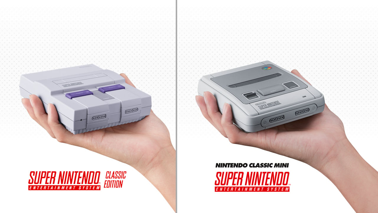
There was great excitement in the Nintendo Life team when the Super NES Classic Edition was revealed to the world, but of course it didn't take long for envy to set in from our US based colleagues when they saw the European version of the SNES Mini; the design differences have always been a hot topic. Heck, the North American version doesn't even have the colourful buttons on the controller, such a travesty!
This led us to wonder why the Japanese Super Famicom's sublime design needed to be messed around with at all. After a quick bit of online research we came across a fascinating interview with NOA's Lance Barr, which explains the reasoning. You can find it here, as unfortunately the original link from Nintendojo no longer seems to be working (we'll re-link if the page goes live again).
Here's what Lance had to say in regards to the motivation in making the US version more square looking:
The Super Famicom was maybe okay for the market in Japan. For the US, I felt that it was too soft and had no edge. We were always looking at future modular components (even the NES had a connector on the bottom), so you had to design with the idea of stacking on top of other components. I though the Super Famicom didn't look good when stacked and even by itself, had a kind of "bag of bread" look.
Lance Barr is still at Nintendo of America after a long 34 year career, where he resides as its Design & Brand Director.
Let us know what you think of how the North American Super NES compares to the Japanese Super Famicom (or European SNES) with a comment below.
[source assemblergames.com]


Comments 68
I have always liked the NA version better.
We in Europe got by far the nicest version of the SNES. Not just the console but the controllers are miles better looking too.
Yeah the toaster eject was so cool! still have mine and it is mostly NOT yellow.
North American version 4 life
They both have their merits (I own the SFC & the NA SNES) but I love the boxy look of the North American version. And also, those 60hz refresh rates
@SLIGEACH_EIRE Looks like an outdated car tbh. NA Snes looks like a robot I'd say nostalgia takes it per person. The colo(u)rful buttons looked so off when I saw them for the first time that I was taken aback, but definitely seem to be the better choice when I think of it.
They're both ugly, but very durable. Still have my original NA system, never had a problem with it.
I've always thought the US version looks ugly but I guess that's because I grew up with the pal version and had never seen the US version till the Internet took off
I guess it's just what you're used to
I was able to secure a U.K. Amazon pre-order...even though I live in Canada. It'll be more expensive with shipping but I don't care, I just want the system to play. Here's hoping it can be powered by just USB so I don't have to deal with crazy U.K. power chords (like the NES Classic was). I don't trust Canadian retailers. They didn't offer pre-orders for NES Classic, so this time I'm jumping on board the U.K. version. Personally I don't have a preference in design, the SNES is my favourite console (either SNES or Super Famicom)!
I have all three. The only things the NA version has over the pal version is that it is 60 Hz and if you break the tabs in the cart slot you can play Japanese games.
I prefer the multicolored buttons over the purple and... light purple aesthetic.
While I, an American, also prefer the Super Famicom design to the US design, I'd stop way short of calling it sublime. I consider the US SNES not particularly attractive, while I'd say the international model is not unattractive. I never found Nintendo's console designs pretty from that period.
I personally prefer the NA design, but that's what I grew up with. I guess nostalgia plays a big part in preference. I do prefer the EU controller's colored buttons, but many 3rd party NA controllers had the same colors, and were decent.
"Lance Barr is still at Nintendo of America after a long 34 year career, where he resides as its Design & Brand Director"
Good for Lance. Just don't let him design any more consoles.
I don't know what the bag of bread comment is all about. The Super Famicom design made sense, since it was closer in style to the Famicom. It's NOA's fault for changing the NES design to the big block, so the Super Famicom looked odd next to it.
Much prefer the JP/EU design, NA design is a tad too edgy and boxy for my tastes. Preder refined curves.
Although my real dislike is the choice of purple as the main colour (and only) colour outside of the dull light grey. Should have gone with Nintendo red.
I bummed out thinking the NA version was the one on the right. Not jealous of the European version, y'all can have that. Enjoy!
I'm passing by again to say he is right. It DOES look better.
I never knew the NA version was supposedly inferior in design until today lol. As long as it doesn't fade to a pee yellow color, I think looks amazing!!!
I agree with good ol Lance here. Much prefer my NoA issue and love the shades of purple!
I don't have an opinion one way or another, but, being in the Americas, thr American version is what we got back in the day, and as such is where all of my nostalgia resides. For that reason, of given the choice, I'd 100% go with the American model for the SNES mini.
I like the american one.
The North American one is the ugliest console Nintendo ever made.
...well, maybe the original DS is worse.
The Virtual Boy still looked kind of cool in its own way...but yeah, it might be tied with this thing.
@electrolite77
Love it
Even as an American, I can easily see (and I also think) that the European/Japanese design is far, FAR superior to the American two-color brick design. And it's an absolute fail that they haven't at least color coded the controller buttons to match the game prompts, as the EU/JAP edition did. All the US model had was two shades of purple.
If that is supposed to be cool, like a robot or something, then the closest thing I can think of, mainly because of the color scheme, is Megatron or another Decepticon. And those were evil, so the American design is bad..
But in all seriousness: youthful sentiments aside (although understandable, because you'll be more prone to like what you've grown up with or are used to) it simply cannot be denied that the EU/JAP design is more elegant, sleeker and has the better color scheme.
Far as I'm concerned, the only good thing about the US system is games in NTSC format, because they simply run better.
I also don't like the name of the American version: SNES Classic Edition. That does not remind me of a mini console at ALL, but of the ACTUAL classic version of the SNES, as in the big one.
It IS a Classic Mini, and as such, that name is much more appropriate.
I'm also having a bit of a chuckle concerning the people that are mentioning which version they will choose, since there is no choice: only the appropriate model will appear in your area, so it will only be that model.
@SLIGEACH_EIRE The SNES 2 or sometimes referred to as the SNES mini was the best looking version of the system. Seen here: https://upload.wikimedia.org/wikipedia/commons/thumb/c/cf/SNES-Model-2-Set.jpg/800px-SNES-Model-2-Set.jpg
That was the best version, and yeah it did have releases in Japan and Europe, but this was a case where the purple looked better than the grey. But the Europe controller definitely always looked better, I'll agree to that.
Both machines look cool. If I were offered both on day one, I'm not sure which I would have picked back in the early 90's. But I remember after they refreshed the SNES and started selling the Famicom shaped one after it's "slim" version refit, I saw it in stores and thought "eeeww, how ugly, it looks so cheap."
So Barr really did nail the local and age demographic's interests at the time, unpopular as the thinking may appear now. It fit what we saw as "current" in that era. And I still love the shades of purple.
Also, toaster eject forever and ever.....
I prefer the Japanese / European design. It's what u grew up with.
We got concave buttons :>
I drastically prefer the shape and coloring of the US Super Nintendo. Not sure what you're on about.
I want the NA version because that's my console from my youth. The other looks better to my current sensibilities... though I'd miss the concave buttons and toaster release.
This is what I think of whenever I see the US version.
Literally the only thing about the Japanese version that's "better" is the color scheme of the controller. Besides that, the console itself is just boring. The NA version is kind of odd, but it definitely stands out more than the Japanese version, which looks like one of those pointless VHS rewinders you could buy back in the day.
North American one is my childhood and it's way better than the others.
In the U.K. You guys definitely have a better looking console n controllers than us in the US. But I will say I love our cartridges a lot better. Especially the top label of games.
So, Europe version will have colorful buttons ?
I prefer the look of the NA machine.
Pre-ordered this at Game earlier. I had an Amiga when I was young and always really liked the look of the SNES (cool Euro version) that a few of my mates had. It has a sleek, 'functional futuristic' vibe. Super refined and designed for it's purpose.
It make sense that the U.S is the altered / bastardised version. The placement of everything is way off - it looks like an early prototype. It's front loaded and the colour scheme it really flat. Sure the Euro one is mostly grey - but 3 different shades - and it has that lovely 4 colour logo highlight at the back.
Plus, what is that corrugated bottom section supposed to be for - it looks like it's sitting in a takeaway carton.
@Hikingguy
Yeah, I was referring to the Nintendo made consoles, but yeah, if you add other companies, than there's a bunch of other ugly consoles, I agree!
Sony has made a bunch of kind of ugly consoles I think.
As much as I love the original PS...outside of the nostalgia, it is not very pretty honestly, and PS3 is all over the place in my opinion.
All the Ataris are kind of ugly in my opinion, but that is not fair to all of them since some of them are so old...Atari 5200.
Love the US version so much. Glad we didn't get the 'baguette'.
As some people here, I grew up with the NA version so I relate to that one. I still prefer the different coloured buttons of the Super Famicom.
I remember the first time seeing the US SNES when I was a teenager, in a magazine I think? I just thought it looked plain weird, having been used to the PAL model. I didn't understand why theirs looked so different. Now I'm older I know the Super Famicom to be the best version. The best shape but also full screen 60Hz gaming. Best of both worlds.
Both designs look like hover cars from the future but the European one looks like it would be faster!
@Kayfios
*Indigo
*Lavender
@Enigk
Well, duh. The European design is naturally more aerodynamically advanced than the North American variation.
If you slapped wheels on those suckers and raced them down a hill, the PAL model would win.
(You could also add additional weighted objects to either one to guarantee success, if you don't mind a little cheating.)
I actually like the design of the US model.. however they should've gone with the same colour scheme as the European and Japanese versions.
The purple and grey is unique. Don't care if people say it isn't pretty. It's more iconic looking than the other.
The button colors on the EU SNES are way better.
@rjejr Is that a real advert or a mock-up?
Both look cool, but I like the NA one a little better. Controller looks better on the other though, I guess I like the colorful buttons.
@Sakura It's from a movie called Crazy People. Here's the 90s clip.
https://www.youtube.com/watch?v=DGVeZ4XLo4Y
The NA one is still my favorite. The only issue is the yellowing that happens to the bottom half. Although mine is still gray, so I got lucky there.
I get that Europeans like the idea that they can one-up the U.S. on something... but this is mostly nostalgia. I have the NA one and love it and because it's the one I remember i could care less about form factor. I want one that matches those greatest gaming memories of my life.
The colorful controller on the other hand.... Europe/Japan had that right all the way. NA blew it with purple/grey buttons
Those lilac switches, geez.
Nice! After genders, religions, races, origin, politics. Now we have the design of the good old SNES to fight over.
Team Super Famicom here (I lived in Japan when it was released)
@rjejr Thanks. Being on this site has got me into the habit of thinking that things can't be real, only to find out that they are. Now I'm willing to entertain the notion that anything might be real.
Even the colour scheme on the mobile page here is purple! Where is the JP/EU colour scheme button NL?!?
Well, neither in my opinion were unattractive systems. But I definitely do prefer the look of the American version. It's, I dunno, more stately and substantial looking to my eyes. More elegant. The JP/EU version looks more unremarkable. Plus, the big swath of darker gray in the middle isn't super attractive in my opinion (though the colored buttons on the controller sure are!)
But again, this is purely subjective preference over matters of simple aesthetic. It's definitely not anything to get into a shooting match over. If you prefer the look of the JP/EU version, more power to you. At the end of the day, as I said, they're both attractive systems.
Cheers!
"There's no way we're releasing a console that looks like a bag of bread. A toaster on the other hand..."
I'm not a fan of the multi colored controller buttons. Always liked the purple buttons and accents on the US version.
I love the color palette of the NA version. It's controller looks amazing too! And have I mentioned that I love the color Purple! It's all I wanted in a console! Definitely gonna buy the NA version. Who's with me?!
Lance Barr should hold his head in shame.
THIS is a thing of beauty:
@SanderEvers They're both ugly,
How was the Japanese and European versions ugly?
The Super Famicom looks like

While the American Super NES looks like
Europe and Australia can keep their colorful buttons and unearned sense of superiority. With 20 minutes, a security bit, and a Dremel, I can modify an "ugly" SNES to play Japanese games. You can't do that with a PAL system.
Don't get me wrong, I like Nintendo/Super NES games, but I enjoy using emulators on the PC without using cheats just like the real thing.
And almost 80 bucks for the emulator box with 21 games? I'm not much of a console guy, does it have the ability to upload snes games as well?
Well, now that Nintendo had started pulling their games from emulator websites and all because of some legality issue, I don't agree with. But that's my opinion.
Still gonna stick to the American SNES on this one. I know some people have made old car comparisons with it, but hey, I love that kind of cubic look to things! The Super Famicom design, comparatively, looks rather bland to me, with how smooth and round they made it. It's like Normal Spongebob to our Spongebob.
I will admit, though, that I do wish we had the multicolored buttons.
Removed - inappropriate language
Tap here to load 68 comments
Leave A Comment
Hold on there, you need to login to post a comment...