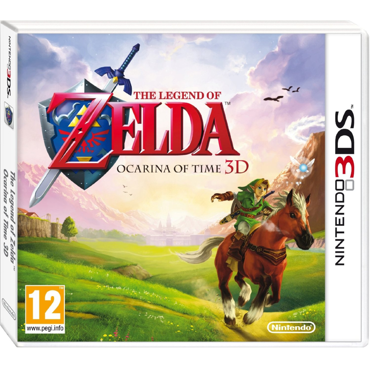
We thought the golden cover art for Legend of Zelda: Ocarina of Time 3D in North America was good, but this artwork for the European version trumps it.
Showing Link and Epona on one of many gallops across Hyrule, it may not be quite as classy as North America's cover but it's certainly more colourful. Check out that attention to detail too — you can see Epona's breath and dust flying from her hooves.
Its cheery overtones are probably not entirely representative of the game's overall mood but it'll certainly look bright on your shelf. We've also added some extra screenshots to the gallery, right below this post.
Which cover do you prefer?
Please note that some external links on this page are affiliate links, which means if you click them and make a purchase we may receive a small percentage of the sale. Please read our FTC Disclosure for more information.
[source amazon.co.uk]


Comments 88
OMG why is this so much more beauitful
IMO the best cover would just be a giant rupee though >:3
Oh yeah, I totally agree - the gold cover is really cliche by this point in the Zelda series. I'm glad EU decided to break away from the norm. Their cover looks awesome!
Blrrrrrrg! Why does the US always get the lesser-quality boxart?
I kinda like ours more. This one looks kinda... empty.
@pix - empty...kinda like Hyrule Field, am I right? or am I right?
I like the Gold one.
more classic like
Wow. The nicest box art ever? Definitely a contender
OMG Whyyyyy?! Nintendo, why do you keep forsaking us Americans?! D: That box art is beautiful!
Phantom Hourglass, Spirit Tracks, and now this? Europe consider me jealous of your Zelda box arts! >.>
Haha, yeah @zerk. Also the logo isn't centered, which looks odd IMHO. I can see this being a badass wallpaper, but boxart? Eh.
thats the picture from the zelda teaser site. looks awesome. much better than the other boxart
I like it lots better than the gold one myself
@Pix and zerk. Do i detect a hint of jealousy
I find the off-center logo to add a very artistic touch, and the emptiness goes great with the emptiness of Hyrule field and really focuses the eye on all the scenery.
totally agree Tj. Man its nice
NA one is definitely more Zelda-looking. No gold? No go.
Very nice
That looks gorgeous.
i do really love the golden one, but this here even surpasses it
one of the most beautiful box arts ever for the best videogame of all time
Definitivamente esta es mejor Deberian ponerla en todas las versiones, no solo la Europea D:
I really like the EU version (which I'm getting). Good thing I bought the UK version of the 3DS.
The EU version looks so colourful and detailed! Ace!
@20
Pienso lo mismo
I agree with pix on this one. Ours is better for boxart imo.
@20 @24 English comments please, guys!
Oh, wow! "A touch of class" indeed. That's gorgeous!
It's far more inviting and far less "video-gamey", IMHO, especially for newcomers to the series or games in general. (Yes, those people still exist.) It really treats the game like the work of art it really is.
@emirblade I know, right? It's like comparing the NA cover of Ico (PS2) to the original. The original conveyed the wide-open expanse and loneliness of the game, giving the consumer an idea of what the game was really about, whereas the NA one was far too generic.
It wouldnt be Zelda if it wasnt gold. While I do like the artwork on the European box better it just doesnt look right not being gold. What they need to do is make the Cartridge or whatever you call it gold.
O_O That is absolutely gorgeous! I'd go so far to say that it was smexi! O_O
Whoever did this artwork needs a payrise, that boxart is simply outstanding!!
This one.
absolutely gorgeous
@32 .....D:
This is one of those EXTREMELY rare times I'm actually glad I'm European
(Like the 3DS launch!.. I think I should stop making the Americans mad now)
I like them both to be honest. And it's cool to see two different box art covers for the same game.
That looks spectacular! The NA artwork looks quite cheap in my opinion. As great as it looks, I won't be getting this. I already have the game on the VC and it'll be a while before I get a 3DS.
I'm still liking the American version more. It's gold.
I think that this box art is good art. The American box art is good box art. I'm not a huge fan of box arts with a lot of detail on them.
While both box art covers will look nice on the shelf, I think the Europe version is really nice looking. Nintendo did a good job on it.
Never was a fan of the North American one, so this makes me happy!
It's alright, I guess. Somehow feels a bit too.....cartoony.
Looks like, just as with the DS games, america gets a plain, solid-colored with some texture box art while europe gets a complete landscape.
This one actually gets close to the epicness of the mockup Ocarina of Time boxart. Bi-winning.
I prefer the gold one myself.
My final hope is that the gold cover is the slipcover for the US version and we can still get this one. But, if not... I'm happy with the US gold cover. Harkens back to my gold cartridge for the N64, so it'd keep up a theme with me. I do like the European box thugh... it really is beautiful.
nice =] it's gorgeous
This is beautiful but the gold one is just classic
I just want the content in the box =)
I really like the EU box, but the gold one is the classic look. Reminds me of when I got bought Links awakening.
MOAR! MOAR!
Awesome!
Both covers look great and better than the original, but I like the U.S. cover more.
While I don't usually care much about boxart...the EU boxart really does blow the U.S. cover out of the water.
To be honest I like the US cover more simply because this one is too empty. It just feels like they took a random picture of Hyrule Field, pasted Link and the logo on it and there you go. ( And yes I know the Link on Hyrule Field part is actually one piece and only the logo is added. )
But it's not too bad I guess. I preferred if Link would be standing next to Epona (and preferably a little further away as well) and actually gazing into the sunset rather than galopping away from it. That way, the emptiness wouldn't have been too bad since the focus would be more on the sun setting, which would have added a much better touch to this boxart if you ask me. The current one gives the feel of Link being in the middle of an adventure, while what I described would show him ready to START his adventure. Much better vibe that way.
But oh well!
I so prefer European box art. Sure, the golden one is very Zeldish, but still very happy about this one.
am i the only one who doesn't care what the box looks like? give me the game inside, haha :3
I definitely like this one over the US one. They're both good though. The US one is mysterious and majestic with the gold color and Link silhouette. This one is outgoing and beautiful. It's telling you you're entering a beautiful wide open world and is colorful.
After box art of <<alien vs predator>> on atari jaguar this is the best box art of all time
I'm sorry NTSC, but PAL has won this round again. Better luck next time.
that's the same artwork as featured on the japanese minisite for the game
think i prefer the NA coverart, tho...but it sure looks gorgeous
Wow... It looks like some amazing painting
I wonder who painted this.
I will definitely buy this game if I get a 3ds for my birthday
Can the golden box art be swaped with the European boxart in the overview section
Looks fantastic! I like both covers though.
Nope, dragon, you're not the only one. It could be a five-year-old's crayon drawing of Navi and I wouldn't mind, so long as the game inside is what I wanted.
simply beatiful
@TBD beat ya to that post 48
That looks absolutely gorgeous, but I feel the gold boxart is more classic and loyal to the original.
The art is quality, but why put something like that on a small box? it would make more sense to include this as a wall poster or something. The gold one is the better boxart because it’s iconic. But neither make the game seem all that interesting..
They should've used THIS for the box, it’s an attention grabber.
That's a beautiful box art.
The European boxart is beautiful, but That kind of thing belongs on a big poster or something. I like the US version better because it fits the size of which it's displayed. In terms of art, though, the European version blows the US version out of the water.
Truth be told it dont bother me any. It the game I want you all could have the box.
I used to care very little about the box art and stuff until I began buying a lot of full price games as digital downloads on my PSP. Then I somehow felt cheated with not getting the box art and UMD disc.
I shall save the pic and print it off and insert into my own copy of OOT3D and show my friends my very rare boxart not available in stores. Actually there's a website for custom game inserts here: http://www.vgboxart.com/ I suggest a look-see some of the art is pretty cool!!
Awesome! I think I like this one better, since it looks like the entire image is made especially for this version of Oot, while the gold box only shows a old piece of artwork of Link and Epona.
But both look nice!
I think it looks great, but at the end of the day it doesn't really bother me what it looks like. But what I would like is for the actual cartridge to be gold, like my old N64 one.
Crap! I won't have the heart to open the box in case I tear it or make a crease
Pretty. I wish Hyrule Field actually looked like that...
Any one know if they are coming out with a Ocarina of Time 3DS? Like the pokemon black and white ones?
IMHO
this looks fan-made :/
perdy
@81.....What? You're not making sense. That is Ocarina of Time 3DS.
Now only if the cartridge was gold, then it would be perfect.
I don't care what colour the cartridge is, or what the cover art is like. I just want to be able to play it. On my 3DS as soon as possible.
I like the "classic" NA box art look. With my Zelda collection I wouldn't want this EU one ruining the "gold standard" that is Zelda. I agree with those that say this should be a poster though.
Very nice
I'm jealous. I mean, sure I could probably photocopy this off the Internet and slide it in under the cover holder should I actually get the 3DS Ocarina game, but it wouldn't be the same....
okay, that probably came out wrong. I meant the same as having this cover as the North American cover, but with the ESRB rating instead of the European one ... or better yet, no rating to obscure the art. I wish they didn't have to put the rating on the front as well in video games, just put it on the back like with movies. I mean, who's too stupid to look on the back for the rating?! Seriously ...
...And you've probably stopped reading this by now.
I prefer the classy NA art. Besides, the NA one reminds me more of the original art.
Now that is a 3ds box!
I don't know why, but European boxes are better than USA ones, as my opnion...
@Tj92,
He probably wanted to know if there would be a special 3DS to go together with Ocarina of time 3D. I have no idea, who knows!
it kinda really doesnt matter different case and cartige same game dont matter wat case u buy your playing the the same thing
That box art looks fantastic. Why does the US always get the worst one though? I guess it really doesn't matter but that is pure BEAUTIFUL.
Show Comments
Leave A Comment
Hold on there, you need to login to post a comment...