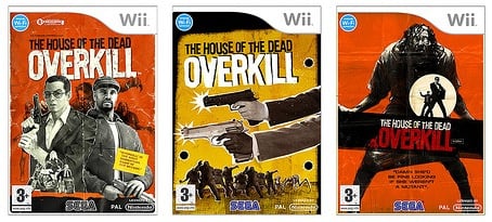
SEGA's House of the Dead: Overkill took the franchise in a whole new art direction, pushing a cheesy grindhouse aesthetic to the limit. The box art and in-game posters reeked of 70's exploitation movies, strengthening the game's much-needed personality.
Fluidesign, the studio behind all the tacky posters, logos and box art, have posted a Flickr gallery with outtake art for the game. The design evolution is interesting to see, as the characters went from a more realistic appearance to the comic book-y look finally settled upon.
Subscribe to Nintendo Life on YouTube845k
Do you prefer the final art or one of the earlier prototypes? Let us know in the comments!
[source gonintendo.com]
Comments 14
I like the yellow-background boxart with the two guns
I like the center one too.
nintendo wifi was once planned? I really wanted leaderboards, it didn't seem as much as a complete game without it, eventhough I rarely use them, lol.
3+? No wonder they were scrapped.
i didn't like the one they used but the first and 3rd one from prototype looked good i guess it doesn't matter now
I prefer the original box, I like that one. It has a tag line on the cover... "this is like something out of a videogame!"
Great game. Splat!
I like the second one too. And I've noticed that all three boxes have a Wi-Fi icon on them. Does that mean the game was gonna be online?
@Ricardo91: Nah, I think the WiFi icon is just placeholder, in case the developers wanted to do something online they could stick the logo in those places.
@Terranigma
That one reminds me of Ozzy Ozzbourn
I also think that the 3+ is the funny part.
The game was never going to be online. SEGA just decided not to lie about it.
I wasn't a huge fan of the 'feel' of this game, but I'll take a new HOTD game anyday. Even though I usually enjoy nitpicking at the poor choices of the corporate types, I must admit the cover they chose was a decent choice. The centre one that everyone seems to like is a little tacky for me...
@Kawaiipikachu ALL ABOARD!!!!!!!!!!!! Ha ha ha ha ha ha!
3+ ??!!!
I didn't really like the game when I played it my mate's house. Good game that tried way way too hard to shock. Didn't shock me. Maybe if I was an 18 year old I'd have a laugh, but I,m not!
Show Comments
Leave A Comment
Hold on there, you need to login to post a comment...