Kao the Kangaroo isn't the first platforming mascot you might think of when you cast your mind back to the heady days of the late '90s and early 2000s. But in a world where dragons, bandicoots, plumbers, blue hedgehogs, and more duked it out, this punching marsupial stood out with his simplicity.
Many hold the Kao the Kangaroo series dearly having grown up with him, but with only three games to his name (plus the GBA one) — and the last releasing in 2005 — many might have been surprised when the bouncy boxer was given a second chance. Earlier this year, Tate Multimedia announced a reboot of the series, and today Kao the Kangaroo makes a triumphant leap back onto consoles!
Subscribe to Nintendo Life on YouTube845k
You can read our review above to find out what we thought of the new game, and to celebrate its release, we got an exclusive look at some of the reboot's concept art from Kamil Smala, one of the artists working on the new Kao the Kangaroo. Smala shared with us the challenges of designing and redesigning a character to fit into the modern day platforming landscape.
Hi, I am Kamil Smala, Concept Artist working on the new Kao the Kangaroo game at Tate Multimedia. Hope you’ll enjoy this quick dive into the design choices we’ve made to bring an iconic mascot to modern days and platforms.
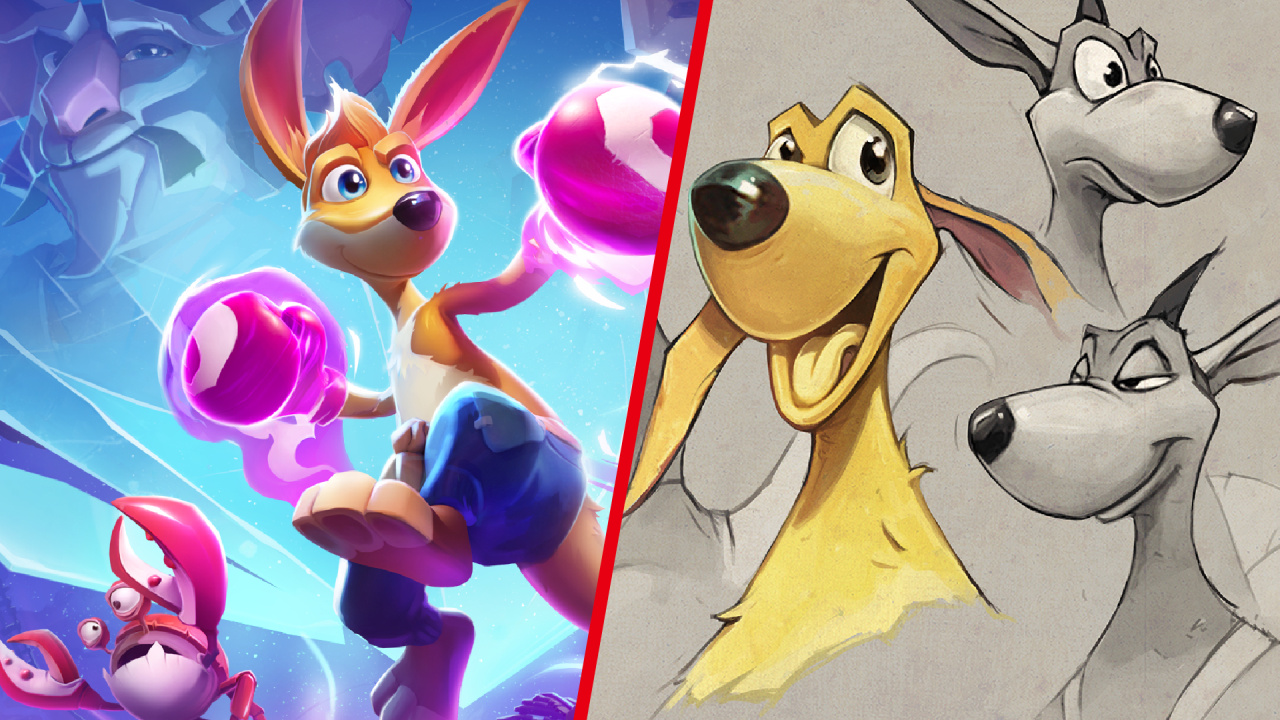
Kao, revealed back in 2000, is a young kangaroo that quickly won the hearts of many players. 17 years have passed since the last part of Kao the Kangaroo's adventures appeared. However, despite the time, this protagonist with a rocket-shaped nose and ping-pong balls attached to it as eyes is still well-known as one of the most famous heroes in the platformer genre. Now, after all these years, Kao is back in a new adventure. Thus, the decision to redesign our slightly old but stylish character seemed quite obvious. In a few sentences, I'll try to present our main assumptions in changing the hero of our saga.
It’s no secret that redesigning the main character can take some time. The players’ verdict can be hard to predict. Well... I take it back... players just don't like any changes! [smiles] On the other hand, we felt the need to affect the appearance of Kao, so that our kangaroo could compete with other characters from modern platform games. Let's say that Kao is a Polish response to such hero characters as Crash Bandicoot, Spyro, or even good old Croc [winks] On the other hand, the character already had its fans, and its appearance became a kind of an archetype of how this small, brave kangaroo fighter should look like. Certainly, the new version of Kao was supposed to evoke the same positive vibes, but at the same time bring a lot of freshness, which in this case wasn’t doable without a scalpel... [winks]
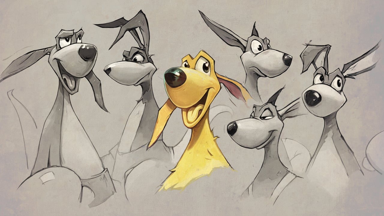
Kao has grown up. Almost. He is older now, for sure, but not much; just more stubborn, mouthy, and youthfully brave. He was never a superhero, but rather an adventurous kid with pure motivations, and we wanted to keep it this way.
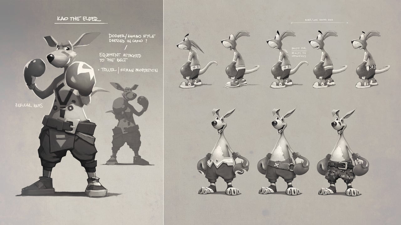
It’s all about eyes. This is by far the biggest change in the design of Kao. Eyes stretched outwards and without eyebrows posed certain limitations in terms of building Kao's expressions. Despite its cute appearance, we realized that altering the eyes would be a big change, but a necessary one in order to modernize the character. We moved the eyes to the inside of the head while keeping that 'Kao' frame. It allowed us to make Kao look more realistic, yet maintain his cartoon-like features, thus staying true to Kao's nature.

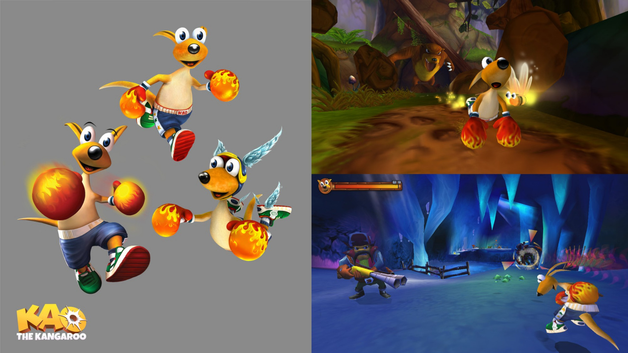
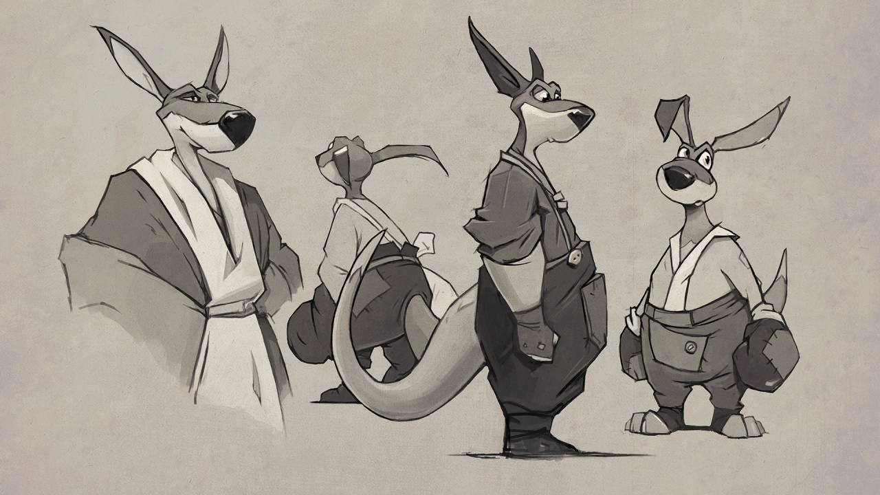
What about the body? Initially, we tried to give Kao more human proportions. Kao gained height, became more slender, but eventually returned to his firmly set form. The main focus was on giving the expression of dynamics, by keeping a compact shape and the most eye-catching, scaled boxing gloves, which we have enlarged anyway.

To put it simply, the "previous" Kao was a running triangle with short legs, topped with the head. That triangle shape was what we wanted to keep but in a less obvious form. We also marked the muscles and shoulders to make him look more convincing as a young fighter. Overall, however, Kao stayed simple, compact, and quite geometric, but in a modern way. The sports shoes that appeared in Kao the Kangaroo: Round 2 are no longer here. We changed them to focus players’ attention on the gloves themselves, which have increased significantly in the new version. Some new details have appeared such as fluffed hair and "bunny ears" as a counterweight to the huge gloves. And the proportions of the head in relation to the rest of the body indicate that we are still dealing with a kid.
Overall, despite the anxiety, we are pleased with how the players have embraced the new Kao. We hope that the game will start a new chapter of the Kao the Kangaroo adventure in which we will still have the pleasure to participate.
Thanks to Kamil Smala and the development team for sharing these gorgeous pieces of concept art with us, as well as sharing the process behind redesigning Kao the Kangaroo. We're looking forward to seeing him in motion when we get our hands on the game today.


Comments 4
I'm happy they are bringing games from our past to modern times so many hidden gems in the past that really didn't get a chance to shine have an opportunity to shine now. There are more gamers now more than they ever have been. Plus this will show those big name companies simply gameplay is an option too not always have to be flashy and so realistic.
Old design of Kao looked so weird.
But new design of Kao, he looked so handsome as kickboxer kangaroo. 😍
Dang, wish they had kept the shoes on.
Many videogame characters undergo changes to their design over the years. Just look at Mario. People only have a problem when the redesign goes completely against the source material, swapping certain traits for another.
Show Comments
Leave A Comment
Hold on there, you need to login to post a comment...