Big, bold yellow text, with a thick blue outline, shaped in a gentle arc. This is the Pokémon logo, which is one of the most recognisable logos in the gaming industry — and media as a whole. It's bright and simple, eye-catching and easy to read. And the logo's creator, Chris Maple, revealed that he had just one month to make it.
In an interview with IGN's Rebekah Valentine, Maple shared his story on how he came to design one of the most recognisable brand logos in the world. A designer friend told Maple to expect a call on a fateful day in 1998, when he was head of Media Design, a business that specialised in last-minute design work for companies.
Maple was called to the Nintendo office in Redmond, Washington, where he met then-Nintendo of America President Minoru Arakawa. In Maple's own words, Arakawa "introduced himself and said that they're going to be launching a game officially in the United States and Europe."
"Only problem is, the prior agencies they've tried out for the situation didn't quite hit the mark, and they burnt the budget and time element. Are you okay with that?" Maple agreed to the terms, without knowing what the game was, until another person came and dumped "all these toys and pieces of paper and weird drawings" on the table in front of him
The things on the table were Pocket Monsters, and Arakawa revealed that, in the West "'It's Pokémon. We're going to call it Pokémon.'" With no instructions or advice, Maple had very little to work with — “We were given nothing but paper and toys,” he says, but also, he had a strict deadline: the logo would need to be ready in one month's time, ready for E3 1998 and the reveal of what would be Pokémon Red & Blue.
Maple tells IGN that a logo design would normally take around six months to make, as it involves a lot of back and forth. But given Maple's company's own brief, he was used to this. So he took a number of different designs to Nintendo, and presented them. The executives selected the one closest to what we know today as the logo.
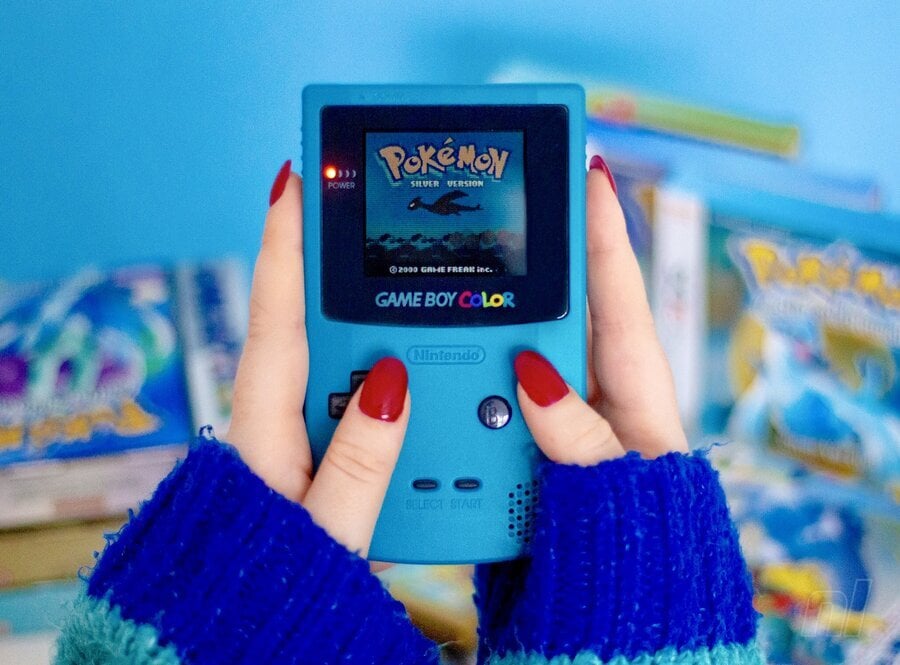
There were some final adjustments to the P and e, and Maple submitted colour tests and eventually settled on blue and yellow, but he's not completely sure why Nintendo accepted it, putting it down to vibes and the "energy." The colour, ultimately, "It just feels a certain way. I know it sounds flaky, but it's true."
We're sure Maple, and no one at the time, expected Pokémon to explode the way it did. Now, the franchise is approaching its 30th anniversary, and Maple admits he'd like to go back to help add to the logo for the big bash.
"I would hope that Pokémon International would ring me and say, ‘Hey, this would be great PR. The guy that did the logo gets to put the 30th on for us. Good PR for us.’" Maple continues, "That would be smart of them to do. Of course I'm pitching for myself here."
Well, that 30th anniversary is very soon — Red & Green was released in Japan on 27th February 1996, two years before the games would come to the West. Let's see whether Nintendo or The Pokémon Company decide to reach out to Maple.
Ahead of that, however, we have Pokémon Legends: Z-A to look forward to, which is coming to Switch and Switch 2 in Late 2025. Pokémon Scarlet & Violet or Generation 9, is also getting a free performance update for Switch 2 at launch.
Let us know what you think of the Pokémon logo in the comments.
