Hi folks, and welcome to another edition of Box Art Brawl!
Before we get cracking, let's see how things panned out last time. We checked out Teenage Mutant Ninja Turtles: Tournament Fighters on the SNES, pitting North America and Europe against Japan in a dual for the ages.
It's funny, there are definitely certain instances where we can pretty confidently predict which region will come out on top, and this was definitely one of those times. Japan won hands down, bagging a whopping 75% of the vote thanks to its colourful composition and impressive use of depth of field.
Subscribe to Nintendo Life on YouTube845k
This time, we're sticking with the SNES with the original release of Super Bomberman, a game that would spawn one of the most recognisable franchises in all of gaming. Launched in 1993, it received unique box art designs in North America, Europe, and Japan, so we've got a classic three-way battle on our hands this week.
So without further ago, let's get started.
Be sure to cast your votes in the poll below; but first, let's check out the box art designs themselves.
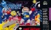
North America
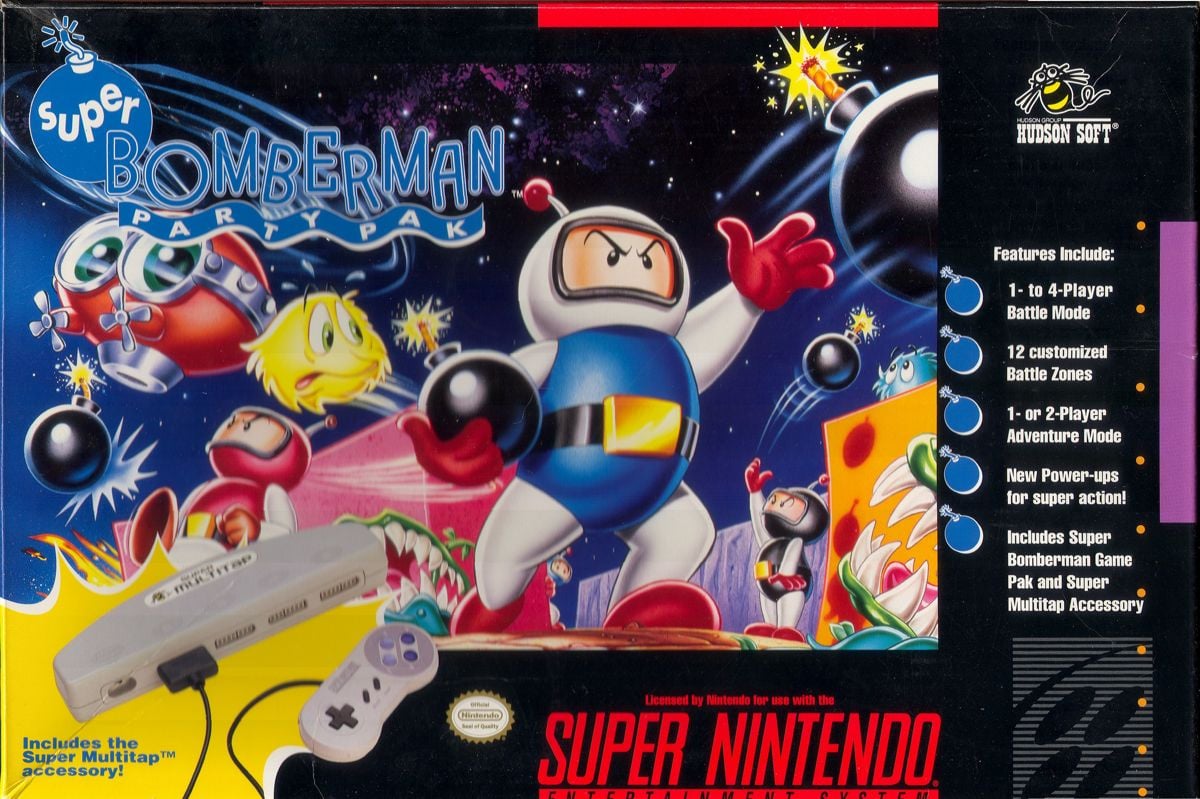
Known as Super Bomberman Party Pack in the US thanks to Hudson Soft's desire to promote the game's multiplayer chops (it would be the first SNES game to support four players), the box art here is decidedly different from both EU and Japan. The characters are certainly recognisable, but it seems the desire here was to create something that looks a bit more '3D' than its regional counterparks. There's certainly a good use of colour going on, but it also kind of reminds us of the US cover of Mega Man... Just not quite so egregious.
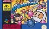
Europe
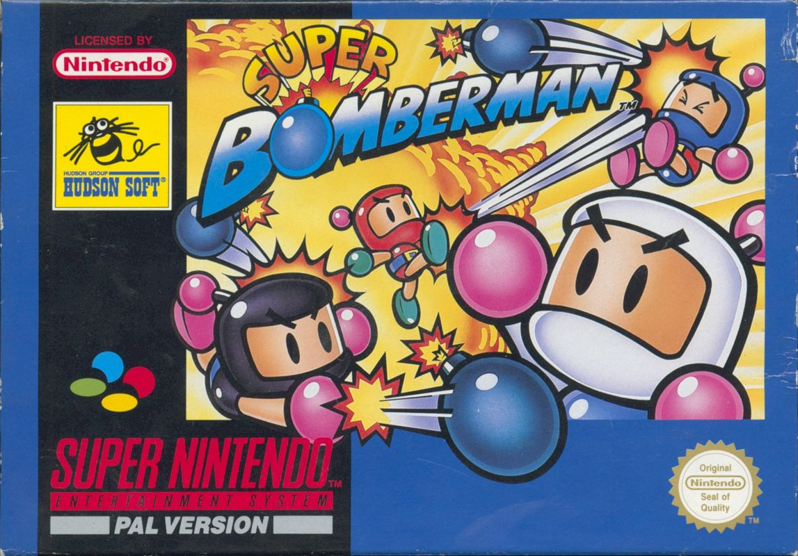
Europe's approach is a bit more straightforward, showcasing the classic Bomberman characters kicking bombs at one another. There's not really much chance of misunderstanding what the game is all about, right? The art style is simple, yet bold and timeless. Indeed, this same approach is still utilised by current owner Konami, so it obviously worked.
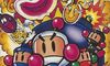
Japan
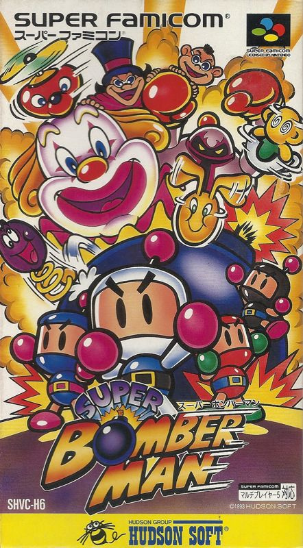
Cor, blimey. This one's a looker. Utilsing the more vertical orientation of Japan's SNES box, the design here is both colourful and action-packed, showing a multitude of different characters from the game against a backdrop of explosions and smoke. The style is almost a cross between EU and NA, with simplistic linework mixed with slightly more realistic colour rendering. It's a nice one!
Which region got the best Super Bomberman box art? (1,865 votes)
- North America
- Europe
- Japan
Thanks for voting! We'll see you next time for another round of the Box Art Brawl.


Comments 50
Japan for sure as it has more characters like the North American box art which help distinguish it from other Bomberman games (and the former also has a more appealing artstyle than the latter at least for me) and explosions just like the European one - after all, it's a Bomberman game!
I know the idea in the 90s was to be "rad" but Japanese box art just made games look fun
America has the worst imo. I voted Japan as it’s the most chaotic and exciting, just like the game.
What abomination is that on the North American art?
I like the NA version in the same way I like the NA Mega Man box art. It’s as if some Hudson exec hired an artist and refused to let them actually play the game, instead explaining everything to them over a drink in a bar. At least this time it’s more or less on track!
The Japanese one is a mess! I voted Europe
Man did you see that kick Red Bomberman did! I'm picking Europe.
QUESTION/REQUEST for the Nintendolife team: Is there a possibility of showing the winner of the previous, box art poll under the results description section? This would help remind readers of the art instead of trying to find the previous link/page. Even if it’s smaller to not take away from the new article/poll.
Thoughts?
Thank you.
I kinda like the USA one, it's original at least lol, but Europe is objectively better
American Bomberman discovered McDonalds
I'd have to go with the unpopular choice: The North American box art. I just find the art style more appealing. I also like how there's a lot more going on compared to the European and Japanese box art.
That clown... that clown...
The NA design isn’t that bad art-wise, but it’s not the iconic designs of modern Bomberman.
The Japanese box art is nightmare fuel, with the grinning clown and whatever that is with the top hat. I don’t even have coulrophobia but I still find it disturbing 😳
So Europe it is! It also depicts the characters throwing bombs at each other, so it would’ve probably been my choice anyway since it represents the gameplay more accurately.
The art on the US one is too soft, looks more like the cover of a cheap tie-in comic. And the Japanese one is just too everything. I don't think you need to cram every element of the game onto the cover.
Europe is definitely the best of the bunch. The characters look cool, there's enough action to show off how hectic the game is without overloading the image and detracting from how simple and cool the bombermens are.
The NA one looks like a game featuring angry weightlifters.
JP is the most eye catching and bombastic, heh, but I don't think I can vote for it due to the prominence of that creepy clown.
North America is HORRIBLE.
Japan would be great without the clown.
Europe wins.
This was actually a hard choice this week for me. I liked every single box art but Japan really stuck out to me. Yes it's too busy but for this cover I didn't mind it at all.
Hard to choose between Japan and Europe this week, the former has a little too much going on and the latter a little too little.
Went for Japan in the end.
US looks like the terrible Saturday morning cartoon Bombernan that never happened. The Japan box is far too busy for me. Europe takes this one.
Look, Japan is probably the best one but I like EU's use of a format that's harder to work with, and also its overall simplicity. Japan feels a tad crowded tbh.
When it comes to the general layout of the art and how people actually look at this kind of things and the natural eye movement pattern, the Japanese one is actually a bit messy but the EU one is actually really well done.
European is the best! Also: I need this game and Super Bomberman 2 on SNES NSO asap!!
I went with Europe this time. It has the classic Bomberman visuals without being too busy like Japan's. I get early Mega Man art vibes from the NA art...which isn't a good thing.
Also, while clowns don't bother me, I could see those who dislike them avoiding the Japanese box like the plague. XD
The European and Japanese versions definitely honor the franchise, but without a doubt I'll stick with the American version!
Crazy, authentic, with many elements that allude to the game's new mechanics, totally original.
Of course it doesn't match the game's original art, but it's such a well-constructed reinterpretation that in my opinion it's appropriate to cover the game!
surprised personally that european won, its just so generic that it could be the cover for any bomberman game, ever.
as usual the Japanese one has every character and villain "exploding" from the same split atom in the center of the universe. boring!
The NA one is the clear winner for me, with lots to look at, and an original design. Also, my man the black bomberman casually chucking a bomb up to a waiting blue baddie, while his yellow comrade looks on in horror. inspired stuff! 👍👍
(minor correction, it's called the Super Bomberman Party Pak, which was the style at the time. ✌️)
PS - it looks nothing like the mega man 1 box art. I think y'all are thinking of the mega man 2 box art ✌️✌️
Yep, as suspected, my favorite is the least popular. It's incredible how consistent that is. This was a tough one though.
@YoshiTails me too plus Bomberman looks badass ready to go
@BulkSlash oooph, yeah that border was a mistake
Box Art Brawls Current Total:
Europe: 75
Japan: 71
North America: 85
Australia and New Zealand: 1
@Olliemar28 Minor trivia note: Super Bomberman was the first SNES game to support four players SIMULTANEOUSLY. But I'm certain Clue and the US port of Monopoly supported more than four players a year earlier by passing the controller around.
I recall the TurboGrafx-16 Bomberman (and maybe '93 as well) had similar "real" Bomberman artwork.
@amongtheworms The Genesis port of Viewpoint. They told the artist the game title only.
@Olliemar28 Also, Hudson Soft did release an obscure US variant without the multitap at some point.
The cover art is mostly the same except it added a couple magazine review logos.
That version was definitely a later release, because I can remember renting the game after it came out from Blockbuster. Blockbuster had the first release because they rented it out inside a special large case designed to hold the Super Multitap in addition to the game, which we can be sure they wouldn't have bothered with if it wasn't the initial release.
https://gamefaqs.gamespot.com/snes/588720-super-bomberman/boxes/40422
Scrolling down to the Japanese one froze me in my tracks for a good second or two. I'm not even afraid of clowns!
So had to vote for Europe this time. (Although the off-style soft look of the NA box has a certain charm to it, I gotta say.)
Hey, you! Fat Pikachu! We found a friend for you!
Europe all the way here.
The US one isn't a bad concept, and it's executed fairly well, but the shift in the art style just doesn't work for Bomberman here.
People often complain that covers look too busy. Some seem to like minimalism so much that anything beyond a logo is too busy. I often disagree with that, but here the Japanese cover is definitely too busy. There's no particular focus on composition other than put everything possible on it in front of a busy background. In communicates little and doesn't really draw the eye anywhere specific. It's too much.
Europe has that awful border, though the NA cover isn't any better. But the art and composition are the best for the Euro cover, so that's my vote.
Europe almost never had the best version. But it's the clear winner here.
@KingMike
Ha! Just had a look and I was laughing imagining what was going through the artist’s mind.
“Erm, should I draw a window? Or a mountain? Hmmm. How about an eye with a laser beam coming out of it? Somebody tell me what this game’s about…”
I actually prefer the Japanese version because it shows all of the enemies in the cover. I know no one really plays Bomberman for the story but...this sits well with me because of the memories i have with the original. The american is kinda funny and i kinda dig it...especially how Black Bomberman tosses the bomb over his head.
The clown on the JP art reminds me how that boss scared the crap out of me when i first played the game. To see the screen go dark (except for the characters) and then the clown face just appearing making faces was scary. And him making that face each time you hurt him was very memorable.
The boxarts haven't aged well and the European one least of all. So that one for me
I like the Japanese box art for all the bomber man games. But Europe runs it really close this time. Id love them to release a Bomberman collection of all the SNES/Genesis/PC Engine games.
JP one for me this week. I like how it shows Bombermen and enemies.
Everyone getting a Like!
Box Brawls rule!!!
Clown = no win
Europe for sure
Europe actually shows the game, and that clown is scary
It's interesting, usually I'm with the majority, but this time I picked NA and it was the worst. I think it is because I remember the day I got the game, and how me and my friends could all play at once. It was SO cool. We were like, this is the FUTURE! Even though we had had the "multi-tap" whatever it was called for the NES that allowed us to play four players, and my atari 5200 allowed for 4 players from the jump. But still, this time it was the FUTURE! (because 5.)
Gotta go Japan as it’s the most beautiful one like I would want a poster of that one easy.
Japan all the way. I like all the action.
You can also see where the more recent Bomberman R games got their covers from.
America's is too cheesy (and Bomberman looks like he needs to go to the gym)
Europe did better than, but it's cover is too simple
@SoIDecidedTo The Multitap had five-player support but the game it launched with had a maximum of four.
What is ridiculous to think about now is the GamePro reviewer who commented on that suggesting a "funny" response (sending Hudson Soft a little gift) that these days would probably get you in some kind of trouble for even writing.
@KingMike I remember always thinking there would be a hidden code where a 5th bomber could be in the center. But alas, it never came to be.
Show Comments
Leave A Comment
Hold on there, you need to login to post a comment...