Hello folks, and welcome to another edition of Box Art Brawl!
In last week's battle, we took a look at Pokémon Stadium for the N64, pitting Europe and North America against Japan. It was a fairly close match, but Japan just about managed to take the crown with 58% of the vote.
So this time, we're going back to the SNES to look at Capcom's Mega Man 7. Launched in 1995, it was deemed a decent title in its own right, but many players considered it to be a bit of a step down when compared to the more stylised Mega Man X.
Subscribe to Nintendo Life on YouTube845k
Europe and North American share very similar designs for this one, so they're going to team up once again to go against Japan. Let's get on with it!
Be sure to cast your votes in the poll below; but first, let's check out the box art designs themselves.
Europe / North America

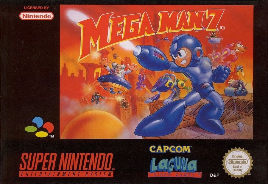
The western design for Mega Man 7 features the Blue Bomber himself front and centre, striking a very eye-catcing pose. You've also got Dr. Wily and his goons in the background, while the logo itself curves nicely over the top of the image. We like the contrast here between the deep blue of Mega Man's body and the ominous red background.
Japan

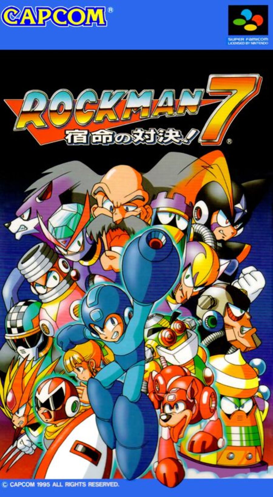
Japan's design is very much a case of "everyone is here" for Mega Man. We can see the hero in the middle of the composition towards the bottom, with all the supporting cast, including Rush and Zero, lurking in the background. It definitely fills the image quite nicely, but we think it might be a tad 'busy'... What do you think?
Which region got the best Mega Man 7 box art? (2,365 votes)
- Europe / North America

- Japan

Thanks for voting! We'll see you next time for another round of the Box Art Brawl.


Comments 47
Neither is bad but Japan wins in virtue of not showing Mega Man with pecs which uh. That just looks wrong on him lol.
....someone should mod that into Smash Bros though.
A real Showdown of Destiny this week. Went with Japan.
Japan because when it comes to Mega/Rock Man the characters, especially the selection of Robot Masters, is one of the aspects that distinguish each game in the series.
Seems like all of Rockman JP cover arts are better than non-Japanese. So, JP one for me.
For a change I voted US/EUR and I'm in the minority again! ^^
I really don’t like either… What is Proto Man shouting at? Why does Wiley look drunk? Why the overbearing color scheme on the US/PAL box? 🤮
Doesn't the Japanese box look like an 80s - vintage cheap BBC cartoon to anyone else?
I love the North American box art, but I have to give it to Japan.
The Japanese version for me. Looks awesome and I like how it features many characters, including Roll in her classic "pray" pose.
As usual in these MegaMan polls, I went with the Japanese box art. They tend to focus on the games’ casts of characters, and I love the cartoony gallery art.
Going to go with the Japanese one. My curiousity is, however, is his blaster, where he has his on the right arm in the Europe/NA box, and left arm on the Japanese.
Gotta go with Japan due to the nice character spread. NA/EU isn't BAD, but I don't care for the color scheme. Not to mention that, while Western designs for Mega Man became better with time (Need I mention the art for the first two titles?), it seems they didn't quite know what to do with Mega Man in the 80s/90s.
The Japanese box art just looks too jumbled up. The Western art has dynamic action while showing off some of the foes you must face. I went with the western box art.
"We can see the hero in the middle of the composition towards the bottom, with all the supporting cast, including Rush and Zero, lurking in the background."
You must have better eyesight than me, as I can't find Zero...
Honestly it feels like if you've judged one Mega Man boxart, you've judged them all. Even that seems pretty similar between games.
Japan. It’s almost always Japan. Man, do I love that cover art!
Removed - inappropriate; user is banned
Japan. The characters there get a deserved appearance in the boxart limelight.
Japan's is a bit busy, sure. On the flip side, the NA cover is a bit sparse. Mega Man looks good, front and center in a dynamic pose. NA Mega Man covers sure came a long way at this point. But there's so much nearly empty space. Putting tiny enemies around the background randomly doesn't really lift up the composition. It's not bad. The Japanese one continues the design of jumbling up all the characters like a collage, and it's not a clean design, but I always thought it worked. Plus, the art style for Japanese Rock Man art just can't be beat. I prefer the Japanese cover, as usual.
Japan - this one wasn't close for me. I like having all of the main characters on the box. The other version has too much black-space, makes it difficult to see the other characters, and has a Laguna logo that feels really out of place. One thing I will give the other version - I think its Mega Man is more in line with the redesigned Mega Man they used for this game.
Zero? That's Bass!
I’m going to vote against the apple-cheeked Mega Man every single time.
Edit: another commenter has pointed to my attention that the Western Blue Bomber has inappropriate pectoral muscles. To that I add that he’s also a robot who sweats and wears a cute little belt buckle with his initials on it!
Both are good, but I chose Japan because it's more classic feeling. Although I really like the artistic 'world burning down' look in the Europe cover, it's not quite the vibe I usually associate with Mega Man.
North America/ Europe looks so classic Super Nintendo, I love it.
The European cover is cool, but its more like back cover of an album design.
Honestly for this one I actually went NA/Europe because while I like the all together look of the Japanese one the red really does play off Megaman s blue.
Japan easily
@SmileMan64 Maybe she should team up with Paula?
I went with NA as it includes that awesome punk steam roller boss.
Is this one even a contest?
Both are great to be honest, but I'm going with Japan this time. I like the artwork just a little more.
Always hard to vote for the NA SNES boxes. Those big black borders and excess marketing logos make them seem like they’re “greatest hits” skus instead of AAA new releases
I like the japanese more, the western background is weird and too drab.
@Tempestryke LOL Awesome. No final boss could oppose them if they pray together.
I wanted to like the US box art, but it just a little… off. I think it just comes down Mega/Rock man expression. He looks stressed (I don’t even want to mention the fact that he’s sweating…) If he’d just had a confident smirk or something by like that, I would’ve preferred that cover more.
@SmileMan64 lol
@olliemar28 Out of topic, but have you guys already reported that Nintendo blocked international transactions in the eShop out of the country the credit card was issued in?
Nobody can buy in the Argentina shop at insane low prices anymore
Box Art Brawls Current Total:
Europe: 61
Japan: 63
North America: 67
Australia and New Zealand: 1
I'm playing this right now on the Switch after my initial playthrough on the Wii U Virtual Console. The Dr. Wily in this game is unforgiving.
As for the box art I choose, I'll go with Japan as usual. Why does the western box art show Treble as if he's fighting alongside Mega Man? Where's Bass?
Not to mention, I love how Dr. Wily is like "Lemme be in the photo" between Freeze Man and Burst Man.
There is no sense of composition with the Japanese one. No direction. It doesn't guide the eye. There's no tension. It's as mentally empty as it is visually full.
My nostalgia screams North America, but I had to go with Japan this time. It's much more beautiful!
As usual Japan gets it right so my vote goes there.
in a rare instance, the NA MegaMan box is pretty good. but, JP still wins.
I found it kinda weird that the NA box art features Treble but not Bass.
I chose Japanese just because Mega Man looks more like he's supposed to look, but I'm not crazy about it either.
The overall composition of the Western art is better than the jumble of (admittedly well-drawn) character in the Japanese version. Point goes to West.
The Western one looks off model, like fan art almost. The Japanese one looks how I think Megaman and gang are supposed to look. And since it's Megaman, it makes a lot of sense showing all those bosses on the cover.
Show Comments
Leave A Comment
Hold on there, you need to login to post a comment...