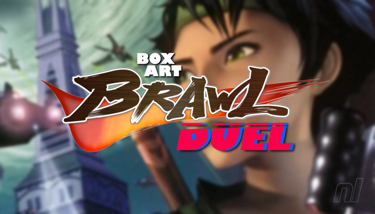
Hi everyone, and welcome to another edition of Box Art Brawl.
Last time, we took a look at Yoshi's Island for the N64. In the end, the vote heavily favoured towards the Japanese box art, which went for a lovely embroidered aesthetic over the more traditional approach taken by North America and Europe. With 64% of the vote, Japan won by a near landslide. Well done!
This time, we're jumping forward in time a bit to 2003 and the launch of Ubisoft's Beyond Good and Evil for the GameCube. Although the action-adventure was deemed a commercial failure, it nevertheless gained a significant cult following, leading to Ubisoft announcing a sequel in 2008 which... still isn't out. Oh well.
Subscribe to Nintendo Life on YouTube845k
Beyond Good and Evil sadly didn't launch in Japan back in 2003, so we're just going to be looking at the North American and European box art this week. With that in mind, let's get cracking, shall we?
Be sure to cast your votes in the poll below; but first, let's check out the box art designs themselves.
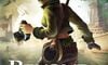
North America
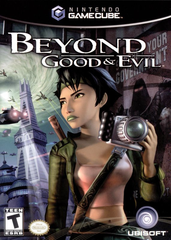
Both variants here are relatively similar to one another. Both showcase the game's journalist protagonist, Jade, looking exceptionally badass, we must say. The North American version features a more close-up image of the character with the logo itself sitting just above her.
We can also catch a decent glimpse of the game's world in the background, lending the overall image a nice sense of place. Overall, a decent effort!
Europe
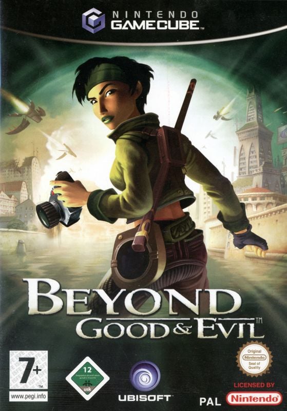
Here, we can see a bit more of Jade herself as she takes centre stage in the composition. The overall brightness of the image has been boosted slightly in comparison to the North American version, and we'd argue that Jade's pose is a lot more impactful.
This is going to be a tough one! Over to you, folks.
Which region got the best Beyond Good and Evil box art? (1,787 votes)
- North America
- Europe
Thanks for voting! We'll see you next time for another round of Box Art Brawl.


Comments 50
US for me this week. I prefer the snooping vibes as opposed to wading in the middle of a river.
Boobs or arse?
kinda of interesting how much boob the north american cover shows
NA wins by a small margin for me but probably only because I've only seen the EU one up until today
PAL one is the most recognizable one?... At least, I haven't seen a NA one before. So... PAL one for me this week.
I never came across this game due to living in Japan for most of the GC era, so I had to vote without any knowledge of Jade or her adventures.
The “Croftian” focus on Jade’s bust and midriff in the NA cover was distracting for me, but I preferred its overall mood over the EU cover, where it seems like our heroine is about to get punk’d from behind.
Happy Mother’s Day to the other gaming moms out there! 😁💕
Tough one but gone for Europe.
I'm going for the North American one this time. I own the European one but I actually think I prefer the NA version. I love how it shows more of the world in the backdrop and the dystopian 'support your government' poster is bringing in that nice one person against the system theme. It does a much better job of portraying Jade as a stealthy, but powerful rebel.
Despite neither giving me a clear idea of what the game is about the North American one is slightly better in that sense with the protagonist hiding and that poster in addition to all the elements present in the European one minus the river.
I went Europe because they gave her head the correct proportions.
@JohnnyMind I can’t think of a single box art illustration that gives an idea of what a game is about, now that I think about it.
@ButterCashier The eternal question.
NA one is hotter.
@ButterCashier a little mini brawl in the comments, I like it.
I vote arse. Hahaha
I like the composition of the NA better it looks more like a scene while the EU is caught between looking a bit like a scene and the modern trend of just slapping a image of the protagonist onto a background image.
Both are good, but I prefer how the NA one more clearly shows components from the game. Buildings, flying ships, propaganda poster. It does more to pique interest, IMO. Also, the mood of the NA box art is more representative of the game as well. Captures the stealth and curiosity, rather than just making it seem like a standard action game.
I bought this game in college when it came out, and I stayed up all night playing the game for about 12 hours straight. I am someone who doesn't care about story in games at all, but I was fully invested in this one. In fact, the scene where the orphanage burns down and Jade is talking to the dog is the ONLY scene to ever make me cry in any game.
Neither is particularly great IMO, but I went with Europe. Jade looks less...blocky?...a bit more natural. Plus I like the bloom of light behind her. Brownie points to the NA variant for that neat poster however.
@MrLinkTathapast There are some example that come to mind from previous Box Art Brawl: the Japanese Metroid Fusion box art shows that it takes place inside a spaceship along with some enemies including the main antagonist, the X Parasite; the Professor Layton and the Curious Village American and Japanese ones, the latter in particular, show you the colorful cast you meet throughout the adventure while the European one shows some puzzles etc.
Box Art Brawls Current Total:
Europe: 54
Japan: 57
North America: 62
Australia and New Zealand: 1
Yeah, I'm going to go with the US art on this one.
Granted I haven't played the game, but with the camera seemingly being portrayed as her "main" tool in both box arts, the US art does a better job of making her look investigative (seeking out the truth in a dark society kind of way), while in the EU art she's out in the open getting ready to do battle with it?
Kinda surprised the EU box has such a large lead TBH.
Holy crap.
They're both good! I've never had trouble choosing one of these before, but with this, I can't decide!
This game was on my wish list back in the day. (...nearly 20 years ago!) I never got to it. I didn't have money to buy it when it was in stock. It became harder to find. Eventually, I just moved on.
Can't vote on either, they're very bland and generic looking.
@Setrodox I think you can buy it digitally on Xbox and it's definitely on GOG and Steam. As of writing this comment, it's on sale on Steam U.S. for $2.99.
Having not played the game, all I can ask is "Is this like Pokémon Snap where you go around taking photos?" That's the impression I get from her holding her camera.
If I had to choose one, I'd probably vote US for giving a clear look of the settings.
This was a tough one - I like them both.
I went with NA in the end because I like the movie poster vibe.
I miss the GameCube Era. The cases looked the best.
So strange to see this here, as I was just thinking about this game yesterday. It was on my radar when it came out and I was planning to get it. The game's failure to sell well enough led to it being marked down to $10 a few weeks after its release which worked in my favor. One of the best deals I ever got.
As for the boxes, I think they both end up communicating the same overall vibe, but I prefer the composition of The European cover. It's a bit more dynamic while also having more room to breathe, which I think works better in this case.
@JohnnyMind Without any prior knowledge in the game, there’s no way to discern what something is about without playing. Unless you think each Final Fantasy is the last one? Maybe this one! Lol
I think the first one is a way better representation of the game's overal feeling!
Boobs or arse
The difference is small, but I think that, had I not always seen the EU one, I would have prefered the US one.
In both cases she's looking over her shoulder, camera ready. US has a better background, more obviously a totalitarian tyranny (what Jade is looking AT), EU has better colours (what she was pointed at and saw just moments before). So both represent the game quite well.
I would especially like to finally see a sequel on the Switch or its successor (presuming it will also be a handheld). And not see it become a fully open world game, but a true sequel, so open-ISH but intentional and structured. Or see the HD version on Switch at least. Such a good game.
The US one really has better vibes that match the game and is a more flattering angle on Jade. If I didn’t have so much to play, I’d go back and play this one again. It’s been long enough. I recall it being pretty short and getting 100% completion in about a dozen hours. It was a great rental.
@Tourtus What's Xbox, GOG, and Steam? JK. But I use NintendoLife for a reason. I only use Nintendo consoles.
@ButterCashier that's what I was thinking.
In that case, I gotta vote for the European boxart.
Both are bad, but the European is slighly less bad.
European one is much nicer, although the US one does give more of a sense of what the game is about it’s undermined somewhat by the objectification of Jade.
Honestly not sure how people are saying neither give a sense of what the game is about. Both clearly show the protagonist wielding a camera is a dystopian, future setting so it’s not a massive leap of logic that this is a game about sleuthing and uncovering some kind of government conspiracy in a futuristic dystopian world. Ok maybe the European ones doesn’t give the dystopian and political angle so obviously. But still, that’s exactly what the core of the game is about.
The US is too cluttered, and the model of Jade looks horrible. The EU cover is a far nicer composition, and Jade actually looks decent.
Great game. I’m surprised Ubisoft never made a sequel…
Europe got it done for me... That cover is striking and inviting. On another note, this remains an unplayed GCN game for me and another regret next to Skies of Arcadia Legends.
so where's the sequel
We're actually gonna get Half Life and Portal 3 before we get a sequel to this game. I don't trust Ubisoft to stick the landing at this point anyway.
Europe. The US cover art one is too "busy".
No matter which cover...the game is pure gem. Bought the HD digital version on PS3 just recently
@MrLinkTathapast The US version of Phalanx is a good example of how to do this.
NA. You can readily tell what the game is about. EU cover looks awkward. Jade is just randomly looking back while in a river?
@Jacket_p Exactly
Gotta go with North America on this one. I like the vibes of stealth coming off it and honestly the European one just looks like it would be the sort of poster for like a movie adaptation of Beyond Good and Evil. Eeeeyikes.
@Setrodox
Why limiting yourself?
The Game isn't as demanding and should work on every Laptop of the last ten Years and beyond.
Go to Gog.com, grab it for a handful of Dollars/Euros/Pounds and have it without DRM, save it everywhere you want to keep it forever.
@Azuris I don't feel limited at all with 50+ purchased games on the Switch that I haven't played yet.
Definitely the North American variant for me, though both of them are good in their own way. No real loser here.
@Setrodox
50 Games but not Beyond Goo and Evil
Jokes aside, give Gog a Chance and just use whatever you can, as said, you are fine even with an older Laptop for older Games.
You'll get them for 50-200% less as on the Switch (not kidding).
Show Comments
Leave A Comment
Hold on there, you need to login to post a comment...