
Killer7 - Box Art Brawl
Image: Nintendo Life

Hello folks, welcome to another edition of Box Art Brawl!

Last time, we perused over the three box art designs for Viewtiful Joe, one of the 'Capcom Five' titles for the Nintendo GameCube. North America came out on top this time, winning 57% of the vote. Japan took the silver medal with 24%, and Europe closing out with the remaining 19%. It seems that the yellow/pink variants in Europe didn't go down too well with voters, after all!

This time, we're going to be checking out another of the Capcom Five: Killer7 from legendary game creator Suda51. Released for the GameCube back in 2005, Killer7 received slightly mixed reception upon launch due to the heavily stylised visuals and gameplay, but has since gained somewhat of a cult following.

It was subsequently released on Steam in 2018, yet has yet to see a re-release on Nintendo platforms. Nevertheless, we reckon it deserves the spotlight this week. It's another three-way brawl, so let's get cracking!
Be sure to cast your votes in the poll below; but first, let's check out the box art designs themselves.

North America

Killer7 NA
Image: Capcom

North America's design for Killer7 is pretty slick, featuring the main cast of characters broken up into their own little segments, which appears to be the result of what looks like a bullet hole in a pane of glass. The dark red theme we've got going here is extremely effective, and we like the pitch black logo a lot, too. Nice!

Europe

Killer7 EU
Image: Capcom

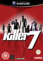
Europe's design is a lot more understated, but equally effective in our eyes. There's a sort of 'Reservoir Dogs' theme going on with the main characters walking towards the viewer against a striking red background. The character models are also reflected below the logo itself, which is a neat little touch!

Japan

Killer7 JP
Image: Capcom

Well, now... this is different! So, Japan's design for Killer7 - or as it appears to be known in the region, 'Killer7 Capcom Killer7' - doesn't feature any of the characters from the game, but rather focuses on a more abstract pattern with light blues and cream colours making up the composition. It looks really nice, we have to admit, though we're still a bit baffled as to why the game's logo is repeated top and bottom. You can also see a sliver of the Capcom logo right at the bottom, so maybe it's meant to respresent wallpaper..?


Which region got the best Killer7 box art?

Thanks for voting! We'll see you next time for another round of the Box Art Brawl.