Hello folks, welcome to another edition of Box Art Brawl!
For last week's brawl, we took a look at one of a handful of Virtual Boy games (and one that many of you had forgotten even existed): Panic Bomber. It wasn't a particularly close race for this one, with Japan winning comfortably with 71% of the vote. Well done, Japan!
This week, we're heading back to the GameCube era to check out one of Hideki Kamiya's best games: Viewtiful Joe! We've got different cover designs across all three major regions this time, so it's going to be a proper, three-way brawl. Nice.
Subscribe to Nintendo Life on YouTube848k
Launched back in 2003, Viewtiful Joe was released exclusively for the GameCube as part of the 'Capcom Five'; five (well, technically four) games that Capcom had pledged to create specifically for the GameCube to boost hardware sales and demonstrate strong third-party support, including the legendary Resident Evil 4. Of course, most of us know by now how this all eventually transpired: three of the four games made their way to other platforms, with only P.N.03 remaining exclusive to the GameCube.
Nevertheless, Viewtiful Joe was a critical success, even if it wasn't particularly a commercial one. It spawned a direct sequel and a couple of spin-off games, and quite frankly, we're just itching for Capcom to get it ported over to the Switch!
Be sure to cast your votes in the poll below; but first, let's check out the box art designs themselves.
North America
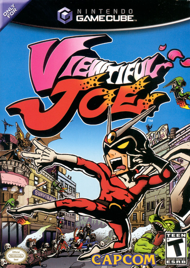
North America's design for Viewtiful Joe is probably the most "traditional" out of all of the variants, in that it simply features the titular protagonist against a fairly busy background, full to the brim with the game's various enemies. It's absolutely gorgeous, bursting with colour from corner to corner, with the logo itself nice and bold at the top. Lovely!
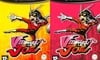
Europe
Huh? Twoooo?!
Yep. Europe got two box art variants for Viewtiful Joe, though the only difference between them is the colour: one is yellow, and the other pink - ta-da! Otherwise, we've got the protagonist himself striking the same pose as the North American variant, and both designs have the same background as each other. Why were there two variants? There just were! This writer remembers being lumbered with the pink one and being fairly disappointed, but looking back now..? Yeah, they're both really nice.
Japan
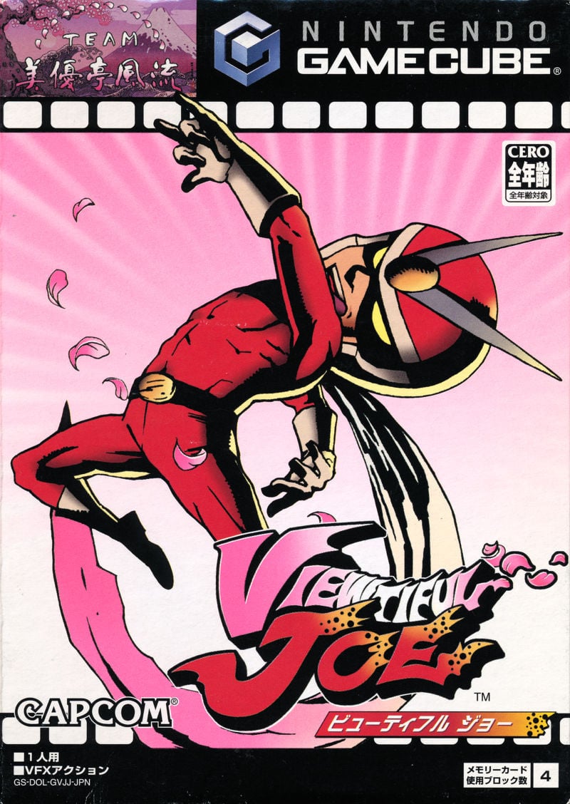
Japan's design is quite interesting, because it's the only one of the bunch that features the game's signature film reel visual at the top. Our protagonist is striking a different (albeit arguably more iconic) pose from the western design, and we've got a really lovely pink gradiant going on with the background, including some pretty flower petals surrounding Joe. This is a great design overall!

Thanks for voting! We'll see you next time for another round of the Box Art Brawl.


Comments 46
The game’s OST lives rent free in my head.
Joe is full of dynamism on the Japanese cover. It's tough to pick between that and the US one.
@GrailUK Exactly why I went for the Japanese one, although each box art has something that the others lack so it really depends on what matters the most to you.
I like the U.S. ons here easily. It has tons of color and captures that look of a comic book. The other versions are just too simple.
I went for the North American box art, for the exact reason @TYRANACLES said, I really love the comic book feel the cover gives off.
Yellow Europe pops the most
Going to go for JP, 2nd choice was NA and then EU.
Great game. North America got my vote
Golden age for Capcom
Europe. Yellow. Good.
No accounting for taste.
Tough call to be honest, all brilliant. Game needs a reboot as well.
Japanese Joe is the most Viewtiful. I have the pink Europe one myself, and am not sure whether that is why I'd vote it as a second or not. I think pink background / red Joe suits the colours in the title best. Yellow is not a background colour imo, and the flashy busy NA background is cool but makes me wonder what Joe is doing there kicking air with his back towards all enemies and nothing pointing to his physical presence within that background. So yeah, Japanese, pink EU, NA, yellow EU. In that order.
Japanese Joe has a much cooler pose, plus cherry petals. Jump kick? Come on, we've seen jump kicks before.
North America due to the background variety; it looks like a comic book and conveys a little about the game at any rate. Japan's cover receives brownie points for that awesome pose though. The NA box art would be the best of both worlds if it incorporated that design lol.
This series passed me by - no GameCube - but I recall there being a Viewtiful Joe anime back in the day. Never really got into it TBH.
That dark pink box brings the whole EU option down. Ollie was right to be a bit despondent about it IMO.
I love that flourish among the falling sakura petals, so as nice as the US cover is, I’m going Japan again this week. Truly viewtiful!
Despite my love of Japan’s tokusatsu heroes, I’m ashamed to admit I’ve never played this game. I think I sensed its presence in the Wonderful 101, though.
Three way brawl! I don’t think we have had a four brawl yet?
US pretty easily this week. Colorful & shows off the game's action.
JPN would be second. It's more simple, but in a deliberate artsy kind of way.
EU variants in last because it looks like they simply took the US art & sucked out the energy.
The North American one has the courtesy of telling you a little bit of the game unlike the others.
Voted for the North American one, but the Japanese cover is a close second.
NA, but the game sucks hahahahaha. When I finally played it years later after it was release, I couldn't understand all the hype.
NA, no contest.
I think the pose on the Japanese cover looks a bit puzzling if you aren't already familiar with it, so I think the other pose works better. The NA cover is busy, but not too busy in my opinion. I also like the extra color the NA cover provides, so that's my vote. But I thought there was something to like with all of them.
I have the pink version! What a game, both that and the sequel were brutal but great fun.
Incredible that all these years later these games are not remastered for current systems.
I'd really only like the first one, but if it were a collection that would please all.
There's something to be said about the simplicity of the Japanese box but gotta go with the North American box art for how colorful and alive it is.
Box Art Brawls Current Total:
Europe: 47
Japan: 51
North America: 56
Australia and New Zealand: 1
This game NEEDS a re-release
The yellow version of Europe's boxes is my favorite. VJ and VJ2 deserves a remaster. More people should play these games.
Yellow Europe. And, as always, my pick is the loser. Vote-wise, I mean.
Leaning on North America's detailed box art, but all of these covers are masterpieces!
I really would kill for Viewtiful Joe 3 or a collection of the first 3 games... Too bad it'll never happen. Kinda crazy we haven't gotten an indie successor yet.
I hafta say NA, it's vibrant and lively.
I would love to see Viewtiful Joe come back. A game about movie superheroes would likely work even better today.
Like others have said, the NA cover looks like a comic book. Though I would argue that the Japanese design looks more like a comic book cover, whereas the NA one looks more like a page you would find inside the book.
That being said, I still liked the NA cover better. Go figure 🤷♂️
@RR529 You summed up my thoughts exactly.
NA Cover for me. The first time the stylish combat ever clicked for me. Plus that great ost.
That (and the second part) was such a great game!
And the GC version looked and sounded better than the PS2 one.
Wow Europe got done dirty on this one.
i loved that the japanese box art incomporated the film reel astectic so know in this franchise
Never liked the American. It lacks style.
Surprised to see it is winning
@sketchturner AAAGH, I don't know, it really left a sour taste in my mouth too bad to pick it up again. I have children now, so I have to pick up wisely my free time entertainment hahahaha.
North America all the way. The blue background makes everything pop. The blue sky is what I think of when I think Viewtiful Joe
@Sequel
It’s one I meant to pick up long ago, while still living in Japan where used copies were cheap and plentiful. I’ll have to rectify that and hook up my old Gamecube. It’s been ages!
The only thing missing from the US Boxart is the film border on the Japanese cover which really fits the motif of the game well, but the NA box still the best looking of the bunch due to the vibrant colour and better background art.
On a related note, Viewtiful Joe definitely needs a remastered collection (including Red Hot Rumble) as well as a new entry in Switch asap please Capcom!
… Wun can only hope.
Such a great series! Wish it would come to Switch.
Show Comments
Leave A Comment
Hold on there, you need to login to post a comment...