MP Hunters - Box Art Brawl
Image: Nintendo Life

Hello folks, welcome to another edition of Box Art Brawl!

In our final edition of 2022, we took a look at the GameCube remake of Hideo Kojima's stealth masterpiece: Metal Gear Solid: The Twin Snakes. As expected, the Yoji Shinkawa designed cover for the Euopean and Japanese variant took the lion's share of the vote with 78%. That said, there were plenty of fans of the North American design who understandably thought that the stark red colour of Shinkawa's effort was a tad garish.

To kick of 2023, we're going to be looking at a classic title for the Nintendo DS: Metroid Prime Hunters. Though no where near as lauded as the mainline Metroid Prime trilogy on the GameCube and Wii, Metroid Prime Hunters was nevertheless an impressive showcase for the DS hardware. The 'First Hunt' demo packaged in with launch DS consoles more than proved the game's worth, though it's safe to say that the visuals and gameplay have not aged particularly gracefully by today's standards.

For this week's brawl, North America and Europe have identical designs and so will team up against Japan. So without further ado, let's get cracking!
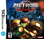
Be sure to cast your votes in the poll below; but first, let's check out the box art designs themselves.

North America / Europe

MP Hunters - NA
Image: Nintendo

The western design for Metroid Prime Hunters is pretty nice, overall. It features Samus herself in the immediate foreground in a rather striking pose, with a selection of the game's other hunters in the background. There are a whole bunch of stars surrounding the characters and a pleasant colour gradiant from blue to orange; a tactic often used in movie and game posters.

We like this one a lot!

Japan

MP Hunters - JP
Image: Nintendo

Japan's approach to the design for Metroid Prime Hunters is a lot more abstract in nature, featuring Samus in another equally striking pose, but this time the other hunters are completely absent. Instead, we've got the game's title in the background in a bold, silver typeface against a block of red colour. It's certainly very eye-catching and when looking at the two variants side by side, this one is probably more likely to draw our gaze, even if it might not be quite as visually pleasing as the western approach.


Which region got the best Metroid Prime Hunters box art?

Thanks for voting! We'll see you next time for another round of the Box Art Brawl.