Switch icon connoisseurs will have something to celebrate very soon. Digital Eclipses' excellent Teenage Mutant Ninja Turtles: The Cowabunga Collection is getting an update pretty soon, and as part of that update, the game's Switch icon is also getting revamped.
Now, we know some of you lovely readers are pretty picky about your Switch icons, just like we are. And frankly, the heroes in a half-shell deserved a little better than what they initially got. Luckily, Digital Eclipse has listened, and with an upcoming update, Switch owners will also be graced with a brand new menu icon.
The developer acknowledged this much-anticipated change on Twitter after confirming that it will be holding a livestream to show off some "improvements" coming to the retro compilation:
"And yes, for those of you who were not fond of the Switch icon for TMNT: The Cowabunga Collection, when the title update is applied, the tile will become the main logo instead.
We heard you. We always hear you."
So the new icon looks pretty swish, right? It's just like the game's box art, which is what a lot of developers and publishers go for nowadays. The original wasn't awful, but to say it ruffled some rat hair.
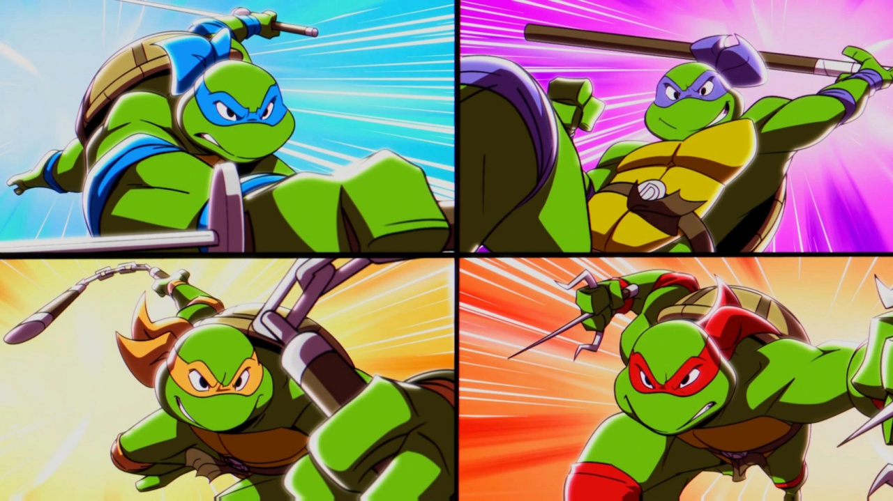
In case you haven't seen it, the current (soon-to-be retired) icon is a rather colourful piece of screen decor with all four turtles on it. But there was no title, no logo, and the icon is designed to look like a little button that sinks into the Switch's white background. Except it didn't work if you had your Switch screen in dark mode. You can see for yourself in SuperDarkMimelV's tweet below.
So that's that, then! We don't know exactly when the update is dropping, but given that Digital Eclipse is going to be showing some of the tweaks at 11am PT / 2pm ET tomorrow, we have a feeling our Switch screens will be looking just that extra bit nicer very soon.
What do you think of the original logo? Are you happy about the change? Let us know!
[source twitter.com]


Comments 46
Yes please update it. Because the current icon looks atrocious 🤢🤮
Now this just makes me upset again that Sonic Mania doesn't have an icon title either xD
Really glad to see this being changed, the original always stuck out and not in a good way.
Now I really hope that they have also added a support for single joy-con multiplayer for most of the games, that was the most baffling omission.
The upcoming update better add online for the remaining TMNT multiplayer games cause only having 4 of the games to have online is a slap in the face imho.
That's a surprisingly thought provoking coda for an icon change. It's definitely for the better though, the old one looks like it was made for Wii U with that kind of border.
People really complain about anything, huh?
I'm surprised no developer has figured out and/or incorporated a way to have different options to choose from for their games. Could make some of them rewards for beating the game on difficulty "X" or something like that.
Are there not more IMPORTANT things in the world to worry about? Is it Pork Roll or Taylor Ham? Why can't I wear white after Labor Day? Should I drink a liter(litre) of vodka before meeting with my boss?
Even with something that seems this insignificant, it's nice to hear developers are listening. I just hope a majority of the criticism was constructive in tone
So.. the old one is the bright, vibrant, colourful, easily identifiable one, and the better one is the mangled smush of splodges and an unreadable title card in a tiny font?
... is that right?
yeay progress!!! Woot!!
I like having the game title in an icon on Switch. Otherwise it gives off mobile game vibes. It’s not a dealbreaker, but the fact that the developers care enough to change it says a lot about them.
Now that a lot of stuff is digital, an icon is the new packshot. And it is important and part of the whole thing.
I don't understand anybody saying "who cares".
Edit: It is good that it get's updated. And it is good that stuff like this makes the news.
Y'all are crazy. The new icon is going to look really silly on that tiny screen. I prefer an icon you can tell instantly at a glance what it is.
@Yanina is good when they update when needed. But the new design is a bit crowded and busy for a tiny switch icon. The old design is much cleaner and easy to recognize in handheld mode.
Funny that they have their other title Atari 50th there without a title
well, cowabunga say it all.
Wish Sega would have updated the Sonic Mania icon at some point (when the Plus DLC came out that would have been a perfect time). Really hate how it's just his smiling face with no title, sticks out like a sore thumb. Skyrim is bad in this regard as well, but at least it's as obnoxious as Mania's icon is.
Cool, now someone get on The Oregon Trail Team, Skyrim, Sonic, and some others and we are good
Who doesn't have their Switch in dark mode? And yes, this game is so much more well done than the icon let on. The new one better conveys its bodaciousness.
I mean that's cool I guess.
I was absolutely fine with the logo...
Why changing it?
Removed - inappropriate; user is banned
They need to change the fact that when you press B to back out of the menu, you jump. That is whack.
Id love to see more games do this, Persona 5 Strikers is a big one that comes to mind when it comes to an icon that needs changed
Yeah, I did think the icon was a bit off. I welcome the change.
Why do people hate the icon? It looks fine to me.
Plus it’s not a museum it’s a menu your gonna be looking at those icons for like 3 seconds before passing over it or selecting it.
Really dislike icons that is just plain text with not even a single picture.
I liked the original one because it stood out amongst the other games and reminds me of the actual games…
I also disliked the original one because it stood out amongst other games.
Wonder why we as users can’t just assign our own icons… doubt it would be that revolutionary of an option to put into a system update…. But then I remember the online shop haha. Maybe it is difficult…
Then I remembered the game is rad… and would rather play it than stare at the icon for hours pondering this question.
Liked the old one more cuz it pops… but the new ones not bad cuz it don’t pop and blends in haha…. Bottom line is… the next time I put the game in and it updates…. I would have forgotten what the OG icon even was hahaha.
@Scapetti The irony, Lol! Though I give the Atari 50th a marginal pass since it’s actually a logo. Adding “50” to it would complete it and differentiate it more from the Flashback Collection, IMHO.
So long as you can readily tell what something is I don't really see difference the icon design makes one way or the other? I prefer the existing one over the changed one I guess but either way if it works it works.
If only they would patch up the awful lag on these gsmes i would be happier. Just doesnt feel right and should a priority in tgese collections
This is a welcome change in my book
Do not change the freaking icon you fools, there's nothing wrong with it. At least let us choose, those who want the ugly cover arts icon could have it as free DLC but leave us who still want the comic style animated icon to ourselves.
This is all very reminiscent of the Snake Pass icon fiasco. And just like back then, I'm happy with the change they made.
@Tron81 The lags had more to do with your awful devices (tv, console, controller, network, router, bluetooth, your location, etc.) than the games which can't be fix by them.
@thesilverbrick You probably play mobile too much, simple icons in gaming had become the norm since the PS1 days. Even on PS1, every game had an icon to represent them via memory card slot, heck Star Wars: Masters of Teras Kasi had a Yoda with boxing gloves as an icon. To gave a stupid title logo on an icon is just lame, there's nothing wrong with the comic style turtle icon. They're fixing something that's not even broken.
@RobynAlecksys the old icon looks like a knockoff mobile game or something you'd find in a 2010's flash games website.
Having an option of game icons the user can choose from on the switch home pages would in fact be a great idea!... Maybe when the switch is more stable! 😄
I also feel that the old icon was bad, the turtles look off-brand and not related to the art of the games themselves, but I also think the new icon is too much in too small a space. Maybe third time's a charm 😋
Update is live, btw. Happy to say that we now have Gameboy, and Gameboy Color filters, people! 😁
@Jayenkai I think the old one is ugly. Plus I hate it when there is no title in the thumbnail. Shouldn’t have to hover over a game to see what it is…
Old icon + title = cleaner and more "readable".
The chaotic mass of tiny little images in the new icon is just a mess.
https://socoder.net/uploads/1/2022/51/99DC1780-E48E-43B8-B5D8-3E2C53A7A2B5.jpeg
@Serpenterror Im talking about input lag actually, though the online is a whole other problem. An emulator shouldnt do a better job then a console port at this point. Rather get the frames down then read extra stuff
@Serpenterror I don’t play mobile games at all. And I’m completely aware of the small icons on older memory cards used to represent the games. Using just a tiny photo to represent a game makes sense when the size of the icons is small. But when you’re trying to represent a game library, some indication of the name of the game is actually not just stylistically more pleasant to me and others, but it’s also very helpful for somebody who is unfamiliar with the library when navigating said menu. Plus, game icons on the Switch home screen are fairly large and take up a significant portion of the screen, so using some of that space to actually showcase the game’s title makes perfect sense, unlike on a mobile phone or an array of tiny save data icons. If you like simple icons with no titles, more power to you. To each his own.
I quite like both! Feel sorry for anyone who loved original icon. Imagine a day where you could select from a few icons instead, that will be nice.
@RobynAlecksys Hey man, I totally agree with you about the icon, but it's okay if other people don't, you shouldn't call them braindead for having a different opinion :^((
Show Comments
Leave A Comment
Hold on there, you need to login to post a comment...