Hi everyone, and welcome to another edition of Box Art Brawl!
In last week's brawl, we took a look at the GBA karting classic, Mario Kart Super Circuit. North America and Europe joined forces against Japan and came away with the win, garnering a whopping 75% of the vote. It's clear that the more simplistic composition proved exceptionally popular with readers, and we have to say, we firmly agree.
This week, we're going to be checking out the SNES version of Prince of Persia, published for the system by Konami. This 1992 version of the game boasted improved visuals and more levels when compared to the original Apple II release and was reasonably well received by players and critics.
It's a full three-way brawl this week, so strap yourselves in folks; let's get started!
Be sure to cast your votes in the poll below; but first, let's check out the box art designs themselves.
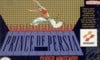
Europe
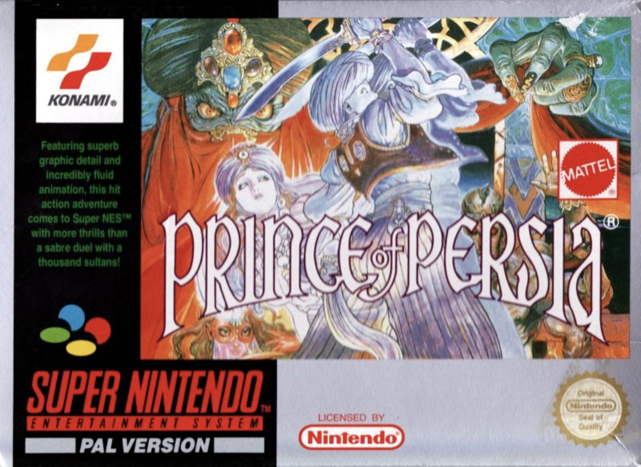
Europe's design for Prince of Persia shares a lot in common with Japan's, albeit cropped down significantly to fit into the region's standard box layout. Nevertheless, it's a gorgeous piece of artwork bursting with colour and detail.
On the flip side, however, because it's been cropped down so much, we miss awesome details like the formidable skeleton rising out of what seems to be lava at the bottom. See Japan's entry to see what we mean!
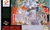
North America
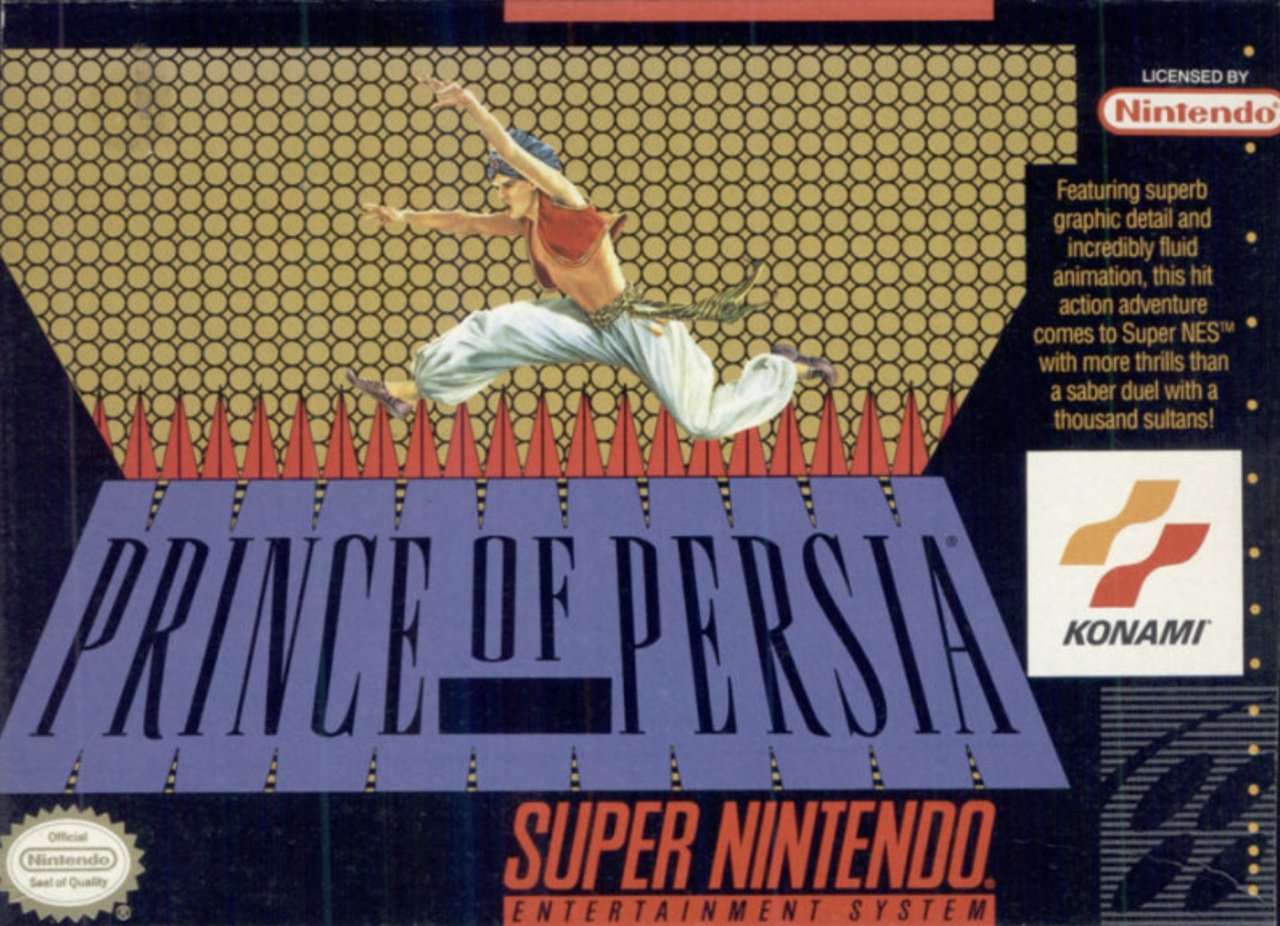
So North America's variant is, uhh... weird. It features the prince himself leaping over the game's title, with an interesting gold pattern in the background. It's certainly bold, but we're not really sure why this was the chosen design when the Japanese/European one exists... We can't imagine this being particularly popular with voters.
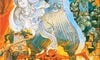
Japan
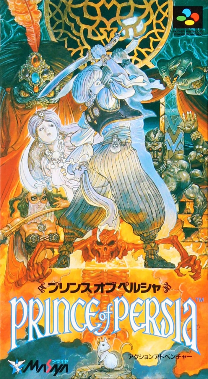
Japan's design is the full image seen in North America's version, showcasing everything missing from the otherwise cropped image. The artwork does all the heavy lifting here, and even the title itself seems as if it's tucked away at the bottom to avoid intruding on the beautiful imagery. Lovely stuff!
We've a feeling we know how this vote is going to go, but then we've been horrifically mistaken in the past, so we'll see!
Thanks for voting! We'll see you next time for another round of the Box Art Brawl.


Comments 52
Heads up, the picture for Europe and NA are switched.
The Japanese box art is great. The cropping on the European one is strange. It doesn't really work for a horizontal box. The North American one is strange. I am struggling to work out what is happening. Is the part with the title supposed to be the ground? That then makes the perspective seem strange
The ugliness of the generically plain background ruins the otherwise endearingly goofy North American foreground art. As for the European art... yikes. Absolutely hideous. There is way too much going on in that horribly cramped frame, and the colour choices are so bad that nothing stands out, which is ironic, because the Japanese colours are even worse, but I prefer the Japanese box art between the two due to the marginally superior composition and the fact that the subjects in the image stand out just a smidge more.
Just rubbish all around, which is a shame, because I have such a soft spot for the classic Prince of Persia (while not really caring for anything that came along after).
And as much as I hate that cheap, crappy background, the North American art is my favourite between the three.
EDIT: I have amended my comment to reflect that the art with the Prince jumping over spikes is in fact the North American artwork, but was listed as the European art in error.
Who voted for Europe? Stevie Wonder?
EDIT: Oh, that’s the American version just listed wrong on the article. Who made this article? Stevie Wonder?
This will be an historical landslide victory for Japan.
I voted for USA because it made me laugh. It's so literal and utterly tasteless. It's my favourite.
I’d say the pics are switched, but the text matches the pictures. Writer’s just confused
What a coincidence. Just bought the Famicom Box Art book from Bitmap Books and opened it yesterday for the first time, where I saw this artwork and thought just how cool it looks. The easiest win of a Box Art Brawl in a long time and just a very great piece of videogame art in general (in comparison to many of the last times, where we had to choose the lesser Evil). I'm talking about the Japanese one, obviously.
The European one looks bland AF.
Anyways, I voted for the Japanese box art, as it's a more fleshed out cover of the North American one.
Edit: It seems (based off of the comment section), that the North American art work might be the bland one afterall.
I think in Europe, the general consensus was to make video games as child-friendly as possible. Even if the content was bad, as in MK2, the box-art couldn't be. I can understand why it viewed like a cut-and-paste of the in-game Sprite over a non-descript background. Not saying I voted for it but of course that's what was happening in europe. I went for Japan
@Olliemar28 The first two images are the wrong way round.
EDIT: Picked Japan. The NA one is just too bland and says nothing at all. The EU one is fine, but clearly just a downgrade to the Japan one.
The European and the American boxart is mixed up in this article.
Well... "North American" cover art have "PAL version" title below "Super Nintendo Entertainment System". I already know that they are switched up. NA one looks really poor if compare it with the JP one or PAL one.
Japan without a question and it's not even my bias speaking: same art as the European one (currently switched with the North American one, but you can immediately tell since it says PAL version), but on the full box instead of being cropped out.
The less we speak about the North American box art the better...
is this really even a vote
How gorgeous is the Japanese box art!?! Easy choice this week!
No contest, Japan is the clear winner in this poll
Clear vote for Japan but the NA one represents best what you’ll be doing in the game
I want to talk to the person who made the American boxart because like.....WHY???????????????
I'm going to wait for the images to be properly placed before making my actual vote but I think I've got to give it to EU: it is just the Japanese one but cropped but I honestly think it looks better because of it (got a lot less clutter for me, you know?).
Japan is the clear winner here. It’s not eveua contest.
Thanks to all who mentioned the switched western designs. I don't even have anything witty to say, I don't know what happened there. Not that it matters; Japan's design is obviously the best one.
Japan easy this week, the full art looks nice.
Understanding that the article mixed up the US & EU boxarts, I think I'd choose the US art at a (distant) second. The colors are kinda ugly, but it has a simpleness to it that works better than how cluttered EU manages to be despite cropping JP's art.
I think when I was younger I always saw this game at Blockbuster and I always passed it over cause od the bland box art. It's sad because this game is amazing. Great soundtrack and I like all the extra levels.
With that said...I am going with the Japan boxart. For goodness sake you can see the mouse on the bottom!
@Olliemar28 don't worry. These things happen.
This one's not close. Though I don't really like the actual drawings, the layout and style are just great.
I mean I like the silver colouring on the PAL box, that's the version of the game had, but by god the full art on the japanese version is glorious, it's no contest, that's some fine handrawn old school artwork.
I'm voting Japan just for the mouse at the bottom.
The Mattel logo killed the PAL version for me and the US one looked like they used clipart to produce it.
@HammerGalladeBro I think that is a rat. But yes it does pull the whole scene together.
It's no contest. The Japanese one blows Europe and North America's cover art out of the water (or sand). The European one is a little better, but that beautiful mural is obscured by all that image cropping, and the North American box art is so plan, generic, and boring.
My stepmom asked a retailer for a non-violent game and was referred to this for some reason. The employee either (1) knew nothing about the game, (2) needed to find an excuse to get it off the shelves, or (3) assumed from its bland (NA) cover art that it's just a bunch of jumping. So the cover might have directly resulted in at least one sale.
Come one this isn't even fair, lol.
JAPAN
Box Art Brawls Current Total:
Europe: 44
Japan: 49
North America: 53
Australia and New Zealand: 1
At the time of my vote, Japan was at 89 percent, which frankly is too low! I do commend the artist for the US version on how he or she captured the prince's jump, but that's about it for that. I don't know what they were thinking with that layout. The European version suffers from unfortunate cropping. It makes me wonder why the western regions went to horizontal boxes while Japan used vertical as that made it so much more difficult to use the original box art. And in this case, the original box art is quite stunning, from the layout to the art itself. Stylistically, it won't work for everyone. I know the distinct Castlevania artwork from the Symphony of the Night era didn't resonate with me at first, but I grew to appreciate it over time. This box is quite cool.
@LavaTwilight Except that ugly one was the US one, and the EU one was the cropped JP one.
I obviously voted for the Japanese one, but I actually like the NA one a lot, you guys are being too harsh.
@Branovices Not harsh enough
I need a none of the above option this week!!
Perhaps if you spent more time defending your walls,
and less time admiring your box art,
you wouldn't be here.
@Daniel36 really? Then I got nothin'
@Olliemar28 The North America boxart is a super-crunched version of the weirdly-shaped PC box.
@GX_64 It's... an attempt... to convert the oddly-shaped PC version box.
A blind person could have seen that the Japanese box art was superior, it's incredible.
Japan. Japan. And Japan. Europe's is unfortunately cropped. What was NA's box art team smoking?
Stunning artwork by Katsuya Terada, one of my favorite box-arts period. The game is such an overhaul of the original too!
Japan has a mouse. Hands down they win!
I remember renting this as a little kid, and even at that very young age, thinking how.... off the box art looked.
I wondered if it was showing him falling to his death on those red triangled spikes!
Here is a bio page with more of the artist's work:
http://www.boxequalsart.com/katsuyateradaartistprofile.html
This one was no contest lmao
I have been a fan of terada's work since I first seen his stuff for dragon warrior in Nintendo power when I was a kid. really amazing artist. his "sketch" artbook is pretty great.
This isn't even a fair competition. Japan by a long shot.
I've also been a huge fan of terada's work. I also have to admit that his "sketch" art book has no wordle to describe the praise.
Show Comments
Leave A Comment
Hold on there, you need to login to post a comment...