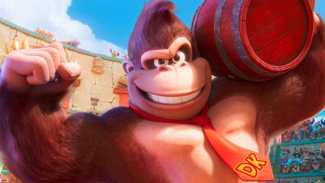
One character we weren't necessarily expecting to see in the latest Mario Movie trailer was the king of the jungle, Donkey Kong.
During the short Nintendo Direct, Shigeru Miyamoto introduced Donkey Kong's voice actor Seth Rogen and also mentioned how the character had a new look:
Shigeru Miyamoto: "It's been over 40 years since the release of the original Donkey Kong game, which was also my debut title. We've also changed his design for the first time since he became a 3D model in the original Donkey Kong Country game. Some of you may have noticed, but for this movie, we seized the opportunity to give him a comical personality and design reminiscent of the original character. What do you think?"
So, what do you think of Donkey Kong's new look? Vote in our poll and leave your thoughts below.


Comments 75
I would prefer the DKC look, but this definitely isn't bad
Yeah it's REAL good. Especially compared to his last CG outing(which I do have a soft spot for). It feels like a nice hybrid of his current look with some influence from Miyamoto's design for DK on Game Boy.

I sort of prefer the one we have in the games over this one. However, most of the new character renders aside from Luigi and Toad sort of carry this "off" feeling for me.
In the trailer itself, I think it looked pretty good. The stills they showed afterwards made it look kinda weird though, for some reason. I definitely respect the efforts to modernize the ORIGINAL original design too, that’s pretty cool.
@N00BiSH That’s not very banana slamma of you
@Platinum-Bucket I say that as someone who genuinely loves the DK cartoon.
It's not bad, but I hope this stays a movie thing. I /love/ his video game design and don't want to see this become the cross-genre norm.
I just hope he doesn't talk.
Looks like DK lol. Likewise you can also tell he was definitely designed by illumination
The eyes are weeeeird. Looks like a Dragon Quest character.
I like it! It's a happy medium between Rare's DKC design, and the 1981 arcade design.
I actually really, really love it
Still.... The only thing that doesn't look good in the Mario movie is Mario. SMH
@N00BiSH Banana slamma reinstated
I said in the other story, but this design makes me think of the costume for the American Super Smash Bros. N64 commercial. Which is not a bad thing for me. His design is slowly but surely growing on me.
I like it. Let's be real, it's not THAT different than the Donkey Kong Country DK.
It reminds me a lot of the Miyamoto design, but combined with the Country design. I like it.
I really like it, it would be weird to ditch the DKC design completely (unless the film featured a young Cranky, in which case reverting to the classic look would make sense), but I’ve always liked the older design, so this seems like a pretty decent mixture of the two.
I definitely prefer the Donkey Kong Country design, but considering the fact that every character has subtle changes, I think it’s fine.
When I see it in motion in that trailer, I don't see much difference between it and the DK in the games. It's mostly the eyes; in the games, the zone around them is somewhat different and he always has something of a frown... but in the movie trailer, when he emotes during the fight against Mario, he looks closer to his game look. Body proportions are somewhat different too, but the thing is that he looks good when he moves.
I hope that they don't change how he or the other characters look in the games, but the movie has its own art style and I think he looks good in it.
@Stubborn_Monkey I doubt they'll change the game's art style to conform with the film. People had the same concerns with the Sonic movie and that didn't really impact the Sonic games in the long run.
I'm really not digging the visuals. They've taken the charm away from all of the characters and moulded them into the grotesque image of Western 3D/CGI animated films (which I've never been a fan of). They should have resembled something closer to what they look like in the games, only with a little more detail.
@N00BiSH Yeah, I don't expect it to change either.
Eh, honestly the visuals look basic. But it's Illumination, so that's to be expected.
As long as they don’t get rid of his fancy necktie, I don’t really care.
I think it captures early doing Kong pretty well, and animated he looks even better!
My first reaction was "I don't hate it"
i don't know how to describe the difference
I'm not really much of a Donkey Kong fan but I think it's a cool design for him. I can't decide which design is better honestly.
I like it more than the Rare look. He generally looks friendlier, ironically enough.
Im sad that they took off some of the identity rare given to him
Tropical freeze is my favourite
I like that the movie designs are unique to differentiate it from the games. I prefer a separate continuity and look, just like what the Sonic movies are doing.
Oh man i am so hyped for this movie!
Seeing a part of smashbros and mario kart.
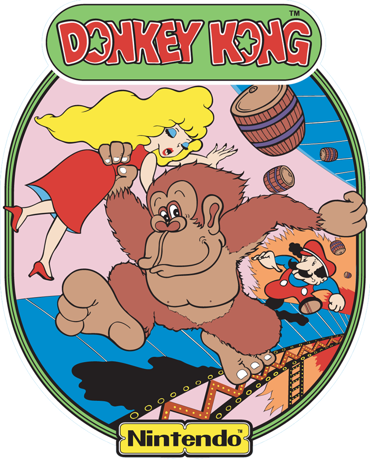
@N00BiSH Just a little thing - the image you posted above is from the 1994 Donkey Kong for Game Boy; Miyamoto's artwork for the 1981 arcade game is this one, if I'm not mistaken:
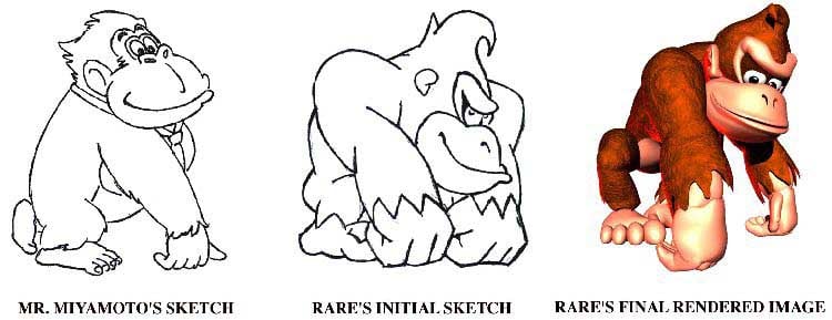
However, Rare used similar artwork as reference when they where redesigning DK for Donkey Kong Country:
@Kyloctopus Heh, he didn't have it in the arcade games; he first started to wear it around 1994, when Donkey Kong for Game Boy and Donkey Kong Country were released... (Well, he may not be the same character in DKC given that Cranky is said to be the Donkey Kong from the arcade games, but whatever...)
I like it, its fine.
@nukatha Seth Rogen is voicing him in the movie.
Looks weird in still images, but looked nice in motion. I really don't have any strong feelings for or against it though: it's just Donkey Kong.
@Stubborn_Monkey
However, Rare used simian artwork as reference when they where redesigning DK for Donkey Kong Country:
It’s cool. Really shows that Miyamoto-dono has had a hand in the movie. And it still acknowledges the work Rare did. Makes him look playful but still dangerous as Mario found out.
I’m so happy that Miyamoto got to reclaim Donkey Kong’s design after nearly 30 years.
I must be blind cause all I see is DKC design.
It's okay. My favorite rendition of Donkey Kong is his Super Smash Bros. Ultimate model. He still has the same body type we're all familiar with that debuted with the Donkey Kong Country games. But in many of his animations, he has a mischievous grin reminiscent of his arcade days. The facial features give him a lot of personality. Hope to see that carried over in future games besides just Smash.
@FatWormBlowsASparky Heh. They actually went to the Twicross Zoo to see how gorillas moved, but in the end they decided not to use it in the game.
I'm not a fan, it doesn't really fuss me much as Mario, Luigi, Toad and Bowser all looked spot on.
i think his designadaptation makes more sense than Marios. Where Mario lost characer, he gained some. Maybe in a diferent way than the DKC-DK but he looks just like he's gonna be a lot of fun and thats his whole purpose.
I like it,but i can see why Nintendo doesn't allow animators to make his teeth show when his mouth is fully open.
It kinda depends on from which angle you see him. In some shots he looks incredibly good, in others ot so much.
Honestly, I haven't even noticed it till I read this article .
I love it but when are we getting a new mainline Donkey Kong game?? Or Mario one at that!
Its better than his cartoon design back in the day that one was so awful looking.
As long as the model is not based on the Donkey Kong Country TV series, I am happy with it. That model is the stuff of nightmares.
This movie just keeps looking better and better! It is looking like it was made by fans who know the games rather than Execs chasing cash!
Removed - offensive remarks; user is banned
Nice wish we have an original DK arcade remake on Switch 2 maybe
Not too bad, but I don't like it that they are making all of the characters we love into that generic design style of Dreamworks. I dunno, I still think they should've kept the original designs, because if it ain't broke, don't fix it.
It's fine for the movie but I would hate it if this was for new DK games (if there were any)
Can we please have a side by side comparison? I don't see a thing... 💁♂️
@nukatha I don't think they would have cast Seth Rogen just to have him grunt for an hour and a half.
@nukatha
..."Shigeru Miyamoto introduced Donkey Kong's voice actor Seth Rogen..."
@Stubborn_Monkey Its not out of a legacy thing. I just like the necktie
Removed - offensive remarks
He looks . . . fuzzier.
For the purpose of it being a film, rather than a Nintendo-made product, it's perfect. Really liking how this is shaping up, and after the cast reveal, I never thought I'd be saying that!
It looks like Donkey Kong. I have no quibble with it.
It’s fine. It’s not too dissimilar to Rare’s DK, though I do wonder why they felt the need to redesign him at all since Rare’s is perfect and would’ve worked just as well in this film.
@Aretelio @BFahey3
George Clooney played a dog, and Jay Leno played a cat in South Park, just making animal noises.
I'm going to be honest; Donkey Kong looks horrible. Does anyone agree with me?
@N00BiSH Thats not the "original" design... for starters, he got its tie later, 1994.
Edit: I just saw this was already addressed by @Stubborn_Monkey in an excellent comment!
I think everything Ive seen regarding this movie is incredibly insulting to billions of fans that grew up with it. Man does it look stupid. Its a game, not a movie.
Not a fan of any of the designs.
I like it.
While I think it’s unfortunate they felt the need to redesign many of these characters that have been refined and perfected over 40+ years of gaming, DK’s design has been more or less stuck in 1994 with an early-days CGI look. The fur’s gotten more realistic over the years but the physiology remains optimized for fewer polygons.
The convoluted DK-to-DKC lore has been gradually downplayed for years so it’s only right for the character to reclaim his original role and early Miyamoto design. Retaining the tie and cowlick is the perfect compromise.
@Kyloctopus Oh, he definitely looks better with it; aside from making him look both funny and elegant, it's a simple yet effective way to give him a distinctive appearance, without it he'd look like a random gorilla.
Looks awesome. Fun design. It's very Donkey Kong. Seth Rogan's VO will make DK hilarious.
honestly it looks great if they remember to take out the darkness around his eyes when he opens them wide and isn't squinting
Show Comments
Leave A Comment
Hold on there, you need to login to post a comment...